Analogous colors are hues that are adjacent to each other on the color wheel. They are often used in photography to create aesthetically pleasing images, as the colors complement each other and create a harmonious look.
Using analogous colors in photography is a great way to create a cohesive look and draw the viewer’s attention to a particular part of the image. They are often used in nature photography, as they create a natural feel that can make the viewer feel as though they are actually in the scene.
When using analogous colors in photography, it’s important to remember that they should be used in moderation. Too many analogous colors can make the image look too busy and overwhelming. It’s best to choose two or three analogous colors and use them throughout the image.
When selecting analogous colors, it’s a good idea to pick colors that have the same level of saturation. This will ensure that the colors blend together nicely and create a harmonious look. It’s also important to consider the lighting of your photo, as the colors will look different in different lighting conditions.
When using analogous colors in photography, it’s also important to consider the background of the image. If the background is light, then it’s best to choose darker analogous colors, and vice versa. This will help create a balance between the foreground and background and make the image look more harmonious.
Analogous colors can be used in a variety of ways in photography, such as creating a color scheme for a portrait or adding depth to a landscape. They can also be used to create a sense of harmony and balance in the image. Regardless of how they are used, the key is to use them in moderation and to always consider the lighting and background. By doing so, you’ll be able to create aesthetically pleasing images that draw the viewer’s attention.
More on this subject:
Photographers should spend more time learning about color theory as it relates to the photographic image. For this reason we have included the short article below. However, for more comprehensive photography education consider enrolling in our online photography course.
Choosing colors next to one another on the color wheel can give your photographs flow, harmony and a easy to understand color theme. Analogous colors are located next to each other on the color wheel. Orange and yellow, for instance, are have an analogous color harmony as do blue and purple. Unlike complementary colors, analogous colors create a more soothing look to your photographs.

Here is an example of a photograph which uses analogous colors as its main color theme.
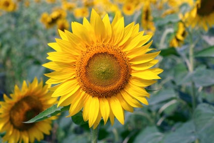
Notice how the colors in this photograph relate to each other more. This creates less contrast and a more flowing looking photograph.
There is no “right” color theme to use in photography. However, it is important to know your different options so you can actively seek out the desired photographic effect your looking for. If you are trying to create a visually dramatic photograph it might be worth spending the extra time and looking for the colors in your surrounding which will help you make the dramatic look you are shooting for.
To learn more about our comprehensive and interactive online photography course with one-on-one support from our teachers please visit the course homepage here.
Learn more about color in photography
More photography resources.
See also:
Color & Perspective
Color Simplicity
Color Tinting & Shading In Photography
Complementary Colors
Color Wheel
Color Psychology In Photography
Color Balance and Highlight
Monochromatic Photography