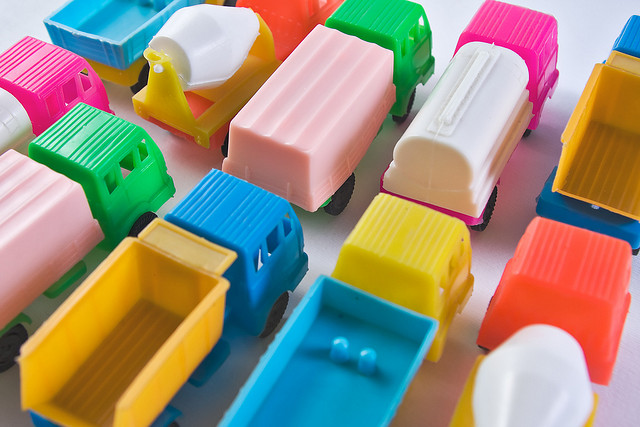
photo by HoriaVarlan
This lesson is extremely important photographic lesson. As art photographers you’ll need to put careful thought into what colors are going to make it into the 4 walls of your photograph. Painters spend a lot of time conceptualizing and thinking about what colors are going to make it onto their canvas. Painters spend a lot of time working with colors, they understand color psychology and they understand with great intimacy the process of mixing, blending and color coordination.
Photographers on the other hand spend very little time learning about color theory. Photographers who understand how to properly incorporate color into their photographs are rare. The photographers who do know how to use color can easily separate themselves from the herds of amateurs and have their photography stand out as unique, well organized and visually impressive.
As viewers of artwork, we often form a judgment about a piece within a few short seconds. Something about a photograph may ‘catch our eye’ or we simply look at it and think it looks ‘right’. We often can’t articulate what you like about a photograph. As amateur photography critics we often just say “I like it” or “I don’t like it”. However, there is something much more complex going on here. As a photographer it’s your aim to understand what information the viewer is processing to come to the “I like it” observation.
As photographers we know that there are certain things that are pleasing to the human eye. As photographers we need to study what photographic elements the audience appreciates. One of these photographic elements is color organization. Many great photographs organize color in such a way that makes it easy for the human eye to look at the picture and enjoy the details. Before we go any further we need to learn the basic of color theory.
Beyond all that here is much more detail on color in photography:
Introduction to Color in Photography
Photography is an art form, and color is an essential element of the creative process. Color can be used to create dramatic and vivid images that evoke emotion and tell a story. In this tutorial, we’ll discuss the importance of color in photography, as well as how to use it effectively to make better photographs.
Why is Color Important in Photography?
Color is a powerful tool in photography that can be used to communicate a message or add emotion to a scene. It can be used to create contrast and focus the viewer’s attention, as well as to set the mood. Colors can evoke different emotions and feelings, and can be used to convey a certain atmosphere. For example, warm colors like yellows and oranges can give a feeling of warmth and comfort, while cool colors like blues and greens can give a feeling of calmness. Color can also be used to add depth and texture to a photograph.
How to Use Color to Make Better Photographs
Beginners can use color to make better photographs by understanding the basics of color theory. This includes understanding the color wheel, the different types of colors (primary, secondary, and tertiary colors), and how colors interact with each other. Additionally, understanding how light affects color can help create stunning photographs.
Using the right colors for a photograph is essential. Color can be used to create a certain mood or atmosphere, or to draw attention to a particular subject. Knowing how colors interact and what colors work best together can help create more dynamic photographs.
Other Topics to Learn About in Photography Related to Color
In addition to understanding the basics of color theory, there are a few other topics related to color in photography that beginners should learn.
– White Balance: White balance is a technique used to ensure colors are correctly represented in a photograph. It adjusts the colors to make sure they appear natural and as they would in real life.
– Color Temperature: Color temperature is a measure of how warm or cool colors appear in a photograph. Understanding the effects of different color temperatures can help create interesting photographs.
– Color Grading: Color grading is a technique used to enhance a photograph by making minor adjustments to the colors. This can be used to add more drama or to bring out certain colors to make the photograph more visually appealing.
Summary
Color is an important element of photography and can help create stunning photographs. Understanding the basics of color theory and how to use color effectively can help beginners create more dynamic photographs. Additionally, learning about topics such as white balance, color temperature, and color grading can help create more striking images.
More photography articles and resources.
See also:
Color Simplicity
Color Tinting & Shading In Photography
Analogous Colors
Complementary Colors
Color Wheel
Color Psychology In Photography
Color Balance and Highlight
Monochromatic Photography