Composition Is Arrangement, Not Rules
Composition is the arrangement of everything inside the frame relative to everything else: where the subject sits, what surrounds it, what leads the eye where, and what gets left out entirely. The same subject, photographed from the same spot with the same camera settings, can look accidental or deliberate depending only on how it’s arranged in the rectangle. This page introduces the core tools; the full techniques, with worked examples for each, live on Photography Composition: 15 Techniques to Improve Every Photo.
Rule of Thirds
Divide the frame into thirds both horizontally and vertically and you get four intersection points. Placing a subject on one of those points, or aligning a horizon with one of the horizontal lines, tends to feel more dynamic and considered than centering everything, because it gives the eye somewhere to travel from rather than resting dead center. It’s a starting guideline, not a law: plenty of strong photographs center the subject deliberately, especially when the composition is symmetrical or the subject demands direct confrontation.
Leading Lines
Lines inside a frame, roads, fences, shorelines, rivers, architectural edges, even a line of shadow, pull the eye along their length. Placed well, a leading line carries the viewer’s eye from the edge of the frame toward the subject, giving the photo a sense of movement and depth even though nothing in it is actually moving.
Framing
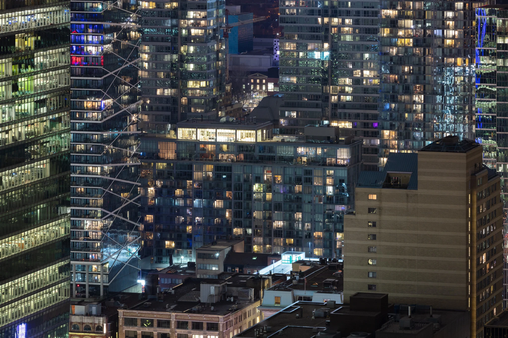
Framing uses an element already in the scene, a doorway, an archway, overhanging branches, a window, to enclose the main subject inside a second, smaller frame within the photograph itself. It draws the eye straight to whatever sits inside that inner frame and adds a sense of depth by clearly separating a near layer from a far one.

Simplicity and Negative Space
Removing distracting elements from a scene, or choosing a camera position and focal length that excludes them, is often more powerful than adding anything. Negative space, the empty or visually quiet area around a subject, gives the eye somewhere to rest and makes the subject itself feel more important by contrast. A cluttered frame competes with itself; a simplified one has a clear subject.
Color and Contrast
Contrast (light against dark, or a saturated color against a muted one) is one of the fastest ways to direct attention, because the eye is drawn to the area of greatest difference in a frame before it consciously processes anything else. Color can also create depth on its own: warm tones tend to advance toward the viewer and cool tones tend to recede, so a warm foreground against a cool background reads as more three-dimensional even in a flat photograph.
Rule of Odds
An odd number of subjects in a frame, three people rather than two, three rocks rather than four, tends to feel more balanced and interesting than an even number, because an even number often splits naturally into pairs that compete for attention, while an odd number leaves one element without a partner, which the eye resolves as a loose group instead. Like the rule of thirds, it’s a tendency worth knowing, not a requirement.
Common Mistakes
- Treating every “rule” here as mandatory. Each one is a description of what commonly works, not a checklist a photo fails for skipping.
- Stacking every technique into one frame. A photo doesn’t need thirds, leading lines, framing, and the rule of odds all at once. Most strong images lean on one or two ideas clearly rather than all of them faintly.
- Finding a good arrangement and forgetting the light. Composition and lighting work together; a perfectly arranged frame in flat, uninteresting light still falls flat. See Lighting.
- Cropping in post to “fix” composition instead of arranging in camera. A crop can rescue a shot, but composing deliberately before pressing the shutter keeps far more resolution and far more options.
Try This
Pick one static subject and, without changing your camera settings, shoot it five different ways: centered, on a rule-of-thirds intersection, framed by something in the environment, with a clear leading line pulling toward it, and with as much distracting clutter removed from the frame as you can manage by changing position alone. Look at the five side by side and decide which arrangement actually serves that specific subject best. The answer will be different for a different subject, which is the whole point.
Related
- Photography Composition: 15 Techniques to Improve Every Photo, the full hub with worked examples for every technique above and more.
- Rule of Thirds
- Leading Lines
- Negative Space
- Contrast
- Composition in Street Photography