Contrast in photography is difference: how strongly one part of a picture stands apart from what surrounds it. Most people mean tonal contrast, the spread between the darkest and brightest tones, but colours, textures, sizes and even ideas can contrast too. The eye goes first to wherever the difference is greatest, so controlling contrast is how you decide what a viewer notices, and in what order.
Tonal contrast: global and local
Tonal contrast is the difference in brightness between areas of a photograph. It works at two scales.
Global contrast is the overall range of the whole image: how dark the deepest shadows are compared with the brightest highlights, and how steeply the tones step between them. A snowy field with a black crow in it has high global contrast. A grey beach on an overcast day has low global contrast. A basic contrast slider changes global contrast across the entire frame.
Local contrast is the difference between neighbouring areas: the ridge of a board against the groove beside it, the edge of a cheekbone against the shadow under it, one cloud against the next. An image can have low global contrast and high local contrast at the same time. A misty forest can be pale overall while each tree trunk still stands crisply against the fog directly behind it.
This distinction matters because the two feel different. Global contrast sets mood and punch. Local contrast sets texture, crispness and the sense that you could reach in and touch the surface. Most flat-looking photographs need more local contrast, not more global contrast, and most harsh-looking ones have too much global contrast crushing detail at both ends.
What the histogram tells you about contrast
The histogram is a graph of how many pixels sit at each brightness, from black on the left to white on the right. Its shape is a direct picture of global contrast.
| Histogram shape | What it means | Typical scene |
|---|---|---|
| Narrow hump in the middle, empty at both ends | Low contrast: few true darks or brights | Fog, haze, overcast landscape, shooting into glare |
| Broad spread that just reaches both ends | Full tonal range, normal contrast | Most well-lit everyday scenes |
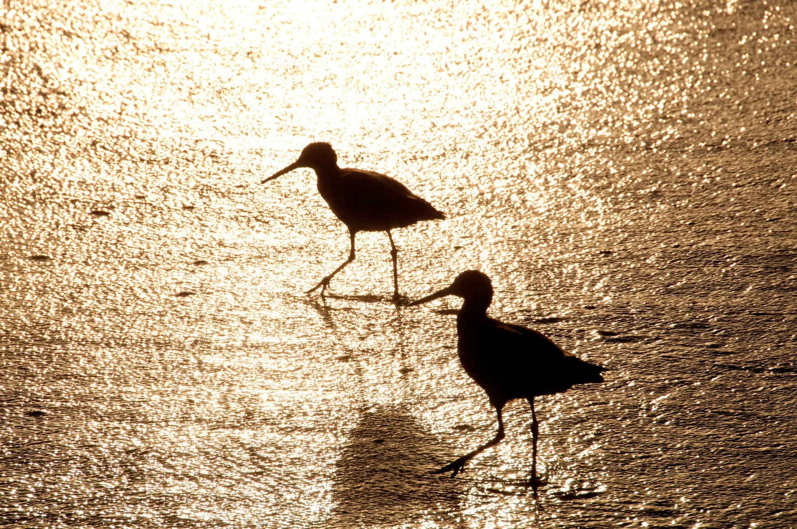
| Two peaks near the edges, a valley between | High contrast, few midtones | Silhouettes, bright windows in dark rooms, snow and shade |
| Piled against one or both walls | Clipping: detail lost to pure black or pure white | A scene wider than the sensor can hold, or a heavy contrast edit |
Two cautions. First, the histogram shows brightness distribution, not quality. A foggy scene should have a narrow hump, and forcing it to fill the graph can destroy what made it beautiful. Second, the histogram says nothing about local contrast. Your eyes judge local contrast; the graph judges global range.
How the quality and direction of light set contrast
Before any setting or edit, light decides how much contrast you have to work with. Two properties matter most.
Size of the source. A light source that is small relative to the subject produces hard light: shadows with sharp edges and a big jump from lit to unlit. Direct sun is a small source because it is so far away, even though it is huge. A large source, such as an overcast sky, a big window or light bouncing off a white wall, wraps around the subject and produces soft light: gentle transitions and open, detailed shadows. Hard light raises contrast; soft light lowers it. More in hard and soft light.
Direction. Light from behind the camera (front light) fills in the small shadows that describe shape and texture, so it tends to flatten local contrast even in bright sun. Light from the side rakes across surfaces, and every bump casts a shadow, which raises local contrast dramatically. Light from behind the subject puts bright rims and backgrounds against shaded faces, raising global contrast and often producing silhouettes. See direction of light for the full range of angles.
Want the subject as a black shape against bright light? Silhouette photography covers the best times and conditions and the camera settings that make it work.
Time of day ties both together. Clear midday light is hard and overhead, with strong global contrast but short shadows. Low sun near sunrise and sunset is still hard but rakes across the land, giving rich local contrast. Cloud softens everything.
A practical rule: if you want texture, move until the light is coming from the side. If you want smooth skin, calm water or a gentle mood, find open shade or wait for cloud.
Colour contrast: hue, temperature and saturation
Colours contrast in three independent ways, and a strong colour photograph usually leans on at least one of them.
- Hue contrast. Colours that sit opposite each other on the colour wheel, such as orange and blue, red and green, or yellow and violet, intensify each other when placed side by side. These are complementary pairs, explained further in colour theory for photographers.
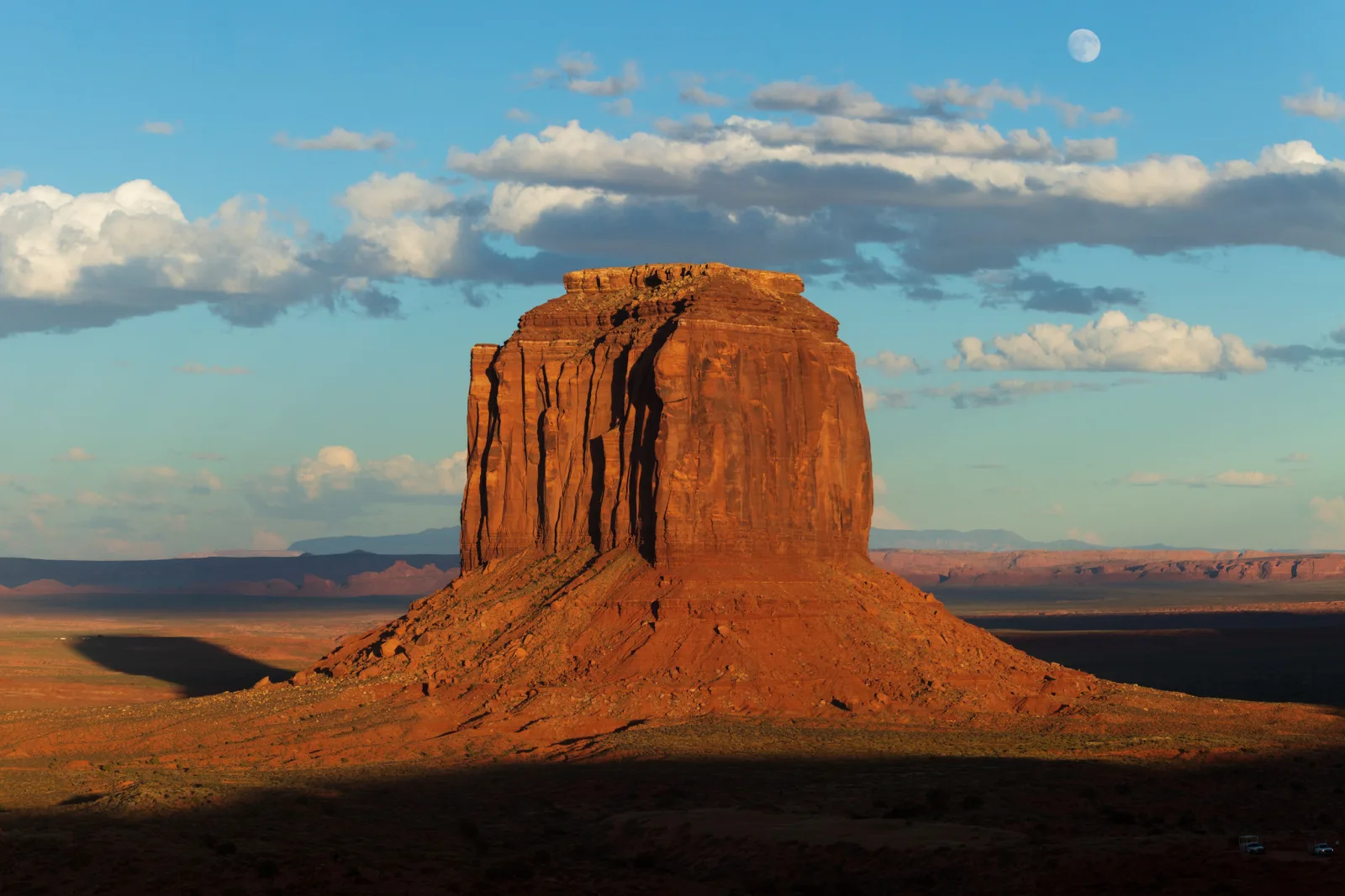
- Warm against cool. Orange, red and yellow read as warm; blue, cyan and violet read as cool. A warm subject in a cool setting, such as a lit window at blue hour or a sunlit rock face under blue sky, separates almost automatically, and warm tones tend to feel nearer to the viewer than cool ones.
- Saturated against muted. A single saturated colour in a field of greys or soft tones pulls attention as strongly as a bright highlight does. A red umbrella on a grey street works for this reason, even though red and grey are not complementary.
Colour contrast and tonal contrast are separate. Pure red and pure green of the same brightness contrast strongly as colours but become the same grey in black and white. This is why a colourful photograph sometimes turns to mush when converted: its separation was carried entirely by hue. If you plan to convert to black and white, check whether your subject differs from its surroundings in brightness, not only in colour. The colour mixing controls in a black and white conversion let you push those colours apart in tone.
Texture, scale and meaning: contrast beyond tone and colour
Once you start seeing contrast as difference of any kind, many more tools open up. Each of these directs attention in the same way tonal contrast does: the eye goes to where the difference is.
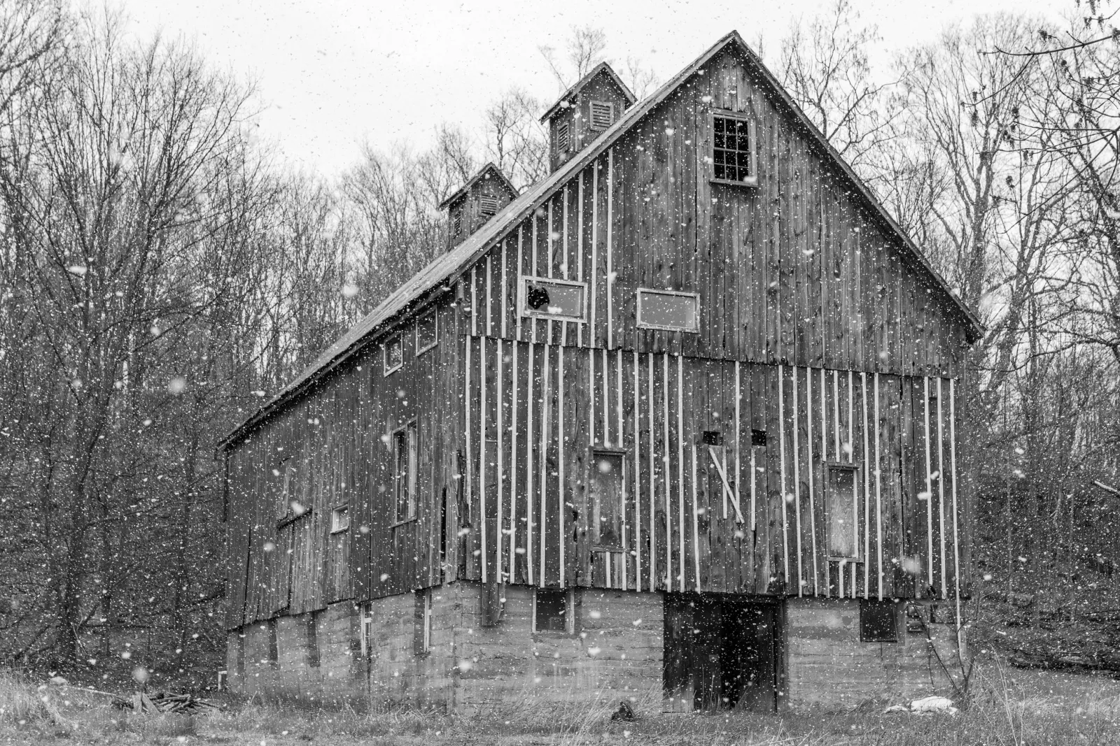
Textural contrast. Rough against smooth: rusted metal beside polished glass, a gnarled hand on a silk sleeve, jagged rock at the edge of still water. The smooth area makes the rough one feel rougher, and side light is what reveals both. The guide to texture in photography goes further.
Contrast of scale. A tiny figure at the foot of a cliff tells the viewer how big the cliff is, and the size difference itself becomes the subject. The same works in reverse: a close-up of a small object filling the frame beside a distant landscape. It works when the viewer knows the small element’s real size, which is why people, doors and trees make the best references. See scale in photography.
Contrast of sharpness and motion. A sharp, still person in a crowd blurred by a slow shutter speed. A crisp subject against a background thrown out of focus by a wide aperture. Stillness against motion and sharp against soft are both differences the eye picks up instantly, and both are covered in more detail in the guide to subject separation.
Conceptual contrast. Old and new, rich and poor, nature and machine, joy and grief. Here the difference lives in meaning rather than in pixels: a horse-drawn cart in front of a glass tower, a child laughing in a ruined building. This is the territory of juxtaposition. Conceptual contrast is strongest when it is backed by visual contrast, so that the old and new also differ in tone, colour or texture and read clearly at a glance.
Managing contrast in camera
The cheapest contrast control is where you stand and when you shoot. Beyond that, you have several tools, roughly in order of how often you will reach for them.
- Choose the light. Wait for cloud, move into open shade, turn so the sun is to your side instead of behind you, or come back at another time of day.
- Choose the background. Placing a dark subject against a bright area, or a bright subject against shadow, creates contrast exactly where you want it.
- Expose for the part that matters. In a high contrast scene you usually cannot hold everything. Decide which end carries the picture. For a silhouette, expose for the bright sky and let the subject go black. For a face in the shade of a bright street, expose for the face and accept a bright background. Exposure compensation or spot metering makes the decision stick.
- Add or subtract light. A reflector or a touch of fill flash lifts shadows and lowers contrast on a nearby subject. A black card or a dark wall on one side deepens shadows and raises it.
- Use filters where they help. A polarizing filter cuts glare from leaves, water and haze, which raises both colour saturation and local contrast; it also darkens blue sky most strongly at about 90 degrees from the sun. A graduated ND filter darkens a bright sky to bring it closer to the land’s brightness, lowering global contrast so both can be recorded.
- Bracket when the range is too wide. When a scene simply exceeds what one exposure can record, shoot several frames at different exposures and blend them later, as described in HDR photography.
Flare lowers contrast too: stray light striking the front element lifts the blacks across the whole frame. A lens hood or a hand shading the lens often restores contrast that seemed to be missing.
Is flare washing out your blacks? Lens flare explains where it comes from inside the lens, what makes it worse and how to prevent it.
Adjusting contrast in the edit: curves, clarity and local tools
Editing does not create contrast out of nothing; it redistributes the tones you captured. Every contrast adjustment is a trade. Making some tones step apart more steeply means others must be squeezed closer together, because the image still has to fit between black and white.
The contrast slider is a quick global S-shaped adjustment around the middle grey. It pushes highlights and shadows toward clipping at the same time, and usually raises saturation too.
The tone curve gives precise control. The horizontal axis is the input tone and the vertical axis is the output. Wherever the curve is steeper than the diagonal, those tones are pulled apart and contrast rises. Wherever it is flatter, tones are pushed together and contrast falls. A gentle S-curve (shadows lowered a little, highlights raised a little) steepens the midtones, where faces, skies and most subjects live, while compressing the extremes. You can also do the opposite: flatten the midtones slightly to calm a harsh scene. Lifting the black point so the darkest tone becomes a dark grey gives the soft, faded look used for quiet or nostalgic images. The guide to curves and levels walks through each of these moves.
Want to set the darkest and brightest tones yourself? Setting the black and white points covers what they mean, reading the histogram and the hold-Alt-or-Option drag method.
Clarity and similar sliders raise local contrast. They work much like sharpening, but over a far larger radius: instead of adding contrast along fine edges a pixel or two wide, they increase the difference between areas many pixels across, mostly in the midtones. That is why a little clarity makes clouds, fabric and weathered surfaces come alive without changing the overall brightness range. Too much produces halos along strong edges, a gritty look on skin, and a crunchy, overprocessed feel. A dehaze control removes a uniform veil of brightness, which raises contrast most strongly in hazy, distant areas.
Local adjustments put contrast only where you want it. Dodging and burning (brightening and darkening by hand) can deepen the shadow side of a face, brighten the lit edge of a building, or darken a distracting bright patch near the frame edge. Because the eye goes to the brightest, highest contrast area first, a common finishing move is to lower contrast slightly at the edges and raise it slightly on the subject.
When low contrast is the right choice
High contrast is not the goal; the right contrast is. Several kinds of subject call for low contrast.
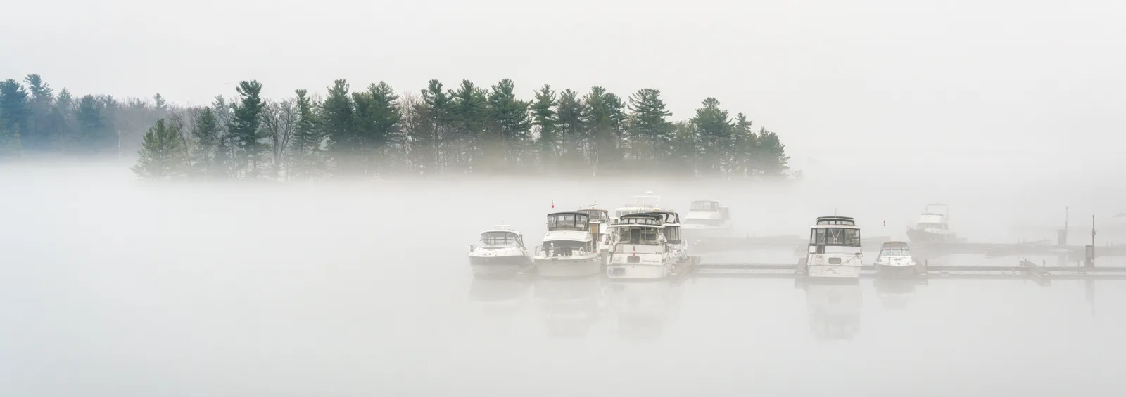
- Fog, mist and haze. The atmosphere itself is the subject. Adding contrast removes it. Keep the tones compressed and let one darker element, a tree or a boat, carry the frame.
- High key images. Pale, airy portraits, snowscapes and minimal scenes depend on a narrow range of light tones with only small touches of dark. The high key and low key guide explains how to expose and edit for this.
- Soft portraits. Hard contrast exaggerates every line and blemish on skin. Soft light and a gentle curve flatter nearly everyone.
- Quiet, melancholy or nostalgic moods. Low contrast feels calm and distant; high contrast feels urgent and dramatic. Match the contrast to what you want the viewer to feel.
Shooting fog or mist? Fog and mist photography covers what fog does to light and depth, exposing so it stays bright, and focusing when there is almost no contrast.
Low contrast is not the same as a flat, unfinished file. A deliberate low contrast image still has a clear subject, usually the darkest or most distinct element in the frame, and still has local contrast where it matters. The difference is intent: the tones are compressed because the scene and the mood call for it.
Common mistakes
- Adding contrast to every photo by habit. Fix: decide what mood the scene has before you edit, and only then set contrast to match it.
- Using global contrast to fix a flat subject. The whole frame gets harsher, but the subject still looks dull. Fix: raise local contrast on the subject with clarity or a curve applied through a mask, and leave the rest alone.
- Clipping both ends. Heavy contrast pushes shadows to pure black and highlights to pure white, and detail is gone for good. Fix: watch the histogram and the clipping warnings while you edit, and back off until the important tones hold detail.
- Relying on colour alone for separation. The picture falls apart in black and white or for viewers with colour vision deficiency. Fix: make sure the subject also differs from its background in brightness.
- Brightest area in the wrong place. A white sky patch or a shiny car at the frame edge steals attention from the subject. Fix: recompose, or darken it locally in the edit.
Try this
The three-light contrast study (about 30 minutes). Pick one textured object you can move, such as a pine cone, a crumpled paper bag or an old shoe, and a window with daylight coming through it.
- Place the object so the window is directly behind you and photograph it. This is front light.
- Move the object so the window is directly to one side. Photograph it again from the same distance and with the same exposure mode.
- Now move the object so the window is behind it. Photograph it a third time.
- Finally, go back to the side-lit position and hold a sheet of white paper opposite the window, just out of frame, to bounce light into the shadow side. Shoot once more.
Compare all four on a screen at the same size. Note which one shows the most texture (usually the side light), which has the widest global contrast (usually the backlight), and how much the white card softened the side-lit version. Then open the flattest frame in your editor and try to make it match the side-lit one using only a curve and a local contrast slider. Some of it can be recovered and some cannot, which is the clearest lesson in getting contrast right with light first.
Want to try this light on a person? Window light portraits covers window light quality, how window orientation changes it and why it makes a good starting point.
Frequently asked questions
Is high contrast better than low contrast?
No. Each suits different subjects and moods. High contrast feels bold and dramatic and suits strong light, graphic shapes and street scenes. Low contrast feels calm and soft and suits fog, portraits and quiet landscapes. The mistake is contrast that fights the subject.
What is the difference between contrast and dynamic range?
Dynamic range is how wide a range of brightness a scene contains, or a sensor can record. Contrast is how the tones are distributed and how steeply they differ within the finished photograph. A high dynamic range scene can be edited into a low contrast image, and a low range scene can be given strong contrast.
Does shooting raw affect contrast?
A raw file has no contrast baked in; the editor applies a default tone curve when it displays it, which is why raw files can look flatter than the preview on the camera. You set the contrast yourself instead of accepting the camera’s choice.
Related guides
- Subject separation: every way to make a subject stand apart, with contrast as one tool among several.
- High key and low key photography: building a whole image from light tones or from dark ones.
- Curves and levels: the precise tools for shaping tonal contrast in the edit.
- Colour theory for photographers: complementary pairs, harmony and colour temperature in depth.
- Juxtaposition in photography: contrast of meaning, and how to find it.
- How to read a camera histogram: checking exposure and tonal range in the field.
- Hard light vs soft light: how the size of a light source sets contrast.
- Texture in photography: using light and contrast to make surfaces feel real.