Photography Classes Online – Icon Photography School › Forums › Photography Lessons › Lesson 9 › Lesson 9 › Re: Re: Lesson 9
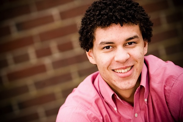
Beautiful photograph!
It’s a very well composed portrait. It’s full of life and texture which are two of the most important portrait elements.
Your focus is also great. When doing portraits your subject’s eyes are usually your focal point. You’ve done a great job of making his eyes the primary focal point.
My only recommendation from a composition standpoint would be to consider getting rid of some of the dead space above his head. Photographers are split about this. Many people don’t mind the extra space, but many people like to bring the frame down in a traditional portrait environment.
Some people like to put a little space above the head:
http://digital-photography-school.com/wp-content/uploads/2007/08/portrait.jpg
However some people like to bring it a little bit lower, sometimes even cropping a little bit of the top of the head.
http://digital-photography-school.com/wp-content/uploads/2008/03/20080222-cnd-272141.jpg
What you’ve done isn’t wrong. I just want you to be aware of your use of space.
Secondly, although I love your composition, this was a black and white photography assignment. We wanted to see tonal range, but you’ve kept your tones predominantly grey. I’ve taken a “levels” reading through PhotoShop so you could see the reading. Notice the hump in the mid-tones and the lack of pixels in the bright (right) and dark (left) side of the tonal spectrum. The height of the humps represent the pixels in each tonal category. You have virtually none in either black or white. This can often make a black and white photography look flat. However, look at the following image with both bright whites and rich blacks:
http://cdn-write.demandstudios.com/upload//9000/100/00/4/49104.jpg
Getting that tonal spectrum is key to dramatic black and white images.
Great image though. I just want to see you experimenting with tones!