Monochromatic means made of a single color. A monochromatic photograph uses one hue, such as blue, red or green, in different shades, tints and levels of saturation, with no other colors competing. Black and white photography is the best-known kind of monochrome image, but a photo built entirely from blues, or from warm oranges, is just as monochromatic.
The word comes from the Greek monos (one) and chroma (color). This page explains how monochromatic photos work, how they differ from black and white, where to find single-color scenes, and how to create the look in editing.
Monochromatic vs. monochrome vs. black and white
The three terms overlap, and people use them loosely:
- Monochrome means one color, and works as both a noun and an adjective. It covers any image made from a single hue in many tones: black and white, sepia, the blue of a cyanotype, or a photo toned entirely green. See monochrome for the term on its own.
- Black and white (grayscale) is monochrome with no hue at all: only tones from black to white. Black and white photography covers it in depth.
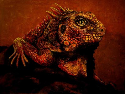
- Monochromatic is an adjective only, and in color photography it usually describes a color image where one hue dominates the whole frame, like a misty forest that is all soft greens or a desert scene of sand and rock in one warm orange.
So every black and white photo is monochrome, but not every monochromatic photo is black and white.
What makes a single color interesting
A single hue can still vary in three ways, and a monochromatic photo depends on all three:
- Lightness. The same blue can be almost white (a tint, the hue mixed with white) or almost black (a shade, the hue mixed with black). This range of tones does the work that different colors normally do.
- Saturation. A fully saturated blue next to a grayish blue reads as two different elements even though the hue is the same. See saturation for how it works.
- Hue drift. Real monochromatic scenes are rarely one exact hue. Blues drift toward cyan or violet, and oranges toward red or yellow. Small shifts like this add life; large ones break the effect and start to look like an analogous color scheme instead.
On the color wheel, a monochromatic scheme is a single spoke: one hue, from pale to dark. It is the simplest of the color harmonies and the calmest, because nothing in the frame fights for attention through color. That is why monochromatic photos often feel quiet, unified and moody.
Why use a monochromatic palette
- Strong mood. One hue sets one feeling. A frame of blues reads as cold, calm or lonely; a frame of reds and oranges reads as warm, intense or dry. Color psychology in photography explains these associations.
- Attention on shape and light. With color contrast removed, the eye goes to lines, texture, form and the play of light and shadow.
- Simplicity. One color removes clutter. Monochromatic scenes suit minimalist photography and the idea of color simplicity.
- Consistency. A series of photos edited toward the same hue looks like a set, which is useful for portfolios, books and exhibitions.
Where to find monochromatic scenes
You do not need editing to make a monochromatic photo. Many situations reduce the world to one color on their own:
- Blue hour. In the twilight after sunset and before sunrise, the whole scene turns blue. The blue hour is the easiest place to start.
- Fog, mist and haze. Fog mutes color and contrast until a scene is soft grays, blues or greens. Fog photography covers how to expose for it.
- Snow and overcast light. Fresh snow under a cloudy sky is close to monochrome, often with a slight blue cast.
- Sunrise and sunset. A low sun and dust or smoke in the air can wash a scene in orange or red.
- Deserts, beaches and stone. Sand, rock and dry grass often share one warm hue.
- Forests and fields. Dense foliage gives many greens and almost nothing else.
- Underwater. Water absorbs red light quickly, so deeper scenes turn blue or green. Underwater photography explains why.
- Single-color subjects. A painted wall, a pile of fruit, a field of one flower, or a person dressed in a color that matches the background.
Want to know exactly when the blue light happens? Blue hour photography covers the timing, the settings and what to shoot.
How to shoot a monochromatic photo
- Look for the dominant hue first. Before framing, ask what single color the scene is built on, then frame out anything that does not belong to it, such as a red car in a blue street.
- Find tonal contrast. Without color contrast, the photo needs light against dark. Place a bright area of the hue against a deep one, or a pale subject against a dark background of the same color.
- Use texture and shape. Rough against smooth, and strong outlines, keep a one-color image from looking flat. Texture is often what holds a monochromatic photo together.
- Keep your white balance deliberate. Auto white balance may try to neutralize the very color you want. Set a fixed white balance, or shoot raw and set it in editing. A lower Kelvin setting pushes the image toward blue, a higher one toward orange.
- Watch the exposure. Large areas of one color can fool the meter. Check the histogram, and in color the individual channel histograms if your camera shows them, so the dominant color does not clip.
- Use soft light for subtle gradations. Diffused light gives smooth steps from light to dark; hard, direct light gives bold, graphic contrast.
How to make a photo monochromatic in editing
There are several ways to create the effect after the shot. They differ in how much of the original color survives.
Tone a black and white conversion
Convert the photo to black and white, then add one color to it. You can tint the whole image, or use split toning with the same hue in both shadows and highlights. This gives a classic toned print such as sepia (warm brown) or a cool blue. You have full control over the hue and its strength.
Desaturate every color except one
In the color mixer (HSL) panel, lower the saturation of every color range except the one that dominates the scene. Then use the hue sliders to pull nearby colors toward the main one, for example shifting greens toward yellow in an autumn scene. This keeps the photo in color but strips out anything off theme.
Grade toward one hue
Use the color grading wheels or the tone curve’s individual red, green and blue channels to push shadows, midtones and highlights toward the same hue, then lower overall saturation if the result is too strong. Color grading explains the controls.
Use a color overlay or gradient map
In a layer-based editor, a solid color fill layer set to a color blend mode, or a gradient map running from a dark to a light version of one hue, turns any photo monochromatic. Lower the layer’s opacity to let a little of the original color back in.
Not sure which hue to choose? Color theory for photographers explains how hues, harmonies and color contrast affect a picture.
Common mistakes
- Flat, low-contrast images. Fix: one hue needs a full range of light and dark. Set a true black and a bright highlight, or add local contrast to the subject.
- A stray color in the frame. Fix: a small patch of a contrasting color pulls the eye straight to it. Reframe, or desaturate it in editing, unless it is meant to be the subject.
- Oversaturating the one color. Fix: a strong single hue at full saturation looks artificial and hides detail. Pull it back until texture shows.
- Letting the camera correct the color away. Fix: set white balance manually so blue hour stays blue and sunset stays orange.
- Using a filter look on every photo. Fix: choose the hue to suit the subject and mood. A cold blue on a warm family portrait works against the picture.
Try this
Pick one color and spend ten minutes photographing only things that are made of it: a blue door, a blue sky reflected in a window, a blue shadow on snow or concrete. Frame each shot so nothing of another color appears. Then look at the set together and pick the three that have the widest range from light to dark. Those are the ones that work as monochromatic photos.
Frequently asked questions
What does monochromatic mean in photography?
It means the photo is built from one color in different shades, tints and saturations. The single hue can be any color, and black and white is the most common monochrome form.
What is the difference between monochrome and monochromatic?
Both mean one color. Monochrome is used as a noun and an adjective, most often for black and white or toned images, while monochromatic is only an adjective and is most often used for color photos dominated by one hue.
Is black and white the same as monochrome?
Black and white is one kind of monochrome, the kind with no hue at all. Sepia, blue-toned and other single-color images are monochrome too, but they are not black and white.
How do I make a monochromatic photo?
Either find a scene that is naturally one color, such as blue hour, fog or a desert, or create the effect in editing by toning a black and white conversion or desaturating every color except one. In both cases you need strong contrast between light and dark to keep the image from looking flat.
What is a monochromatic color scheme?
It is a palette made from one hue and its lighter tints and darker shades. In photography it gives a calm, unified look, compared with complementary colors, which use opposite hues for strong contrast.
See also: Color & Perspective Color Simplicity Analogous Colors Complementary Colors Color Wheel Color Psychology In Photography Color Balance and Highlight