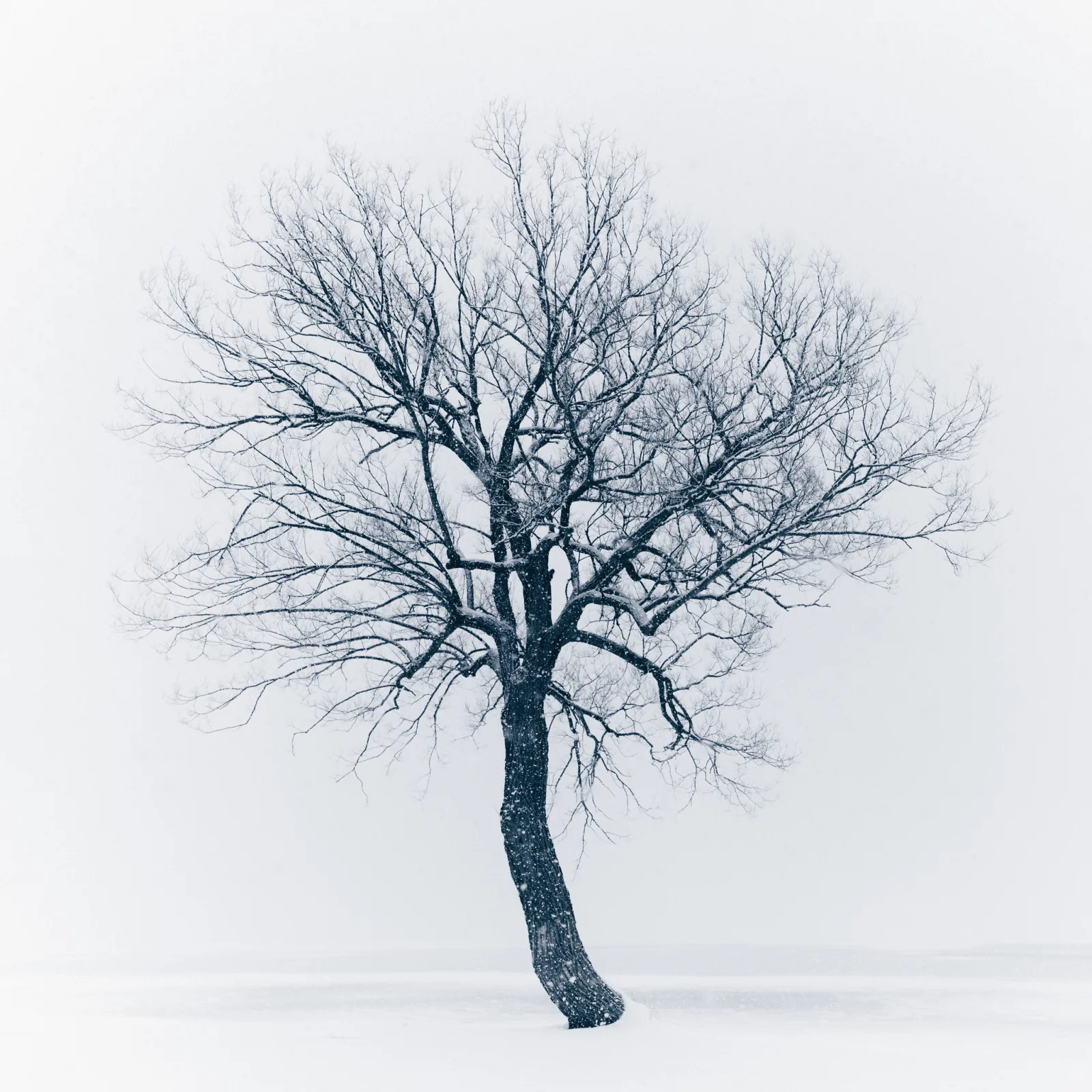
Negative space is the quiet area around and between the subjects of a photograph: open sky, calm water, a plain wall, fog, shadow or a smooth blur. It matters because it decides where the eye goes and how a picture feels; the same subject can look lonely, calm, tense or grand depending only on how much space surrounds it and what that space is like.
The subject is the positive space, and everything that does not compete with it is negative space. The two are not separate ingredients. They define each other, so every framing decision you make about one is also a decision about the other. This page gives you that model, then the practical part: how to find or make clean space, how much of the frame a subject really covers, how to expose a frame that is mostly empty, and how to tell space you chose from space you simply failed to fill.
Space is one of the classic elements of art. A photograph uses it in two ways: as the balance of filled and empty areas across the flat frame, which is what this page is about, and as the illusion of distance into the scene, covered in depth in photography.
Positive and negative space define each other
Designers call this the figure and ground relationship. The figure is what you notice; the ground is what it stands on. You cannot change one without changing the other: move closer and the subject grows while the space shrinks and changes shape; step to the side and a gap opens between two buildings that was not there before.
That last point is the one most learners miss. Negative space has a shape. The sliver of sky between two trunks, the triangle of light under a bent arm, the gap between a dancer’s legs: the eye reads these as shapes just as it reads the subject. Space that has a clear, deliberate shape and leads somewhere is active. Space that is cut into awkward leftover scraps, or squeezed into a narrow strip against the edge of the frame, is trapped, and it makes a picture feel cramped even when there is plenty of it. The shape in photography page goes further into reading these outlines.
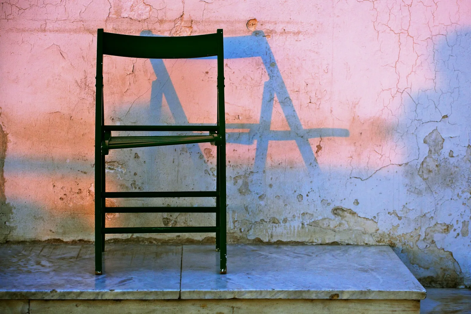
Sometimes the relationship flips. A pale clearing in a dark forest, a patch of bright sky framed by buildings, or the shape of light on a floor can become the thing you look at, with the solid objects turned into its frame. When figure and ground are ambiguous like this, the picture asks the viewer to choose, and that tension can be the whole point of it. Japanese aesthetics has a word for purposeful emptiness, ma: the interval that is part of the work rather than an absence of it.
Negative space is whatever does not compete
Negative space is often described as “empty”, which leads to the idea that it has to be white, plain or blurred. It does not. A cracked wall, rippled sand, a sky with a soft gradient or a dark doorway can all work, as long as nothing in them pulls the eye away from the subject. The test is not emptiness but competition: does this area ask for attention, or does it give attention to the subject?
That is also why negative space is not the same as background. A background can be detailed, bright and busy, and then it fights the subject. It only becomes negative space when it is quiet enough to set the subject off. And because the test is competition, even a crowded frame has some negative space: the stretch of plain pavement around a street photography subject, or the dark gap between two lit faces.
Negative space is also not the same as minimalism. Minimalist photography is a style that reduces a picture to very few elements, and it leans heavily on negative space. But a busy, layered photograph can still use negative space well, and a minimalist photograph can fail if its one subject is weak.
What the space does to a picture
It isolates. With nothing else to look at, the eye goes straight to the subject. A bare tree in a dense forest is one tree among many; the same tree in a snowfield is the picture. This is contrast at the level of the whole frame: one thing against very little.
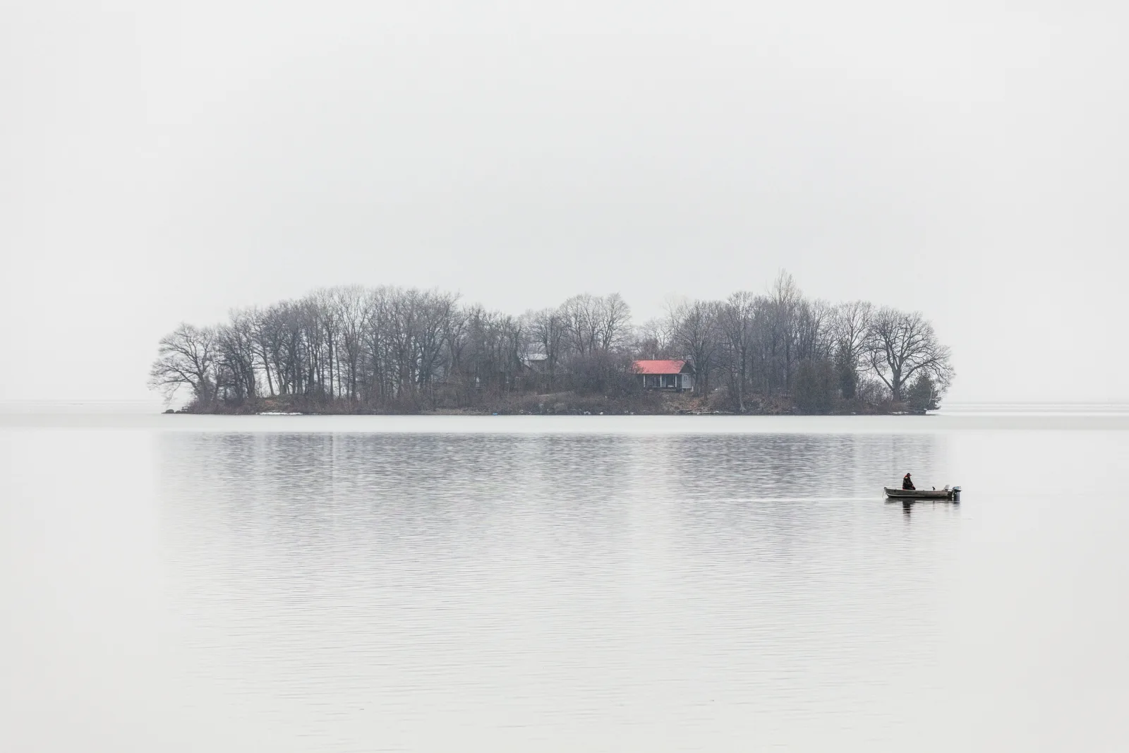
It shows size. Size in a photograph comes from a reference the viewer recognizes, such as a person, a boat or a car. Space does not create scale by itself, but it lets a small reference read clearly, and the amount of space around it tells the viewer how big the setting is. The scale in photography page covers references in more detail.
It points. Space in front of a subject that is moving or looking somewhere gives it room to go, and the picture feels open. Put the same space behind it and the subject seems to be leaving the frame or pressed against the edge, which can feel tense or final. Space above a subject can read as freedom or as smallness; space below can feel grounded or precarious.
Wondering how much room to leave in front of a moving or looking subject? The rule of space covers lead room, nose room and when to break it.
It sets the mood, but not always toward calm. Generous, even space often feels quiet and contemplative. Yet a lone figure in a vast dark frame can feel exposed or uneasy, and a subject jammed against one edge with a wide empty field beside it can feel tense. Do not assume space equals peace; look at what this space, around this subject, actually does.
How much of the frame the subject really covers
There is no correct ratio of subject to space. What is worth knowing is how small a “small” subject really is, because area grows with the square of size. A subject that spans one third of the frame’s width and one third of its height covers about one ninth of the area, not one third.
| Subject spans this much of the frame’s width and height | Share of the frame’s area | Share left as space |
|---|---|---|
| 1/2 | 25% | 75% |
| 1/3 | 11% | 89% |
| 1/5 | 4% | 96% |
| 1/10 | 1% | 99% |
| 1/20 | 0.25% | 99.75% |
Two practical lessons follow. First, placing a subject on a rule of thirds intersection says nothing about how much space surrounds it; a subject on that point can cover 25% of the frame or 0.25%. Placement and area are separate decisions. Second, think about where the picture will be seen. A subject one twentieth of the frame’s width is about 20 pixels wide in a photo shown edge to edge on a phone screen about 390 pixels across, and about 3 cm wide in a print 60 cm across. A clear dark silhouette survives at 20 pixels; a low contrast smudge does not. The smaller the subject, the more distinct its shape and tone must be.
Where to find, or make, negative space
Sky
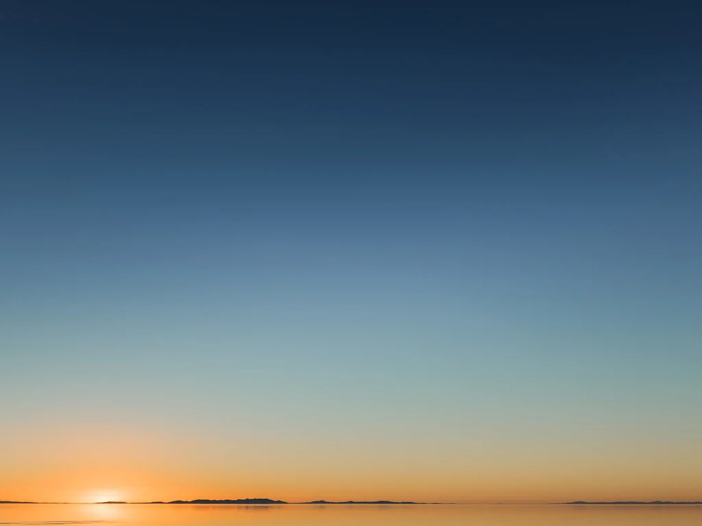
The sky is the most available negative space there is. Lower the camera and look up, and cluttered backgrounds drop out of the frame. A smooth overcast sky or a clear gradient is the cleanest version; dramatic clouds fill the space with detail and start to compete. Place the subject low and give the sky most of the frame, or shoot from below so the subject stands out as a silhouette.
Still water
Calm water gives a second field of space below the horizon, often carrying the sky’s color, with the subject held between the two. Wind ripples add texture; a long exposure of several seconds smooths them into a glassy surface that sets off any rock, post or boat. In daylight that usually needs an ND filter: a scene metered at 1/125 second becomes about 8 seconds behind a 10 stop filter, because each stop doubles the time and 2 to the power of 10 is 1,024.
Fog, snow, shadow and darkness
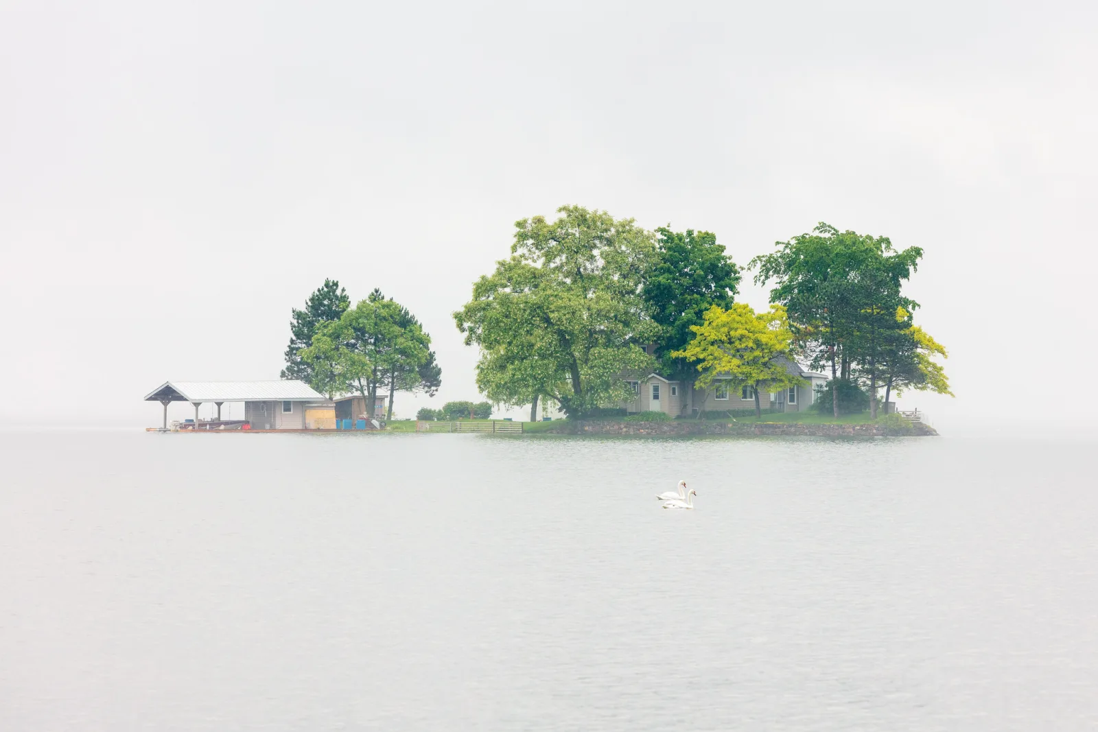
Light and weather can delete detail for you. Fog fades everything behind the subject into soft grey, so a tree or an island seems to float. Fresh snow turns fields and roads into broad white expanses in which any dark shape stands out. Deep shadow does the same in reverse: expose for a lit figure and the unlit street around them falls to black, the way Fan Ho isolated single people in crowded Hong Kong.
Walls, floors and surfaces
Plain or evenly textured walls, floors, tables and paper give you negative space you can control, which is why portrait and product photography rely on them. The surface’s tone and texture set the mood: smooth white feels clean, rough concrete feels urban, a dark wall feels heavy and close.
Blur, and why blur alone is not enough
Shallow depth of field turns a busy background into smooth washes of color that can act as negative space. But blur only removes edges; it does not remove brightness or color. A bright window or a red car behind your subject is still a bright or red patch when it is out of focus, and it still pulls the eye. Choose what lies behind the subject first, then blur it.
A longer focal length helps with that choice, because its narrow view takes in a much smaller patch of background. Keep the subject the same size in the frame by stepping back as you zoom, and see how much background is left behind it. The figures below are for a full frame sensor, a subject framed 2.16 m wide, and a background 30 m behind the subject.
| Focal length | Horizontal angle of view | Camera to subject | Width of background in the frame |
|---|---|---|---|
| 24mm | 74° | 1.44 m | 47 m |
| 50mm | 40° | 3 m | 24 m |
| 100mm | 20° | 6 m | 13 m |
| 200mm | 10° | 12 m | 7.6 m |
At 200mm the background in the frame is about one sixth as wide as at 24mm, so a single clean patch of sky, hedge or wall can fill everything behind the subject. Nudging your position a step to the left or right then changes which patch that is.
Is the trouble that your subject blends into what is behind it? Separating the subject from the background covers tone, color, light and distance as well as blur.
Exposing a frame that is mostly empty
Your camera’s meter assumes the scene averages out to middle grey. A frame that is mostly bright sky, snow or white wall breaks that assumption, so the camera tends to darken it toward grey and the clean white space turns dull. A frame that is mostly black void tends to be brightened, so the dark space turns murky grey and noisy. Modern multi-zone meters correct for some of this, but not reliably.
- For space that should be bright, such as snow, fog or overcast sky, start with exposure compensation of +1 and try up to +2.
- For space that should be dark, start at -1 and try down to -2.
- Check the histogram: bright space should sit near the right edge without piling up against it, dark space near the left.
Getting this right matters more here than in a busy frame, because the space is most of the picture. A white field rendered grey is not negative space any more; it is a grey area competing for attention.
Try it in the simulator: in Aperture, Shutter or Auto mode with Evaluative metering, use exposure compensation so the snow comes out white instead of grey.
Curious where each metering mode actually looks in a frame like this? Metering modes explained has a tool that shows evaluative, center-weighted and spot metering reading the same tricky photos.
Placing the subject in the space
A small subject placed off center, near a thirds line or a golden ratio point, usually gives the space more to do: there is a large field on one side and a smaller one on the other, and the eye travels between them. A centered subject in an even field feels still and formal, which suits symmetry but can feel static otherwise.
Watch the edges. A subject that nearly touches the frame edge, or a branch that just kisses a corner, creates a point of tension that steals attention from all that clean space. The tangents and mergers page has a routine for checking every edge before you press the shutter.
Tone carries weight too. Dark areas tend to feel heavier than light ones, so a subject with deep shadow on one side and pale sky on the other can feel unbalanced in a way you may or may not want. An empty area does not need to be “balanced” by placing another object in it; that usually just adds a second subject. The space itself can be the counterweight. The visual weight page goes deeper into this.
To try placement on real photos, switch on the thirds or golden ratio guide below, then crop one yourself and watch how moving the frame changes the space on each side of the subject.
Spare or full: compare two photos
Look at both photos below and decide which one uses negative space on purpose, and where your eye goes first in each, before you read the answer.
Leaving large calm areas around the subject amplifies its presence and gives the image room to breathe. A fully packed frame is louder but often less focused.
Common mistakes and misconceptions with negative space
- Half measures. A subject with a moderate amount of background is an ordinary picture, not a negative space picture. If the space is the idea, give it enough room to be noticed, and then check that the subject can hold it.
- A subject too weak for the space. A small, vague or low contrast subject cannot hold a vast frame, and the viewer ends up searching. A crisp dark bird on pale sky works at a tiny size; a grey bird on grey sky does not.
- Intruders. A power line, a dust spot or a stray bright leaf in an otherwise quiet area pulls the eye at once, because it breaks the uniformity. Scan the space as carefully as you scan the subject, and move, wait or reframe before reaching for retouching later.
- Accidental space. Some frames are empty because the photographer did not get close enough, not because they chose the space. Ask whether cropping the empty area would improve the picture. If it would, the space was not doing anything, and you may need to fill the frame instead.
- Trusting blur to fix a cluttered background. Bright and saturated shapes stay bright and saturated when blurred. Pick the background first.
- Leaving it to the meter. A frame that is mostly snow or sky usually needs plus compensation, and a frame that is mostly black needs minus. Look at the histogram.
- Planning to crop later. Cropping can only remove space, never add it, and extending the canvas in an editor invents pixels that were never there. If you might want room, leave it when you shoot; you can always crop tighter afterwards.
- Believing there is a correct amount. No percentage makes a picture work. The right amount is whatever makes the subject and the space say what you mean.
Try this: one scene, three framings
This takes about 10 minutes with any camera or phone.
- Find one simple subject with a clean surround: a post against the sky, a cup on a table by a plain wall, a single tree in a field.
- Make a tight version where the subject fills most of the frame.
- Make a middle version where the subject spans about a third of the frame’s width.
- Make a spacious version where it spans a tenth or less. Move your feet rather than zooming, and try the subject in two different positions in the frame.
- For the spacious frames, check the exposure: if the space should be white or black, adjust compensation until it is.
Now look at all of them side by side, on the screen you usually view photos on. For each, write one line on what it gained and one on what it lost. Judge the result by three questions: in the spacious version, does the subject still read at a glance? Is there anything in the space that pulls your eye? And does the mood actually change between the three? If it does not, the space is not doing anything yet; find a cleaner surround or a stronger subject and repeat.
Want to practice framing the same photo several ways without going outside? The crop exercise on the rule of thirds page lets you reframe a set of photos against the thirds and golden ratio grids.
Negative space in black and white
Without color, a photograph is only tones, so the tone of the space becomes the main decision. Near-white space gives a light, high key image; near-black space gives a heavy, low key one; mid grey feels calmer and more neutral. Black and white photography also removes color as a source of distraction, which is one reason so many well-known negative space pictures are monochrome. Michael Kenna is known for misty landscapes in which a single pier, tree or post sits in vast pale space; Fan Ho used shadow and bare walls to isolate single figures. Studying how the empty areas in their pictures are shaped is one of the best ways to train your eye.
Drawn to pictures with very few elements? Minimalist photography takes the idea further, into a whole way of seeing.
Want to check how negative space fits with the other composition tools? The photography composition quiz tests negative space, the rule of thirds and leading lines, with an explanation for every answer.
Negative space questions
What is negative space in photography?
It is the quiet area around and between the subject of a photograph, such as sky, water, a plain wall, fog, shadow or a smooth blur. The subject is the positive space. Used on purpose, negative space isolates the subject and sets the mood of the picture.
Does negative space have to be empty or white?
No. It can be dark, colored or textured, like a cracked wall or rippled sand. What matters is that nothing in it competes with the subject for attention.
Is negative space just the background?
No. A background can be busy and fight the subject. It becomes negative space only when it is simple and quiet enough to set the subject off, whether because it is plain, blurred, or lost in fog or shadow.
How much negative space should a photo have?
There is no correct amount. Area grows with the square of size, so a subject a tenth of the frame’s width and height covers only about 1% of the frame. Whatever space you give it, make sure the subject is distinct enough in shape and tone to hold it.
Why do my photos with lots of sky or snow look grey?
The meter assumes the scene averages to middle grey, so it darkens a frame that is mostly bright. Add +1 to +2 exposure compensation and check that the histogram sits near the right edge without clipping.
Which photographers are known for negative space?
Michael Kenna is known for misty black and white landscapes with a single pier, tree or post in vast pale space. Fan Ho used shadow, light and empty walls to isolate single figures in the streets of Hong Kong. Looking at the shape of the empty areas in their pictures is a good way to study the idea.