RGB stands for red, green and blue, the three colours of light that screens and camera sensors use to describe every colour in a digital photo. Each pixel stores three numbers, one per channel, and the mix of those numbers sets the colour you see. Understanding those numbers helps you read a histogram properly, avoid clipped colours and banding, choose the right colour space and fix a colour cast by measurement instead of guesswork.
Why red, green and blue: additive colour
Your eye has three kinds of colour-sensitive cone cells. One responds most to long wavelengths (reds), one to medium wavelengths (greens) and one to short wavelengths (blues). Every colour you perceive is your brain comparing how strongly those three cone types are stimulated. That is the whole reason digital imaging uses three channels: if a device can control how much red, green and blue light reaches your eye, it can produce a very large share of the colours you are able to see.
This is called additive colour because you start from darkness and add light. Mix the three primaries and you get:
- Red + green = yellow. There is no yellow light in a yellow pixel on your screen, only red and green light close enough together that your eye blends them.
- Green + blue = cyan.
- Red + blue = magenta. Magenta does not exist as a single wavelength at all. It is purely a sensation your visual system creates when the red and blue cones are both stimulated and the green ones are not.
- All three at full strength = white. All three at zero = black.
How your camera turns light into RGB
A camera sensor is, at heart, colour blind. Each photosite simply counts how much light arrived during the exposure (the details are in how image sensors work). To record colour, the sensor is covered by a colour filter array: a mosaic of tiny red, green and blue filters, one over each photosite. The most common layout is the Bayer filter, a repeating 2 by 2 block with two green, one red and one blue filter. Green gets twice the share because your eye takes most of its sense of brightness and fine detail from the middle of the spectrum.
So each photosite records only one of the three colours. A photosite under a red filter knows nothing about how much green or blue light fell on that spot. Demosaicing is the step that fills in the gaps: software looks at neighbouring photosites and estimates the two missing values at every location, producing a full red, green and blue value for every pixel.
This has practical consequences:
- A raw file is not an RGB image yet. It holds one value per photosite plus instructions. The raw converter performs demosaicing, applies white balance and converts the result into an RGB colour space. That is why the same raw file looks different in two different programs: each makes its own choices at this stage.
- A JPEG is already RGB. The camera did the demosaicing, white balance and colour conversion for you and baked the result into 8-bit channels. See RAW vs JPEG for what that costs you in editing room.
Channels and the RGB histogram
A colour photo is really three greyscale images stacked together: a red channel, a green channel and a blue channel. In each one, bright means “lots of this colour here” and dark means “little of it”.
Your camera’s standard histogram usually shows luminance, a single graph of overall brightness. Luminance is not a simple average of the three channels. It is a weighted mix in which green counts for much more than red, and blue counts for very little, because that matches how bright each colour looks to you. For the common sRGB standard the weighting is roughly 21 percent red, 72 percent green and 7 percent blue.
That weighting hides a trap. Photograph a saturated red sign and the red channel can be pinned at its maximum while green and blue sit near zero. Because red contributes only about a fifth of the luminance, the luminance histogram shows a comfortable mid-tone peak with plenty of room on the right. Meanwhile the red channel has clipped: every shade of red in the sign has been flattened to the same value, and the texture and gradation are gone for good.
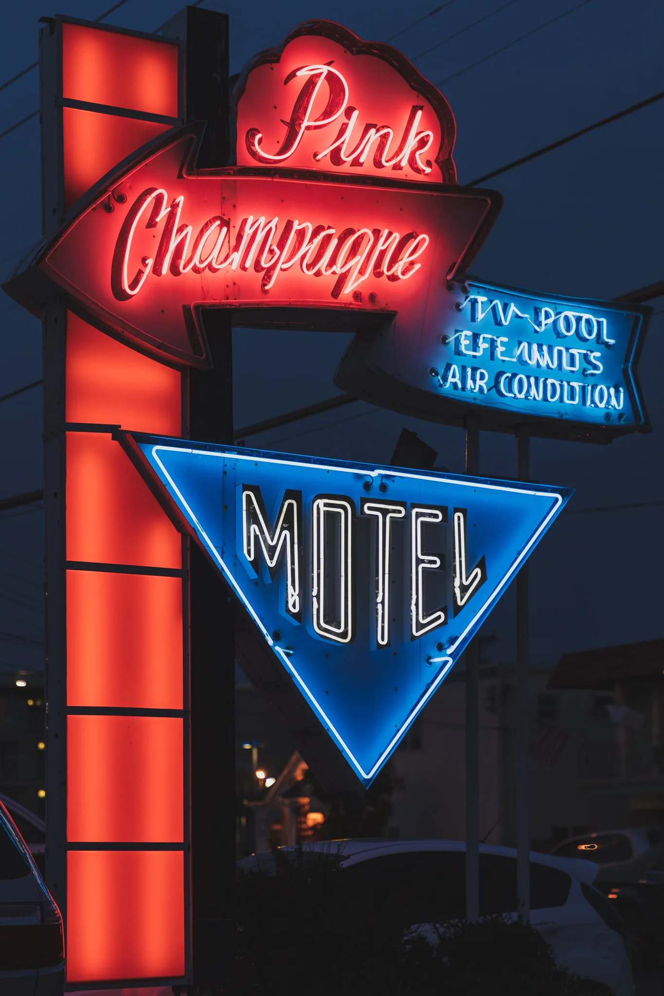
The fix is to switch your camera to the RGB histogram (three separate graphs) whenever you shoot strongly coloured subjects: sunsets, neon, stage lights, flowers, festival costumes. If one channel is climbing the right wall, reduce exposure until it pulls back, even if the luminance graph says you have room. The camera histogram guide covers reading all three graphs, and clipping explains why lost channel data cannot be recovered.
Bit depth: how many steps each channel has
Each channel value is stored as a number, and bit depth sets how many different numbers are available. More bits means finer steps between the darkest and brightest value in each channel.
| Bit depth per channel | Levels per channel | Where you meet it |
|---|---|---|
| 8-bit | 256 (0 to 255) | JPEG files, most web images, many displays |
| 12-bit | 4,096 | Many raw files |
| 14-bit | 16,384 | Many raw files |
| 16-bit | 65,536 | TIFF and editing files saved from a raw workflow |
With 256 levels in each of three channels, an 8-bit RGB image can describe 256 x 256 x 256, or about 16.7 million, combinations: plenty for a finished image, but editing is another matter.
Suppose a clear blue sky in an 8-bit file spans only about 40 blue values from the horizon to the top of the frame. If you add strong contrast or saturation, those 40 steps get stretched across a wider range. The gaps between them become visible as distinct stripes instead of a smooth gradient. That is banding, also called posterisation. A 16-bit file of the same sky has hundreds of intermediate steps in that span, so heavy edits stay smooth.
A simple decision rule follows. Do your heavy editing on raw files or 16-bit files. Convert to 8-bit only at the end, for the JPEG you share or send to a lab. The colour depth guide and the shorter bit depth entry go deeper into how raw bit depth relates to what you see.
Reading RGB values: what 255, 255, 255 actually means
In an 8-bit image, each channel runs from 0 (none of that colour) to 255 (the maximum). Most editing software shows these numbers under your cursor or through a colour sampler tool. A few reference points make them easy to read:
| RGB value | What it is |
|---|---|
| 0, 0, 0 | Black: no light in any channel |
| 255, 255, 255 | The brightest white the file can hold |
| 128, 128, 128 | A neutral grey (all three equal) |
| 255, 0, 0 | The most saturated red the colour space allows |
| 255, 255, 0 | Full red plus full green: yellow |
| 200, 205, 225 | A light grey with a blue cast (blue is highest) |
255, 255, 255 is not “extra bright”, it is the ceiling. It means every channel is at its maximum, so any detail that was brighter than this in the scene has been flattened into the same value. On a screen, it becomes the brightest white the display can produce. In a print, it means no ink at all, so you see bare paper. A bright cloud that reads 252, 250, 248 still has texture; a patch that reads 255, 255, 255 across a wide area is blank.
The numbers are not proportional to light. Image files store values with a gamma encoding that spends more of the available steps on darker tones, where your eye is most sensitive to small differences. As a result, 128 is not half the light of 255. In sRGB it represents only about a fifth of it. A tone that looks halfway between black and white on screen sits near 119, not 128.
The most useful habit is the equal-channel test. When red, green and blue are equal, the colour is a neutral grey. When they differ in something that should be neutral, the difference tells you exactly which cast is present and how strong it is. That is the basis of the colour correction method further down.
RGB colour spaces are containers, not quality settings
RGB numbers on their own are only instructions. To turn 255, 0, 0 into an actual colour, software needs to know which red “255 red” means. A colour space answers that question: it defines the exact red, green and blue primaries and the white point, and therefore the full range (gamut) of colours the numbers can describe.
The same numbers mean different colours in different spaces. The most saturated red in a wide space is more intense than the most saturated red in a small one, so 255, 0, 0 in a wide space is a stronger red than 255, 0, 0 in sRGB. That is why an image displayed with the wrong colour space looks dull or garish.
| Colour space | Size | Typical use |
|---|---|---|
| sRGB | Smallest of the three | The web, phones, social sharing, most consumer labs |
| Adobe RGB | Wider, mostly in greens and cyans | Printing on capable printers and labs that request it |
| Wide-gamut working spaces (such as ProPhoto RGB) | Very large, includes colours no screen or print can show | Editing raw files in 16-bit before converting for output |
Think of these as containers of different sizes. A bigger container does not make your photo better. It only helps if the scene contained colours that fall outside the smaller one, such as intensely saturated flowers, fabrics or lights, and if your output can actually reproduce them. A wide space also spreads the same number of steps over a larger range, which is why wide-gamut working spaces should always be paired with 16-bit files to avoid banding.
The practical rule: edit raw files in a wide working space, and export to sRGB for anything going on screen or to a lab that does not state otherwise. The colour space guide compares the spaces in detail, and colour management explains how profiles carry the right meaning of your numbers from camera to monitor to print. None of this works reliably unless your screen shows the numbers accurately, which is what monitor calibration is for.
RGB vs CMYK: what to send when you print
Printing works the other way round. Paper starts white and ink subtracts light from it, so printers use subtractive colour: cyan, magenta, yellow and black (CMYK). Cyan ink absorbs red, magenta absorbs green and yellow absorbs blue.
That does not mean you should convert your photos to CMYK. Photo printers and photo labs are built to receive RGB files. Their software converts your RGB values into the right mix of inks for their specific printer and paper, using profiles designed for that exact combination. If you convert to CMYK yourself, you throw away that tailored conversion and usually get flatter colour.
- Photo lab or online print service: send an RGB file, usually sRGB, unless the lab explicitly asks for Adobe RGB.
- Your own inkjet printer: print from RGB and let the printer profile handle the conversion.
- Magazine, brochure or book on a printing press: CMYK is involved here, but the designer or print shop normally performs the conversion to their own press standard. Supply RGB unless they ask otherwise.
A preview of how your RGB colours will look on a particular paper is called soft proofing, and preparing photos for printing walks through sizing and export.
Using RGB values to neutralise a colour cast
A colour cast is an overall tint, usually from the colour of the light: blue from shade and overcast sky, orange from household bulbs, green from some fluorescent tubes. Your eye adapts to these and stops noticing them, which makes casts hard to judge by eye, especially after you have been staring at an image for a while. The numbers do not adapt.
- Find something that should be neutral. Good candidates are a grey card, white or grey clothing, concrete, road markings, overcast sky or sunlit snow. Avoid anything lit by a different light than the rest of the scene.
- Sample it. Use the colour sampler or read the values under your cursor. Sample a mid or light tone, not a clipped highlight at 255.
- Read the imbalance. If you get 180, 182, 205, blue is about 25 higher than the others: a blue cast. If you get 210, 195, 170, red is high and blue is low: a warm, orange cast. Green higher than both red and blue means a green cast; green lower than both means magenta.
- Correct it. The quickest route is the white balance eyedropper: click the neutral area and the software shifts white balance until the three values match. On a raw file this is the cleanest fix, because white balance is applied before the RGB conversion.
- Re-check and then judge by eye. Sample again to confirm the values are within a few points of each other, then decide whether you want to keep some warmth for mood.
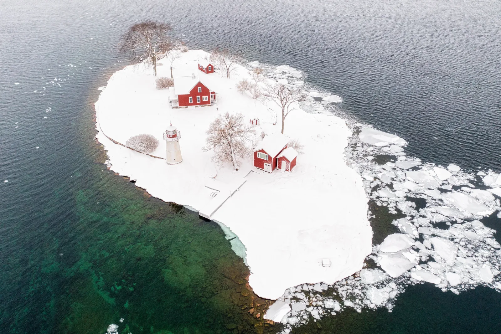
Shaded snow is a special case. It legitimately reflects blue sky, so a blue reading there is accurate rather than an error. Sample sunlit snow if you have it. For skin, which is never neutral, a common check is that red should be the highest value, green in the middle and blue the lowest. If blue is higher than green on a face, the image is too cool.
Common mistakes
- Trusting only the luminance histogram with saturated subjects. A single channel can clip while the graph looks safe. Fix: turn on the RGB histogram for sunsets, lights and flowers, and expose so no channel hits the right edge in important areas.
- Heavy edits on 8-bit JPEGs. Strong contrast or saturation moves create banding in skies. Fix: edit raw or 16-bit files, and export 8-bit only at the end.
- Exporting in a wide colour space for the web. Many viewers treat untagged or unexpected files as sRGB, so a wide-gamut file can look dull and washed out. Fix: export sRGB for screens and sharing.
- Converting to CMYK for a photo lab. It discards the lab’s own tuned conversion. Fix: send RGB unless the printer asks for something else in writing.
- Judging colour casts by eye alone after long editing sessions. Your vision adapts to the cast. Fix: sample a neutral area and compare the three numbers.
Try this
Spend 20 minutes making the numbers visible. Photograph two scenes: something intensely coloured (a red or orange object in bright light is ideal) and something that should be neutral (a white sheet of paper or a grey wall, lit by a window or a warm indoor bulb).
- For the coloured subject, shoot one frame at the exposure your camera chooses, then check both the luminance and the RGB histograms. Add exposure in one-third stop steps until one channel touches the right edge. Note how much room the luminance graph still claims at that point.
- Open the neutral shot in your editor and sample the paper in three places. Write down the RGB values and name the cast from the numbers alone.
- Use the white balance eyedropper on the paper and sample again. Check that the three values now sit within a few points of each other.
- Finally, sample the brightest part of the coloured subject in your over-exposed frame and find the channel that reads 255.
Frequently asked questions
Is RGB the same as a colour space?
No. RGB is the colour model: the idea of describing colour with three red, green and blue values. A colour space such as sRGB or Adobe RGB is a specific definition of exactly which red, green, blue and white those values refer to.
Should I shoot in sRGB or Adobe RGB?
If you shoot raw, the camera setting only affects the preview and the embedded JPEG; you choose the colour space when you process the file. If you shoot JPEG only, sRGB is the safer choice unless you have a colour-managed print workflow that benefits from Adobe RGB.
Do I need 16-bit files if I only post online?
For editing, yes, if your edits are strong or the image has smooth gradients like sky or studio backdrops. For the final file you post, 8-bit sRGB is standard and fine.
Related guides
- Color Space Explained: sRGB, Adobe RGB and wide-gamut spaces compared in depth.
- Photography Color Management: keeping colour consistent from camera to screen to print.
- Color Depth: how bits per channel affect gradients and editing headroom.
- How to Read a Camera Histogram: using luminance and RGB histograms in the field.
- Banding: why smooth gradients break into stripes and how to prevent it.
- What Is White Balance?: setting colour temperature so neutrals stay neutral.
- Why Your RAW Photos Look Different From the Camera Preview: what happens between the sensor data and the image you see.