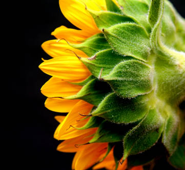
Color simplicity means limiting a photograph to a few colors, often one dominant color and one or two that sit close to it or set it off, so the subject and the mood read at a glance. The sunflower above uses only yellow-orange petals, green bracts and a black background. Nothing else competes, so the eye goes straight to the shapes and textures of the flower.
A photo with too many unrelated colors feels busy even when the composition is sound. When a picture disappoints and you cannot say why, the reason is often color clutter: a red sign, a blue bin and a green car all pulling at the eye from different corners. Simplifying the colors is one of the quickest ways to make a picture look deliberate.
Why Fewer Colors Make Stronger Photos
- Attention goes where you want it. Every strong color has visual weight. With only a few colors in the frame, the subject is the obvious place to look; with many, the eye wanders.
- An accent can do real work. One saturated color in a quiet frame, a red coat in a gray street, becomes the subject almost by itself. That only works if nothing else is shouting.
- Mood becomes clear. A frame of blues and grays feels calm or cold; a frame of oranges and browns feels warm. Mix every color and the mood muddies. How colors and composition affect emotions goes further into this.
- Shape and texture show. When color stops competing, form, line and texture carry the picture, as the sunflower’s petals and fuzzy green bracts do.
Five Ways to Simplify Color
Color simplicity is not one look. These are the usual ways photographers build it, roughly from the most restrained to the boldest.
One color in many shades
A monochromatic photo uses a single hue in lighter and darker versions: a blue hour cityscape, a field of wheat, fog in a pine forest. It is the simplest color scheme there is and often the calmest. Tints and shades explains how adding white or black to a hue gives the range of tones these pictures depend on.
Neighboring colors
Analogous colors sit next to each other on the color wheel, such as yellow, orange and red, or green, teal and blue. They feel harmonious because they share part of their makeup. The sunflower is mostly analogous: yellow, orange and yellow-green.
One complementary pair
Two complementary colors, opposite each other on the wheel, make each other look stronger: orange against blue, red against green, yellow against purple. Keep it to one pair and let one of the two dominate the frame, with the other as the smaller accent.
One accent against neutrals
Black, white, gray, beige and brown are close to colorless. A frame built from neutrals plus one strong color gives that color all the attention. A black background, as in the sunflower photo, is the purest version of this.
Muted color
Low saturation, from fog, haze, overcast light or deliberate editing, pulls all the colors toward gray so none of them shouts. The frame can contain several hues and still feel simple.
Want the theory behind these schemes? Color theory for photographers covers the color wheel, color harmony, warm and cool tones, and white balance as a creative tool.
How to Find Color Simplicity When You Shoot
Most of the work happens before you press the shutter, by choosing what goes in the frame.
- Look at the colors before the subject. Before you shoot, name every color you can see in the viewfinder. If the list is long, change something.
- Choose the background. A plain wall, the sky, deep shade or water gives you a field of one color. Moving a step to the side often swaps a cluttered background for a clean one.
- Get closer or use a longer lens. Filling the frame with the subject leaves no room for stray colors. Fill the frame is the simplest version of this.
- Change the angle. Shooting down onto pavement or grass, or up against the sky, removes most of the surrounding color.
- Expose for the bright subject. Exposing for a sunlit subject against shade lets the background fall to near black, the look of the sunflower photo.
- Use light that unifies color. Warm low sun pulls a scene toward gold, the blue hour toward blue, fog and overcast toward muted gray. Each one gives the frame a single color family.
- Wait. A passing car, a bright jacket or a sign may be the only thing breaking the scheme. Let it leave the frame.
- Control what you can. In portraits, choose clothing and props that match or complement the setting rather than adding new colors.
Simplifying Color in Editing
Editing can finish what the camera started, but it works best on a frame that is already close.
- Crop out a colored object at the edge of the frame.
- Lower the saturation of stray colors with the HSL or color mixer controls, leaving the main colors alone. Hue and saturation explains the controls.
- Shift a hue toward its neighbor so two clashing colors become analogous, for example nudging a yellow-green toward the surrounding green.
- Use white balance and color grading to pull the whole frame toward one temperature.
- Darken distracting areas so their color drops away.
Push these too far and the photo looks artificial: skin turns gray, skies turn odd shades, and edges show halos. Make small moves and compare with the original.
Taking simplicity further than color? Minimalist photography covers negative space, simplifying scenes and color minimalism.
Common Mistakes
- Ignoring the background. The subject is fine, but bright colors behind it steal the attention.
- Two accents. One red object leads the eye; two red objects in different corners split it.
- Letting the complementary pair fight. Equal amounts of two strong opposites look loud. Let one take most of the frame.
- Turning simplicity into dullness. A simple palette still needs a range of tones, from dark to light, or the picture looks flat.
- Fixing everything in editing. Heavy selective desaturation is easy to spot. Choose the frame first.
Try This: A Ten Minute Color Walk
Pick one color before you go out. For ten minutes, photograph only scenes where that color dominates and no more than one other color appears. Then shoot three frames of one subject: one with a busy, multicolored background, one with a background in the same color family, and one where the subject is the only colored thing in a neutral frame. Compare them side by side and notice which one you look at longest.
Color Simplicity Questions
Is color simplicity the same as black and white?
No. Black and white removes color completely; color simplicity keeps color but limits it. A monochromatic color photo is the closest step, since it uses one hue in many shades.
How many colors should a photo have?
There is no fixed number, but many strong color photos are built on one dominant color, one supporting color and neutrals. If you cannot name the main color of your photo in one word, it may have too many.
Is color simplicity the same as minimalism?
They overlap. Minimalism reduces everything in the frame: objects, lines and space. Color simplicity reduces only the palette, so a detailed, crowded scene can still have simple color if it is all one color family.
See also: Color in photography, Color balance and highlight, The psychology of photography