White balance is the camera setting that tells the camera what color the light is, so that things that are white in front of you come out white in the photo instead of orange, blue or green. It is measured in kelvin, and every camera offers presets for daylight, cloudy, shade, tungsten (incandescent) and fluorescent light, plus Auto and a custom setting you measure yourself. The sections below give the number behind each preset, which way the dial turns, and how to choose.
Why Cameras Need White Balance At All
Human vision performs color constancy automatically: a white shirt looks white to you whether you're standing under a candle, an overcast sky, or a fluorescent office light, because your brain continuously discounts the color of the ambient light. A camera sensor does not do this. It records whatever wavelength mix actually reaches it, so the same white shirt comes out orange under candlelight, blue in open shade, and greenish under some fluorescent tubes unless something corrects for the light's color first. White balance is that correction: an instruction telling the camera (or your RAW editor) what color the ambient light is, so it can shift the recorded colors back to neutral.
The Kelvin Scale
Light color is measured in kelvin (K), a scale borrowed from the color a theoretical heated object glows as it gets hotter. Low kelvin values describe warm, orange-red light: candlelight sits around 1900K, household tungsten bulbs around 2700 to 3200K. Middle values describe roughly neutral daylight, around 5000 to 5600K at noon. High kelvin values describe cool, blue light: open shade often runs 7000 to 8000K, and the sky at deep twilight can read 9000K or more. The scale runs opposite to everyday color language: "warm" light is low kelvin and "cool" light is high kelvin, so a higher number describes a bluer light, not a warmer one.
A rough map of common light, from warmest to coolest:
- 1800 to 2000K: candle flame, deep orange.
- 2700 to 3200K: household tungsten (incandescent) bulbs, orange-yellow.
- 3500 to 4500K: most fluorescent office lighting, slightly cool and often green.
- 5000 to 5600K: midday sun, neutral daylight, and the color a flash is built to match.
- 6000 to 7500K: light cloud cover to overcast sky, slightly cool.
- 7000 to 8000K: open shade on a clear day, distinctly blue.
- 9000K and above: deep twilight and the bluest shade, very blue.
Want the unit and the idea behind it on their own? Color temperature covers what the numbers measure, and kelvin covers the unit itself.
The Part That Confuses Everyone: Which Way the Camera Dial Goes
Here is the detail that trips up most people learning manual white balance: setting a higher kelvin value on your camera's white balance dial makes the photo render warmer, more orange, not cooler. This feels backward until you remember what the dial actually means. It is not telling the camera what color you want the output to be; it is telling the camera what color it should assume the ambient light already is, so the camera can subtract that color back out. If you dial in a high kelvin number, you are telling the camera "assume this light is very blue," and the camera responds by pushing heavy orange correction into the image to neutralize the blue it now believes is there. Dial in a low kelvin number and you're telling it "assume this light is very orange," so it pushes blue correction in instead, and the result looks cooler. The light in the room has not changed; only what you told the camera to assume about it has.
That gives a quick rule for fixing a shot by number: if the picture looks too blue, raise the kelvin value; if it looks too orange, lower it. A good starting point outdoors in daylight is 5500K, adjusted from there.
The quickest way to get a feel for the dial is to fix the color yourself. Pick the light, then drag the kelvin and tint until the whites look white.
Want the other challenges? The full camera simulator has all 21, across eight scenes.
White Balance Presets and Their Kelvin Values
Every camera ships with presets that pick a fixed kelvin value for common lighting. The number is the light the preset assumes, and the correction it applies goes the opposite way. Exact values differ a little from camera to camera, so treat these as typical ranges.
| Preset | Assumed light (typical) | What it does to the image |
|---|---|---|
| Daylight | 5200 to 5500K | Neutral for midday sun; the baseline the others are measured from |
| Cloudy | 6000 to 6500K | Adds mild warmth to cancel the bluish cast of an overcast sky |
| Shade | 7000 to 8000K | Adds stronger warmth to cancel the blue of open shade |
| Tungsten (incandescent) | 2800 to 3200K | Adds strong blue to cancel the orange of household bulbs |
| Fluorescent | 3800 to 4500K | Adds a slight magenta shift to cancel the green of the tubes |
| Flash | 5500 to 6000K | Matches the near-daylight color of flash and strobes |
| Auto | Chosen per frame | The camera analyzes the scene and guesses |
Daylight and cloudy white balance
Daylight is the honest setting at about 5200 to 5500K: it records light as the sun delivers it, so a sunrise stays warm and an overcast scene stays cool. Cloudy sits at roughly 6000 to 6500K and adds gentle warmth to cancel the bluish cast of a gray sky. Shade, at 7000 to 8000K, adds more for subjects lit only by blue sky.
Tungsten, incandescent and fluorescent white balance
Tungsten and incandescent are the same preset under two names, about 2800 to 3200K, built for orange household bulbs; it cools the image heavily, so leave it on outdoors and every frame turns blue. Fluorescent tubes vary widely, so that preset is the least reliable: it adds a slight magenta shift against green, and a custom setting or the tint control often does better.
Auto White Balance: When It Works and When It Fails
Auto white balance analyzes the scene and guesses which tones should be neutral. It is a sensible default for everyday shooting, for walking through a city as the light keeps changing, and for any moment when the light shifts faster than you can change a setting. It is unreliable the moment a scene has strong color casts, mixed light sources, or one dominant color that fools the algorithm into "correcting" a color that was never a lighting problem in the first place.
Scenes with nothing neutral to anchor to are the usual failures: Auto can cool a sunset and drain the warmth you came for, or add magenta to a green forest. In those scenes choose Daylight or a fixed kelvin value. Auto also changes its mind from frame to frame as the colors in the composition change, so for a series that must match, set one fixed value.
Custom White Balance With a Grey Card
For accurate, repeatable results in a fixed lighting setup, photograph a neutral grey or white card that fills the frame under the actual light you'll be shooting in, then use the camera's custom white balance function to sample that shot. The camera measures exactly what color the "neutral" reference came out as and builds a correction from that measurement instead of a guess. This is standard practice in studio, product, and any color-critical work, because it accounts for the specific mix of light in that specific room, which a generic preset cannot.
- Put the card in the same light as your subject, facing the same way.
- Photograph it so it fills most of the frame. Exposure does not need to be perfect, though it should not be clipped to pure white.
- In the white balance menu choose the custom option and pick that frame as the reference.
- Shoot with the custom setting for as long as the light stays the same.
Many cameras store custom values, so a studio you return to can be measured once and recalled. The same card works in an editor: shoot one reference frame under the light, click the white balance picker on the card, and copy that correction to every photo taken under the same light.
A grey card sets neutral, but what about accurate color across every hue? How to use a color chart shows how a chart builds a profile for your camera, and the gray card page covers the card itself.
Temperature and Tint: The Second Axis
Kelvin only moves color along the blue to orange line. Light also leans green or magenta, and that is a separate control, tint. Fluorescent and some other discharge lamps cast green, which kelvin alone cannot cancel; a magenta shift can. Set the temperature first, then nudge tint until neutral objects stop looking green or pink.
In post, set white balance before any other color work, since a color cast changes how every other slider behaves.
RAW vs. JPEG
This is where the file format you shoot in matters more than almost anywhere else in photography. A RAW file stores white balance as a metadata instruction layered on top of unprocessed sensor data; changing it later in software is non-destructive and identical in quality to having set it correctly in camera, because the underlying data never had a white balance baked into it. A JPEG applies the white balance setting permanently to the pixel data at the moment of capture. You can still nudge a JPEG's color temperature afterward, but you're pushing already-processed, already-compressed pixel values around, with real quality loss the further you push, often showing up first as banding in skies and clipped color channels. If you shoot JPEG, getting white balance right in camera matters. If you shoot RAW, white balance is a creative decision you can defer entirely to your editor without any penalty.
Even with RAW it is worth getting the setting roughly right in camera. The back screen then shows believable color, which makes it easier to judge a frame, and the edit starts close to where it should end.
Wondering what else the file format changes? RAW vs JPEG compares the two, and RAW explains what a RAW file holds.
Mixed Light
A single white balance setting can only correct for one color of light at a time. A room lit by a tungsten lamp near a window letting in daylight has two different color temperatures in the same frame, roughly 3000K near the lamp and 5500K near the window, and no single kelvin setting neutralizes both; correcting for the tungsten leaves the window light looking unnaturally blue, and correcting for daylight leaves the lamp looking deep orange. Professional solutions include gelling the lights to match one temperature (an orange "CTO" gel on a flash to match tungsten ambient, or a blue "CTB" gel to match daylight), turning off or blocking one source, or simply accepting the mixed cast as part of the scene's character, which is often the better choice for documentary or available-light work where fighting the light isn't worth the effort.
Four ways to handle it, in the order worth trying:
- Remove a source. Close the curtain, switch off the lamp, or move the subject away from one of the lights.
- Serve the dominant source. Set white balance for whichever light falls on your main subject, usually the face, and let the other source go slightly off-color.
- Match the sources. Gel the smaller light to match the larger one, then set white balance for that shared color.
- Correct locally in post. A brush or gradient can warm or cool one part of the frame, such as one side of a face lit by a window, while leaving the rest alone.
Splitting the difference with a middle kelvin value rarely satisfies either source, though it can look acceptable when both are close in color. Sometimes warm and cool light in the same frame is the point; restaurant and event interiors often look better with the contrast left in.
Need to rescue a frame lit by two kinds of light? How to fix mixed light in post walks through correcting it after the shot, and gel explains the colored filters that match one light to another.
Creative White Balance
Nothing requires white balance to be "accurate." A deliberately warmer-than-correct setting during a sunset intensifies the orange rather than neutralizing it: Cloudy or Shade, or a higher kelvin number, tells the camera to assume bluer light than there is, so it adds extra warmth. Setting Tungsten white balance in broad daylight (telling the camera to assume very warm ambient light when it's actually neutral) pushes a strong blue cast across the whole scene, a common deliberate look for night, cold, or unsettling moods. The opposite works too: leaving Daylight on under tungsten bulbs keeps the orange glow of a candlelit table or a warm interior. Because RAW files keep white balance as an adjustable instruction rather than a baked-in change, the safest way to experiment creatively is to shoot RAW at a neutral or slightly-off setting and push the color further in post, where you can compare options side by side instead of committing in the field.
The test is intention: a shift that serves the mood is a creative choice, and one that happened because a preset was left on is an error.
Looking for the natural light that is already warm or cool? Golden hour and blue hour are the two times of day where the color of light does most of the work for you.
Choosing White Balance by Kind of Shot
- Portraits: judge white balance on the faces first, since a wrong skin tone is the first thing anyone notices. A slight warm lean, such as the Cloudy preset, can flatter skin, but judge it by eye.
- Landscapes: keep the gold at golden hour, and keep mist and cold scenes neutral or slightly cool to preserve the mood.
- Product work: use a custom setting from a grey card and hold it fixed for the whole set.
- Events: light changes without warning, so Auto and RAW together are practical.
See It Side by Side
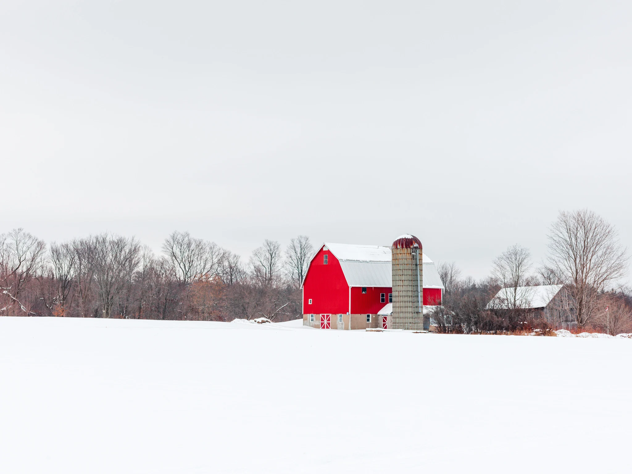
Warm light shifts an image toward orange and yellow, the look of tungsten bulbs or a low sun near the horizon. Cool light pushes toward blue, the look of open shade, overcast sky, or uncorrected daylight-balanced footage under a blue sky.

Common Mistakes
- Assuming Auto White Balance is "correct" by default. It is a guess, and a busy or heavily mixed scene will fool it more often than a simple one.
- Mixing up which direction the kelvin dial goes. A higher number on the white balance dial makes the image warmer, not cooler, for the reasons explained above.
- Leaving a preset on after the light changes. Walking outside with Tungsten still selected turns every frame strongly blue. Reset the setting when you change location.
- Fighting mixed light to a "perfect" neutral instead of picking which source to serve. Usually one color cast has to win; deciding which one on purpose beats a muddy compromise.
- Correcting to neutral when the warmth was the point. Golden hour is supposed to look golden. Stripping it out removes what drew you to the scene.
- Nudging white balance repeatedly on a JPEG and wondering why color starts banding or shifting oddly. That's cumulative quality loss from adjusting already-baked pixel data; shoot RAW if color accuracy matters.
- Treating white balance as a fixed camera setting rather than a creative tool. "Wrong" white balance, applied on purpose, is a legitimate way to set mood.
Try This
Photograph the same static subject under one light source (indoor lamp, window light, or open shade all work) using each white balance preset your camera offers: Auto, Daylight, Cloudy, Shade, Tungsten, and Fluorescent. Line the results up side by side. You'll see the same scene rendered from strongly orange to strongly blue from nothing but a menu setting, which is the fastest way to build an instinct for what each preset is actually assuming about the light.
Then pick one scene beside a window and shoot it at 3000K, 4000K, 5500K and 7000K. Notice which makes a sheet of paper look most like paper.
White Balance Questions
What is white balance in photography?
It is the setting that tells the camera the color of the light, so whites and grays come out neutral instead of tinted orange, blue or green. Without it the camera records the color of the light along with the color of the subject.
What Kelvin value is daylight white balance?
Midday sun is roughly 5200 to 5500K, and the Daylight preset is set to about 5200 to 5500K. Overcast light is cooler at about 6000 to 7500K, and open shade on a sunny day can pass 7000K.
What is cloudy white balance in kelvin?
The Cloudy preset sits at roughly 6000 to 6500K. It adds a small amount of warmth to cancel the blue of an overcast sky. Shade goes further, to about 7000 to 8000K.
What is incandescent white balance?
It is the same preset as Tungsten, about 2800 to 3200K, built for traditional household bulbs. It adds blue to cancel their orange light, so using it in daylight gives a strong blue cast.
Where to Go Next
- Golden Hour: the natural low-kelvin light most photographers first learn to recognize.
- Tungsten light: the orange household light the Tungsten preset is built for.
- Color management: keeping color accurate from camera to screen.