Photography Classes Online – Icon Photography School › Forums › Photography Lessons › Lesson 7 › hard and soft lighting › Re: Re: hard and soft lighting
Great work on both the lighting and composition of both of these photographs.
Let’s look at each photograph individually. Your first photograph has very dramatic composition. The bar that acts as a leading line, drawing the audience’s eyes into the frame is a great way not only to direct attention, but also to use diagonal lines to create drama. Not only that, but because of the way you’ve used the bar as both a foreground and middle ground object you’ve also create a sense of dimension which helps give a sense of reality and depth to the photograph.
You’ve also used a shallow depth of field to further the illusion of depth in a 2 dimensional space and helped enhance the illusion of 3 dimensions. Great work on this shot.
In your second shot you’ve also used a shallow depth of field and generally good composition. However, with this shot I feel there is more room for improvement in the composition.
For starters, the lighting isn’t that hard. Although it’s sunny out, the lighting is hitting your subject very softly, it could be caused by shade, shadows or soft directional lighting, but there is no contrast in the highlights or dark shadows. Look at the following hard light portrait to get and idea of the difference.
http://i21.photobucket.com/albums/b276/bluesky93/08-28-2005/IMG_8268_BW_R.jpg
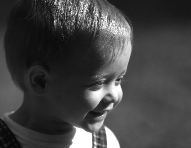
Secondly, there is some distracting amputations (cutting off) of secondary objects on the left side of the frame. Although you’ve used a shallow depth of field, which makes it a little less distracting, the object is still in focus enough that the inclusion of the partial object is seen as misplaced or accidental. I can’t identify the object and therefore it doesn’t really add to you visual story.
My last point isn’t a criticism, but it’s something to be aware of. You’ll find with a lot of portraits eyes are generally not located in the center. They are generally located in the upper 2/3rds of the shot. You’ll also notice this is films. The eyes are generally not in the center of the frame. It’s not wrong to place them in the center of the frame (in fact, my example of hard lighting above, the eyes are in the center and I think that’s a good shot), but the point is to be aware of the visual difference. Centered eyes are often seen as too balanced and risk having awkward composition. On the other hand eyes located 2/3rds of the way up a frame look as follows:
http://farm3.static.flickr.com/2201/2378683459_33eb84cc03.jpg?v=0
Other than that, great work!