Wow! Incredible.
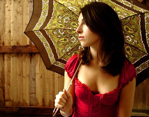
You’ve done a great job with this image. Not only from a creative standpoint (with is obvious), but also from a technical standpoint. You’ve carried forward many of the technical lessons learnt in previous assignments. For instance, you have great color control in this image and you’ve chosen complimentary colors of red and green to help make the composition dramatic and “loud”. Even the gradients within each of these two colors are beautiful. The light pinks and the light greens are gorgeous especially when seen against their darker counterparts. Beautiful.
Your image also abides by the rule of thirds and you’ve even managed to incorporate a sense of depth by showing the forest floor. The ground is a great foreground object because it’s full of texture (roots, dirt etc) and it gives your audience an interesting secondary object to look at when they are not looking at your main object. The same is true for your forest. I love having my eyes wander around the woods to see what’s out there.
From a composition standpoint, the only thing I find a little awkward is the placement of your main object. She is placed off center to the left of the frame, but she’s also looking left. As a general rule of thrum you want to provide more space on the side the main subject is looking (or facing). For example:
http://www.cheapshooter.com/wp-content/uploads/2008/08/portrait-400×266.jpg
or
http://farm1.static.flickr.com/96/249787694_e8405d2699.jpg
it’s not wrong what you’ve done as long as it was motivated.
Other than that, great work!
.