Photography Classes Online – Icon Photography School › Forums › Photography Lessons › Lesson 1 › Lesson 1 Assignment Entry
- This topic has 2 replies, 2 voices, and was last updated 16 years, 6 months ago by
Brandon.
-
AuthorPosts
-
January 25, 2008 at 8:56 pm #17347
Brandon
ParticipantHere is my Lesson 1 assignment entry.
( I read what was suppose to be completed and did not see anything about more then 1 entry, but I saw someone else entered a couple, so I will enter 2 here and if there needs to be more, please let me know).
1st set-
Everyday Look
Stereo System…
Re-discovering it
Stereo System…
Look forward to comments…
January 25, 2008 at 10:17 pm #18717Duncan Rawlinson
KeymasterHello.
Great work! I really like both sets (but I had to delete one because you’re only supposed to upload 1 set!). I choose to leave your first set, which I found to be more impressive.
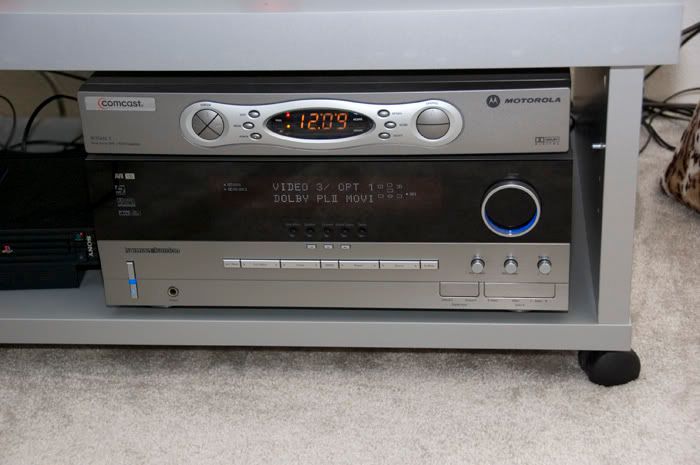
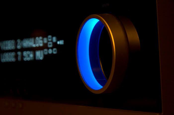
Let me start off by saying that you did a wonderful job of showcasing the power of what careful attention to detail can have. Your first shot looks exactly how I wanted it to: Boring, dull, unimaginative and easily forgettable. The first shot shows various distracting elements and cuts off objects on the 4 edges of your photograph. However, these are some of the biggest mistakes that first time photographers make. They focus too much on the main object (in this case the stereo system) with complete disregard to other important photographic elements. Your second shot however, incorporates some very powerful visual elements which really make it stand out. In fact, this shot is great for 2 main reasons.
1. It uses informal balance which is often more visually pleasing to the eye. You’ve used the rule of thirds (to be discussed in a later lesson) to organize your photograph and you’ve adjusted your depth of field to help with simplifying the photography and helping to place emphasis on more important elements (In this case the blue light).
2. Most impressively you’ve managed to color simplify. This is often hard for first time photographers to do. They let in too many colors which leads to an overall unorganized and chaotic look. You have chosen only a few colors which really make the photograph stand out.
Overall, great job. Exactly what I was hoping for!
January 25, 2008 at 10:28 pm #18718Participant@teacher wrote:
Hello.
Great work! I really like both sets (but I had to delete one because you’re only supposed to upload 1 set!). I choose to leave your first set, which I found to be more impressive.
Let me start off by saying that you did a wonderful job of showcasing the power of what careful attention to detail can have. Your first shot looks exactly how I wanted it to: Boring, dull, unimaginative and easily forgettable. The first shot shows various distracting elements and cuts off objects on the 4 edges of your photograph. However, these are some of the biggest mistakes that first time photographers make. They focus too much on the main object (in this case the stereo system) with complete disregard to other important photographic elements. Your second shot however, incorporates some very powerful visual elements which really make it stand out. In fact, this shot is great for 2 main reasons.
1. It uses informal balance which is often more visually pleasing to the eye. You’ve used the rule of thirds (to be discussed in a later lesson) to organize your photograph and you’ve adjusted your depth of field to help with simplifying the photography and helping to place emphasis on more important elements (In this case the blue light).
2. Most impressively you’ve managed to color simplify. This is often hard for first time photographers to do. They let in too many colors which leads to an overall unorganized and chaotic look. You have chosen only a few colors which really make the photograph stand out.
Overall, great job. Exactly what I was hoping for!
Thank you very much…I understand about only 1 photo, the stereo would have been my choice as well. I am very excited, because what I was taking a picture of, is exactly what it apparently conveyed to you, so I am super excited about that. I wanted to showcase the blue light from the knob, but not just have the blue light and knob in the photo, cause it would have looked and felt weird, so I chose to make that sharp and then the digital elements from the rest of the stereo just be there and give more life to the photograph but not become the subject of the photograph.
I understand what you mean about too many colors, the thing I love about the photograph is the blue light, so that needed to stick out and be the most prevalent in the photograph.
-
AuthorPosts
- You must be logged in to reply to this topic.