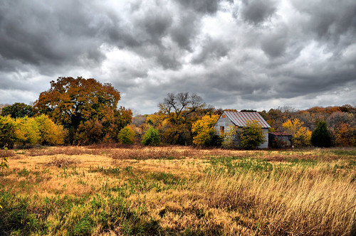
Great photograph.
For this assignment you’ve chosen to capture a wide landscape image. The photograph is simple in its composition, yet busy enough to give your audience primary and secondary elements to engage with when viewing the image.
It’s a darker image that uses darker tones of gray and green as the main color palette. The composition uses informal balance with the horizon line close to the bottom wall of the photograph and the clouds (which are the more interesting of the two layers) take the majority of the composition.
The only two areas I would like to you experiment with are:
Try incorporating depth into your photographs by changing your perspective even slightly. But getting closer to the ground you can add a strong foreground element (even if it’s just grass)
For example:
http://farm4.static.flickr.com/3192/3006380746_8c16d4dba5.jpg
You don’t need to be too dramatic about your foreground, but even bringing it a bit closer can really help your composition.
My second recommendation isn’t a critique of your photograph but more of a technical recommendation. I don’t think there was anything you could have done to avoid the issue.
You have a very small blown out area in your sky. We’ve written a blog post about this issue that you should read about here:
http://photographyicon.com/blog/2008/11/26/digital-cameras-latitude-dynamic-range/
Other than that, beautiful work!
.