Photography Classes Online – Icon Photography School › Forums › Photography Lessons › Lesson 7 › Lesson 7; Lighting
- This topic has 1 reply, 2 voices, and was last updated 14 years, 4 months ago by
Duncan Rawlinson.
-
AuthorPosts
-
March 16, 2010 at 10:00 pm #18123
100155
ParticipantA vacation in San Diego offered many photo ops. I like these and think they fit the assignment.
[attachment=0:2yn20th6]Torrey pines sunset.jpg[/attachment:2yn20th6][attachment=1:2yn20th6]SD Iceplants.jpg[/attachment:2yn20th6]
March 17, 2010 at 10:02 am #19570Duncan Rawlinson
KeymasterNice work with this assignment.
The gentle lighting of the first image is strongly contrasted with the bright, vibrant lighting in the second image. Similarly, both color palettes are strikingly different and evoke dramatically different emotional responses.
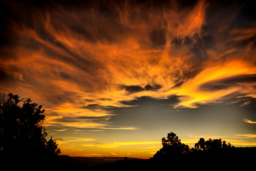
Let’s begin by looking at your first image. I really like this image and I see why you were drawn towards it from a color standpoint. “cool” images with a “warm” highlight work well because the color palette is dramatic (using complimentary colors) and it doesn’t take much of an orange highly to jump off the page. Less than 10% of the image is made up of the warm highlight, yet it holds such a visual prominence in your composition.
My main concern with this image is that you need to be careful with sunset photographs. Generally speaking there needs to be much more than the warm highlight to make the composition interesting. There needs to be interesting cloud formation, line, strong foreground objects, secondary object or part of a landscape. Otherwise there is nothing to explore. It’s all texture and color.
For instance, let’s look at some other strong sunset photographs:
Uses cloud formation as a strong design element:
http://farm3.static.flickr.com/2336/2129252744_14946f56be.jpgUses rock formations (shapes) and landscape, as well as depth
http://photography.nationalgeographic.com/staticfiles/NGS/Shared/StaticFiles/Photography/Images/POD/v/victoria-coast-sunset-525071-ga.jpgUses reflection and atmosphere:
http://farm4.static.flickr.com/3007/2570514442_55fa6145d6.jpguses the water as a strong foreground object
http://photography.nationalgeographic.com/staticfiles/NGS/Shared/StaticFiles/Photography/Images/POD/b/beaufort-sea-canada-sunset-92541-sw.jpgOut of all of the photographs above, I think your image could have used the design strategy of the last image. The water in your foreground seems like the most interesting object in your composition. You should consider using the color highlight as a secondary design object and instead get closer to the water (even crouch down) and find a way to use the water (more specifically the waves) to add texture and possibly create a line if possible by changing your angle and perspective.
I would also consider changing the horizon line to abide more closely to the rule of thirds. Similarly, I would straighten your horizon line. Diagonal lines are not bad if they look intentional, but the small slant to your horizon line looks accidental.
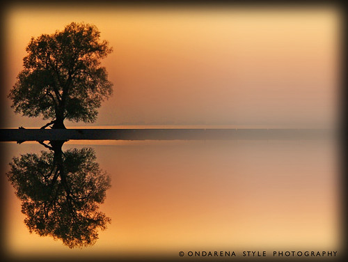
Your second image is also great. It’s unusual to see such strongly saturated (almost florescent) color in a natural environment. Everything from the water to the plants seem to have almost cartoonish qualities to them.
Great work on this assignment.
-
AuthorPosts
- You must be logged in to reply to this topic.