Photography Classes Online – Icon Photography School › Forums › Photography Lessons › Lesson 4 › NPG Lesson 4
- This topic has 1 reply, 2 voices, and was last updated 14 years, 7 months ago by
Duncan Rawlinson.
-
AuthorPosts
-
December 15, 2009 at 1:07 am #17788
Nikki
Participanti wasnt so sure what to do for this assignment because i dont have the extra funds to purchase a lens or filter for my camera. so i picked a photo i took from a recent concert i attended that i thought was as close as the assignment lol. the picture is of Country singer Dierks Bentley and i put my logo across it so no one takes the pic lol photographer’s copyright 😀 hehe…
im sorry if ur not so impressed with the pic 🙂 but live photography is more my thing and im tryin to fit it in with my assignments 🙂 thank you!,
NikkiDecember 17, 2009 at 7:44 am #19220Duncan Rawlinson
KeymasterGreat work with this photograph.
You’ve used a simple yet very powerful effect. I do have a couple of recommendations however. For starters, the human face is one of the most important elements in a portrait photograph.
Essentially, this is an environmental portrait with your subject performing in their work environment. It’s a beautiful image that has a clearly communicated color palette, abides by the rule of thirds and used a lot of negative space to help simplify the composition.
However, the top layer that acts as a sort of “bed” that you rest your text on cuts through your subject’s face. When you look at a photograph with a person in it, your attention is almost always drawn to their face first. That is why there is so much emphasis placed on strong focus on the subject’s eyes. Any other environmental or add on effects that get in their way of their face may act to disrupt the harmony of your photograph.
My recommendation would be to either make the later a little thinner or move it down a little so it doesn’t interfere with your main subject’s face.
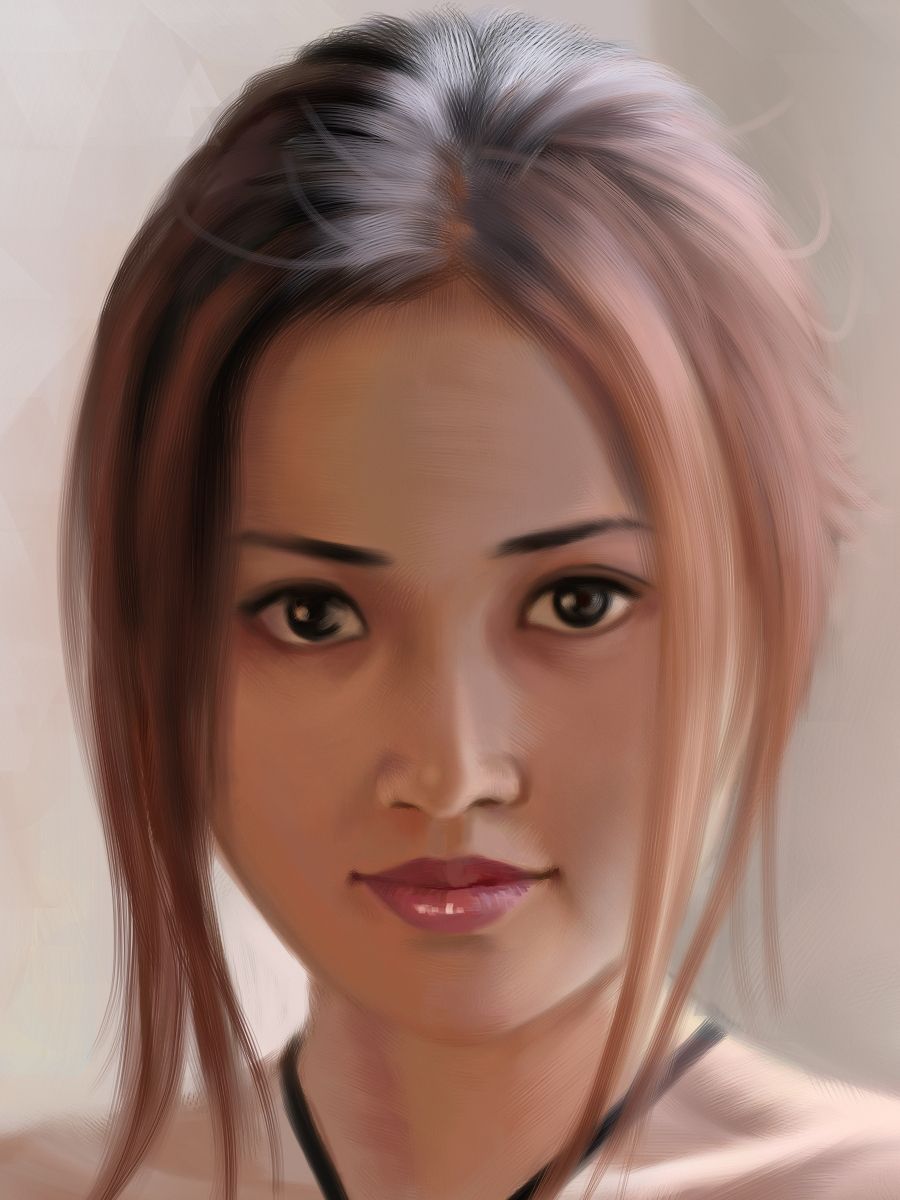
My second comment has to do with the dead space above your subject’s head. What you’ve done isn’t wrong, but I want you to be aware of that type of framing so it’s always a conscious choice. Generally, photographers like bringing their top frame down close to the subject’s head, or even cutting off part of the top of their head.
For example see the following photograph:
A little space above the head
http://www.ethereality.info/ethereality_website/paintings_drawings/new/portraits/elena_formal_portrait/closeup-3.jpgno space above the head
http://farm1.static.flickr.com/207/504258852_f260357db0.jpgOverall, you’ve done a great job on this assignment!
-
AuthorPosts
- You must be logged in to reply to this topic.