A photo book transforms a collection of individual images into a unified story. Unlike a gallery wall or a social media feed, a book gives you control over sequence, pacing, scale, and the physical experience of encountering each photograph. It is one of the most satisfying ways to present your work, whether you are documenting a family year, showcasing a personal project, or building a professional portfolio to show clients. This guide covers everything from concept and sequencing to layout, typography, paper, and production.
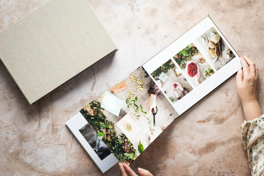
Photo books have a long and rich history in photography. From Robert Frank’s “The Americans” to Sally Mann’s “Immediate Family,” some of the most influential photographic works exist primarily as books. The format forces you to think beyond single images and consider how photographs relate to each other, how a viewer’s eye moves through a sequence, and how the physical object itself contributes to the experience. Even if your goal is simply a beautiful family album, the principles of good book design will make it dramatically more compelling.
Planning Your Photo Book
Before you open any design software, spend time thinking about what your book is and who it is for. A wedding album, a travel journal, a portfolio for gallery submissions, and a personal fine art project all demand different approaches to every design decision.
Define Your Purpose
Ask yourself what this book needs to accomplish. Is it a gift for a client? A record of a trip? A presentation piece for potential clients or gallery owners? The answer shapes your choices about size, paper, binding, image selection, and design style.
A client wedding album should be elegant, timeless, and focused on their day. A personal art project can be experimental and boundary-pushing. A portfolio book should be clean, professional, and let the images speak without design distractions. A family yearbook can be playful and informal. Knowing the purpose before you start prevents mid-project confusion and redesigns.
Choose Your Images
The most common photo book mistake is including too many images. More images do not make a better book. Ruthless editing makes a better book. Every image should earn its place. An image that is similar to another image already in the book, that does not advance the narrative, or that is technically weaker than the rest should be cut.
Start by pulling everything that might belong in the book into a single collection. Then go through it multiple times, removing images with each pass. Many professional photographers aim to cut at least 50 percent of their initial selection. It is painful but necessary. A book of 60 strong images will always be more powerful than a book of 120 images padded with filler.
Pay attention to variety in your selection. You want a mix of scales (wide shots, medium shots, close details), orientations (horizontal, vertical), moods (bright, dark, quiet, energetic), and subject matter. This variety creates visual rhythm and keeps the viewer engaged as they turn pages.
Sequencing and Narrative Flow
Sequencing is the most underappreciated skill in photo book design. The order of images determines the emotional arc of the book. Two identical collections of photographs sequenced differently will tell entirely different stories.
The simplest sequencing approach is chronological, and it works well for events, trips, and projects with a clear timeline. But even within chronological order, you make choices about pacing: which moments to linger on, which to breeze past, where to place transitions.
Thematic sequencing groups images by subject, mood, or visual similarity rather than time. A landscape portfolio might flow from dawn to dusk, from calm to dramatic, or from intimate details to grand vistas. A street photography book might alternate between humor and solitude, crowd and isolation.
Regardless of approach, think about how each pair of facing pages (called a spread) works together. When a viewer opens your book, they see two pages simultaneously. The images on those two pages should relate to each other in some way, whether through visual similarity, contrast, narrative connection, or tonal harmony.
Physical prints and a table or floor are the best sequencing tools. Print small work prints of every image (4×6 is fine) and arrange them in pairs and sequences. Move them around. Try different orderings. This tactile process reveals connections and flow problems that are difficult to see on screen. It is also one of the most creatively rewarding parts of making a book.
Book Size and Format
Size and format affect how images are experienced and how the book feels in the viewer’s hands.
Standard Sizes
Common photo book sizes include 8×8, 8×10, 10×10, 11×14, and 12×12 inches. Square formats work well for books that mix horizontal and vertical images, as both orientations fit the page without feeling cramped. Rectangular formats favor images in the matching orientation but can feel awkward with a mix.
For portfolio and fine art books, larger formats (11×14 or 12×12) give images more presence and impact. For personal albums, travel books, and gifts, 8×8 or 8×10 is more practical and affordable. Consider how the book will be viewed. A large coffee table book that sits open on a table is different from a smaller book that viewers will hold in their hands.
Orientation
Landscape (horizontal) format books work beautifully for landscape and travel photography because they match the orientation of most landscape images and open to a wide spread that can accommodate panoramic compositions. Portrait (vertical) format books suit portrait work, editorial layouts, and text-heavy designs. Square books are the most versatile and are the default choice for many photographers.
Page Count
Most photo book services offer books from 20 to 100 pages, sometimes more. A good rule of thumb is one to two images per spread (two facing pages), which means a 40-page book holds roughly 20 to 40 images. For a personal project or portfolio, 30 to 50 pages is a sweet spot that is substantial enough to feel like a complete work without overwhelming the viewer.
Wedding albums often run 40 to 60 pages. Family yearbooks work well at 20 to 30 pages. Do not pad your book with extra images to fill pages. It is better to have a shorter book with all strong images than a longer book with filler.
Layout and Design Principles
Good layout serves the images. The design should be invisible in the sense that the viewer notices the photographs, not the layout. Restraint is the most important design principle for photo books.
White Space
White space (the empty area around images) is not wasted space. It gives images room to breathe and directs the viewer’s attention. A single image centered on a page with generous margins has more impact than the same image crammed into a tight layout with three other images competing for attention.
The most elegant photo books tend to use more white space than beginners expect. When in doubt, give your images more breathing room. You can always tighten later. Starting tight and trying to add space later usually means rethinking the entire layout.
Images Per Spread
One image per spread gives maximum impact to each photograph. It is the standard approach for fine art books, photo essays, and portfolio presentations. Two images per spread creates a natural dialogue between the images and is the most common layout for albums and project books. Three or more images per spread can work for sequences, detail pages, and creating visual variety, but it reduces the impact of each individual image.
Vary the number of images per spread throughout your book to create rhythm. A section of single-image spreads feels contemplative. A multi-image spread after several singles creates energy and pace change. Alternating between layouts keeps the viewer engaged.
Image Sizing
Not every image needs to be printed at the same size. Varying image scale is one of the most effective layout tools. A full-bleed image (edge to edge, no margins) feels immersive and dramatic. A smaller image centered on the page with wide margins feels intimate and precious. Scale creates emphasis. Your strongest images deserve the largest presentation.
Full-bleed images work best for bold compositions, expansive landscapes, and establishing shots. Smaller, bordered images work for details, quiet moments, and transitions. The contrast between large and small keeps the visual experience dynamic.
Alignment and Grids
Use a consistent grid system to align images on the page. When you place multiple images on a spread, their edges should align with each other and with established margins. Sloppy alignment looks amateurish. Most design software includes grid and snap features that make precise alignment easy.
Consistent margins throughout the book create visual coherence. Pick your margins early and stick to them. If your outer margins are one inch, they should be one inch on every page. The gutter (inside margin where pages meet) should be wider than the outer margins to account for the binding, which absorbs some of the inner page area.
Backgrounds and Borders
White or off-white backgrounds are the safest and most versatile choice. They work with every type of photography and never compete with the images. Black backgrounds can work for moody, dark-toned images but make lighter images feel disconnected. Colored backgrounds are almost always a mistake unless you have a very specific design reason for them.
Avoid decorative borders, frames, drop shadows, and other embellishments. They are the hallmark of amateur design. Your images are the design. Everything else should disappear.
Typography
Some photo books include text: titles, captions, essays, or technical information. When text is part of your book, treat it with the same care as your images.
Font Selection
Choose one or two fonts and use them consistently throughout the book. A clean serif font works well for longer text and captions. A simple sans-serif font works for titles and page numbers. Avoid decorative, script, or novelty fonts entirely. They date quickly and distract from the images.
Font size should be large enough to read comfortably but small enough that the text does not compete with the images. Body text at 9 to 11 points works well for most book sizes. Captions can be slightly smaller. Titles and chapter headings should establish hierarchy without shouting.
Text Placement
Keep text separated from images. Place captions below or beside images, not overlaid on them. Title pages and text pages should have their own spreads rather than sharing space with photographs. When text and images compete for attention on the same page, both lose.
If you include an artist’s statement, introduction, or essay, place it at the beginning or end of the book, not scattered throughout. The exception is short captions that identify locations, dates, or subjects, which can appear on image spreads if they are discreet and consistently placed.
Paper and Printing Options
Paper choice profoundly affects how your images look and how the book feels. This decision is as important as layout and sequencing.
Paper Types
Glossy paper produces the most vibrant colors and deepest blacks. It is eye-catching and dramatic. The downside is fingerprints and glare. Glossy works well for commercial albums and clients who value color punch.
Matte paper has no shine or reflection. Colors are slightly more muted, but the viewing experience is more even across different lighting conditions. Matte paper feels more artistic and is the standard for fine art photography books. It resists fingerprints and does not produce glare.
Luster or semi-gloss splits the difference. It has moderate sheen that enhances colors without the glare issues of full glossy. It is a versatile choice for most applications. If you want to learn more about how different surfaces affect your images, see our comparison of print media options.
Paper Weight and Feel
Heavier paper stock (measured in GSM or pounds) feels more substantial and premium. Standard photo book pages are typically 150 to 200 GSM. Premium books use 200 to 300 GSM stock or even thicker layflat pages that are rigid enough to lay completely flat when the book is open.
Layflat binding is worth the premium for photo books. Standard binding creates a slight curve in the center gutter where pages meet, which can interfere with images that span across both pages. Layflat pages open perfectly flat, allowing images to run seamlessly across the full spread. This is especially important for panoramic images and any layout where an image crosses the center fold.
Cover Options
Hardcover books feel substantial and professional. They protect the pages and stand up on shelves. Most premium photo books use hardcovers. Softcover (paperback) books are lighter, less expensive, and more casual. They work for personal projects, zines, and books intended for frequent handling.
Cover materials include photo-wrapped (your image printed directly on the cover), linen, leather, and fabric. Photo-wrapped covers make a strong visual statement. Linen and fabric covers feel elegant and let the inside images be the surprise. Your choice should match the purpose and audience for the book.
Image Preparation
Preparing your images for a photo book requires the same attention as preparing for any print output. The quality of the source files directly determines the quality of the final product.
Resolution Requirements
Most photo book services require images at 300 DPI at the printed size. For a full-page image in a 12×12 book, that means your image should be at least 3600×3600 pixels. Check your printing service’s specific requirements, as some accept lower resolutions for larger formats. Use the print size calculator to verify your images have sufficient resolution before starting your design.
Color Space and File Format
Most photo book services accept sRGB JPEG files, and some accept Adobe RGB. Check your service’s specifications. If they accept Adobe RGB, use it for slightly wider color reproduction. If they only accept sRGB, convert your files carefully from your working color space to sRGB before placing them in the layout.
For the highest quality, export your images as maximum-quality JPEGs or, if your service supports it, TIFF files. Avoid over-compressing your files. The small file size savings are not worth the quality loss when the images will be printed large. For a thorough look at file formats, see our RAW vs. JPEG guide.
Consistency Across Images
Images in a book should feel cohesive. If your collection spans different shooting conditions, locations, or time periods, spend time in post-processing to bring visual consistency. This does not mean making every image look identical, but the overall color palette, contrast range, and tonal character should feel unified.
Pay particular attention to skin tones if the book includes portraits. Inconsistent skin tones across different images are immediately noticeable when the images appear pages apart. Apply consistent editing approaches to bring them into harmony.
Choosing a Printing Service
The range of photo book services spans from consumer platforms to professional-grade print houses. Your choice depends on your budget, quality expectations, and the purpose of the book.
Consumer Services
Consumer photo book services offer easy-to-use template-based design tools, affordable pricing, and fast turnaround. They are excellent for family albums, travel books, and personal projects. Print quality has improved dramatically, and many consumer services now produce results that would have been considered professional quality just a few years ago.
The tradeoff is limited design flexibility. Template-based tools may not support the exact layouts, margins, or typography you want. Paper and binding options are more limited. And the color accuracy, while good, may not match what you see on a calibrated monitor.
Professional Services
Professional photo book printers cater to photographers and designers. They accept custom layouts from design software like InDesign or Lightroom, offer a wider range of papers and bindings, and provide better color management including ICC profiles for soft proofing. Professional services cost more, but the quality difference is visible in paper feel, binding durability, and color fidelity.
If you are producing books for sale, client delivery, or portfolio presentations, a professional printing service is worth the investment. The book itself becomes a reflection of your professional standards. To ensure your files translate well to print, review our guide on preparing photos for print.
Self-Publishing Platforms
Services like Blurb and others allow you to design a book, print personal copies, and optionally make it available for sale through their marketplace. This is an excellent option for photographers who want to produce short runs without minimum order quantities. You can order one copy or one hundred.
Self-publishing platforms vary in design tools, print quality, and pricing. Some offer professional-grade design software integration while others rely on browser-based editors. Order a proof copy before committing to any service to evaluate quality firsthand.
Design Software Options
Your choice of design software depends on how much control you need and your comfort level with design tools.
Adobe InDesign is the professional standard for book design. It offers complete control over every aspect of layout, typography, and image placement. The learning curve is significant, but it gives you unlimited creative freedom. If you plan to make books regularly or sell them professionally, learning InDesign is worthwhile.
Lightroom’s Book module provides a simpler, photographer-friendly interface for creating photo books. It integrates directly with your Lightroom catalog, supports multiple page templates, and exports print-ready files for services like Blurb. It is more limited than InDesign but adequate for most photographer-designed books.
Service-specific software provided by printing companies offers templates and drag-and-drop simplicity. It is the fastest way to create a book but offers the least design flexibility. For a first book or casual personal projects, these tools are perfectly fine.
Storytelling Through Sequence
A great photo book tells a story, and that story emerges from how the images are arranged rather than from any single image alone.
Opening and Closing
The first image sets the tone for the entire book. It should be compelling enough to draw the viewer in and representative enough to hint at what follows. It does not need to be your absolute strongest image, but it needs to be a strong invitation.
The final image is what the viewer carries away. It should provide a sense of resolution or leave a lasting impression. Many photographers choose a quieter, more contemplative closing image that lets the viewer reflect on everything that came before.
Pacing
Like a film or a piece of music, a photo book benefits from pacing variation. Intense, dramatic images need breathing room. Follow a powerful image with something quieter. Build sequences that crescendo toward key moments. Use blank or minimal spreads to create pauses that heighten anticipation.
A book that maintains the same visual intensity on every page exhausts the viewer. A book that varies between intimate details and grand statements, between color and quiet, between full-bleed drama and small centered contemplation keeps the viewer engaged from first page to last.
Visual Connections
Look for visual connections between adjacent images: matching colors, complementary shapes, shared lines, tonal similarity, or thematic echoes. Two images that share a strong visual element feel intentional when placed together, even if they depict entirely different subjects. This creates a sense of coherence that distinguishes a thoughtfully designed book from a random collection of prints.
Common Mistakes
These mistakes weaken photo books more than any other design issues:
- Including too many images. The urge to include everything is powerful and understandable, but it results in diluted books where strong images are buried among mediocre ones. Edit ruthlessly. A shorter, tighter book is always stronger.
- Inconsistent editing style. Images processed with different color treatments, presets, or contrast levels look disjointed in a book. Unify your editing before layout. The images should feel like they belong together.
- Cluttered layouts. Fitting four or five images on every page because you have so many to include creates visual chaos. Give your best images room to breathe. Single-image spreads are not a waste of space.
- Ignoring the gutter. Placing important image elements in the center gutter where pages meet means they will be hidden in the binding fold. Keep faces, text, and critical details away from the inner edges. Layflat binding helps but does not eliminate this concern entirely.
- Random sequencing. Arranging images in the order you shot them, without considering visual flow and narrative, produces a disjointed viewing experience. Every page turn should feel intentional.
- Decorative design elements. Clip art, fancy borders, colored backgrounds, and decorative fonts scream amateur. Let the photographs be the design. Keep everything else clean and minimal.
- Low-resolution images. Using images that are too small for the printed size results in visible pixelation and softness. Check resolution requirements for every image placement, especially full-bleed spreads.
- Not ordering a proof. Publishing or ordering final copies without first reviewing a physical proof print is a gamble. Colors, layout, and binding can all look different in person. Always order a proof.
Try This
These exercises will help you develop your photo book skills:
- Make a mini book first. Before committing to a large project, create a small 20-page book on any topic. Use it to learn your software, test your printing service, and experience the full workflow from image selection to holding a finished product. The lessons from this first book will improve every book you make afterward.
- Print and sequence on a table. Print small work prints of your candidate images and arrange them physically on a large surface. Move them around, try different pairings, and photograph the arrangements you like. This analog process reveals sequencing possibilities that screen-based tools often hide.
- Study published photo books. Visit a bookstore or library and spend time with photography monographs. Pay attention to how professional photographers and designers handle pacing, image scale, white space, and sequencing. Take notes on what works and what does not.
- Create a book from one shoot. Take all the images from a single strong shoot and design a short book around them. Working with a constrained set of images makes sequencing and layout decisions more manageable and teaches you to find variety within a unified body of work.
- Design a portfolio book. Select your 20 to 30 strongest images across all your work and design a portfolio book. This forces you to confront your body of work as a whole and make difficult choices about what represents you best. The finished book becomes a powerful presentation tool.
- Experiment with scale. Take three of your strongest images and design three different spreads for each: one full-bleed, one medium with margins, and one small and centered on the page. Print or export all nine spreads and compare them. You will develop an intuition for when each scale works best.
- Get a second opinion. Show your book layout to someone whose visual taste you trust before sending it to print. Fresh eyes catch sequencing problems, pacing issues, and weak images that you have become blind to through familiarity.
FAQ
How many photos should be in a photo book?
There is no perfect number, but quality always beats quantity. A 40-page book with one to two images per spread holds roughly 25 to 50 images. For personal projects and portfolios, 30 to 50 strong images is a good range. For wedding albums, 80 to 120 images across 40 to 60 pages is typical. The right number is whatever it takes to tell the complete story with no filler.
What is layflat binding?
Layflat binding uses thicker, rigid pages that open completely flat without a curve in the center. This allows images to span across both pages of a spread without any loss in the gutter. Standard binding creates a slight curve or fold in the center that can hide part of the image. Layflat costs more but is worth it for photography books, especially if your design includes full-spread images.
Should I design my own book or use templates?
For a first book, templates from a good printing service are perfectly fine. They handle layout basics like margins, alignment, and gutter compensation automatically. As you gain experience and want more creative control, move to custom layouts in Lightroom or InDesign. The most important thing is to start making books. You can refine your design skills with each one.
How do I handle a mix of horizontal and vertical images?
Square book formats handle mixed orientations most gracefully. In rectangular books, place horizontal images on their own pages at full width, and vertical images either centered on the page with margins or paired with another vertical image on the facing page. Avoid rotating images to fit a layout. A vertical image displayed horizontally is disorienting and unprofessional.
What DPI do I need for photo books?
300 DPI at the printed size is the standard target. For a 12-inch-wide full-bleed image, that requires at least 3600 pixels on the long edge. Some services accept 200 DPI for large formats, but 300 DPI delivers the sharpest results. Always verify your specific printing service’s requirements before starting your design.
How much should a photo book cost to produce?
Consumer photo books range from $20 to $80 depending on size, page count, and options. Professional-grade books with premium paper and binding start around $50 to $100 for small formats and can exceed $200 to $500 for large, high-quality productions. If you are selling books to clients, factor in your design time, image preparation, and profit margin on top of production costs.
Can I sell photo books?
Yes. Self-publishing platforms allow you to list books for sale with a built-in markup. You can also produce books independently through professional printers and sell them through your website, galleries, or events. Selling photography books is a legitimate revenue stream for many art photographers. Be sure to review the copyright implications for any images that include recognizable people, private property, or trademarks.
What is the best paper for a photo book?
It depends on your images and your audience. Matte paper is generally preferred for fine art and documentary work. Luster is the most versatile option for general photography. Glossy produces the most vibrant colors but shows fingerprints. Heavier paper stock (200+ GSM) feels more premium. If possible, order sample pages from your printing service to compare options before committing to a full book.