Black and white photography strips an image down to its essential elements: light, shadow, shape, and texture. Without the distraction of color, the viewer is forced to engage with the structure of the image itself. This is what gives monochrome photography its timeless quality and why it remains one of the most powerful creative choices a photographer can make, even in an era of vivid digital color.
Why Shoot in Black and White
Color is information, and sometimes that information distracts from the story you want to tell. A portrait with a cluttered, colorful background becomes a study in expression and character when converted to monochrome. A busy street scene that feels chaotic in color can become a graphic, structured image in black and white. Removing color simplifies the visual message and draws attention to the elements that matter most.
Black and white also carries emotional weight that color often does not. There is a reason fine art galleries, documentary projects, and editorial features still turn to monochrome. It creates a sense of timelessness, separating the image from the specifics of a particular moment and giving it a more universal, enduring quality. A color photograph says “this is what it looked like.” A black and white photograph says “this is what it felt like.”
Learning to See in Monochrome
The biggest challenge in black and white photography is not technical. It is learning to previsualize how a color scene will translate into tones of gray. Two objects that look completely different in color might appear nearly identical in black and white if they share a similar luminance value. A red flower against green leaves is striking in color but may become a flat, muddy gray in monochrome because both colors convert to similar tones.
Train your eye by looking for tonal contrast rather than color contrast. Ask yourself: where are the lightest and darkest areas in this scene? Is there strong separation between the subject and the background in terms of brightness, not just hue? Scenes with a wide range of tones, from deep blacks through rich mid-tones to bright whites, tend to produce the most compelling black and white images.
Many cameras offer a monochrome preview mode that shows the scene in black and white on the LCD or through the electronic viewfinder. This is an excellent training tool. When shooting in RAW format, the camera still records the full color data, so you lose nothing by using the monochrome preview. You get the benefit of seeing the scene in black and white while retaining all the color information for flexible post-processing later.
Camera Settings for Black and White
Always shoot in RAW. This is important for all photography, but it is especially critical for black and white. A RAW file gives you complete control over how colors are converted to tones during editing. A JPEG captured in the camera’s monochrome mode throws away the color data permanently, leaving you with no ability to adjust the tonal conversion after the fact.
Set your camera’s picture style or film simulation to monochrome for the LCD preview, but make sure you are recording RAW files underneath. This gives you the best of both worlds: a black and white preview in the field and full color data on your memory card.
Pay close attention to exposure. In black and white, the relationship between highlights and shadows is everything. Use your histogram to ensure you are capturing the full tonal range without clipping important highlights or crushing important shadows. Slight overexposure tends to work better for high-key black and white images (bright, airy, minimal shadow), while slight underexposure suits low-key images (dark, moody, dramatic).
Composition for Black and White
Without color to create visual interest, your composition must be stronger. Black and white photography rewards deliberate, structured compositions built on fundamental design elements.
- Contrast. The interplay between light and dark is the foundation of every black and white image. Look for scenes where light falls dramatically, creating strong highlights against deep shadows. Side lighting and back lighting often produce the most striking contrast.
- Texture. Without color, texture becomes much more prominent. Rough stone walls, weathered wood, cracked earth, fabric folds, and skin detail all become powerful visual elements in monochrome.
- Shape and form. Clean geometric shapes, silhouettes, and three-dimensional form revealed by directional light are amplified when color is removed. Architecture, industrial subjects, and natural formations often excel in black and white for this reason.
- Pattern and repetition. Repeating elements create rhythm and visual interest that can carry an image entirely on structure alone. Rows of columns, fence posts, windows, or waves become graphic and compelling in monochrome.
- Leading lines. Lines that guide the viewer through the composition become more prominent in black and white because there is no color to compete for attention. Roads, shadows, architectural edges, and natural lines all gain emphasis in monochrome.
Subjects That Work Well in Black and White
Portraits. Portrait photography in black and white focuses attention on the subject’s expression, eyes, and character. It removes the distraction of clothing colors and background elements, making the human connection more direct and intimate. Dramatic lighting, such as window light from one side, produces classic monochrome portrait results.
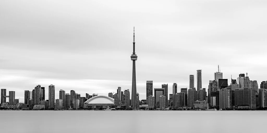
Architecture. Buildings, bridges, and interior spaces are defined by geometry, light, and shadow. Black and white emphasizes the structural lines and spatial relationships that architects intended, often producing more powerful images than color.
Street photography. Street photography has a deep tradition in black and white. The monochrome treatment unifies busy, chaotic urban scenes and gives them a cohesive visual language. It also creates a documentary feel that connects your images to the rich history of street photography.
Landscape. While landscape photography is often associated with vivid color, many of the most iconic landscape images ever made are black and white. Dramatic skies, fog, snow, and stark desert landscapes all translate beautifully to monochrome, especially when the scene has strong tonal range and interesting textures.
Minimalist subjects. Simple compositions with clean lines and negative space are naturally suited to black and white. The absence of color reinforces the simplicity and lets the viewer focus entirely on form and space.
Converting Color to Black and White in Post-Processing
Simply desaturating a color image produces flat, lifeless results. Proper black and white conversion gives you control over how each color in the original image maps to a specific gray tone. This is where the real creative power lies.
Channel Mixing and Color Filter Effects
In Lightroom, Photoshop, and most editing applications, the black and white conversion tool includes sliders for individual color channels: red, orange, yellow, green, aqua, blue, and purple. Each slider controls how bright or dark that color appears in the final monochrome image. Dragging the blue slider to the left darkens the sky, making clouds stand out dramatically. Pulling the red and orange sliders to the right brightens skin tones for a more flattering portrait. This mimics the colored filters that film photographers used to place over their lenses to control tonal relationships.
Experiment with these sliders on every conversion. The default automatic conversion is a starting point, not a destination. Small adjustments to the color channels can transform a dull conversion into a striking one by creating the tonal separation that makes a black and white image work.
Dodging and Burning
Dodging (selectively lightening) and burning (selectively darkening) is a technique borrowed directly from the darkroom, and it is even more important in black and white digital editing than in color. Because monochrome images depend entirely on the relationship between light and dark tones, guiding the viewer’s eye through selective brightness adjustments is essential.
Use adjustment brushes or radial filters to brighten the areas you want to draw attention to and darken the areas that should recede. In a portrait, you might brighten the face and darken the edges of the frame. In a landscape, you might burn the corners and dodge the main subject. These adjustments should be subtle. The viewer should feel guided through the image without consciously noticing the manipulation.
Printing Black and White Images
Black and white photographs truly come alive in print. A well-printed monochrome image on quality paper has a depth and richness that is difficult to appreciate on a screen. If you are serious about black and white photography, printing should be part of your workflow.
Fine art papers with a matte or semi-matte finish often work better for black and white than glossy papers, which can introduce distracting reflections. Baryta papers, which mimic the surface of traditional darkroom fiber prints, are a popular choice for exhibition-quality black and white work. Make sure your printer and paper profile are properly calibrated, and consider soft-proofing your images before printing to anticipate how the tones will translate from screen to paper.
Building Your Black and White Vision
Black and white photography is a skill that develops over time. Start by setting your camera to monochrome preview and spending a few dedicated sessions shooting only with that perspective. Study the work of photographers known for their monochrome images. Pay attention to how they use light, shadow, and composition to create images that communicate powerfully without any color at all. Upload your work to tools like PhotoScanr to review your exposure data and track how your settings translate to final tonal quality. The more you practice seeing in tones rather than colors, the more natural it becomes, and the stronger your overall photographic eye will grow as a result.