Color management is the system that ensures colors look consistent and accurate from capture through editing to final output, whether that output is a screen, a print, or a projector. Without color management, the vibrant sunset you photographed might appear dull on your monitor, oversaturated on your client’s laptop, and color-shifted in print. Check out our monitor calibration for more details. Understanding color management gives you control over how your images actually look when they reach their audience, and it is one of the most impactful technical skills a photographer can develop.
What Color Management Is and Why It Matters
Every device that displays or reproduces color does so differently. Your camera sensor captures color data in its own way. Your monitor renders colors based on its panel technology, backlight, and settings. A printer lays down ink on paper using an entirely different process. Your client’s phone screen uses yet another technology. Without a system to translate between these devices, the same image file can look dramatically different on each one.
Color management solves this problem by establishing a common language for color. It uses standardized color spaces, device profiles, and conversion algorithms to ensure that a specific shade of red in your file appears as the same shade of red on every device that is properly set up. Check out our color spaces explained for more details. The system is not perfect, because each device has physical limitations on what colors it can reproduce, but it gets remarkably close when implemented correctly.
For photographers, color management matters because your creative decisions about color are a core part of your work. The warmth of a portrait, the cool tones of a moody landscape, the precise product colors a commercial client requires: all of these depend on accurate, predictable color throughout your workflow.
Color Spaces: sRGB vs. Adobe RGB vs. ProPhoto RGB
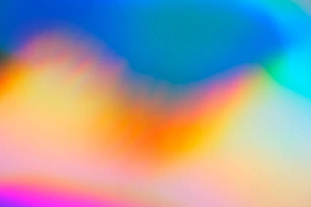
A color space defines the range of colors (called a gamut) that can be represented in an image file. Think of it as the size of the box of crayons available to describe the colors in your photograph. A larger gamut means more colors are available. A smaller gamut means some colors fall outside the boundaries and must be approximated.
sRGB
sRGB (standard Red Green Blue) is the smallest of the three common photographic color spaces, but it is also the most universally supported. It was created in 1996 as a standard for monitors, printers, and the internet, and it remains the default color space for the web, most consumer displays, and most consumer print services.
- Gamut: Covers approximately 35% of the visible color spectrum. This sounds limited, but it includes the vast majority of colors that monitors and consumer printers can actually reproduce.
- Best for: Web delivery, social media, email, consumer print labs, any output that will be viewed on standard monitors.
- Advantages: Universal compatibility. Every browser, every device, every lab handles sRGB correctly. You never have to worry about color space misinterpretation.
- Limitations: Cannot represent highly saturated greens, cyans, and some deep blues that wider gamuts can. For most images, this limitation is invisible. For photographs with extremely saturated natural colors (tropical water, neon lights, deeply saturated foliage), the clipping may be noticeable.
Adobe RGB
Adobe RGB was developed in 1998 to encompass a wider range of colors, particularly in the green-cyan region. It covers approximately 50% of the visible color spectrum.
- Gamut: Significantly wider than sRGB, especially in greens and cyans. The improvement in reds and blues is more modest.
- Best for: Professional print workflows, wide-gamut monitors, and any output path where the reproduction device can handle the wider gamut.
- Advantages: Preserves more of the color information that high-quality printers can reproduce, particularly in nature and landscape photography where saturated greens and cyans are common.
- Limitations: If an Adobe RGB image is displayed without proper color management (for example, in a web browser that ignores the embedded profile or on a system with no color management), the colors will appear desaturated and dull. This is because the Adobe RGB color values are being interpreted as sRGB values, and the wider spacing of colors in Adobe RGB means each value maps to a less saturated sRGB color.
ProPhoto RGB
ProPhoto RGB is the widest of the three, encompassing approximately 90% of the visible color spectrum and even including some colors that the human eye cannot perceive.
- Gamut: Extremely wide. No current monitor or printer can reproduce the full ProPhoto RGB gamut. It is designed as a future-proof working space that preserves maximum color data.
- Best for: Use as an editing and working space, particularly when processing RAW files. Convert to a smaller gamut (Adobe RGB or sRGB) for final output.
- Advantages: Preserves every bit of color data your camera captured, with room to spare. Future displays and printers may be able to reproduce colors that current devices cannot, and ProPhoto RGB files will be ready for them.
- Limitations: Must be used with 16-bit files. In 8-bit mode, the wide gamut spreads the available 256 tonal levels across such a large range that smooth gradients can break into visible banding. ProPhoto RGB images should never be used for web delivery or sent to devices without proper color management.
Choosing the Right Color Space for Your Workflow
The practical recommendation for most photographers is:
- Edit in ProPhoto RGB (16-bit) when processing RAW files. This preserves maximum data during editing.
- Export to Adobe RGB for professional print output or when working with professional labs that accept Adobe RGB files.
- Export to sRGB for everything else: web, social media, email, consumer print services, and any output where you are not certain the viewer’s system supports wider gamuts.
If this feels complicated, a simpler approach works well for many photographers: edit in your software’s recommended color space and export everything as sRGB. You will lose some color gamut in the export, but for the vast majority of images and output paths, the difference is invisible. Add Adobe RGB and ProPhoto RGB to your workflow as you gain experience and when your output path can benefit from them.
Monitor Calibration
Your monitor is the window through which you see and evaluate your photographs. If that window distorts colors, brightness, or contrast, every editing decision you make is based on inaccurate information. Monitor calibration corrects these distortions and ensures what you see on screen is an accurate representation of the data in your files.
Why Calibrate?
Out of the box, most monitors are set up for entertainment: high brightness, boosted contrast, and enhanced color saturation. These settings make movies and games look punchy but produce inaccurate results for photo editing. An image edited on an overly bright, oversaturated monitor will look dark and dull on a properly calibrated display or in print.
Calibration addresses three main properties:
- Brightness (luminance). Most monitors are far too bright for photo editing. A calibrated target of 80-120 cd/m2 (candelas per square meter) more closely matches the reflective brightness of a print viewed in normal room lighting. This is the single most common reason prints look darker than expected: the monitor was too bright.
- White point (color temperature). The standard calibration target is D65 (approximately 6500K), which represents average daylight. Some photographers working primarily for print calibrate to D50 (approximately 5000K), which matches the standard viewing conditions for evaluating prints.
- Gamma (tonal response). Gamma defines how the monitor maps digital values to displayed brightness levels. A standard gamma of 2.2 is the target for most workflows and ensures smooth, accurate tonal gradations.
How to Calibrate
Monitor calibration uses a hardware device called a colorimeter or spectrophotometer. The device sits on the screen surface and measures the actual colors the monitor produces as the calibration software displays a series of color patches. The software then creates an ICC profile, a file that tells your operating system how to adjust the monitor’s output to match the target specifications.
The process is straightforward:
- Install the calibration software that comes with your device
- Let the monitor warm up for at least 30 minutes (cold displays produce inaccurate readings)
- Place the sensor on the screen and run the calibration routine
- The software measures and adjusts, then generates an ICC profile
- The profile loads automatically at system startup
How Often to Calibrate
Monitor characteristics drift over time as the backlight ages and components shift. Calibrate at least once a month for critical work. Every two weeks is better. Many calibration tools can remind you on a schedule. If you notice your prints consistently not matching your screen, recalibrate immediately.
Monitor Quality Matters
Calibration improves any monitor, but it cannot make a low-quality monitor produce accurate results across the full gamut. For serious photo editing, look for monitors that:
- Cover at least 99% of sRGB (many photography monitors also cover 90%+ of Adobe RGB)
- Use an IPS or similar wide-viewing-angle panel technology
- Support hardware calibration (the calibration adjusts the monitor’s internal lookup table rather than the graphics card, producing more accurate results)
- Have a resolution high enough to evaluate fine detail in your images
A good photography monitor does not need to be the most expensive option available. Mid-range displays designed for creative professionals offer excellent color accuracy at reasonable prices. The key is choosing a display designed for color accuracy rather than gaming speed or entertainment features.
The Color Management Workflow: Capture to Output
A complete color management workflow ensures color accuracy at every stage, from the moment you press the shutter to the final output on screen or paper.
Capture
Color management at capture starts with white balance. Setting accurate white balance (or shooting RAW and adjusting in post) ensures that the color data recorded by the sensor accurately represents the colors in the scene. A custom white balance is more accurate than auto white balance, but auto white balance on modern cameras is remarkably good for most situations.
If you shoot RAW, the color space setting on your camera only affects the in-camera JPEG preview. The RAW file contains all the color data the sensor captured, and you choose the working color space when you process the RAW file in your editing software. If you shoot JPEG, the camera embeds the selected color space (typically sRGB or Adobe RGB) in the file at capture time. For JPEG shooters, choosing sRGB is the safest default.
Editing
Process RAW files in ProPhoto RGB at 16-bit depth to preserve maximum color data. Most professional RAW processors default to ProPhoto RGB or a similar wide gamut as their working space. This gives you the widest possible palette during editing.
During editing, all color adjustments are made within this wide working space. Your calibrated monitor translates the file’s colors for display as accurately as its hardware allows. You are editing the data, and the monitor is showing you a representation of that data filtered through its ICC profile.
Soft Proofing
Before outputting to print, soft proofing lets you preview how the image will look on a specific paper with a specific printer. Soft proofing loads the printer-paper ICC profile and applies it to the on-screen preview, simulating the limited gamut and tonal characteristics of the print medium.
During soft proofing, you may notice:
- Saturated colors that flatten because they fall outside the printer’s gamut
- Deep blacks that lighten, especially on matte papers
- Subtle color shifts as out-of-gamut colors are mapped to the nearest printable equivalents
- A change in the paper white simulation that affects the overall tonal range
You can then create a soft-proof-specific version of the image with targeted adjustments to compensate for these changes. This is much more efficient and reliable than making test print after test print.
Output: Print
For printing, the key decision is who manages the color conversion: your editing software (application-managed color) or the printer driver (printer-managed color). This choice must be consistent. If both the application and the printer attempt to apply a profile, the double conversion produces incorrect colors.
- Application-managed color: Your editing software converts the image to the printer’s ICC profile before sending it to the printer. You select the specific paper profile and rendering intent. The printer driver’s color management is turned off. This method gives you the most control and the most predictable results.
- Printer-managed color: You send the image to the printer in sRGB or Adobe RGB, and the printer driver handles the conversion using its built-in profiles. This is simpler but offers less control. It is a reasonable choice when using the printer manufacturer’s own papers and inks.
When ordering prints from a lab, the lab handles the printing profile. Your job is to deliver the file in the color space the lab expects (usually sRGB, sometimes Adobe RGB) and to have soft-proofed against the lab’s profile if one is available.
Output: Web and Screen
For web delivery, convert to sRGB and embed the ICC profile in the file. While most modern browsers are color-managed and will interpret embedded profiles correctly, sRGB remains the safest choice because it is the assumed default when no profile is present. An untagged image on the web will be displayed as sRGB whether that was your intention or not.
For more on preparing images for different output paths, see our guide on RAW vs. JPEG.
ICC Profiles Explained
ICC profiles are the building blocks of color management. Named after the International Color Consortium, these profiles describe the color characteristics of a specific device or color space.
- Input profiles describe how a camera or scanner captures color. RAW processing software uses camera-specific profiles to accurately interpret the sensor data.
- Display profiles describe how a monitor renders color. This is the profile created during monitor calibration.
- Output profiles describe how a printer reproduces color on a specific paper with specific inks. Print labs and paper manufacturers provide these profiles for their products.
- Working space profiles define abstract color spaces like sRGB, Adobe RGB, and ProPhoto RGB. These are used during editing as a standardized reference.
The color management system uses these profiles to translate colors between devices. When your software converts an image from ProPhoto RGB to sRGB for web output, it uses the two working space profiles to remap color values so they produce the closest possible visual match in the smaller gamut.
Rendering Intents
When converting between color spaces of different sizes, some colors in the source may not exist in the destination. Rendering intent determines how these out-of-gamut colors are handled:
- Perceptual: Compresses the entire gamut of the source to fit within the destination, preserving the relative relationships between colors. Colors may shift, but the overall appearance and tonal gradations remain smooth. Best for photographic images with a wide range of colors.
- Relative Colorimetric: Maps colors that exist in both spaces exactly and clips out-of-gamut colors to the nearest available color. Preserves accurate colors within gamut but may create flat, posterized areas where multiple source colors map to the same destination color. Best for images that do not contain many out-of-gamut colors.
- Absolute Colorimetric: Similar to Relative Colorimetric but does not adjust for differences in white point between source and destination. Used primarily for proofing to simulate the exact paper white of a different output device.
- Saturation: Prioritizes vivid, saturated colors over accuracy. Rarely used in photography; more common for business graphics and presentations.
For most photographic printing, Perceptual and Relative Colorimetric are the two intents worth comparing. Try both in soft proofing and use whichever produces better results for the specific image.
Common Color Management Mistakes
Even photographers who understand the theory can make practical mistakes that undermine their color management. Here are the most common pitfalls:
- Editing on an uncalibrated monitor. This is the most frequent and most impactful mistake. Without calibration, every color and exposure decision you make is based on inaccurate information. Calibrate before anything else.
- Working in the wrong color space. Editing in sRGB when you intend to print on a wide-gamut printer wastes available color range. Working in ProPhoto RGB at 8-bit causes banding. Match your working space to your output path and bit depth.
- Forgetting to embed profiles. When you export an image, embed the ICC profile in the file. An untagged image forces the receiving device to guess the color space, which often produces incorrect results.
- Double color management in printing. If both your editing software and your printer driver apply a color profile, the image passes through two conversions and the colors will be wrong. Choose one or the other, never both.
- Sending Adobe RGB files to sRGB workflows. If you export in Adobe RGB and upload to a social media platform or consumer print service that ignores the embedded profile, the colors will appear desaturated and muddy. When in doubt, export as sRGB.
- Ignoring ambient light. The lighting in your editing environment affects how you perceive colors on screen. Bright, colored light (warm tungsten bulbs, colored walls, sunlight streaming through a window) can shift your perception. Edit in neutral, consistent, moderate lighting for the most accurate results.
- Calibrating infrequently. A profile created six months ago may no longer represent your monitor accurately. Calibrate monthly at minimum.
- Using the wrong white point for your output. If you primarily print and evaluate prints under D50 lighting, calibrating your monitor to D50 instead of D65 can improve the match between screen and print.
Setting Up Your Color-Managed Workspace
Your physical editing environment is part of your color management system. A few simple adjustments make a significant difference:
- Neutral wall colors. Bright or saturated wall colors behind or around your monitor reflect onto the screen and influence your color perception. Neutral gray walls are ideal. If repainting is not practical, at least ensure the wall directly behind your monitor is not a vivid color.
- Controlled ambient lighting. Avoid direct light falling on the screen. Use dimmable, neutral-colored room lighting (5000-6500K) at a moderate level. Avoid mixing light sources (daylight from a window combined with warm overhead lights).
- Monitor hood. A hood around the top and sides of your monitor blocks stray ambient light from washing out the screen and shifting your color perception. Some photography monitors include hoods; aftermarket hoods are also available.
- Print viewing conditions. Evaluate prints under consistent, standardized lighting. A D50 (5000K) viewing light near your editing station lets you compare prints to the screen under predictable conditions.
Conclusion
Color management is not about technical complexity for its own sake. It is about ensuring that the colors you carefully craft during editing actually reach your audience as intended. A calibrated monitor, an appropriate color space, embedded profiles, and a consistent workflow from capture to output give you confidence that what you see is what others will see, whether they are viewing on a screen or holding a print. Start with monitor calibration, because that single step improves every image you edit from that point forward. Then gradually add soft proofing, intentional color space selection, and proper output practices as your workflow demands. The goal is not perfection in theory but predictability in practice.
For related topics, see our guides on white balance and RAW vs. JPEG, which cover the early stages of the color pipeline in detail.
Frequently Asked Questions
Do I really need to calibrate my monitor if I only share photos online?
Yes. Even for web-only output, calibration ensures your editing decisions are based on accurate information. If your monitor is too bright or too warm, you will unconsciously compensate by making images too dark or too cool. The result is that your images look wrong on every other screen. Calibration brings your monitor into alignment with the standard (sRGB, D65, 2.2 gamma) that most other displays approximate, giving you the best chance that what you see matches what your audience sees.
Why do my photos look different on my phone than on my computer?
Phones and computers have different screen technologies, brightness levels, color gamuts, and color management implementations. A phone viewed in bright sunlight will render images differently than a calibrated monitor in a dim room. Differences in white point, gamma, and gamut coverage all contribute. While you cannot control every viewer’s device, calibrating your editing monitor ensures your images are accurate at the source. The variations viewers see on their own devices are beyond your control, but they are also not caused by errors in your workflow.
Should I shoot in Adobe RGB on my camera?
If you shoot RAW, the camera’s color space setting only affects the JPEG preview on the camera’s LCD and the embedded JPEG thumbnail. The RAW file contains all the color data the sensor captured, and you choose the working color space during processing. For RAW shooters, the camera setting is essentially irrelevant. If you shoot JPEG, setting the camera to Adobe RGB captures a wider gamut in the file, which is beneficial if you plan to edit and convert to sRGB yourself. However, if you share JPEGs directly from the camera without conversion, sRGB is safer because it will display correctly everywhere.
What is the best rendering intent for photographic prints?
For most photographic prints, start with Perceptual rendering intent. It preserves the overall tonal relationships and produces natural-looking results for images with a wide range of colors. Relative Colorimetric is a good alternative when the image does not contain many out-of-gamut colors, as it preserves in-gamut colors more accurately. The best approach is to compare both in soft proofing for each important print and choose the one that looks better for that specific image.
How much does a monitor calibrator cost, and is it worth it?
Entry-level colorimeters suitable for photography start in the range of $100-$200. Professional-grade spectrophotometers that also profile printers can cost $500 or more. For most photographers, an entry-level or mid-range colorimeter is more than sufficient. The investment pays for itself almost immediately in saved time, reduced reprinting costs, and the confidence that your edits are accurate. It is one of the highest-value purchases a photographer can make relative to its cost.