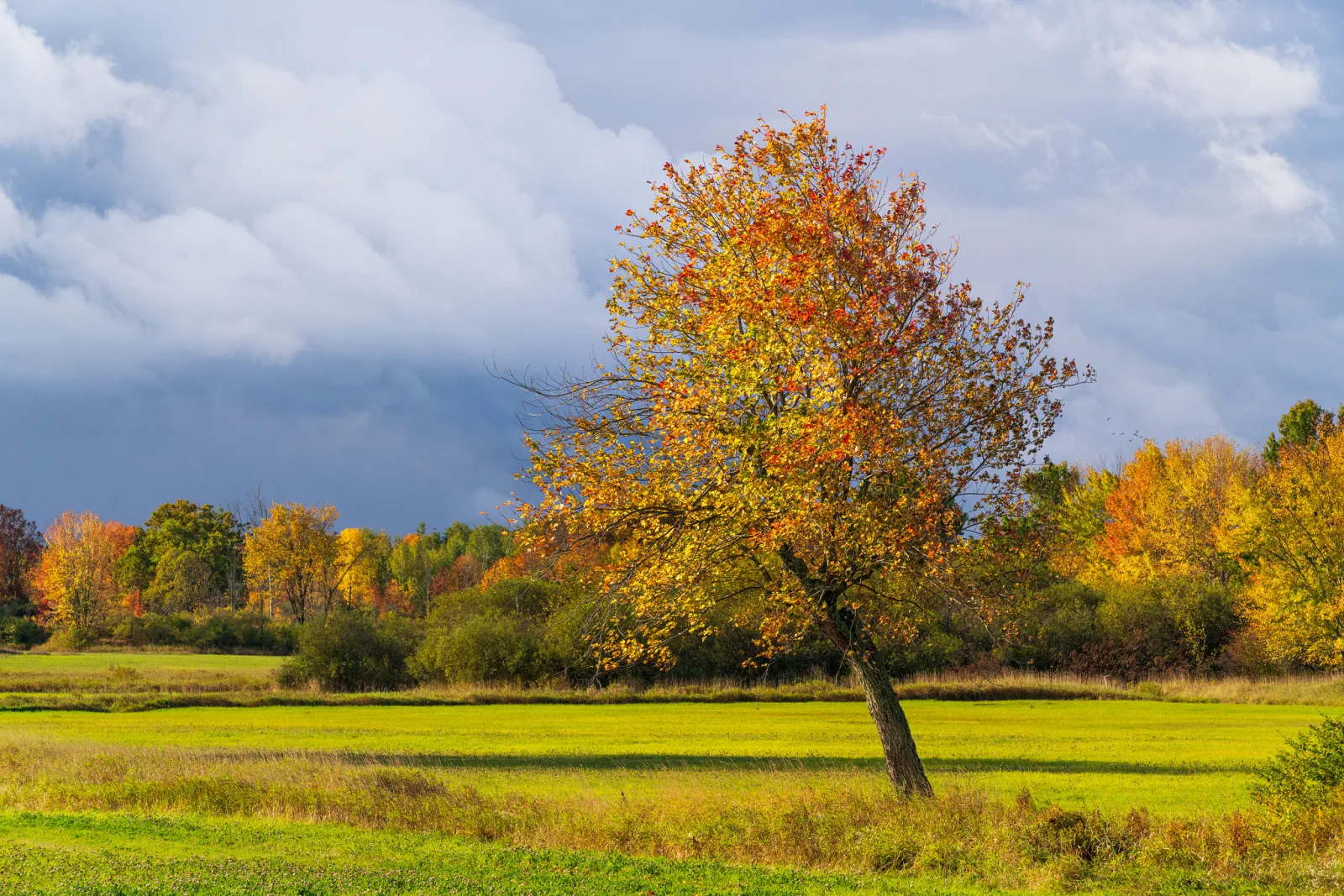
A picture style is the camera setting that decides how your photo looks once the camera turns the sensor’s data into a picture: how much contrast it has, how saturated the colors are, how sharp the edges look, and whether it is in color at all. It matters because it changes every JPEG you shoot, everything you see on the rear screen, and the histogram and highlight warning you use to judge exposure, even when you shoot RAW.
Most people never open this menu, and the camera quietly applies its Standard style to every frame. That is fine until a sunset comes out garish, skin looks orange, a white dress has no detail, or your RAW files look duller than the back of the camera did. All of those trace back here.
What a picture style actually is
The sensor does not record a picture. It records a grid of brightness readings behind red, green and blue filters, which look dark, flat and greenish if you view them as they are. Before you can see a photo, the camera has to process that data: set the white balance, map the brightness values onto a tone curve, build the colors, sharpen, and reduce noise. The picture style is the recipe for the look part of that work.
Every camera maker uses its own name for it. Depending on the camera, the same menu is called Picture Style, Picture Control, Creative Style, Creative Look, Film Simulation, Photo Style, Picture Mode or Color Profile. The presets and the number of steps differ, but the idea is identical: a stored set of adjustments that the camera applies before it saves a JPEG and before it shows you anything.
Most phones do the same thing with their own processing, and many let you choose a look or a style before you shoot. The same rule applies: the look is applied to the picture you get, so choose it knowing what it changes.
What it changes in a JPEG, and what it only changes in a RAW file
If you shoot JPEG, the style is baked into the file. Contrast that crushed the shadows, saturation that turned a red flower into a flat red blob, and sharpening halos are all in the pixels. You can edit a JPEG afterwards, but you cannot get back detail the style threw away.
If you shoot RAW, the style does not touch the sensor data. The camera stores your chosen style as a note in the file, and uses it to build the small JPEG preview embedded inside the RAW. Most editing software ignores that note and applies its own default rendering, which is why your RAW files look different from the camera preview a second after import. The camera maker’s own software usually does read the note, so there the style carries over.
So for a RAW shooter the style still matters in three ways: it is what you see while you shoot, it shapes the histogram and blinkies you use to judge exposure, and it is the look of any RAW plus JPEG pair you keep.
The presets and what each one does
The names vary, but almost every camera offers the same handful of looks. These are what they do, in general terms. Your camera’s exact amounts differ.
| Preset | Contrast | Saturation | Sharpening | What it is for |
|---|---|---|---|---|
| Standard | Medium to high | Medium to high | Medium | The default. Punchy, ready-to-share JPEGs of most scenes. |
| Vivid or Landscape | High | High, especially greens and blues | Medium to high | Bold color in nature and travel scenes, prints straight from the camera. |
| Portrait | Lower | Medium, tuned for skin | Low | Smoother, warmer-looking skin; less texture on faces. |
| Neutral | Low | Low | Low or none | A quiet starting point for editing; keeps more highlight and shadow detail in JPEGs. |
| Faithful or Natural | Low | Low to medium | Low or none | Colors tuned to match the scene as measured in daylight; copying artwork, products, documents. |
| Flat | Very low | Low | Low | Video and heavy grading; looks washed out as is. |
| Monochrome | Medium | None | Medium | Black and white, with color filter and toning options. |
| Auto | Varies | Varies | Varies | The camera guesses the scene and picks a look for you. |
Some cameras add extra looks: film-like color recipes, a style tuned for fine texture, or a set of creative effects. They all work the same way. They are a starting point, not a different kind of setting.
A brighter, more saturated style is not a better one. Standard and Vivid look good on the camera screen because the screen is small and bright, and punchy pictures read well small. The same file on a big monitor or in a print can look overcooked, with skies that band and reds that lose all their texture.
The four sliders inside every style
Each preset is just a set of positions for a few sliders, and you can move them. On most cameras you get a scale of a few steps either side of zero.
Contrast
Contrast sets the shape of the tone curve that maps the scene’s brightness onto the JPEG’s brightness. A steeper curve makes midtones punchier, and pushes the darkest and brightest parts of the scene to pure black and pure white sooner. That is the trade: more snap in the middle, less detail at the ends. The page on contrast in photography covers what it does to how a picture reads.
Saturation
Saturation sets how strong colors are. A few steps up makes flowers and skies livelier; too many and the brightest color channel runs out of room, so a red petal or a blue neon sign turns into a flat patch with no texture. Reds and blues usually go first. Turning saturation down gives a muted, quieter look. Hue and saturation explains how color strength works and how to judge it.
Color tone
Color tone (sometimes called hue) nudges particular colors, mostly skin, one way or the other: on many cameras one direction makes skin a little redder and the other a little more yellow. It is not white balance. White balance shifts the whole picture warmer or cooler to match the light; color tone adjusts how some colors are rendered within it. If everything is orange under house lights, fix the color temperature of the white balance, not the color tone.
Sharpness
Sharpness adds edge contrast to make detail look crisper. It cannot make an out-of-focus or shaky photo sharp; it only makes edges stand out more. Some cameras split it into strength (how much), fineness (how fine an edge it works on; finer settings also sharpen noise) and threshold (how much contrast an edge needs before it gets sharpened). Too much gives bright halos along edges and crunchy noise in skies. If you shoot RAW, this setting does nothing to the file; your editor applies its own capture sharpening.
Monochrome and its color filters
The Monochrome style turns the JPEG and the screen into black and white while you shoot. That is useful even if you plan to edit later, because you see shapes, tones and light without the distraction of color. Most cameras let you add a filter effect, which copies what colored glass filters did on black and white film: each one lightens its own color and darkens its opposite.
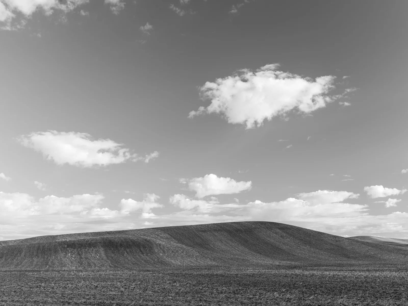
- Yellow: darkens blue sky a little, so white clouds stand out. A gentle, natural-looking choice.
- Orange: darkens blue sky more and adds contrast to stone, brick and sunsets.
- Red: turns blue sky dark and dramatic, and lightens red and orange subjects. It also darkens green foliage. Ansel Adams used a deep red filter to turn the sky nearly black behind Half Dome, one of the best-known uses of the effect; his page tells that story.
- Green: lightens foliage and darkens reds, so lips and ruddy skin come out deeper in tone.
Toning options (sepia, blue and others) tint the whole black and white image. Two things to know. A Monochrome JPEG has no color left in it, so you cannot change your mind later. And a RAW file shot in Monochrome still holds full color; most editors will open it in color, which surprises people. If you want to keep the choice, shoot RAW plus JPEG. For converting and editing in black and white, see the black and white photography guide.
Why your histogram and highlight warning depend on the style
This is the part most guides skip. The histogram and the highlight warning on your camera are calculated from the processed JPEG preview, not from the RAW data. Change the style and they change, with the same exposure.
A high-contrast style such as Vivid pushes bright tones to white sooner, so the blinkies flash and the histogram climbs the right wall earlier. Shooting RAW, that makes you underexpose to stop warnings for highlights that the RAW file had not actually lost. A Neutral style with contrast turned down gives a histogram and warning that sit closer to what the RAW file can hold. That is why many RAW shooters set Neutral and leave it there. It does not make the warning exact, since white balance and saturation also feed into it, but it is closer.
Want to push exposure as far right as the RAW file allows? Expose to the right explains the method, and why a flatter style makes the camera’s warnings more honest for it.
Settings that live next to the style
Several other menu items also change how a JPEG looks, and people often confuse them with the picture style:
- White balance sets the overall color of the light. It is separate from the style and applies whichever style you choose.
- Shadow or highlight protection (often called dynamic range, highlight priority or a similar name) brightens shadows or holds back highlights in the JPEG. It works alongside the style, and some versions also change how the camera exposes.
- High ISO noise reduction smooths grain in JPEGs, also at the cost of fine detail. See noise reduction for the trade.
- Color space (sRGB or a wider space) decides the range of colors a JPEG can hold. It is not a look. The page on color space explains which to choose.
Your camera’s menus put all of these in different places. If you are working through them one by one, the camera menus guide says which settings to set first.
Which style to use
There is no best style, only a best style for how you work.
- You shoot JPEG and want to share straight away: Standard, with sharpness and saturation left at default or one step down. Try Landscape for nature, Portrait for people, and look at the results on a big screen before you commit.
- You shoot JPEG and edit later: Neutral, or Standard with contrast and saturation lowered. You keep more detail in highlights and shadows to work with, and it is easier to add punch than to take it away.
- You shoot RAW: pick the style that gives you the most useful preview. Neutral gives more honest exposure feedback. Standard is closer to how your edited picture will end up. Either is fine; just know which one you are looking at.
- You need accurate color for product photography, artwork or documents: Faithful or Natural, with a correct custom white balance.
- You shoot video: styles matter more, because most cameras process video in camera, with no RAW file to fall back on. A flat style keeps detail for grading; the page on camera settings for video covers when that helps and when it only makes more work. Some cameras offer log profiles, which are a separate, flatter recording meant to be converted with a LUT.
For portraits, be careful with high saturation and sharpness: skin gets blotchy and every pore shows. For landscapes, watch that a Landscape style’s saturation is not turning skies into bands of flat blue.
Making a custom style and keeping a set consistent
Every camera lets you change a preset’s sliders, and most let you save the result as a user style you can call up again. Change one slider at a time, two steps at most, and shoot the same scene each time so you can see what each step does. When you find a look you like, save it and name it for what it is for.
Using the same style for a whole shoot is the cheapest way to get consistent JPEGs: every frame gets the same contrast and color. Mixing styles across a set, or leaving the camera on Auto, means each frame may come out a little different. If you edit RAW files instead, consistency comes from applying the same settings in your editor, covered in editing photos consistently; a saved editor preset is the RAW world’s version of a custom picture style, explained in the guide to presets.
Wondering whether to keep shooting JPEG at all? RAW vs JPEG lays out what each format keeps and loses, and when each one is the better choice.
Common mistakes with picture styles
- Judging exposure on a vivid style while shooting RAW. The blinkies flash early and you underexpose. Use Neutral, or learn how far past the warning your RAW files really go.
- Thinking the style is lost on RAW and therefore pointless. It still sets the preview, the histogram and the highlight warning, which is how you judge every shot.
- Thinking RAW files look dull because the camera is broken. Your editor is showing its own rendering, not your style. Pick a camera-matching profile in the editor, or accept the flatter start and edit.
- Turning sharpness all the way up. It adds halos and noise, and it cannot fix focus or shake.
- Leaving Monochrome on for JPEG only. The color is gone for good. Shoot RAW plus JPEG if there is any chance you want color.
- Using color tone to fix a color cast. A color cast from the light is a white balance problem.
- Forgetting the style is set. A style chosen for one shoot stays on for the next. Check it when you start, the same way you check ISO.
Try this: one scene, three styles
Ten minutes, any camera with a style menu. Set it to JPEG, or RAW plus JPEG.
- Find a scene with bright sky, some shade, and at least one strong color, such as a red car, a blue door or green leaves. Put the camera on a tripod or rest it on something solid.
- Set the exposure in manual mode or lock it, so every frame gets exactly the same exposure.
- Shoot one frame each in Neutral, Standard and Vivid or Landscape. Before each shot, look at the histogram and the highlight warning and note what you see.
- Add a frame in Monochrome with no filter, then one with a red filter effect if your camera has it.
- Put the JPEGs side by side on a computer at 100%.
How to judge it: in the Vivid frame, look for texture lost in the strong color and in the brightest part of the sky. Compare where the highlight warning appeared for each style, even though the exposure did not change. In the two Monochrome frames, see how much darker the red filter made the sky. Then decide which style you will use for your next shoot, and why.
Picture style questions
What is the best picture style?
There is not one. Standard suits most JPEGs that will be shared without editing, Neutral suits JPEGs you will edit and gives RAW shooters more honest exposure feedback, and Faithful suits work where colors must match the subject. Choose by how you work, not by which looks best on the camera screen.
Does picture style affect RAW files?
Not the image data. The camera saves the style as a note and uses it for the preview; most editors ignore the note and apply their own look. The camera maker’s own software usually applies it, and the style always affects the histogram and highlight warning you see while shooting.
Is picture style the same as a filter or a preset?
It is close to an editing preset, but applied by the camera when the photo is made instead of afterwards. Unlike an app filter added later, a style on a JPEG cannot be fully undone, because detail it removed is gone.
Why do my photos look different on the computer than on the camera?
If you shoot RAW, the editor is applying its own rendering instead of your style. If you shoot JPEG, the camera’s small, bright screen flatters punchy styles and hides oversharpening and clipped color that a big screen shows. Judge on a computer before you settle on a style.
Should I use the Flat style for photos?
Only if you will edit every frame or want the most honest exposure feedback. Flat JPEGs look washed out as they are, and the style was designed mainly for video grading. For stills, Neutral with contrast lowered gives most of the benefit and still looks reasonable.
Curious how color itself works in a photo, beyond the camera menu? Color in photography covers hue, harmony and how color steers the eye.
Looking for a look you can call your own once the camera settings are sorted? Finding your editing style is about building a consistent personal look in editing.