There is something magnetic about the texture of film photographs. That organic, slightly gritty quality gives images a sense of depth, warmth, and authenticity that perfectly clean digital files sometimes lack. Film grain has become one of the most popular creative effects in modern photography, and for good reason. It can transform a flat, sterile image into something that feels alive and tactile. Whether you want to recreate the look of a specific film stock or simply add a subtle layer of texture, learning to apply grain thoughtfully is a powerful skill that will expand your creative toolkit.
This guide covers everything from the science behind grain to practical techniques for adding it in popular editing tools. You will learn how to match the characteristics of real film stocks, avoid the most common mistakes, and develop an eye for when grain enhances your work versus when it becomes a distraction.
What Is Film Grain and Why Does It Matter?
Film grain is the visible texture created by the tiny silver halide crystals (or dye clouds in color film) that make up a photographic emulsion. When light hits these crystals during exposure, they clump together in slightly random patterns, creating a fine, organic texture across the image. The size and visibility of grain depends on the film’s sensitivity to light, commonly known as its ISO or ASA rating. Lower ISO films like Kodak Ektar 100 produce extremely fine grain that is nearly invisible, while higher ISO films like Kodak Tri-X 400 or Ilford HP5 pushed to 1600 produce bold, pronounced grain that becomes a defining visual element.
Grain matters because it adds a dimension that digital sensors do not naturally produce. Digital images are composed of perfectly uniform pixels arranged in a rigid grid. This precision creates technically flawless files, but the result can feel clinical. Film grain breaks up that digital uniformity and introduces an analog randomness that our eyes find pleasing. It can also mask minor imperfections in an image, soften skin in portraits, and create a mood that ranges from nostalgic to gritty depending on how it is applied.
Grain vs. Digital Noise: Understanding the Difference
One of the biggest misconceptions in digital photography is that grain and noise are the same thing. They are not, and understanding the difference is essential before you start adding grain to your images.
Film grain is an inherent part of the image-forming process. It is baked into every photograph made on film, from shadows to highlights. Grain has an organic, random distribution that varies naturally across the frame, and it tends to look pleasing because those silver crystals scatter light in a way that produces soft, rounded clumps of texture. The grain pattern also shifts with each frame of film, making every image unique.
Digital noise, on the other hand, is an unwanted artifact produced when a camera’s sensor struggles with insufficient light or runs at high ISO settings. Noise appears as colored speckles (chroma noise) or brightness variations (luminance noise) that are most visible in shadow areas. Unlike grain, noise follows the rigid pixel grid of the sensor, tends to cluster in color patterns that look unnatural, and is generally considered a technical flaw rather than a creative element.
When you add grain to a digital image, you are layering an organic texture on top of a clean digital file. The key is making it look authentic rather than simply degrading image quality. Good grain looks intentional and consistent across the frame. Bad grain looks like you cranked the ISO too high and tried to call it artistic.
When Film Grain Enhances Your Photos
Grain is not universally beneficial. It works beautifully in certain contexts and feels forced in others. Understanding when to use it will save you from applying it as a default filter to every image.
Black and White Photography
Black and white images are where grain truly shines. Without color to carry the visual weight, monochrome photos rely on tone, contrast, and texture. Grain adds that third dimension of texture in a way that makes black and white images feel rich and physical. Think of the iconic street photography of the mid-20th century, where high-ISO black and white film produced images with beautiful, gritty character. If you shoot street photography, documentary work, or moody portraits in black and white, grain is almost always an improvement.
Portraits and Fashion
A light to moderate grain can do wonderful things for portrait photography. It softens skin naturally without the artificial smoothing of frequency separation or skin retouching filters. The texture breaks up the pixel-level detail that can make digital portraits feel uncomfortably sharp, especially on high-resolution sensors. Many fashion and editorial photographers add grain as a standard part of their editing workflow because it gives their images an editorial quality that reads well in print.
Moody and Atmospheric Scenes
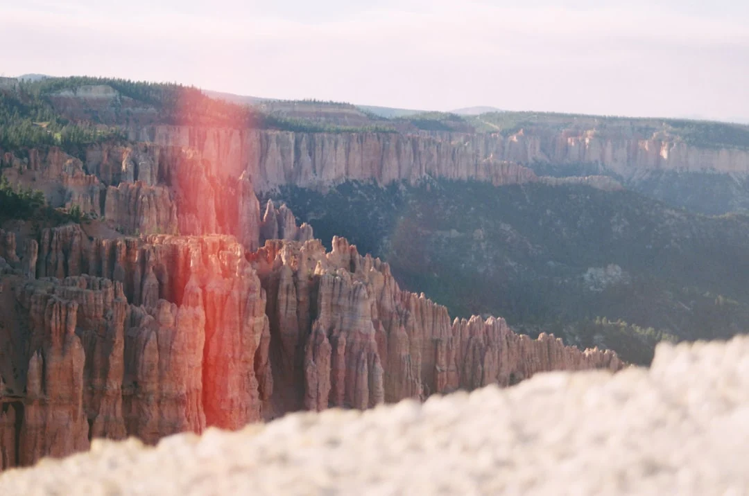
Foggy mornings, rainy streets, dimly lit interiors, and golden hour landscapes all benefit from grain. These are scenes where you want the viewer to feel the atmosphere, and grain contributes to that sense of being immersed in the moment. The texture adds a layer of imperfection that makes the image feel less like a digital capture and more like a memory.
When to Skip the Grain
Commercial product photography, real estate images, technical documentation, and any context where clarity and precision are paramount should generally remain grain-free. Clean, detailed images communicate professionalism in these fields, and adding grain would undermine the purpose of the photograph. Similarly, images that are already noisy from high-ISO capture should not have additional grain layered on top. Fix the noise first, then decide if you want to add grain separately.
How to Add Film Grain in Lightroom
Lightroom has the most straightforward grain tools of any major editing application. The grain panel lives in the Effects section of the Develop module, and it gives you three controls that work together to shape the character of your grain.
The Three Grain Controls
Amount controls the intensity of the grain effect, ranging from 0 to 100. Start low, around 15 to 25, for a subtle film-like texture. Push it to 40 to 60 for a more pronounced look that mimics high-speed film. Values above 70 create extremely heavy grain that works only in very specific creative contexts.
Size determines how large the individual grain particles appear. Lower values create fine, tight grain similar to slow-speed films like Kodak Portra 160. Higher values produce coarser, clumpier grain that resembles faster films like Ilford Delta 3200 or Kodak T-Max P3200. A size of 20 to 35 covers most realistic film looks.
Roughness controls how uniform or irregular the grain pattern is. Lower roughness creates smoother, more even grain. Higher roughness makes the grain more random and organic, which generally looks more authentic. Keep roughness at 50 or above for the most natural results.
Recommended Lightroom Settings for Common Film Looks
These starting points will get you close to the character of popular film stocks. Adjust to taste based on your specific image and output size.
Kodak Portra 400 look: Amount 20, Size 25, Roughness 50. This gives you a gentle, creamy grain that adds texture without dominating the image. Pair it with warm color grading and slightly lifted shadows for the full Portra aesthetic.
Kodak Tri-X 400 look: Amount 40, Size 30, Roughness 60. Classic photojournalism grain. Convert to black and white first, boost contrast, and the grain will sit beautifully in the mid-tones and shadows.
Ilford HP5 Plus pushed to 1600: Amount 55, Size 40, Roughness 70. Bold, punchy grain with visible clumping. Best for high-contrast black and white images where you want the grain to be a primary visual element.
Fujifilm Superia 400 look: Amount 25, Size 20, Roughness 55. Slightly finer grain than Portra with a cooler tonality. Works well with everyday color images where you want a subtle analog quality.
Cinematic 35mm look: Amount 30, Size 35, Roughness 65. Medium grain with a slightly coarse texture. Pair with desaturated color grading and 2.39:1 cropping for a motion picture feel.
Saving Grain Settings as Presets
Once you find grain settings you love, save them as Lightroom presets so you can apply them with a single click. Create a few presets at different intensities: one for subtle grain, one for moderate, and one for heavy. You can then layer these on top of your color editing presets without having to dial in grain values from scratch every time. When saving the preset, check only the Grain checkbox to ensure it does not overwrite your other develop settings.
How to Add Film Grain in Photoshop
Photoshop offers more control and flexibility than Lightroom when it comes to grain, but the process requires a few more steps. The advantage is that you can target grain to specific tonal ranges, blend it with more precision, and create custom grain textures that go beyond what Lightroom’s sliders can achieve.
Method 1: The Add Noise Layer Technique
This is the most popular method because it gives you a non-destructive grain layer that you can adjust at any time.
Create a new layer and fill it with 50% gray (Edit, then Fill, then 50% Gray). Set the layer’s blend mode to Overlay. In this mode, the 50% gray becomes invisible, and only the grain texture you add will show through. Go to Filter, then Noise, then Add Noise. Set the amount between 5% and 15% for most applications. Select Gaussian distribution and check the Monochromatic box. Gaussian distribution produces more organic-looking randomness than Uniform, and Monochromatic prevents colored speckles that look like digital noise rather than film grain.
After adding the noise, apply a slight Gaussian Blur of 0.3 to 0.8 pixels. This softens the individual noise pixels into something that resembles the rounded clumps of actual film grain. Without this blur step, the texture looks too sharp and digital.
You can now control the intensity of the grain by adjusting the layer’s opacity. You can also mask the grain layer to remove it from areas where you do not want texture, or duplicate the layer for stronger effect.
Method 2: Camera Raw Filter
If you want the same simplicity as Lightroom’s grain panel but within Photoshop, use the Camera Raw filter. First, convert your image layer to a Smart Object so the filter remains editable. Then go to Filter, then Camera Raw Filter. Navigate to the Effects panel and use the same Amount, Size, and Roughness sliders as in Lightroom. Click OK, and the grain is applied as a non-destructive smart filter that you can revisit and adjust at any time.
Method 3: Using Real Film Grain Overlays
For the most authentic results, use actual scanned film grain as a texture overlay. Many photographers and companies sell high-resolution scans of blank (unexposed but developed) film frames that contain nothing but pure grain texture. Place the scan as a layer on top of your image, set the blend mode to Overlay or Soft Light, and adjust the opacity to taste. This technique produces the most convincing film grain because the texture comes from actual film, with all the natural irregularity and organic character that synthetic grain generation cannot fully replicate.
You can find free film grain scans online, or you can create your own by shooting and developing a roll of film with the lens cap on, then scanning the resulting frames at high resolution. Different film stocks will give you different grain textures, so build a library of scans from various stocks to have options for different projects.
Adding Grain with Free Tools
You do not need expensive software to add convincing film grain. Several free and open-source tools can get the job done.
GIMP
GIMP is the most capable free alternative to Photoshop for grain work. The process mirrors Photoshop closely: create a new layer filled with 50% gray, set it to Overlay mode, and apply the HSV Noise filter (under Filters, then Noise, then HSV Noise). Set the Value slider between 0.05 and 0.15, keep the other channels low, and apply a slight Gaussian blur to soften the result. GIMP also supports layer masks, so you can selectively remove grain from specific areas of the image.
Snapseed (Mobile)
For mobile editing, Snapseed includes a Grainy Film tool under the Tools menu. It offers preset film styles with different grain intensities and color characteristics. While the control is less precise than desktop applications, the results can be quite convincing for social media and screen display. The Style Strength slider controls grain intensity, and you can fine-tune brightness and saturation within the tool.
RawTherapee and Darktable
Both of these free, open-source RAW processors include grain simulation tools. Darktable’s grain module is particularly good, offering controls for grain size, strength, and a unique frequency slider that lets you blend coarse and fine grain together. RawTherapee’s Film Simulation module can apply color profiles from real film stocks, and you can combine these with its noise generation tools for a convincing analog look.
Advanced Grain Techniques
Matching Grain to Tonal Zones
Real film grain does not look the same across the entire tonal range of an image. In most film stocks, grain is most visible in the mid-tones, less visible in the highlights (because the silver crystals are fully developed and densely packed), and takes on a different character in the shadows (where undeveloped crystals create a coarser texture). To replicate this behavior digitally, create separate grain layers for shadows, mid-tones, and highlights using luminosity masks or tonal selections. Apply stronger, coarser grain to the shadow layer and finer, subtler grain to the highlight layer. This level of detail is what separates amateur grain application from professional results.
Scaling Grain for Output Size
This is one of the most overlooked aspects of adding grain. The grain settings that look perfect when you are zoomed to 100% on your monitor may be completely invisible in a web-sized export, or overwhelmingly coarse in a large print. Always preview your grain at the actual output size you intend to use. For social media, you may need to increase the grain amount and size significantly because the image will be viewed at a fraction of its full resolution. For large prints, scale back, as even subtle grain becomes very visible at print size.
Combining Grain with Color Grading
Grain alone does not create a film look. The most convincing analog aesthetics combine grain with color grading that matches the characteristics of real film. Warm shadows, slightly desaturated highlights, and subtle color shifts in the mid-tones all contribute to authenticity. If you are going for a Kodak Portra look, add warm tones to the shadows and slightly green-shifted mid-tones alongside your grain settings. For a cross-processed look, push cyan into the shadows and yellow into the highlights with heavy grain. The grain and color work together to sell the illusion.
Common Mistakes When Adding Film Grain
Even experienced photographers fall into these traps when working with grain effects.
Too much grain. The most common mistake by far. When you are zoomed in and carefully applying grain, it is easy to push the effect too far. Always zoom out to view the full image at your intended display size before finalizing. Grain should enhance texture, not obliterate detail. If you can see the grain before you see the subject, you have gone too far.
Uniform grain across a noisy image. If your base image already has digital noise from a high ISO capture, adding grain on top creates a messy, unpleasant texture. Always perform noise reduction on your image first, then add grain as a separate, controlled creative choice. This way you start from a clean foundation and build the texture you actually want.
Colored grain on color images. Unless you are specifically going for a cross-processed or experimental look, your grain should be monochromatic. Colored grain particles look like digital noise artifacts, not film. In Photoshop, always check the Monochromatic box when adding noise. In Lightroom, grain is automatically monochromatic.
Ignoring the relationship between grain and sharpness. Heavy grain reduces the perceived sharpness of an image. If you are going for a heavily grained look, accept that some fine detail will be lost, and choose images where that trade-off works. Alternatively, apply sharpening before adding grain so the subject retains definition underneath the texture.
Using grain as a crutch for weak images. Grain cannot save a poorly composed or badly exposed photograph. It is a finishing touch for good images, not a rescue tool for bad ones. If you find yourself adding heavy grain to distract from other problems, address those problems first.
Forgetting output context. The grain that looks perfect on your calibrated desktop monitor may be invisible on a phone screen or overpowering in a 24×36 print. Always test your grain at the intended viewing size and adjust accordingly.
Try This: Practical Grain Exercises
The best way to develop an intuitive feel for grain is hands-on experimentation. Work through these exercises to build your skills.
Exercise 1: The Side-by-Side Comparison. Take a single strong image and create five versions with different grain intensities, from barely visible to extremely heavy. Export them at the same size and view them side by side. Notice where the grain shifts from enhancing the image to degrading it. This exercise calibrates your eye for appropriate grain levels.
Exercise 2: Film Stock Matching. Find published example images from three different film stocks (Kodak Portra 400, Kodak Tri-X 400, and Fujifilm Superia 400 are good starting points). Study the grain character in each, then try to replicate those grain textures on your digital images using the settings in this guide as a starting point. Compare your results to the originals and adjust until they match as closely as possible.
Exercise 3: Genre Exploration. Apply grain to images from five different genres: a portrait, a landscape, a street scene, an architectural photo, and a still life. Use the same grain settings on all five. Notice how the same grain interacts differently with each subject. Adjust the settings for each genre and compare the before-and-after results.
Exercise 4: The Output Test. Take one image with your preferred grain settings and export it at three sizes: a web image (1200px wide), a medium print (12×18 inches at 300dpi), and a social media crop (1080×1080). View each at its intended size. You will likely need to create three different grain versions optimized for each output. This teaches you how grain scales and why one-size-fits-all settings rarely work.
Exercise 5: The Grain Layer Library. In Photoshop or GIMP, create five different grain texture layers at various intensities and save them as reusable files. Label them (Fine, Light, Medium, Heavy, Extreme) and drop them into future projects as overlay layers. Having a ready-made grain library speeds up your workflow and ensures consistency across a project.
Frequently Asked Questions
Does adding grain reduce image quality?
Technically, yes. Grain obscures fine pixel-level detail and reduces measured sharpness. But image quality and image impact are not the same thing. A slightly lower-resolution image with beautiful grain can be far more compelling than a perfectly sharp, grain-free file that feels sterile. The question is whether the creative benefit outweighs the technical cost, and in many genres, it absolutely does.
Should I add grain before or after other edits?
Always add grain as one of the last steps in your editing workflow. Complete your exposure adjustments, color grading, retouching, and sharpening first, then apply grain. This ensures the grain sits on top of a finished image rather than being affected by subsequent adjustments. In Lightroom, grain is applied after all other develop adjustments regardless of when you set it, but in Photoshop, layer order matters.
Can I add realistic grain to JPEG files, or only RAW?
You can add grain to any image file, regardless of format. The grain overlay is applied after the image data is processed, so it works equally well on JPEGs, TIFFs, and RAW files. However, starting with a RAW file gives you more latitude for the color grading and tonal adjustments that often accompany a grain effect, so RAW is preferred when available.
Why does my grain look different when I export versus what I see in the editor?
This is almost always a resolution and scaling issue. When you view your image at less than 100% zoom in your editor, the grain is being downsampled and may look different from the actual pixel-level texture. Always check grain at 100% zoom for accuracy. Also, JPEG compression can soften grain slightly, so export at the highest quality setting your output allows.
Is film grain the same as the Film Grain filter in Photoshop?
The Film Grain filter in Photoshop’s Filter Gallery is not the best tool for this purpose. It applies a stylized, somewhat artificial effect that does not closely resemble actual film grain. The Add Noise method described in this guide, combined with Gaussian Blur, produces much more realistic results. The Camera Raw Filter grain controls are also superior to the Filter Gallery option.
How do I add grain that looks good on both screen and print?
The short answer is that you often cannot use identical settings for both. Screen images are viewed at relatively low resolution where fine grain may be invisible, while prints reveal grain at much larger sizes. The professional approach is to create separate versions for screen and print, adjusting grain amount and size for each output. For a compromise, aim for grain that is just barely visible at your screen output size, which will translate to a gentle texture in moderate-sized prints.
Will grain hide banding in gradient areas?
Yes, this is actually one of the most practical uses for grain beyond pure aesthetics. Smooth gradients in digital images, particularly skies, often show visible banding where tonal transitions are not smooth enough. Adding a light grain (Amount 10 to 15 in Lightroom) effectively dithers these transitions and eliminates visible banding. Many photographers add a minimal grain amount to all their images for this technical benefit alone.