Color is one of the most powerful tools in photography, yet many photographers never think about it deliberately. Understanding color theory, how colors interact, contrast, and create mood, gives you a framework for making stronger compositional choices, both in the field and in post-processing. You do not need an art degree to use color effectively. This guide breaks down the essentials of color theory as they apply to photography, from the color wheel and harmony principles to practical techniques for using color to strengthen your images.
The Color Wheel: A Photographer’s Foundation
The color wheel is the starting point for all color theory. It arranges colors in a circle based on their relationships, and understanding these relationships helps you predict which colors will look harmonious together and which will create visual tension.
The wheel starts with three primary colors: red, blue, and yellow. These combine to create secondary colors: orange (red + yellow), green (blue + yellow), and purple (red + blue). Between each primary and secondary sit tertiary colors like red-orange, blue-green, and yellow-green. Together, these twelve hues form the standard color wheel.
As a photographer, you rarely mix pigments, but you constantly choose what to include in your frame, how to set your white balance, and how to adjust colors in editing. The color wheel helps you make those choices with intention rather than instinct alone.
Color Harmony: Combinations That Work
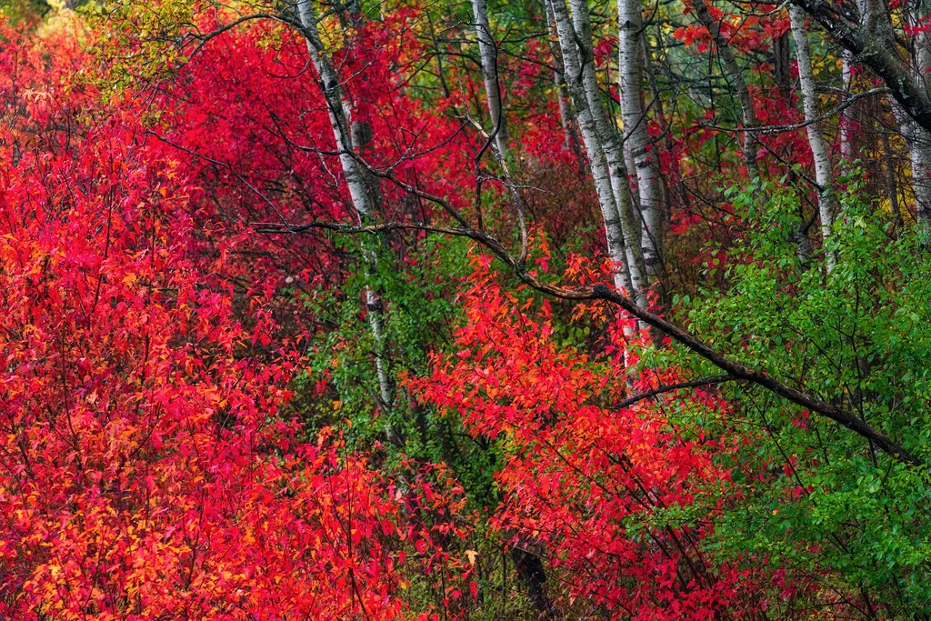
See it side by side
Complementary colors sitting opposite each other on the color wheel amplify each other and make the image vibrate. A monochromatic palette built on one hue reads as calm and unified, with less visual tension.
Color harmony refers to combinations of colors that feel visually pleasing or intentionally impactful. Several classic harmony schemes appear repeatedly in powerful photographs.
Complementary Colors
Complementary colors sit directly opposite each other on the color wheel: red and green, blue and orange, yellow and purple. These pairings create maximum contrast and visual energy. They make each other appear more vivid and saturated.
The blue and orange combination is especially common in photography. Think of a golden hour sunset sky above blue ocean water, or a warmly lit subject against a cool blue background. Orange skin tones against blue shadows is the foundation of the “blockbuster movie look” in color grading. Blue-orange complementary harmony works so well because it maps naturally onto the warm-cool contrast that occurs in real-world lighting.
Analogous Colors
Analogous colors sit next to each other on the color wheel: red, red-orange, and orange, for example, or blue, blue-green, and green. These combinations feel harmonious, calm, and unified because the colors share underlying hues.
Analogous color schemes are common in nature: autumn foliage with its reds, oranges, and yellows, or a forest scene with various shades of green and yellow-green. In landscape photography, analogous colors create a sense of cohesion and visual flow. They are less dramatic than complementary schemes but feel more natural and restful.
Triadic Colors
Triadic colors are evenly spaced around the color wheel, forming a triangle: red, yellow, and blue, or orange, green, and purple. Triadic schemes are vibrant and balanced, offering variety without the stark contrast of complementary pairs. They appear frequently in street photography, markets, and festivals where colorful elements combine in the frame.
Split-Complementary
Instead of using the direct complement of a color, you use the two colors adjacent to the complement. For example, instead of blue and orange, you would use blue with red-orange and yellow-orange. This provides strong contrast like a complementary scheme but with more variety and slightly less visual tension.
Warm vs. Cool Tones
One of the most fundamental color concepts in photography is the distinction between warm and cool tones. Warm colors (red, orange, yellow) advance toward the viewer and feel energetic, inviting, and intense. Cool colors (blue, green, purple) recede and feel calm, serene, or melancholy.
This warm-cool dynamic has enormous practical value:
- Create depth. Placing a warm subject against a cool background creates a natural sense of depth because warm colors appear to come forward while cool colors fall back. Portrait photographers use this instinctively when they light a warm-toned subject against a cool blue or green background.
- Direct attention. The eye is naturally drawn to warm colors first. A single warm element in a predominantly cool scene becomes an immediate focal point. A red door on a blue-gray street, a golden leaf on a green forest floor, or a person in an orange jacket against snowy mountains, the warm element pops.
- Set the mood. A warm color palette feels cheerful, romantic, or nostalgic. A cool palette feels contemplative, distant, or peaceful. Shifting the overall temperature of your image, through white balance or color grading, changes its emotional impact dramatically.
Color and Emotion
Colors carry emotional associations that are remarkably consistent across cultures and contexts. Understanding these associations helps you choose and emphasize colors that reinforce the story you want your photograph to tell.
- Red: Passion, energy, urgency, danger, love. Red demands attention and raises emotional intensity. Even a small amount of red in a frame draws the eye powerfully.
- Orange: Warmth, enthusiasm, creativity, friendliness. Orange feels approachable and lively without the intensity of red.
- Yellow: Joy, optimism, caution, freshness. Yellow is the brightest and most attention-grabbing color. It can feel cheerful in warm tones or sickly in green-yellows.
- Green: Nature, growth, tranquility, health, renewal. Green is the most restful color for the eye and carries strong associations with the natural world.
- Blue: Calm, trust, sadness, depth, professionalism. Blue is the most universally liked color and can convey both serenity and melancholy depending on shade and context.
- Purple: Luxury, mystery, spirituality, creativity. Purple is rare in nature, which gives it an otherworldly or special quality in photographs.
These associations are not rigid rules: context always matters. But being aware of them helps you use color as a storytelling tool rather than leaving it to chance.
Using White Balance as a Creative Tool
White balance is not just a technical correction: it is one of your most powerful creative tools for controlling color. By intentionally shifting white balance away from “accurate,” you can transform the mood of an image.
- Warming the white balance (shifting toward amber) adds golden tones that make landscapes feel sun-drenched, portraits feel inviting, and golden hour shots glow even more intensely.
- Cooling the white balance (shifting toward blue) creates a moody, melancholy, or wintry atmosphere. Blue-shifted images feel quieter and more contemplative.
- Shooting in RAW gives you complete freedom to adjust white balance in post-processing without any quality loss. This means you can try multiple color temperatures for the same image and choose the one that best serves your creative vision.
- Mixed lighting creates natural warm-cool contrasts. A tungsten-lit interior viewed through a window at blue hour, or a campfire at twilight, automatically produces complementary orange-blue color harmony.
Color in Composition
Color is a compositional element as powerful as leading lines, symmetry, or the rule of thirds. Here is how to use it actively when composing your shots:
- Use color to guide the eye. The viewer’s gaze follows a path through an image, and color can direct that path. A series of similarly colored elements creates visual flow, while a contrasting color element acts as a stopping point or focal anchor.
- Simplify your color palette. The most impactful color photographs often have a limited palette, two or three dominant colors rather than a rainbow. Simplicity strengthens the color relationships and gives the image clarity. Look for scenes where color is naturally restrained.
- Use a dominant color. Let one color dominate the frame with a smaller accent of a contrasting color. A vast blue seascape with a single red boat, or a green field with a yellow house, the smaller accent color gains enormous power precisely because it occupies less space.
- Be aware of color weight. Bright, saturated colors feel “heavier” than muted or desaturated ones. A small area of vivid red can visually balance a large area of soft blue. Use this to create balanced compositions even when elements are asymmetric in size.
- Watch for color distractions. A bright, out-of-place color in the background (a neon sign, a red car, a person in a bright jacket) can pull attention away from your subject. Train yourself to scan the edges of the frame for color distractions before pressing the shutter.
Color Grading in Post-Processing
Post-processing is where you have the most control over color. Color grading, the deliberate manipulation of color for creative effect, can unify your images, establish a signature style, and enhance the emotional impact of every photograph.
- HSL (Hue, Saturation, Luminance) adjustments. The HSL panel in Lightroom or Camera Raw lets you shift individual colors. You can make greens more teal, push oranges toward gold, or desaturate distracting colors while boosting your key colors. This is the most surgical tool for color control.
- Split toning / Color Grading panel. This lets you add different color casts to the highlights, midtones, and shadows independently. A common approach is warm highlights with cool shadows, which mimics the natural warm-cool interplay of golden hour lighting. Teal shadows with orange highlights is the “cinematic look” you see everywhere.
- Calibration panel. Lightroom’s Camera Calibration panel shifts the underlying primary colors, which affects the entire image in a global way. Small shifts here can create distinctive color signatures that are hard to achieve with other tools.
- Selective color adjustments. Use masks (radial filters, linear gradients, color range masks) to adjust color in specific areas. You might warm the subject while cooling the background, or boost saturation on a key element while desaturating everything else.
- Develop a consistent palette. Many photographers known for their distinctive style use a consistent color grading approach across their work. This does not mean every image looks identical, but there is a recognizable family resemblance in the color treatment. Presets are a useful starting point, but understanding why certain color choices work helps you adapt them to different images.
Monochromatic Color Palettes
A monochromatic palette uses variations of a single hue, different shades, tints, and saturations of one color. Monochromatic images feel cohesive, elegant, and focused. They force the viewer to see the image in terms of tone, texture, and form rather than color contrast.
You can find monochromatic scenes in nature (a misty forest in shades of green, a desert landscape in shades of gold and brown) or create them through selective framing and post-processing. Black and white photography is the ultimate monochromatic approach, reducing every image to tones of a single “color.”
When shooting monochromatic scenes, pay extra attention to tonal range, you need enough variation in lightness and darkness to maintain visual interest without relying on color contrast.
Practical Tips for Using Color in the Field
- Train yourself to see color. Before composing a shot, consciously identify the dominant colors in the scene. Ask yourself: what is the color relationship here? Is it complementary, analogous, or monochromatic? This habit will rapidly improve your color awareness.
- Scout for color. The same location can offer completely different color palettes depending on the season, time of day, and weather. Autumn foliage, spring wildflowers, golden hour warmth, and blue hour coolness all transform a scene’s color story.
- Use clothing and props strategically. In portrait and lifestyle photography, you can control color by choosing what your subjects wear and what objects appear in the frame. A red dress in a green garden is an instant complementary color composition.
- Look for isolated color. A single colorful element against a neutral background makes for an immediately compelling image. One yellow taxi on a gray street. A red umbrella in the rain. A green door in a white wall. Isolation amplifies color impact.
- Shoot in RAW. Always. Color grading flexibility in post requires the full color data that RAW files preserve. JPEG compression discards subtle color information that you cannot recover later.
Common Mistakes to Avoid
- Over-saturating everything. Pushing saturation too high makes images look garish and unnatural. Use vibrance (which protects already-saturated colors) and target your saturation boosts to specific colors using HSL.
- Ignoring color when composing. Many photographers focus on lines, shapes, and subjects but forget to consider the color relationships in the frame. A beautiful composition can be undermined by clashing or distracting colors.
- Inconsistent color across a series. If you are shooting a set of images for a project, portfolio, or client, inconsistent color grading looks unprofessional. Develop and apply a cohesive color palette across the series.
- Fighting the natural light. The color of natural light changes throughout the day. Rather than correcting it all to neutral, embrace the warm light of golden hour and the cool tones of blue hour. These natural color shifts are part of the story.
- Copying color grades without understanding them. Applying a popular preset without understanding the color theory behind it often produces mediocre results. Learn why certain color choices work so you can adapt them to your own images and shooting conditions.
Frequently Asked Questions
What are the best color combinations for photography?
Complementary pairs (blue/orange, red/green, yellow/purple) create the most visual impact. Analogous combinations (colors next to each other on the color wheel, like blues and greens) create harmony and cohesion. The “best” combination depends on the mood you want to convey, complementary for energy and contrast, analogous for calm and unity.
How do I develop a consistent color style?
Start by studying photographs you admire and identifying their color palettes. Then experiment with white balance, HSL adjustments, and split toning in your editing software until you find a combination that resonates with your aesthetic. Save your settings as a preset and use it as a starting point for your images, adjusting as needed for each shot. Consistency comes from repeated application of the same color principles, not from applying the same preset without thought.
Does color theory apply to black and white photography?
Indirectly, yes. Understanding which colors are light or dark, and which will contrast with each other, helps you predict how a scene will translate to black and white. A red and green that look contrasty in color may appear as similar gray tones in monochrome. Using color filters (or their digital equivalents) lets you control how colors convert to gray tones, which is one of the most powerful creative tools in black and white photography.
How does color affect the mood of a photograph?
Warm colors (reds, oranges, yellows) tend to create feelings of energy, warmth, happiness, or urgency. Cool colors (blues, greens, purples) evoke calm, melancholy, distance, or tranquility. Saturated colors feel intense and vibrant, while desaturated or muted colors feel subdued, nostalgic, or moody. The dominant color palette of an image sets the emotional baseline that the viewer experiences before they even consciously analyze the subject matter.
Continue Learning
Color is a lifelong study, and the more you practice seeing and using color intentionally, the stronger your photography becomes. Explore these related guides:
- White Balance Guide
- Composition Techniques
- Golden Hour Photography
- Black and White Photography
- Landscape Photography Guide
- Portrait Photography Guide
- Photography Masterclass