Print this page (Ctrl+P / Cmd+P) for a handy desk reference. This site includes a print-friendly stylesheet that removes navigation and ads automatically.
Photography Composition Rules: The Complete Quick Reference
Great composition is what separates a snapshot from a photograph. The techniques below are not rigid rules but reliable guidelines that help you organize visual elements in a frame to create stronger, more engaging images. This cheat sheet covers 12 essential composition techniques with explanations of when and how to use each one.
Composition Techniques at a Glance
| Technique | What It Does | Best For | Difficulty |
|---|---|---|---|
| Rule of Thirds | Places subject at intersection of grid lines | Almost every genre, especially landscapes and portraits | Beginner |
| Leading Lines | Guides the viewer’s eye through the frame | Landscapes, architecture, street, roads, rivers | Beginner |
| Framing | Uses elements to create a frame within the frame | Architecture, nature, portraits, street | Beginner |
| Symmetry | Creates balance through mirror-like elements | Architecture, reflections, portraits, product | Beginner |
| Patterns and Repetition | Uses repeating elements for visual rhythm | Architecture, nature, abstract, street | Intermediate |
| Golden Ratio / Spiral | Arranges elements along a logarithmic spiral | Portraits, still life, nature close-ups | Intermediate |
| Negative Space | Uses empty area to emphasize the subject | Minimalism, portraits, wildlife, editorial | Intermediate |
| Fill the Frame | Gets close to eliminate distractions | Portraits, macro, wildlife, food, sports details | Beginner |
| Depth and Layers | Stacks foreground, middle, and background elements | Landscapes, street, travel, documentary | Intermediate |
| Juxtaposition | Places contrasting elements together for impact | Street, documentary, editorial, conceptual | Advanced |
| Foreground Interest | Anchors the image with a strong near element | Landscapes, wide-angle scenes, environmental portraits | Intermediate |
| Diagonal Lines | Creates dynamic energy and movement | Action, architecture, sports, dance | Beginner |
Rule of Thirds
The rule of thirds is the most widely used composition guideline in photography. Imagine dividing your frame into a 3×3 grid with two horizontal and two vertical lines. Placing your subject or key elements along these lines, or at the four points where they intersect, creates a more dynamic and balanced image than placing the subject dead center.
How to use it: Enable the grid overlay on your camera’s LCD or viewfinder. Position the subject’s eye, a horizon line, or the main point of interest at one of the four intersection points. For landscapes, place the horizon along the top or bottom third line rather than cutting the frame in half. For portraits, position the subject’s nearest eye at the upper-left or upper-right intersection point.
When it works best: The rule of thirds works in virtually every genre. It is especially effective in landscapes (horizon placement), portraits (eye positioning), and street photography (placing a moving subject with space in front of them to “walk into”).
When to break it: Center your subject for symmetrical scenes, formal portraits, or when you want to create a confrontational, direct feel. Breaking the rule intentionally is a composition technique in its own right.
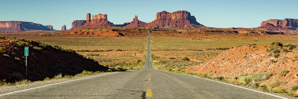
Leading Lines
Leading lines are any lines in the scene that guide the viewer’s eye from one part of the frame to another. Roads, fences, rivers, railings, shadows, rows of trees, and architectural edges all serve as natural leading lines. The strongest compositions lead the eye toward the main subject.
How to use it: Look for natural or man-made lines that converge toward your subject or toward a vanishing point. Position yourself so the lines start near the edge or bottom of the frame and travel inward. Diagonal leading lines are more dynamic than horizontal or vertical ones. Curved leading lines (like a winding path or river) add a gentle, flowing quality.
When it works best: Landscapes with roads or rivers, street scenes with sidewalks, architectural interiors with hallways, and bridges are all natural candidates for leading lines. Any time you see converging lines in a scene, try reframing to use them.
Framing
Framing uses elements within the scene to create a natural border around your subject. Doorways, windows, arches, tree branches, tunnels, and even the gap between two buildings can all serve as frames. This technique draws the eye inward, adds depth, and gives context to the subject.
How to use it: Look for openings, gaps, or shapes near the edges of your scene that you can use to border the main subject. The frame does not need to surround the subject completely. An overhanging tree branch at the top of the frame, or a doorway along one side, can be equally effective. Expose for the subject within the frame, allowing the framing element to go slightly dark for added drama.
When it works best: Architecture (doorways, arches), nature (tree canopies, cave openings), travel (looking through windows), and portraits (shooting through foliage or structures).
Symmetry
Symmetry creates a sense of balance, order, and calm. Perfect or near-perfect symmetry appears in reflections on still water, architectural facades, long hallways, and many man-made structures. It is visually satisfying because the human brain is wired to appreciate balanced patterns.
How to use it: Find a scene with mirror-like balance along a vertical or horizontal axis. Position your camera precisely on the axis of symmetry. For reflections, shoot at water level. For buildings, center yourself on the facade. Small imperfections are fine and can actually add interest, but the overall sense of balance should be strong.
When it works best: Architecture, reflections, formal portraits, product photography, and aerial/drone photography. Symmetry also pairs powerfully with centered compositions, deliberately breaking the rule of thirds for a different kind of impact.
Patterns and Repetition
Repeating elements create visual rhythm that draws the eye across the frame. Patterns can be found in tile work, rows of windows, flower fields, stacked objects, crowds, and natural textures. The power of pattern photography often comes from interrupting the pattern with a single contrasting element.
How to use it: Fill the frame with the repeating element so the pattern dominates. Use a telephoto lens to compress perspective and make the repetition more pronounced. For added interest, include one element that breaks the pattern: a red umbrella in a sea of black ones, a single person standing while everyone else sits.
When it works best: Architecture (windows, staircases), nature (leaf textures, sand ripples), markets (rows of produce), urban settings (parked bicycles, fences), and abstract photography.
Golden Ratio and Golden Spiral
The golden ratio (approximately 1:1.618) appears throughout nature and has been used in art and architecture for centuries. The golden spiral is a compositional overlay derived from this ratio, placing the tightest part of the spiral on the subject and letting the curve guide the viewer’s eye outward through the frame.
How to use it: In practice, the golden ratio places subjects slightly closer to center than the rule of thirds does. Many photographers find it helpful for still life, close-up portraits, and nature images where the rule of thirds feels too far off-center. Several photo editors offer golden ratio and spiral overlays for cropping.
When it works best: Close-up portraits (eye placement), still life, flower and macro photography, food photography, and any image where you want the eye to follow a curved path from the subject outward.
Negative Space
Negative space is the empty or unoccupied area around your subject. Rather than cluttering the frame, you deliberately leave large areas of sky, wall, water, or plain background to let the subject breathe. This creates a minimalist, powerful composition that emphasizes the subject through isolation.
How to use it: Make the subject small within the frame and give it plenty of room. A single bird against a vast sky. A person walking along an empty beach. A lone tree in a snow-covered field. The negative space should be clean and relatively uniform in tone or color so it does not compete with the subject.
When it works best: Minimalist photography, editorial and commercial work, wildlife (bird in flight against open sky), landscape (lone subject against vast environment), and any time you want to convey solitude, scale, or simplicity.
Fill the Frame
The opposite of negative space, filling the frame means getting as close as possible (physically or with a longer lens) so the subject occupies most or all of the image. This eliminates distracting backgrounds, reveals detail, and creates an intimate, impactful image.
How to use it: Move closer, zoom in, or crop tighter. For portraits, fill the frame with the face from forehead to chin. For wildlife, fill with the animal’s head and shoulders. For food, fill with the hero dish. Let textures, expressions, and details become the composition itself.
When it works best: Tight portraits, macro and detail shots, food photography, sports (capturing emotion and effort), and any scene where the background adds nothing to the story.
Depth and Layers
Photography compresses a three-dimensional world into two dimensions. Creating layers of foreground, middle ground, and background restores a sense of depth, making images feel immersive. Each layer adds a level of visual storytelling.
How to use it: Find a scene where you can identify at least three distinct depth zones. In a landscape, this might be wildflowers in the foreground, a river in the middle ground, and mountains in the background. Use a wide-angle lens at a low angle to exaggerate the separation between layers. A narrow aperture (f/8 to f/11) keeps all layers sharp.
When it works best: Landscape photography, travel, street scenes, environmental portraits, and documentary work. Any scene benefits from thinking in layers.
Juxtaposition
Juxtaposition places two contrasting elements together in the same frame to create tension, humor, or commentary. Old next to new. Big next to small. Nature against urban. The contrast between the two elements tells a story that neither could tell alone.
How to use it: Train yourself to notice contrasts in your environment. A child’s bicycle parked next to a motorcycle. A crumbling wall beside a modern glass building. A delicate flower growing through a crack in concrete. Frame the two contrasting elements with roughly equal visual weight so neither dominates.
When it works best: Street photography, documentary, editorial, conceptual art, and travel photography. Juxtaposition is one of the most advanced composition techniques because it relies on observation and storytelling rather than geometric placement.
Foreground Interest
Adding a strong element in the foreground anchors the image and creates a visual entry point. This is especially important in wide-angle landscape photography, where an empty foreground can feel like wasted space. Rocks, flowers, puddles, textures, or any interesting object near the camera can serve this purpose.
How to use it: Get low and get close to the foreground element. Use a wide-angle lens (14mm to 35mm) and a narrow aperture (f/8 to f/16) to keep both the foreground and background sharp. The foreground element should be interesting enough to hold attention for a moment before the viewer’s eye travels deeper into the scene.
When it works best: Landscape photography, seascapes, environmental portraits, travel, and any wide-angle scene that needs a visual anchor in the near field.
Diagonal Lines
Diagonal lines inject energy and movement into a composition. While horizontal lines suggest calm and stability, and vertical lines suggest strength and height, diagonals create dynamism and tension. They can be actual lines in the scene or implied lines created by the arrangement of subjects.
How to use it: Tilt your composition or reposition yourself so key lines run diagonally from corner to corner. A staircase shot from an angle. A road cutting diagonally across the frame. A row of runners leaning forward in a sprint. The diagonal creates a sense that something is happening, about to happen, or in motion.
When it works best: Action and sports, architecture, street photography, dance, and any scene where you want to convey energy or movement.
Combining Multiple Techniques
The strongest photographs often use two or three composition techniques simultaneously. A landscape might combine the rule of thirds (horizon placement), foreground interest (rocks in the near field), leading lines (a river winding toward mountains), and depth/layers (foreground, middle ground, background). A street portrait might use framing (doorway), negative space (plain wall), and the rule of thirds (subject placement).
| Genre | Primary Technique | Strong Secondary Techniques |
|---|---|---|
| Landscape | Rule of Thirds | Foreground Interest, Leading Lines, Depth/Layers |
| Portrait | Rule of Thirds / Fill the Frame | Negative Space, Framing, Symmetry |
| Street | Leading Lines / Juxtaposition | Framing, Diagonal Lines, Patterns |
| Architecture | Symmetry / Leading Lines | Patterns, Framing, Diagonal Lines |
| Wildlife | Rule of Thirds / Negative Space | Fill the Frame, Diagonal Lines |
| Macro | Fill the Frame / Golden Ratio | Negative Space, Patterns, Depth |
| Food | Rule of Thirds / Golden Ratio | Negative Space, Depth/Layers, Fill the Frame |
Common Composition Mistakes
Centering everything. Beginners tend to place the subject dead center in every shot. While centered composition works for symmetry and direct confrontation, it makes most images feel static. Practice placing subjects off-center using the rule of thirds until it becomes instinctive.
Cutting off limbs at joints. In portraits, cropping at the knees, elbows, or ankles looks unnatural. Crop at mid-thigh, mid-forearm, or mid-shin instead. Never crop at the neck.
Cluttered backgrounds. A tree growing out of someone’s head or a trash can at the frame’s edge pulls attention away from the subject. Before pressing the shutter, scan the edges and background of the frame for distractions. Move your feet or adjust your angle to clean up the composition.
Not leaving space for the subject to “look into.” When a person or animal faces one direction, leave more space on the side they are facing. A subject looking toward the edge of the frame with no room feels trapped and uncomfortable.
Tilted horizons. A horizon that is even slightly off-level is distracting in landscapes and architectural shots. Use the camera’s built-in level indicator or grid overlay to keep horizons straight. It is one of the simplest fixes that makes the biggest difference.
Ignoring the foreground in landscapes. A landscape with a beautiful sky and mountains but an empty, featureless foreground feels incomplete. Walk forward, get low, and find something interesting to anchor the bottom of the frame.
Aspect Ratio and Composition
The aspect ratio of your frame influences which composition techniques work best. A 3:2 frame (standard for most cameras) gives you room for sweeping landscapes with foreground interest and generous negative space. A 4:3 frame (Micro Four Thirds, many smartphones) is slightly taller and favors portraits and tighter compositions. A 1:1 square frame rewards centered subjects, symmetry, and bold graphic compositions because there is no dominant axis.
Consider your output format before you shoot. If the final image will be cropped to 16:9 for a website banner, compose with that horizontal strip in mind and keep key elements away from the top and bottom edges. If you are shooting for Instagram’s 4:5 vertical format, the tall frame favors strong vertical leading lines, layered depth, and centered subjects.
Many photographers compose slightly loose in camera and finalize the crop in post-processing. This gives flexibility but costs resolution. If you know the final aspect ratio, composing precisely in camera preserves maximum image quality and forces more deliberate creative choices.
Color as a Composition Tool
Color is one of the most powerful but often overlooked composition tools. Warm colors (red, orange, yellow) advance toward the viewer and demand attention. Cool colors (blue, green, violet) recede and feel calm. Placing a warm-colored subject against a cool background creates natural separation and visual hierarchy without relying on depth of field at all.
Complementary colors (opposites on the color wheel, like blue and orange or red and green) create vibrant contrast that energizes the frame. Analogous colors (neighbors on the wheel, like blue and teal) create harmony and calm. Monochromatic compositions (different shades and tones of a single color) emphasize form, texture, and light over color itself.
Pay attention to small splashes of color that can anchor or distract. A single red element in an otherwise muted scene becomes a powerful focal point. A bright yellow trash can at the edge of a street scene pulls the eye away from the subject. Awareness of color lets you include or exclude elements deliberately, strengthening your composition before you even think about geometric rules.
Visual Weight and Balance
Every element in a photograph carries visual weight, determined by its size, brightness, color saturation, contrast, detail, and position in the frame. A small, bright object can balance a large, dark one. A person’s face, no matter how small in the frame, carries enormous visual weight because viewers are instinctively drawn to human features.
Balanced compositions distribute visual weight evenly across the frame, creating a sense of stability and completeness. Unbalanced compositions place heavy weight on one side, creating tension and unease, which can be a deliberate storytelling choice. The rule of thirds naturally creates a form of balanced asymmetry: the subject at one intersection point is balanced by negative space or secondary elements at the opposing points.
Practice evaluating visual weight by squinting at your scene. Squinting blurs detail and reduces the image to broad areas of light and dark, making it easier to see whether the composition feels balanced or lopsided. If one side of the frame pulls your attention excessively, consider repositioning, adding a balancing element, or embracing the imbalance as a creative choice.
Composition Cheat Sheet FAQ
What is the most important composition rule in photography?
The rule of thirds is the most universally useful composition guideline. It works across every genre and is easy to apply using your camera’s grid overlay. Once it becomes second nature, you will find your images immediately look more polished and intentional.
Should I always follow composition rules?
No. Composition “rules” are guidelines, not laws. Learn them so you can apply them instinctively, and then break them intentionally when a different approach serves the image better. A centered subject can be more powerful than an off-center one. An empty frame with no foreground interest can convey vastness. The key is to break rules on purpose, not by accident.
How do I improve my composition skills?
Practice with constraints. Spend a week shooting only with the rule of thirds. Then a week focused on leading lines. Then framing. Focused practice builds instinct faster than trying to remember all techniques at once. Study photographs you admire and identify which composition techniques they use. Over time, you will start seeing compositions everywhere before you even raise the camera.
Can I fix composition in post-processing?
Cropping can improve composition after the fact, but you lose resolution with every crop. It is always better to compose in-camera when possible. That said, a thoughtful crop that strengthens the composition is far better than keeping a full-resolution image with a weak layout. Most photo editors offer rule of thirds and golden ratio overlays in the crop tool.
What is the difference between the rule of thirds and the golden ratio?
Both are ways to place subjects off-center, but the golden ratio (1:1.618) positions the subject slightly closer to the center than the rule of thirds does. In practice, the difference is small, and many images that “follow the golden ratio” also approximate the rule of thirds. The golden spiral adds a curved flow that works well for images where you want the eye to follow a sweeping path through the frame.
How do I compose with a smartphone?
Enable the grid overlay in your phone’s camera settings (both iPhone and Android have this option). All the same composition techniques apply to smartphone photography. The wide-angle lens on most phones makes foreground interest, leading lines, and depth/layers especially effective.
What composition technique is best for Instagram?
Instagram’s square and 4:5 formats favor centered compositions, symmetry, and fill-the-frame approaches because the tighter aspect ratio leaves less room for elaborate scene-setting. Negative space also works well on mobile screens because the simplicity reads clearly at small sizes. Leading lines and rule of thirds remain effective in landscape-oriented posts.