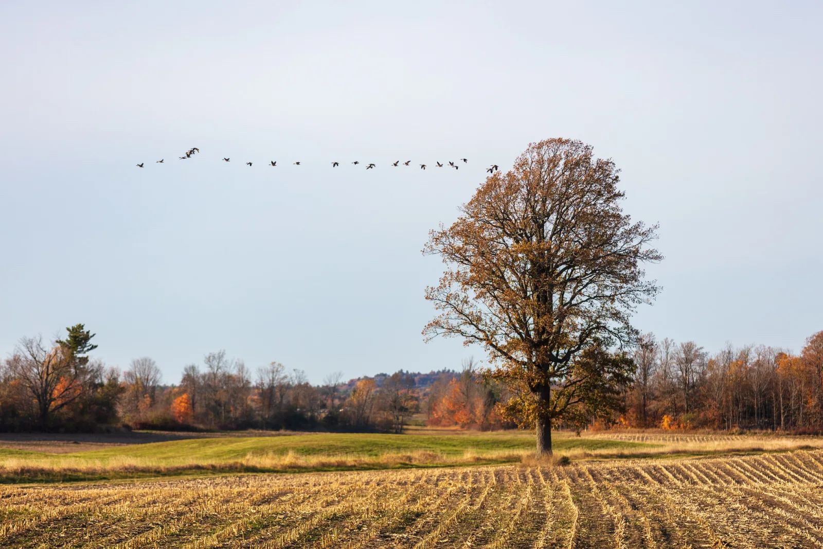
The rule of thirds is a composition guideline: divide the frame into nine equal boxes with two vertical and two horizontal lines, then place your subject on one of those lines or near one of the four points where they cross, instead of dead centre. It matters because it is the quickest way to break the most common habit in photography, putting everything in the middle, and it gives you a starting point for where the horizon, a face or a moving subject should go.
This page explains why the grid works and where it came from, how to use it for single subjects, portraits, landscapes and moving subjects, how the lines move when you change the shape of the frame, how to fix a frame by cropping, and when to ignore it. It is one tool within photography composition, and painters and designers use the same grid.
The grid: four lines and four crossing points
Picture a tic-tac-toe board laid over your photo. Two vertical lines split the width into three equal parts. Two horizontal lines split the height into three equal parts. That gives nine boxes, four lines and four crossing points. Some photographers call the crossing points power points.
The rule asks you to put the most important thing in the picture on a line or near a crossing point. You do it by moving the camera, not the subject: turn a little, step to one side, crouch or stand taller.
The lines sit at one third and two thirds of the way across and down. On a frame 6000 pixels wide and 4000 tall, the vertical lines fall at 2000 and 4000 pixels from the left edge, and the horizontal lines at about 1333 and 2667 pixels from the top. You never need the numbers in the field. They show one thing that matters: the lines are measured from the edges of the frame, so they move whenever the frame changes shape.
Switch the grid on over real photos to see where the lines fall, then crop one yourself and put the subject on a third.
Why it works: stay out of the middle and away from the edges
The clearest way to understand the rule is as two warnings rolled into one.
- Keep the subject out of the centre, unless the scene is symmetrical. A subject in the exact middle splits the frame into two matching halves. Nothing on either side is more important than the other, so the picture tends to sit still, like a target.
- Keep the subject away from the edges. A subject jammed against the border looks cut off or about to leave, and the eye tends to slide out of the picture with it.
Mark a band down the middle of the frame and a band around the edges, and the zone that is left over looks a lot like the thirds grid. That is why “near a line” works just as well as “exactly on a line”, and why centring is still the right answer for a face looking straight at you or a building seen head on. The grid is a convenient place to aim, not a target you have to hit.
Off-centre placement also does something positive. It gives the frame a main side and a quieter side, and the quieter side becomes space you can use: sky for a bird, water in front of a boat, a wall beside a face. That is where most of the feeling of balance in a thirds composition comes from.
Where the rule came from, and what the evidence says
The phrase comes from painting, not photography. In 1797 the English painter and engraver John Thomas Smith wrote about a “rule of thirds” in a book on painting rural scenes. He was talking about proportion: a picture balances better when one element, such as sky, land, light or shadow, takes about two thirds of it and the other about one third, rather than a half each. He applied the same two to one split to where lines such as the horizon should fall. The grid with four crossing points came later, as the idea was turned into a simple overlay.
That origin is still useful. It means the rule is as much about areas as about points. Two thirds sky and one third land is the original idea, and it is often the more important half of the rule in a landscape.
How well does the rule predict a good photo? Not very. Researchers who measured how closely large sets of photos fit the grid found that highly rated photos fit it hardly better than ordinary ones, and there is no solid evidence that viewers’ eyes go to the crossing points first. So treat the rule for what it is: a habit that moves you off the centre and makes you think about space. Once a frame is off-centre, judge it by eye.
Placing a subject on the lines and crossing points
Start with one clear subject and ask where it should sit. A few working habits cover most scenes.

- One subject: put it near a crossing point. Which of the four you pick depends on where it faces and what else is in the scene.
- Two subjects: try one near each of two diagonal crossing points. A pair of people, two boats or a figure and a doorway often settle into a balanced frame this way.
- A tall vertical, such as a tree, post, rock pillar or standing person: run it along a vertical line rather than parking it on a single point.
- A long horizontal, such as a shoreline or a fence: run it along a horizontal line.
- The rest of the frame: use the two thirds on the other side of your subject deliberately. Plain sky, water, wall or shadow is not wasted. It is the space that makes the subject read. See negative space for how to use it well.
Only the subject earns the line. A lamp post on a third does nothing if the picture is really about the person beside it. Decide what the photo is about first, then place that. If two things compete for the eye, visual hierarchy helps you choose which one leads.
Portraits: eyes on the upper line, space in front of the face
In a portrait, the eyes carry the picture, so they get the placement. Put them on or near the upper horizontal line. That leaves the lower two thirds for shoulders, hands or the surroundings and avoids the common problem of a head floating in the middle of the frame with empty space above it.
Sideways position matters too. If your subject turns or looks to one side, put them on the opposite vertical third so there is space in front of the face. This is called look space or nose room, and a face pressed against the edge it is looking toward feels cramped. The same goes for an animal or a bird looking across the frame.
For environmental portraits, where the person is shown at work or at home, put the person on a third and let the other two thirds show the place. The empty part of the frame tells half the story. With a shallow depth of field, focus on the eye nearest the camera so the sharpest point and the placement agree.
A head and shoulders portrait of someone looking straight into the lens is the main exception. A frontal face is symmetrical, and centring it horizontally often looks stronger than pushing it to a side. Keep the eyes near the upper line and let the face sit in the middle.
Landscapes: decide between sky and ground
The horizon is the longest line in most landscape pictures, and a horizon through the middle splits the image into two equal, competing halves. Move it to the upper or lower horizontal line, and decide with one question: which is more interesting, the sky or the ground?
- Interesting ground: rocks, flowers, a textured field or a path. Put the horizon on the upper line so the ground fills the lower two thirds and the sky is a one third band.
- Interesting sky: a storm, layered clouds, or colour near sunrise or during golden hour. Put the horizon on the lower line so the sky takes two thirds.
- Both are dull: look for a different view, not a different line.
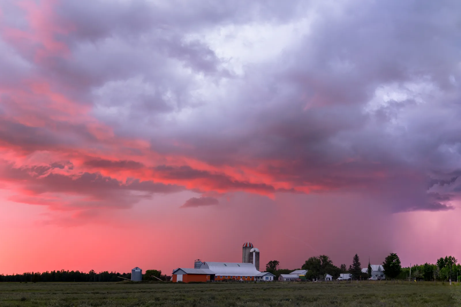
The thirds are a starting point, not a limit. When the sky is extraordinary, giving it even more than two thirds can be right. When the ground is everything, the sky can shrink to a sliver or leave the frame. What you are avoiding is the even split.
The one landscape where a centred horizon is the right call is a mirror reflection. When still water repeats the mountains, trees or sky, the reflection is the subject, and a horizon across the middle lets the two halves match. See reflection photography for how to get the water still enough.
Then place the landmark. A lone tree, a mountain peak, a lighthouse or a boat can sit near a crossing point rather than dead centre. A tree on the left vertical line with the horizon on the lower line is a complete composition on its own. A leading line, such as a road, a fence or a shoreline, can then run toward that point and pull the viewer in.
Is the horizon sloping even though you placed it on a line? How to crop photos covers straightening and what it costs at the corners.
Moving subjects and lead room
A car, a runner, a bird in flight or a cyclist has a direction. Give it more room in front than behind. Put the subject on the vertical third at the back of its movement so two thirds of the frame lie ahead, in the direction it is heading.
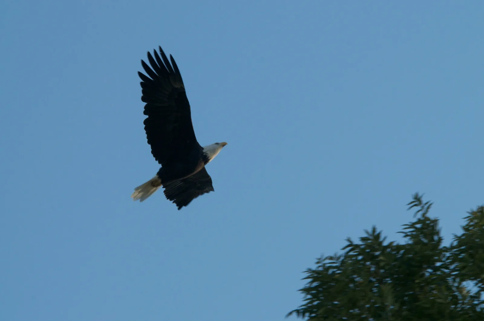
Space ahead lets the movement continue inside the frame. With no room in front, a subject seems about to hit the border. This is lead room, the same idea as look space in a portrait, and video camera operators use it the same way.
Leave less room only on purpose. A subject at the frame edge, with plenty of space behind, can suggest that something has just left, or that the subject is fleeing, or simply add tension. If the action is fast, frame a little wider than you think you need, keep the subject sharp with AF tracking, and place it accurately when you crop later.
Not sure how much room to leave in front of a face or a moving subject? The rule of space covers lead room, nose room and when to break them.
How the grid changes with the shape of the frame
The lines always sit at one third and two thirds of each side, so they move with the frame. This table shows where the horizontal lines fall for four common shapes, all 6000 pixels wide, so the vertical lines stay at 2000 and 4000.
| Aspect ratio | Height at 6000 px wide | Upper line from top | Lower line from top | Height of each third |
|---|---|---|---|---|
| 3:2 | 4000 px | about 1333 px | about 2667 px | about 1333 px |
| 4:3 | 4500 px | 1500 px | 3000 px | 1500 px |
| 1:1 (square) | 6000 px | 2000 px | 4000 px | 2000 px |
| 16:9 | 3375 px | 1125 px | 2250 px | 1125 px |
Here is why that matters. Say a tree sits exactly on the left line of a 3:2 frame, 2000 pixels from the left edge. Crop that frame to a centred square 4000 pixels wide and you cut 1000 pixels from each side. The tree is now 1000 pixels from the new left edge, which is one quarter of the way across, not one third. Every crop moves the grid, so you place the subject after you pick the shape, not before. See aspect ratio for what each shape does to a picture.
Square frames deserve a note of their own. With equal sides, the thirds grid has no long direction to lean into, and centred, symmetrical compositions often look stronger in a square than in a rectangle. If you shoot square, try both. Square format photography goes further.
Turning on the grid in a camera or phone
Nearly every camera and phone can draw the grid over the picture while you compose. The setting has a different name on different devices, but look in the menus for words like grid, gridlines, framing grid, composition grid or viewfinder overlay. Some cameras offer a simple nine box grid and others offer finer ones. Pick the nine box version.
- Camera with an electronic viewfinder or rear screen: the grid is a display option you switch on in the menu. It does not appear in the saved picture.
- Camera with an optical viewfinder: some bodies can show a grid in the viewfinder; on others it appears only on the rear screen in live view.
- Phone: look in the camera settings for grid or gridlines. See phone camera settings for other options worth turning on.
The grid has a second job: it is a level. Line the horizon or a building’s verticals up with a grid line before you press the shutter, and you will have less to straighten later.
Use the grid as a check, not a cage. Compose the way you naturally would, glance at the lines, and nudge the subject onto one. After a few weeks of this, you start seeing the thirds without the overlay.
Cropping to thirds afterwards
Often the best thirds composition is made after the shutter. If your subject was too central, crop to move it. The crop tool in most editing programs shows a thirds overlay, and you can drag the frame until the subject lands on a line.
- Pick the aspect ratio you want to keep first. As the table above shows, changing the shape moves all four lines.
- Straighten the horizon before you judge the placement.
- Drag the frame so the subject sits near a vertical line or crossing point, and the horizon on a horizontal line.
- Check how much resolution is left. A tight crop is fine for a screen but may be too small to print large.
Cropping can only remove edges, so it cannot add room that was never there. Crop a runner to give lead room ahead and you may run out of frame behind. If you know you will crop, shoot a little wider. Photo editing for beginners covers the crop tool alongside the other first edits.
When to break the rule and what to use instead
The rule of thirds trains you to move subjects off the middle and think about balance. Once you understand why it works, you can ignore it on purpose. Five situations call for it.
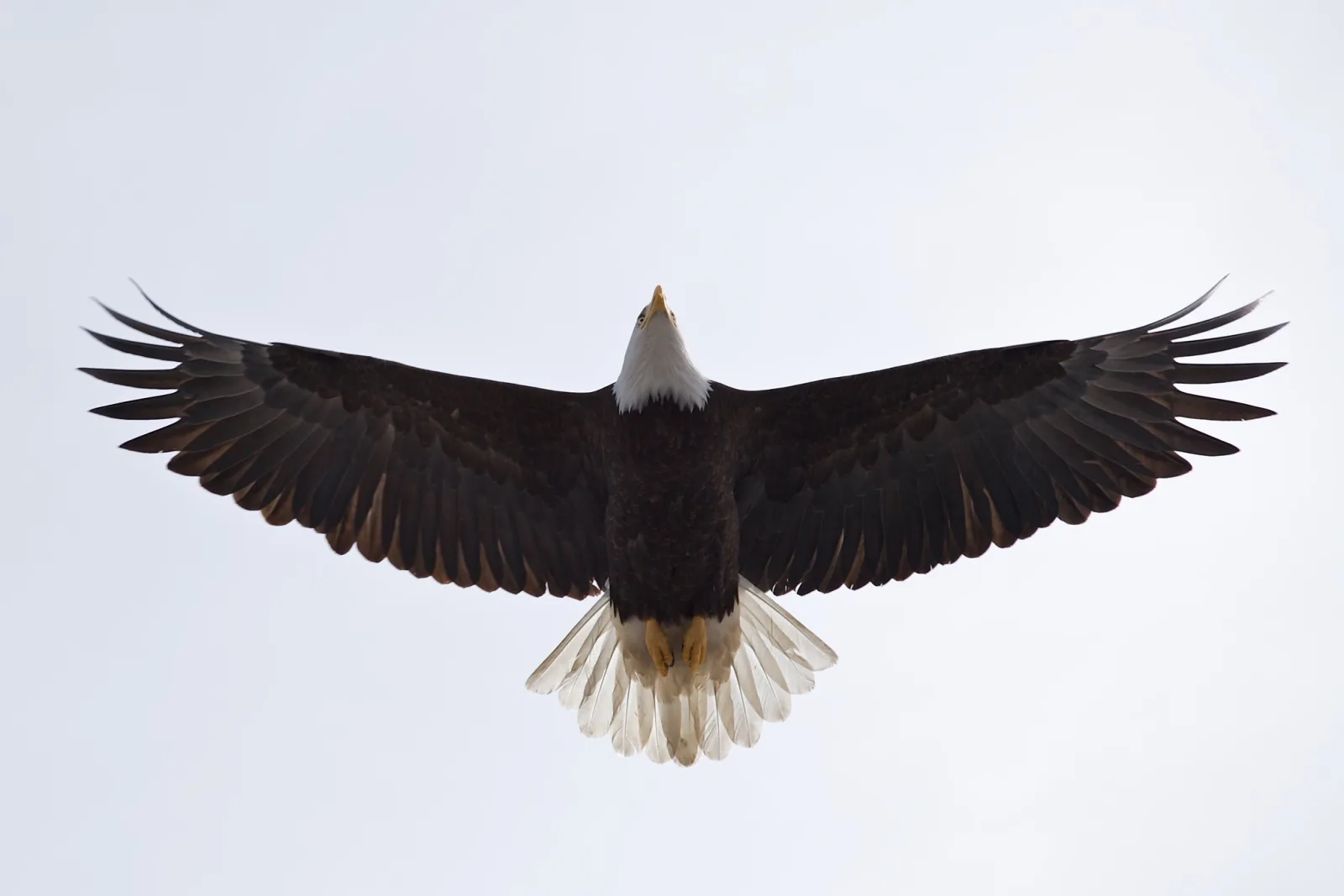
Centre the subject when symmetry is the point. Architecture, corridors, tunnels, a bird with both wings spread and a face looking straight at the camera often work best in the centre, because the two halves match. See symmetry in photography.
Centre the horizon for a reflection. When the water mirrors the scene, the matching halves are the picture.
Fill the frame when the subject is the whole story. A close-up of a face, a flower or a texture has no room for a grid. Fill the frame and the thirds stop mattering.
Push to the edge for tension. A subject at the extreme edge of the frame can feel uneasy or isolated, which is sometimes exactly what the picture needs. Use it deliberately and check the edge for tangents and mergers.
Let a pattern run edge to edge. When repetition is the subject, there is no single thing to place on a line. See patterns and repetition.
See it side by side
Placing the subject on a thirds line or intersection creates tension and movement. Dead center works when the scene has symmetry to earn it. Neither is wrong. Knowing why you chose is what matters.
The thirds grid and the golden ratio
The golden ratio grid, sometimes called the phi grid, puts its lines at about 0.382 and 0.618 of each side instead of 0.333 and 0.667. On the same 6000 by 4000 frame, its vertical lines fall at about 2292 and 3708 pixels and its horizontal lines at about 1528 and 2472. Each line sits roughly 290 pixels closer to the centre across the width, about 5 percent of the frame. The golden spiral is a different overlay again, a curve that winds toward one point. Neither is a stronger law than the thirds, and the thirds grid is easier to use in the field because every camera can show it.
Other ideas deal with what the grid leaves out. The rule of odds covers groups, and visual weight explains why a small bright subject on one third can balance a large dark area on the other two.
Want the other composition techniques in one place? The composition cheat sheet lists them side by side, with the rule of thirds among them.
Common mistakes and misconceptions
Putting something on a line just because it is there. The rule helps only if the thing on the line is the subject. Fix: decide what the picture is about first, then place that.
Treating the grid as exact. Chasing a precise crossing point wastes time, and the evidence does not say the points themselves are special. Fix: aim for near a line and away from the centre and edges, then judge by eye.
Thinking only about points, not areas. The original rule was about proportion: two thirds of one thing, one third of another. Fix: check how much of the frame each part takes, especially sky against land.
Forgetting the empty two thirds. The space on the other side should be doing a job. Fix: ask what the empty part adds, and if the answer is nothing, change the framing or fill it.
Facing the subject out of the frame. A person or animal on the right third but looking right runs out of room. Fix: put them on the third opposite their gaze or direction.
Placing the subject, then changing the crop. A subject on a third of a 3:2 frame is no longer on a third after a square crop. Fix: choose the shape first, then place.
Believing a centred subject is always a mistake. Symmetry, reflections and faces looking straight at the camera often work best centred. Fix: centre on purpose, not by default.
Using it on every picture. If every photo has the subject on the same third, they all feel alike. Fix: change which line or point you use, and break the rule when the scene asks for it.
Is a small subject on a third getting lost? Framing in photography shows how a doorway, branch or window can hold the eye on it.
Try this: a 10 minute thirds walk
Turn on the grid, then take ten minutes around your house, street or a park.
- Pick one simple subject, such as a mug, a tree, a bench or a friend.
- Take a first frame with the subject dead centre.
- Take a second with the subject on the left vertical line, and a third with it on the right. Look at what fills the empty space each time.
- If the scene has a horizon or a table edge, take one frame with it on the upper line, one on the lower line and one through the middle.
- Find a moving thing, like a person walking or a passing car, and take two frames: one with space ahead of it and one with space behind.
- Find something symmetrical, such as a doorway, a window or a bench seen head on, and shoot it centred and on a third.
How to judge the result: put each set side by side on a screen and pick the best frame of each without thinking about the rule. Then check which one you picked. If the off-centre frames win for the single subject and the horizon, and the centred frame wins for the symmetrical scene, you have found where the rule helps and where it does not. Finally, crop your centred frame of the first subject so it lands on a third, and see whether there was enough room around it to do so.
Want to check you can place a subject, a horizon and a moving subject? Try the rule of thirds and composition quiz.
Frequently asked questions
What is the rule of thirds in photography?
It is a guideline that divides the frame into nine equal boxes with two vertical and two horizontal lines. You place the main subject on a line or near a crossing point rather than in the centre, and give the larger part of the frame to whatever matters more, such as sky or ground.
Do you have to put the subject exactly on the intersection?
No. Near a line is enough. What the rule really steers you away from is the dead centre and the edges, so anywhere in the zone around the lines works, and you judge the final position by eye.
Where should the horizon go in a landscape?
On the upper line if the ground is the more interesting part and on the lower line if the sky is. Avoid the middle unless still water is reflecting the scene, where a centred horizon lets the two halves match.
Do you always have to follow the rule of thirds?
No. Symmetrical scenes, reflections, frontal faces, close-ups and patterns often look best centred or filled edge to edge. Research has found little link between fitting the grid and being rated a good photo, so use it as a habit that moves you off the centre, not as a law.
How do I turn on the grid on my camera or phone?
Open the camera or display settings and look for grid, gridlines or a composition overlay. Choose the nine box grid. It shows on the screen while you shoot and is not saved in the picture.
Is the rule of thirds the same as the golden ratio?
No. The thirds grid puts its lines at one third and two thirds of each side, while the golden ratio grid puts them at about 0.382 and 0.618, a little closer to the centre. The thirds are simpler to use, and the difference is small enough that a subject near one is close to the other.