Many photographers specialize in black and white photography due to its sheer power, elegance, and beauty. However, black and white photography is not simply color photography with the color removed. It has its own set of rules and conventions, requiring unique approaches to mood, contrast, and tone since color is not present to set emphasis or create visual separation.
In this lesson, you will learn to see the world in tones rather than colors, understand how tonal range determines the success of a black and white image, and develop the skills to create compelling monochrome photographs.
Why Black and White?
Black and white photography strips an image down to its essential elements: light, shadow, form, and texture. Without the distraction of color, the viewer’s attention shifts to the composition, the quality of the light, and the emotional content of the scene. This is why black and white remains popular despite the universal availability of color photography.
Some subjects are stronger in black and white than in color. Portraits often gain emotional depth when color is removed, because the viewer focuses on expression, skin texture, and the interplay of light and shadow on the face. Architectural photography benefits from black and white because it emphasizes geometric forms and structural patterns. Moody landscapes, foggy scenes, and high-contrast street photography all translate powerfully into monochrome.
Black and white photography also teaches you to see more carefully. When you train yourself to look past color and evaluate a scene in terms of light and dark values, you develop a deeper understanding of how images work, and that understanding improves all of your photography, including your color work.
The Importance of Tonal Range
Tones are the most important element of black and white photography. As humans, we generally perceive colors without actively thinking about their tonal range. When we see light blue and yellow, we see distinct colors. But in a black and white photograph, light blue and yellow may appear nearly identical in tone, creating a flat, indistinct image without careful tonal management.
Take a look at this color photograph:

Now notice the difference when the same photograph is converted to black and white. The result is flat and unremarkable due to similar tones across the color spectrum, which results in a lackluster black and white image:

As a black and white photographer, you need to train yourself to see the world in tones. Consider the range of tones from dark to light and focus on the presence of strong whites and deep blacks to create visually compelling images. Shadows take on added significance because colors will not provide contrast, so you must use tonal differences, texture, and form to create visual separation and emphasis.
Understanding Tonal Range
Tonal range refers to the span of tones between the lightest and darkest parts of an image. A wide tonal range includes deep blacks and bright whites, while a narrow tonal range leans toward mid-range greys. Here is a visual representation of a tonal range spectrum:

Consider this tonal scale as the “color palette” for black and white photography. Practice identifying the lightest and darkest tones in your surroundings. Is the room predominantly light, dark, or filled with varied greys? The most engaging black and white photos often contain both extremes of this spectrum rather than just mid-tones.
Try This: Tonal Range Observation
Spend ten minutes looking at the room you are in right now. Squint your eyes to reduce detail and simplify what you see into light, medium, and dark areas. Where are the brightest highlights? Where are the deepest shadows? Are there areas of strong contrast where a bright surface meets a dark one? These zones of contrast are exactly where the strongest black and white photographs hide. Try photographing these areas and converting the images to black and white. Compare the results with a photograph of an evenly-lit surface, and you will see why tonal range matters so much.
The Histogram: Your Most Valuable Tool
The histogram, found in every digital camera and in editing software like Lightroom and Photoshop, provides a graphical representation of tonal range in an image. It is a powerful tool for black and white photographers because it lets you see at a glance whether your image contains the full spectrum of tones or is bunched into a narrow range.
In Photoshop, you can view the histogram under “Image > Adjustments > Levels.” Here is what the Levels box looks like:
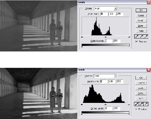
On the left, dark tones are represented, while light tones are on the right, with mid-tones in the center. The height of the bars represents the number of pixels of each tone. A wide tonal range with peaks in both dark and light tones often indicates a more visually dynamic image.
When evaluating a black and white image, check whether the histogram spans the full range from left to right. An image whose histogram is bunched in the middle (all mid-greys) will look flat and lifeless. An image with data reaching toward both ends (deep blacks and bright whites) will typically have more visual impact.
Tonal Range vs. Tonal Balance
While a wide tonal range is desirable, tonal balance (equal representation across all tones) is not necessary and can even detract from the visual appeal. Look at the example below, where shadows and dark tones dominate the image but with enough light tones to add range:

In this portrait, dark tones dominate with enough white highlights (eyes, lips, cheeks) to create a wide tonal range, even though it is unbalanced. This deliberate imbalance creates mood: the darkness conveys drama and intensity, while the highlights draw your eye to the most important features of the face. Achieving tonal range often trumps striving for perfect tonal balance.
This concept connects directly to the ideas of high key and low key photography:
- High key images are dominated by bright tones with minimal shadows. They feel airy, optimistic, and clean. Think white backgrounds, bright light, and minimal contrast.
- Low key images are dominated by dark tones with selective highlights. They feel dramatic, moody, and intense. Deep shadows with isolated bright areas create visual tension.
Both approaches use wide tonal range (there are still blacks in a high key image and whites in a low key image), but the balance of tones shifts dramatically in one direction to create a specific mood.
What Makes a Good Black and White Subject
Not every photograph works well in black and white. Some subjects are strengthened by the removal of color; others lose their primary appeal. Learning to distinguish between them is a critical skill.
Subjects that tend to work well in black and white:
- Strong contrast – Scenes with dramatic differences between light and dark areas translate powerfully to monochrome
- Texture and pattern – Without color to attract the eye, texture becomes a primary visual element. Rough surfaces, fabric, weathered wood, wrinkled skin, and architectural detail all gain prominence
- Geometric shapes – Buildings, bridges, stairways, and other architectural subjects are defined by form rather than color
- Emotional portraits – Removing color from a portrait focuses attention entirely on expression, gesture, and the quality of light on the face
- Foggy or misty scenes – Atmospheric conditions that naturally reduce color saturation translate beautifully to black and white, creating layered, ethereal images
- Silhouettes – Pure form against light is inherently monochromatic
Subjects that often lose impact in black and white:
- Scenes where color is the primary point of interest (autumn foliage, sunsets, colorful markets)
- Images that rely on color contrast for visual separation (a red subject against a green background may become indistinguishable in monochrome)
- Low-contrast scenes with narrow tonal range and no strong textural or geometric elements
Try This: Color vs. Monochrome Comparison
Take 10 photographs of different subjects: a portrait, a landscape, a close-up of food, an architectural detail, a street scene, a flower, and so on. Process each in both color and black and white. For each pair, decide which version is stronger and write down why. This exercise will quickly develop your instinct for recognizing subjects that suit black and white treatment.
Camera Settings for Black and White
Even though you will likely do your final black and white conversion in editing software, there are camera settings and shooting practices that help you capture better raw material for monochrome images.
- Shoot in RAW. Always shoot in RAW format when planning black and white work. RAW files preserve all of the color data, which gives you far more control over how individual colors convert to grey tones in post-processing.
- Use your camera’s monochrome preview. Many cameras let you set the picture style or film simulation to black and white. When you do this while shooting RAW, the preview on your LCD will show in black and white (helping you evaluate tonal range on the spot), but the RAW file still contains full color data for flexible processing later.
- Expose for the highlights. In black and white photography, blown-out whites are difficult to recover. Keep your highlights under control and recover shadow detail in post-processing, where it is much easier to lighten dark areas than to restore lost highlight information.
- Look for directional light. Side light, back light, and any light that creates shadows will produce images with stronger tonal range than flat, front-on illumination.
Converting to Black and White in Post-Processing
Simply desaturating a color image (removing all color) produces the weakest black and white conversions. Instead, use dedicated black and white tools in your editing software to control how each color translates to a grey tone.
In Lightroom, the B&W panel lets you adjust the luminance of individual color channels. By brightening the orange channel and darkening the blue channel, you can darken a blue sky while keeping skin tones bright, similar to the effect of using a colored filter on film. Experiment with each channel slider to see how dramatically the feel of the image changes when you adjust how colors map to tones.
Key adjustments for strong black and white conversions:
- Contrast – Most black and white images benefit from a moderate increase in contrast to separate tones and add punch
- Clarity – Adds mid-tone contrast that enhances texture and detail, which is particularly effective in monochrome
- Channel mixing – The most powerful creative tool. Darkening blues deepens skies; brightening oranges and reds flatters skin tones
- Dodging and burning – Selectively lightening and darkening areas to guide the viewer’s eye and add dimensionality. This technique has been fundamental to black and white photography since the darkroom era.
Try This: Channel Mixing Exercise
Take a single color photograph that contains at least three distinct colors (a landscape with blue sky, green foliage, and brown earth works well). Convert it to black and white using your editing software’s channel mixer or B&W panel. Create three different versions by dramatically adjusting the color sliders. Save each version and compare them side by side. Notice how manipulating the color channels completely changes the mood and emphasis of the image, even though all three are technically “black and white.”
Common Mistakes in Black and White Photography
- Converting weak color photos hoping they will look better. A photograph that does not work in color rarely works in black and white. Monochrome conversion is not a rescue tool. Start with a strong image.
- Ignoring tonal separation. If your subject and background are the same tone of grey, they will blend together and the image will look flat. Before shooting, squint at the scene and check whether your subject stands out tonally from its surroundings.
- Avoiding true blacks and whites. Many beginners produce black and white images that are really “grey and grey.” Do not be afraid of pure black shadows and bright white highlights. They create visual energy and anchor the image.
- Over-processing. Excessive contrast, heavy vignetting, and artificial grain can make black and white images look overwrought. Aim for a natural, timeless quality rather than an Instagram filter aesthetic.
- Not studying the masters. Look at the work of Ansel Adams, Henri Cartier-Bresson, Dorothea Lange, Sebastiao Salgado, and other masters of black and white. Study how they used tonal range, contrast, and composition to create images of extraordinary power.
Lesson Summary
Black and white photography is a distinct discipline that requires you to see the world differently. Success depends on understanding tonal range, recognizing subjects that suit monochrome treatment, and developing post-processing skills that go beyond simple desaturation. Use the histogram as your guide, shoot in RAW for maximum flexibility, and practice seeing in tones rather than colors. The exercises in this lesson are designed to accelerate that shift in perception. Spend time with them, and you will quickly notice improvement in your black and white work.
For more in-depth techniques and examples, see our complete Black and White Photography Guide.