Strip away color, and what remains? Shape, form, texture, light, shadow, contrast, and emotion. Black and white photography forces both photographer and viewer to engage with the fundamental building blocks of visual art. Without the crutch of vivid color to create impact, a monochrome image must succeed purely on the strength of its composition, its tonal range, and its ability to communicate feeling through light and dark. This discipline makes black and white photography one of the most rewarding and instructive practices in the photographic art.
Seeing in Monochrome: Training Your Eye
The biggest challenge in black and white photography is not technical. It is perceptual. We see the world in color, and our visual system uses color as a primary way to distinguish objects, evaluate light, and create emotional responses. Photographing effectively in black and white requires training yourself to see past the colors and recognize the underlying tonal values, textures, shapes, and patterns that will define the monochrome image.
Start by squinting at scenes. This partially closes your iris, reducing your color perception and making tonal differences more apparent. When you squint, you begin to see the world more as your camera will render it in black and white: areas of light and dark, high contrast and low contrast, sharp edges and soft gradations.
Pay attention to how different colors translate to similar tones of gray. A red apple and a green leaf may look dramatically different in color but can appear nearly identical in grayscale. Understanding these tonal equivalencies is crucial because elements that rely on color contrast for separation in a color image may merge into an indistinct mass in black and white. What creates separation in monochrome is luminance contrast: the difference in brightness between adjacent areas.
Many cameras offer a monochrome preview mode that displays the live view or EVF image in black and white while still recording the full-color RAW file. This is an invaluable training tool. Shoot with monochrome preview enabled for several sessions, and you will rapidly develop the ability to pre-visualize how a color scene will translate to black and white.
What Makes a Strong Black and White Image
Not every photograph works well in black and white. The images that thrive without color share certain characteristics that you should look for when deciding whether to shoot or convert a scene monochromatically.
Strong Contrast
Black and white photography lives and dies by contrast. High-contrast scenes with deep blacks and bright whites create visually striking monochrome images. The interplay between light and shadow becomes the primary visual language, and strong contrast ensures that language is spoken loudly and clearly. Look for scenes where directional light creates defined shadows: sidelighting, backlighting, and hard overhead light at midday can all produce excellent high-contrast material for black and white work.
Rich Texture
Texture is amplified in black and white because the viewer is not distracted by color. Rough stone walls, weathered wood, wrinkled skin, bark, sand ripples, fabric weaves, and metallic surfaces all become more tactile and immediate in monochrome. Directional light, especially low-angle sidelight, emphasizes texture by casting tiny shadows across the surface irregularities. If a scene has beautiful textures, it is a strong candidate for black and white treatment.
Compelling Shape and Form
Without color to define objects, shape and form take on heightened importance. Silhouettes, which reduce subjects to pure shape, are inherently monochromatic in nature and work beautifully in black and white. Three-dimensional form, revealed by the gradual transition from light to shadow across a curved surface, becomes the primary way that objects communicate their physical presence. Portraits, nude studies, architectural photographs, and still life images all benefit from this emphasis on form.
Pattern and Repetition
Repeating patterns, whether architectural details, rows of trees, waves on sand, or geometric arrangements, gain visual power in black and white. Color in patterned scenes can sometimes create distracting complexity, while monochrome distills the pattern to its purest visual rhythm. The regularity of the pattern and any breaks in that regularity become immediately apparent, creating images with strong graphic impact.
Emotional Content
Black and white photography has an inherent emotional quality that differs from color. It can feel timeless, classical, dramatic, melancholic, stark, or ethereal depending on how it is handled. Scenes with strong emotional content, from joyful portraits to lonely landscapes to gritty street scenes, often gain emotional depth in black and white because the absence of color removes the scene from everyday reality, giving it a quality of universality and permanence.
Shooting for Black and White
While you can convert any color image to black and white in post-processing, photographs specifically shot with monochrome in mind almost always produce superior results. The shooting decisions you make, from composition to exposure to timing, are different when you are thinking in black and white.
Expose for Highlights
The classic advice for black and white film photography, expose for the shadows and develop for the highlights, has a digital equivalent. In digital black and white photography, protect your highlights by ensuring that the brightest parts of the scene retain detail. Blown highlights in a black and white image are more conspicuous than in color because there is no color information to suggest what might be in the overexposed area; it simply looks like a flat white void.
Check your histogram and keep the right edge from clipping. A slight underexposure is preferable to overexposure because shadow detail can be recovered in RAW processing more successfully than highlight detail. In high-contrast scenes, consider exposing to the right (ETTR) while keeping the highlights just short of clipping; this maximizes the signal-to-noise ratio and provides the most tonal information for your black and white conversion.
Look for Light Direction
The direction and quality of light are more important in black and white than in color because light and shadow are the only tools you have for creating depth, form, and dimension. Front lighting flattens the scene. Side lighting creates depth by defining form through shadow. Backlighting creates silhouettes and rim light effects. Overhead lighting produces hard shadows with strong graphic quality.
Many black and white photographers prefer shooting during the golden hour not for the warm color (which is irrelevant in monochrome) but for the low angle of light that creates long shadows and emphasizes texture. Midday light, often avoided by color photographers, can produce excellent black and white images because the hard overhead sun creates stark shadows and extreme contrast that monochrome handles dramatically.
Camera Settings
Always shoot in RAW, even if your camera is set to show a monochrome preview. The RAW file retains all color data, giving you maximum flexibility during the black and white conversion process. You can control exactly how each color channel contributes to the final grayscale image, a capability that is impossible with an in-camera JPEG black and white conversion.
Use the lowest ISO possible for clean files. Noise is more visible in the smooth tonal gradations of black and white images, particularly in areas of uniform tone like skies and walls. That said, deliberately added film grain during editing is a popular creative choice that differs from the random digital noise of high ISO capture.
For most black and white subjects, aperture priority mode works well. Set the aperture based on your depth of field needs and let the camera determine the shutter speed. Use exposure compensation to protect highlights as needed.
Black and White Conversion Techniques
Converting a color image to black and white can be done many ways, and the method you choose dramatically affects the result. A simple desaturation produces flat, lifeless monochrome. More sophisticated techniques give you creative control over how colors translate to tones of gray.
Channel Mixing
Channel mixing is the most powerful and flexible conversion technique. It works by assigning different weights to the red, green, and blue color channels when creating the grayscale image. By adjusting the contribution of each channel, you control how specific colors appear in the final monochrome image.
Increasing the red channel contribution lightens reds and oranges while darkening blues and cyans. This is equivalent to shooting with a red filter on black and white film and produces dramatic skies where white clouds pop against a darkened blue sky. It also lightens skin tones, which can be flattering in portraits.
Increasing the green channel contribution lightens greens and produces results similar to the panchromatic rendering that most black and white films produce naturally. This is a good starting point for general-purpose conversions.
Increasing the blue channel contribution lightens blues and darkens reds and oranges. This can create ethereal skies and is sometimes used for landscape work where a light, dreamy sky is desired. It darkens skin tones significantly and is generally unflattering for portraits.
In Lightroom, the HSL/Color panel’s B&W tab provides individual sliders for eight color ranges: red, orange, yellow, green, aqua, blue, purple, and magenta. Each slider controls how light or dark that color appears in the grayscale conversion. This granular control lets you fine-tune the tonal relationships between different elements in the scene.
Contrast Adjustments
Contrast adjustment is the most impactful step in black and white editing. The tone curve is your primary tool. An S-curve that darkens the shadows and brightens the highlights increases overall contrast, creating a punchy, dramatic look. A gentler curve produces a softer, more nuanced image with a wider range of gray tones.
Global contrast affects the entire image uniformly. Local contrast, controlled through clarity and structure sliders, enhances fine detail and texture within the image. For textured subjects like landscapes, architecture, and character portraits, boosting local contrast can dramatically improve the image. For smooth subjects like beauty portraits and high-key scenes, reduce local contrast for a smoother rendering.
Consider the black and white points of your image. Should the darkest areas be pure black, or should they retain some detail? Should the brightest areas be pure white, or slightly off-white? These decisions affect the overall mood. Images with true blacks and true whites have maximum contrast and visual punch. Images where the tonal range is compressed into mid-tones feel softer and more low-key.
Dodging and Burning
Dodging (lightening) and burning (darkening) specific areas of a black and white image is a technique as old as the darkroom. In digital processing, it is accomplished through local adjustment brushes, gradient filters, and radial filters. Dodging and burning give you precise control over where the viewer’s eye goes by manipulating the brightness of specific areas.
The general principle is to darken areas you want to recede and lighten areas you want to advance. In a portrait, you might dodge the face to draw attention to it while burning the shoulders and background to make them less prominent. In a landscape, you might burn the corners and edges to create a natural vignette that keeps the eye centered on the main subject.
Be subtle with dodging and burning. Heavy-handed adjustments look artificial and draw attention to the editing rather than the image. Work in small increments, building up the effect gradually. Step back frequently to evaluate the overall balance of light and dark across the image.
Adding Film Grain
Digital black and white images can look too clean, too perfect, too clinical. Adding a controlled amount of film grain during editing can restore the organic feel that traditional black and white film possesses. Grain adds texture to smooth tonal areas, breaks up banding in gradients, and gives the image a tactile quality that many viewers associate with classic photography.
In Lightroom, the Effects panel includes grain controls with Amount, Size, and Roughness sliders. Start with a small amount and increase until the grain is just barely visible at your intended display or print size. Large prints can handle more grain than small web images. Match the grain character to the mood: fine grain for elegant, classic looks; coarse grain for gritty, documentary-style images.
Be aware that adding grain to an already noisy image, such as one shot at high ISO, can create an unpleasant texture. Apply noise reduction first to clean up digital noise, then add film-style grain to taste. This gives you control over the grain character rather than being stuck with whatever the sensor produced.
Black and White in Different Genres
In portraiture, black and white removes the distraction of skin color, clothing color, and background color, focusing attention on expression, form, and the play of light across facial features. Character portraits of weathered faces with deep lines and strong features gain tremendous power in monochrome. Fashion and editorial portraits use high-contrast black and white for its graphic boldness and timeless quality.
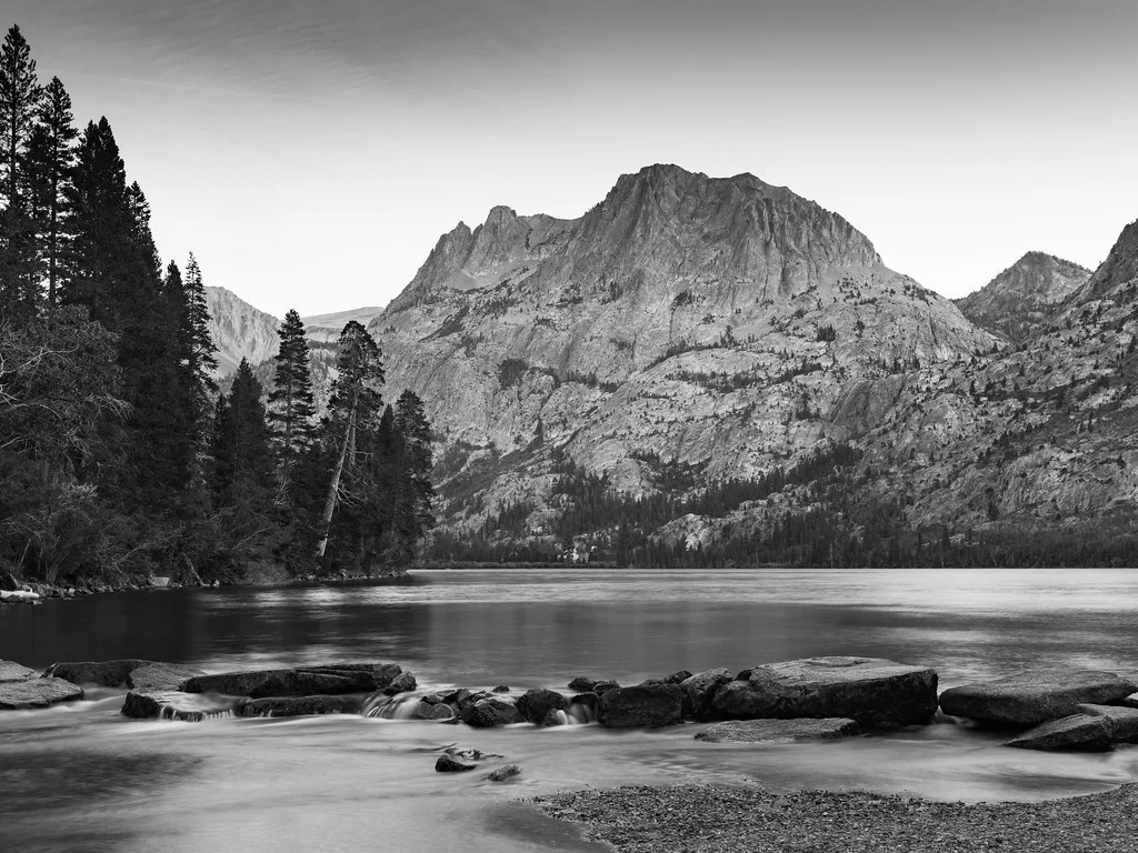
In landscape photography, black and white emphasizes the structural elements of a scene: the shapes of mountains, the patterns of clouds, the textures of rock and earth. Dramatic weather with heavy clouds and shafts of light translates beautifully to monochrome. Long exposure black and white landscapes, with smooth water and streaked clouds, have an ethereal quality that color cannot match.
In street photography, black and white is the dominant aesthetic for many practitioners. It strips away the visual noise of colorful urban environments, simplifying complex scenes to their compositional essentials. The documentary tradition of black and white street photography, from Henri Cartier-Bresson to Vivian Maier, gives monochrome street images a connection to photographic history that enriches their meaning.
In architectural photography, black and white emphasizes geometric form, structural lines, and the play of light on surfaces. Modern architecture with clean lines and dramatic shapes works especially well. The absence of color focuses attention on the architect’s structural vision rather than material finishes.
Developing Your Black and White Vision
Commit to shooting exclusively in black and white for a defined period, whether a week, a month, or an entire project. This forced constraint rapidly accelerates your ability to see monochromatically. Without the option of relying on color, you will develop a heightened awareness of tone, contrast, texture, shape, and light quality.
Study the masters of black and white photography. Ansel Adams for landscape, Richard Avedon for portraiture, Henri Cartier-Bresson for street photography, Edward Weston for still life and form. Pay attention not just to their subjects but to how they handle tonal range, contrast, and the distribution of light and dark across the frame. These artists spent their careers refining their monochrome vision, and studying their work can compress years of learning into focused study sessions.
Black and white photography is not merely the absence of color. It is a complete visual language with its own grammar, vocabulary, and expressive capabilities. Learning to speak this language fluently makes you a better photographer in every genre, because it trains you to see the fundamental elements of visual composition that underlie all photography, color or monochrome.