Juxtaposition in photography is one of those simple but powerful ideas that can change the way you see the world. It’s about putting things together that don’t seem to belong — light beside dark, old next to new, or beauty against decay — and watching how the relationship between them tells a story all on its own.
What Is Juxtaposition?
In plain terms, juxtaposition means putting two or more elements close together to make their differences or similarities stand out. The word comes from Latin roots meaning “next to” and “placement.” In photography, it’s how we use those differences to create emotion, irony, humor, or tension inside a frame.
As Visual Education puts it, “Juxtaposition photography involves combining two or more elements in the same picture, highlighting the interesting contrast between them, to create an eye-catching and thought-provoking image.”:contentReference[oaicite:0]{index=0}
Why Juxtaposition Works
Our brains are wired to notice contrasts. When we see two things side by side, we automatically try to connect them. That’s why a simple image can spark complex emotions or ideas. A photo of a homeless man sitting under a luxury store sign doesn’t need a caption — the contrast itself says everything.
Different Types of Juxtaposition
1. Conceptual Juxtaposition
This is when you use visual contrast to express an idea. Think of a wealthy district and a beggar in the same frame. That tension between privilege and poverty instantly communicates a deeper truth about society. Sometimes it’s uncomfortable, but that’s part of the point.
2. Visual Juxtaposition
This is all about what things look like — color, texture, scale, or light. A bright yellow dress against a dark sky, smooth metal beside rough wood, or blue next to orange. These contrasts create energy inside the picture that pulls the viewer’s eye around.
3. Contextual Juxtaposition
Here the surprise comes from placement. A baby surrounded by trash or a couple lying in a bed in the middle of the woods (both examples from Visual Education) make the viewer stop and ask “Why here?” That question gives the photo its staying power.:contentReference[oaicite:1]{index=1}
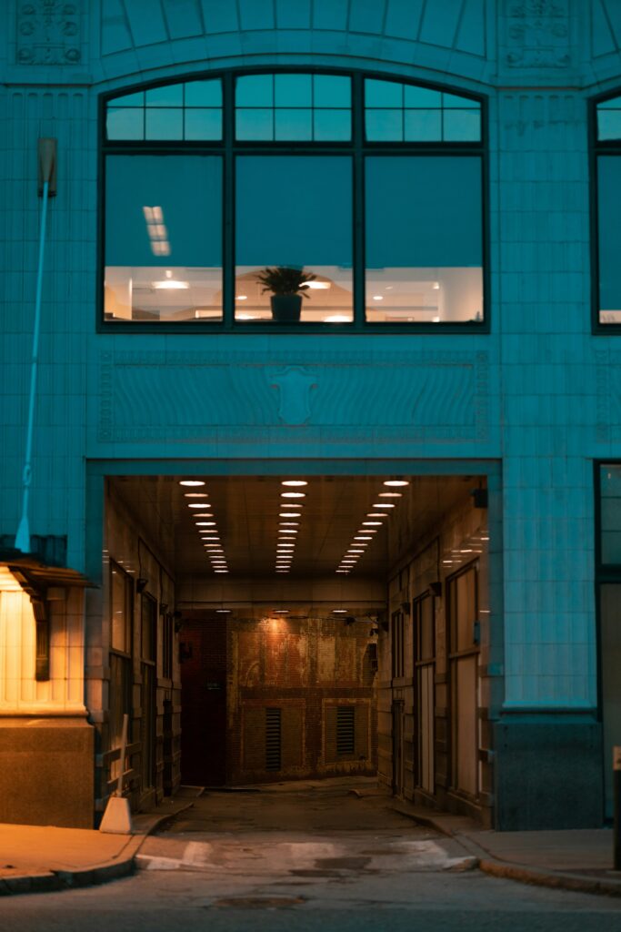
4. Temporal Juxtaposition
Sometimes the contrast is about time — a modern billboard against a crumbling wall, or a new car reflected in a shop window filled with antiques. You’re showing the past and the present in one frame, which always carries a quiet sense of storytelling.
5. Emotional Juxtaposition
Putting two feelings together can be just as striking as visual contrast. A laughing child beside a grieving adult, or a smiling portrait taken in a place marked by loss, can make the viewer feel the complexity of real life.
Classic Examples from Art and Photography
- Man Ray’s “Ingre’s Violin” (1924): A woman’s back becomes a musical instrument, turning the human body into both object and symbol.:contentReference[oaicite:2]{index=2}
- René Magritte’s “The Son of Man” (1964): The familiar meets the absurd as a man’s face is hidden by a floating apple — an image that invites endless interpretations.:contentReference[oaicite:3]{index=3}
- Karl Taylor’s “Fashionscape” Series: Models in elegant gowns stand in volcanic Icelandic landscapes. The mix of glamour and raw earth keeps your eyes glued to the frame.:contentReference[oaicite:4]{index=4}
How to Create Juxtaposition in Your Photos
1. Hunt for Natural Contrasts
The world is full of them — sunlight hitting graffiti, nature creeping through a manmade wall, joy beside boredom. Keep your eyes open for moments where two different worlds collide. Miss one of them and the magic’s gone.
2. Play with Scale
Size differences can create drama. A tiny figure beside a skyscraper, or a toy car placed in front of a real street, makes viewers rethink perspective. The trick is to frame them so both elements feel connected.
3. Light vs. Shadow
Few contrasts are as timeless as this one. Light brings clarity and hope; shadow brings mystery. Let them coexist in your composition and you’ll instantly add depth and emotion.
4. Use Color to Your Advantage
Colors opposite each other on the wheel — like blue and orange or red and green — naturally pop. That’s why photographers often use these pairs to energize their images. It’s not luck; it’s science with style.
5. Place the Unexpected
Take something ordinary and put it where it doesn’t belong. A dancer in an abandoned factory, or a bride standing knee-deep in the ocean. The brain loves surprise, and it keeps people looking.
6. Balance the Visual Weight
Each subject needs to hold its own. If one dominates too much, the contrast disappears. Use leading lines, focus, and spacing to let both sides of your photo “speak.”
7. Work with Layers
Foreground and background relationships can make your juxtapositions more interesting. For example, a political poster behind a person’s face can turn into unplanned symbolism if you time it right.
Common Juxtaposition Themes
- Wealth and poverty
- Nature and technology
- Youth and age
- Light and darkness
- Life and death
The Psychology Behind It
We process contrast faster and remember it longer than uniform scenes. This is known as the contrast effect — our brains evaluate everything by comparing it to something else. Juxtaposition uses that instinct to make images more memorable and meaningful.
Street Photography and Juxtaposition
Street photographers thrive on chance. They wait for coincidences — reflections, gestures, signs, or shadows that align for one perfect second. That’s why Henri Cartier-Bresson called it “the decisive moment.” Juxtaposition is the heart of that timing. It’s about seeing what’s about to connect before it happens.
Fashion and Commercial Photography
In advertising, contrast sells. A sleek model in a rugged landscape or a pristine product in a messy setting makes the subject stand out. Karl Taylor’s Iceland fashion series proves how visual tension turns elegance into impact.:contentReference[oaicite:5]{index=5}
When Juxtaposition Is Funny or Unintended
Sometimes the best juxtapositions happen by accident. A billboard for weight loss next to a burger ad, or a kitten poster hung beside a “No Pets Allowed” sign. These moments show how humor and irony depend on context. You don’t plan them; you just notice them.
Juxtaposition in Surrealism
Surrealists like Magritte and Dalí used juxtaposition to challenge logic. A lobster on a telephone or a man raining from the sky forces the viewer to re-think reality. Photographers can do the same using digital manipulation or creative staging.
Architectural Juxtaposition
Buildings often tell stories of time through contrast. The glass Pyramid at the Louvre in Paris, surrounded by centuries-old stone, shows how history and modern design can exist together without conflict. It’s visual conversation built from concrete and glass.:contentReference[oaicite:6]{index=6}
Tips for Better Juxtaposition Photography
- Explore widely and pay attention to your environment.
- Experiment with framing and perspective until the elements connect.
- Use natural light to emphasize differences in texture or tone.
- Edit gently — enhance contrast without overdoing it.
- Always think about what you’re saying, not just what you’re showing.
Wrap Up
Juxtaposition in photography teaches you to see relationships, not just subjects. It helps you find meaning in contrast and beauty in conflict. Whether you’re shooting street scenes, portraits, or abstract ideas, remember that opposites attract for a reason. The world is full of visual arguments waiting to be photographed.
So keep your camera ready. The next great juxtaposition might be right in front of you, and if you blink, you’ll miss it completly.