A tiny child standing before a towering skyscraper. A vivid flower growing through a crack in grey concrete. An ancient stone church flanked by a glass office building. These images stick in your memory because they harness one of the most powerful storytelling tools in photography: juxtaposition. By placing two contrasting elements within the same frame, you create meaning, tension, and emotional resonance that neither element could achieve alone. Juxtaposition is not just a composition technique. It is a way of seeing the world in terms of contrast, opposition, and unexpected connections.
What Is Juxtaposition in Photography?
Juxtaposition in photography means placing two or more contrasting elements side by side within the same image. The contrast can be visual (big vs. small, dark vs. light, rough vs. smooth), conceptual (old vs. new, natural vs. man-made, wealth vs. poverty), or emotional (joy vs. sorrow, chaos vs. calm). The key is that the elements differ from each other in a meaningful way, and their proximity within the frame highlights that difference.
The word “juxtaposition” comes from the Latin “juxta” (next to) and “positio” (placing). It literally means placing things next to each other. In photography, this placement is deliberate. You as the photographer choose what to include in the frame, how to position the contrasting elements, and how much visual weight to give each one. The juxtaposition does not happen by accident. You see the contrast in the world and frame it in a way that makes the viewer see it too.
Juxtaposition is fundamentally about meaning. While composition techniques like the rule of thirds or leading lines guide the viewer’s eye, juxtaposition guides the viewer’s mind. It asks the viewer to consider the relationship between the contrasting elements, to think about why they exist together, and to draw their own conclusions about what the contrast means.
Why Juxtaposition Works
The human brain is wired to notice differences. When two dissimilar things appear together, the brain automatically compares them, looking for connections, contradictions, and meaning. This comparison process engages the viewer at a deeper level than simple visual appreciation. A beautiful sunset is pleasant to look at. A beautiful sunset visible through the bars of a prison window provokes thought and emotion. The juxtaposition transforms a pretty scene into a meaningful one.
Juxtaposition also amplifies the qualities of each element through contrast. A large object appears larger when placed next to a small one. A rough surface appears rougher next to a smooth one. A warm color appears warmer next to a cool one. Each element in a juxtaposition serves as a reference point that intensifies the qualities of the other. This amplification effect is why juxtaposition creates such visually striking images.
Finally, juxtaposition creates narrative tension. When contrasting elements share a frame, the viewer wonders about the story behind their coexistence. How did a luxury sports car end up parked next to a crumbling building? Why is a person in formal business attire sitting on a park bench with bare feet in the grass? The viewer fills in the narrative gaps, becoming an active participant in the image rather than a passive observer.
Types of Juxtaposition
Scale Juxtaposition
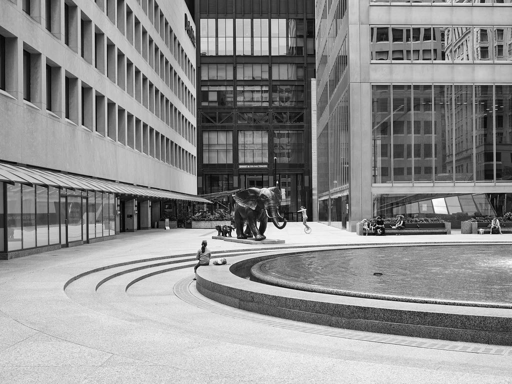
Placing a large element next to a small one emphasizes the scale of both. A person standing at the base of a massive redwood tree. A tiny boat on a vast ocean. A child’s hand next to an adult’s hand. Scale juxtaposition creates a sense of awe, vulnerability, or intimacy, depending on the context. It is also one of the most effective ways to communicate the size of a subject that the viewer has no other reference for. A photograph of a waterfall means nothing without a sense of scale. Add a person standing at its base, and the viewer immediately understands its enormity.
To create effective scale juxtaposition, include both elements fully within the frame so the size difference is clear. Use a wide-angle lens to exaggerate the perspective difference, or a telephoto to compress the elements together. The small element should be recognizable enough that the viewer can use it as a scale reference. A person works because everyone knows how big a person is. An unfamiliar object does not provide the same reference.
Old vs. New
Contrasting elements from different time periods creates a temporal juxtaposition that tells a story about change, progress, or preservation. A horse-drawn cart passing a modern electric car. A centuries-old cathedral reflected in the glass of a new skyscraper. An elderly person using a smartphone. These images capture the layering of time that exists in every environment, and they invite the viewer to consider the relationship between past and present.
This type of juxtaposition is especially rich in travel photography and street photography, where historical and modern elements coexist in the same spaces. Cities that have preserved older architecture alongside new development are particularly fertile ground for old-vs.-new juxtaposition.
Natural vs. Man-Made
The contrast between natural elements and human constructions is one of the most common and effective forms of juxtaposition. A tree growing through a fence. Wildflowers pushing through cracks in asphalt. A vine-covered building being reclaimed by nature. These images speak to the relationship between human civilization and the natural world, a theme that resonates across cultures and time periods.
In landscape photography, man-made elements within natural settings (a lone cabin in a vast valley, a road cutting through a forest, a bridge spanning a river) create juxtaposition that adds narrative and scale to the natural scene. In urban photography, natural intrusions into the built environment (a weed growing from a wall, a bird perching on a streetlight) create moments of organic life within rigid structures.
Color Juxtaposition
Contrasting colors placed next to each other create visual vibration and energy. Complementary colors (red and green, blue and orange, yellow and purple) create the strongest color juxtaposition because they sit opposite each other on the color wheel. A red fire hydrant against a green hedge. A blue door on an orange building. A yellow taxi on a purple-twilight city street. Color contrast catches the eye instantly and creates images that feel dynamic and alive.
Color juxtaposition does not require complementary colors to be effective. Any strong color difference creates contrast: a bright element against a muted background, a warm-toned subject in a cool-toned environment, or a splash of color in a monochromatic scene. The lone red umbrella in a sea of black umbrellas is a classic example that uses color juxtaposition to create a focal point.
Textural Juxtaposition
Placing contrasting textures next to each other creates a tactile contrast that the viewer can almost feel. Rough stone next to polished glass. Soft fur next to cold metal. Weathered wood next to fresh paint. These textural contrasts work on a sensory level, engaging the viewer’s sense of touch through visual cues. In product photography, fashion, and still life, textural juxtaposition adds sensory richness that makes images more immersive.
Emotional and Conceptual Juxtaposition
The most powerful juxtapositions are often conceptual rather than visual. Joy and sorrow. Wealth and poverty. Freedom and confinement. Life and death. These abstract contrasts are communicated through the specific visual elements you include in the frame. A laughing child in the foreground with a crying person in the background. A luxury storefront next to a homeless person’s belongings. A wedding bouquet on a hospital bed.
Conceptual juxtaposition requires sensitivity and awareness. These images carry moral and emotional weight, and they must be created with respect for the subjects involved. The best conceptual juxtaposition photographs observe and reveal contrasts that genuinely exist in the world, without exploiting or sensationalizing the subjects.
Light and Shadow Juxtaposition
The contrast between light and shadow is one of photography’s most fundamental juxtapositions. A face half in light and half in shadow. A sunlit clearing surrounded by dark forest. A bright window in a shadowy room. Light-dark juxtaposition creates drama, mystery, and visual depth. It is the basis of chiaroscuro, the dramatic lighting technique used in painting and photography for centuries.
How to Create Effective Juxtaposition
Train Your Eye to See Contrasts
The first step is developing awareness. Juxtaposition exists everywhere, but you have to see it. Start by actively looking for contrasts as you move through your day. Big next to small. Old next to new. Rough next to smooth. Natural next to artificial. The more you practice noticing these contrasts, the more automatically your eye will spot them when you have your camera in hand.
Make the Contrast Clear
For juxtaposition to work, the contrast must be immediately apparent to the viewer. If the viewer has to study the image to figure out what is being contrasted, the juxtaposition is too subtle. Both elements need to be clearly visible and recognizable. Use composition techniques like the rule of thirds to position the contrasting elements where the viewer’s eye will find them. Eliminate distracting elements that might dilute the contrast.
Give Both Elements Visual Weight
A juxtaposition where one element dominates and the other is barely visible does not create effective contrast. Both elements need enough presence in the frame to register. This does not mean they need to be the same physical size. A tiny figure next to a massive building creates powerful juxtaposition precisely because of the size difference. But the tiny figure must still be visible and recognizable. Ensure the smaller or less prominent element has enough visual clarity to serve its role in the contrast.
Use Proximity
The closer the contrasting elements are to each other within the frame, the stronger the juxtaposition. Elements on opposite sides of a large frame may not register as a comparison. Elements directly adjacent to each other, or even overlapping, create an unavoidable contrast. In street photography, waiting for contrasting elements to align in close proximity is often what separates a strong image from a weak one.
Let the Viewer Interpret
The best juxtaposition photographs present the contrast without dictating what the viewer should think about it. Show the old building next to the new one, but do not add text or overly manipulate the image to force a particular conclusion. Let the viewer draw their own meaning from the contrast. This openness to interpretation is what gives juxtaposition images their lasting power. Different viewers will see different stories in the same contrast.
Juxtaposition in Different Photography Genres
Street Photography
Street photography is the natural home of juxtaposition. Cities are dense with contrasts: rich and poor, old and new, large and small, static and moving. The street photographer’s job is to see these contrasts in real time and frame them before the moment passes. Billboards and posters create accidental juxtapositions with passersby. Architectural contrasts between adjacent buildings are everywhere. Human behavior creates endless contrasts: a person sleeping on a bench while commuters rush past, or a child playing in a puddle while adults try to avoid it.
Travel Photography
In travel photography, juxtaposition captures the complexity and contradiction of a place. The ultra-modern and the deeply traditional existing side by side. The tourist and the local. The grand monument and the ordinary daily life happening in its shadow. These contrasts communicate something essential about a destination that a single, harmonious image cannot. Travel juxtaposition images feel honest and layered because they acknowledge that every place contains multitudes.
Portrait Photography
In portrait photography, juxtaposition can reveal something about the subject that a straightforward headshot cannot. A tough, muscular person holding a delicate flower. A serious businessperson surrounded by colorful children’s art. A young person in an old environment, or an old person in a youthful setting. The contrast between the subject and their surroundings or props adds dimension and tells a richer story.
Landscape Photography
In landscape photography, juxtaposition often involves the contrast between human presence and natural grandeur. A tiny house dwarfed by mountains. A straight road cutting through wild, untamed terrain. A man-made dam holding back a vast body of water. These juxtapositions communicate the scale of nature and the ambition (or folly) of human intervention. They also create powerful depth cues, as the small human element provides scale for the enormous natural backdrop.
Architecture Photography
In architecture photography, the contrast between different architectural styles, eras, or materials creates compelling juxtaposition. A Gothic church next to a glass tower. A wooden cottage beside a concrete apartment block. A pristine modern interior containing a single antique piece of furniture. These architectural contrasts tell stories about development, preservation, and the evolution of design. Photographing them requires positioning yourself so both elements are clearly visible and the contrast reads strongly.
Juxtaposition and Other Composition Techniques
Juxtaposition becomes more powerful when combined with other composition techniques. Use framing to present one element through a frame formed by the other. Use leading lines to connect the two contrasting elements visually. Use negative space between the elements to let the contrast breathe. Use symmetry to present the contrasting elements in a balanced, side-by-side arrangement that emphasizes their differences.
The rule of thirds is particularly useful for positioning juxtaposed elements. Place one element on the left third and the other on the right third. Or place one on the top third and the other on the bottom. This creates a balanced composition that gives each element its own space while maintaining visual connection between them.
Common Mistakes
The contrast is too subtle. If the viewer does not immediately notice the contrast, the juxtaposition fails. Make sure the contrasting elements differ enough in the key quality (size, age, texture, color, concept) that the contrast is unmistakable. Subtle juxtaposition can work in fine art contexts, but for most purposes, clarity is essential.
Too many elements competing for attention. A frame filled with multiple contrasts in different directions becomes chaotic. The viewer does not know which contrast to focus on. Limit your juxtaposition to one primary contrast per image. If the scene contains multiple contrasts, choose the strongest one and compose to emphasize it while minimizing the others.
Forced or staged juxtaposition. Juxtaposition is most powerful when it feels discovered rather than manufactured. If the viewer senses that you arranged the contrasting elements artificially, the image loses its documentary power. In street and travel photography, wait for genuine juxtapositions to present themselves. In conceptual and fine art photography, where staging is expected, make the staging bold and deliberate rather than trying to disguise it.
Insensitive juxtaposition. Photographing the contrast between wealth and poverty, or comfort and suffering, requires ethical awareness. These contrasts exist in the real world and deserve to be documented, but they must be approached with empathy and respect for the people involved. Avoid reducing human subjects to props in a visual exercise. Ask yourself whether the image dignifies or diminishes the people in it.
The elements do not connect. For juxtaposition to work, the contrasting elements must share the frame in a way that invites comparison. If they are too far apart, or if there is no visual connection between them, they feel like two separate subjects rather than a single juxtaposition. Position the elements so that the viewer’s eye moves naturally from one to the other. Proximity, alignment, and visual flow all help create the connection.
Relying on juxtaposition alone. Juxtaposition creates meaning, but the image still needs to be well-composed, well-lit, and well-exposed. A compelling contrast in a poorly composed frame is a missed opportunity. Apply the same technical and compositional standards to your juxtaposition images that you apply to all your work. The contrast enhances the photograph, but it cannot save a technically weak image.
Try This
The contrast walk. Go for a walk with your camera and look exclusively for contrasts. Big and small. Old and new. Natural and man-made. Colorful and muted. Record every juxtaposition you find, even if some are stronger than others. By the end of the walk, you will have trained your eye to see contrasts that you would normally overlook.
The billboard exercise. In an urban environment, look for accidental juxtapositions between billboards, advertisements, or posters and the real life happening in front of them. A smiling model on a billboard above a crowded, unhappy commute. A “Sale!” sign above an abandoned shop. These accidental contrasts are a street photography staple and teach you to see the ironic juxtapositions that urban environments constantly produce.
Old meets new. Find a location where something old (a building, a vehicle, a tool) exists next to something modern. Photograph the two elements together, experimenting with different compositions. Try placing the old element in the foreground and the new in the background, then reverse it. Compare how the emphasis changes based on which element is closer to the camera.
Color contrast pairs. Spend an afternoon looking exclusively for color juxtapositions. A red element next to green. Blue next to orange. Yellow next to purple. Photograph each pair and notice how the complementary colors vibrate and amplify each other. This exercise trains your color awareness and teaches you to see color contrast as a compositional tool.
Scale juxtaposition with people. Photograph a person next to something much larger or much smaller than them. A person next to a massive tree, a towering building, a wide canyon, or a tiny insect. Use the person as a scale reference that helps the viewer understand the size of the other element. Experiment with different angles and focal lengths to exaggerate or compress the scale difference.
The still-vs.-moving shot. Find a scene where something is still while something else is moving. A statue as pedestrians blur past it. A parked car as traffic flows around it. A person standing still in a busy terminal. Use a slow shutter speed to blur the moving element while keeping the still element sharp. This technique creates a visual juxtaposition of stasis and motion that communicates tension between permanence and transience. Add this to your photography project ideas.
FAQ
What is the difference between juxtaposition and contrast?
Contrast is the broader concept. It refers to any difference between two elements: light vs. dark, warm vs. cool, sharp vs. blurry. Juxtaposition is a specific application of contrast where you deliberately place contrasting elements next to each other within a composition to create meaning or visual impact. All juxtaposition involves contrast, but not all contrast is juxtaposition. A high-contrast black-and-white photograph uses tonal contrast, but juxtaposition requires two distinct, identifiable elements placed in proximity.
Can juxtaposition be accidental?
In the real world, yes. Contrasting elements end up next to each other all the time without anyone intending it. But in photography, you make a choice to frame and capture that contrast. Even when the juxtaposition itself is accidental, your decision to photograph it is deliberate. The best street photographers are constantly scanning for these accidental juxtapositions and framing them in the moment.
How many contrasting elements should I include?
One primary contrast per image is the safest approach. Two contrasting elements are enough to create a clear, readable juxtaposition. Adding a third or fourth element risks creating visual clutter and diluting the contrast. If the scene contains multiple contrasts, choose the strongest or most meaningful one and build your composition around it.
Does juxtaposition always need to tell a story?
Not necessarily. Some juxtapositions are purely visual: a color contrast, a scale difference, a textural opposition. These work on an aesthetic level without requiring narrative interpretation. However, the most memorable and impactful juxtapositions do carry some kind of meaning or story, even if it is open to interpretation. A visual contrast that also carries conceptual weight is stronger than either one alone.
How do I avoid making juxtaposition feel heavy-handed?
Subtlety and trust are key. Present the contrast and trust the viewer to see it. Do not over-explain or over-emphasize the juxtaposition through extreme composition or processing. The most powerful juxtaposition images often feel quiet and observational rather than loud and confrontational. Let the elements speak for themselves.
Can juxtaposition work in minimalist photography?
Yes. In fact, minimalist juxtaposition can be extremely effective because the contrast is amplified by the simplicity of the composition. Two contrasting elements in a field of negative space, with nothing else in the frame, create a juxtaposition that is impossible to miss. The minimalist approach strips away all distractions and presents the contrast in its purest form.
How does juxtaposition relate to symmetry?
Juxtaposition and symmetry can work together beautifully. A symmetrical composition with contrasting elements on either side of the axis of symmetry creates a formal, balanced presentation of the contrast. The symmetry adds order and structure, while the juxtaposition adds meaning and tension. This combination is common in architecture photography, where symmetrical buildings may display contrasts in material, condition, or style on either side.
Is juxtaposition a modern photography technique?
Juxtaposition has been used in visual art for centuries. Renaissance painters placed saints against sinners, light against darkness, and the divine against the earthly. Photography inherited this tradition and expanded it, especially through documentary and street photography in the twentieth century. Photographers have always been drawn to contrast as a storytelling device. The technique is timeless, not modern.