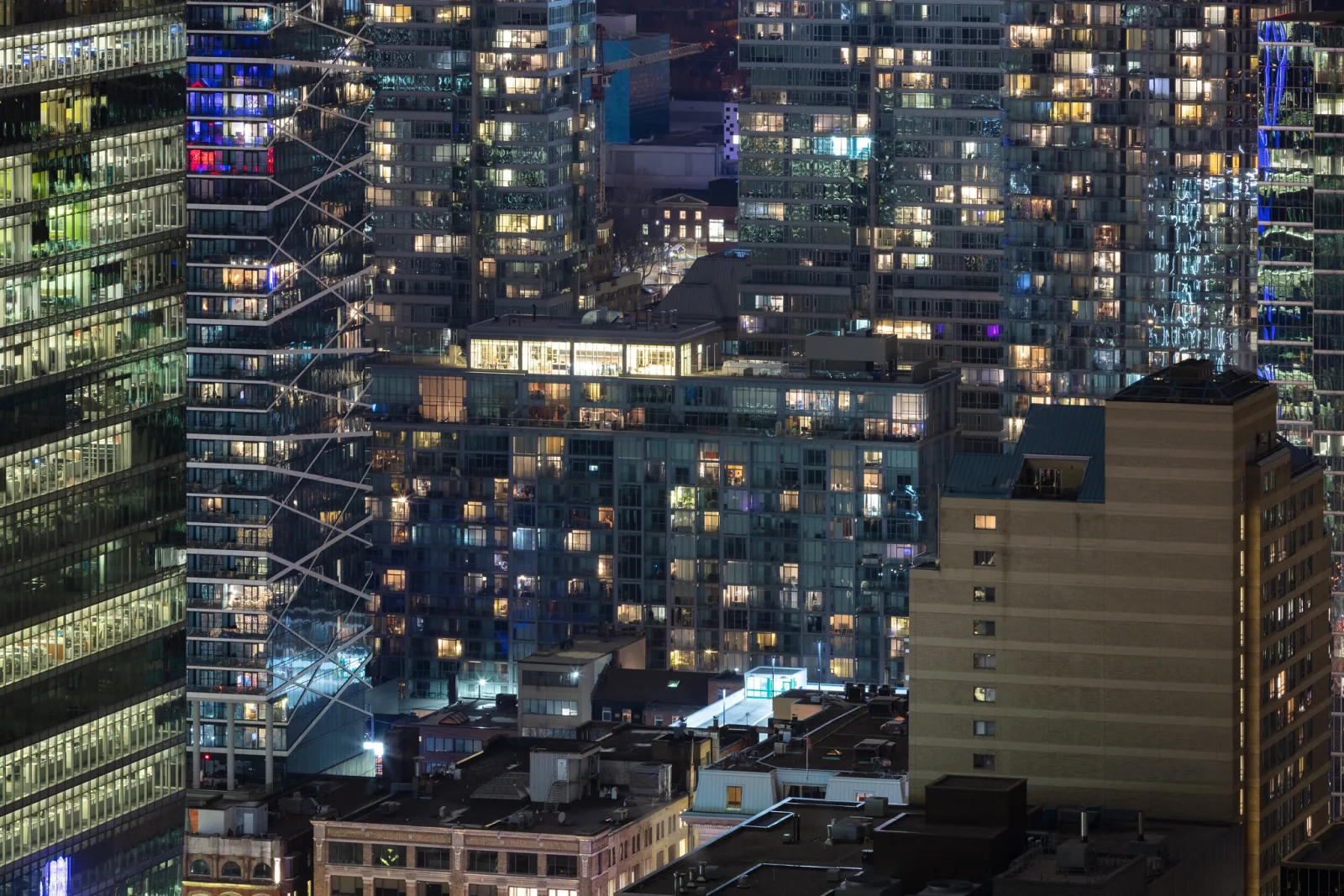
Glossy paper gives the deepest blacks, the most saturated color and the crispest look, but it mirrors every lamp and window and shows fingerprints. Matte paper has no glare and a quiet, flat surface, at the cost of lighter blacks and lower contrast. Luster sits between them: close to the depth of glossy, with a fine texture that breaks up reflections and hides handling marks, which is why it is the usual choice for prints people will hold.
This page is about the surface of photo paper itself: what each finish does to tone, color and detail, what the many finish names mean, and how to match a finish to a picture and to the place it will be seen. Choosing between paper, canvas, metal and acrylic is a different question, covered in canvas prints vs photo paper, and getting the file ready is covered in how to prepare photos for printing. Here the medium is already decided: it is paper, and the only question is which one.
Why the surface changes the picture: mirror reflection and scattered light
You see a print by two kinds of reflected light. The first kind enters the surface, passes through the ink or dye, bounces off the white paper underneath and comes back out carrying the picture. The second kind never enters at all. It bounces straight off the top of the surface, and it has the color of the lamp or the sky, not the color of the picture. Every difference between glossy, luster and matte comes from what the surface does with that second kind of light.
A glossy surface is smooth, so it behaves like a weak mirror. The surface reflection leaves in one direction only. Stand anywhere except in that direction and none of it reaches your eye, so you see the picture alone and the blacks look as dark as the ink or dye can make them. Stand in that one direction and you see a clear image of the lamp or window sitting on top of the print.
A matte surface is microscopically rough, so it scatters the surface reflection in every direction. There is no bright mirror image of the lamp from any angle. Instead a thin, even veil of white light lies over the whole print, from every angle. You do not notice it in the highlights, but in the dark tones it is a large share of what reaches your eye. That veil is why a matte black looks like deep charcoal next to a glossy black, and why colors look less saturated: adding white light to any color makes it paler.
Apparent sharpness follows from the same thing. Much of what the eye reads as sharpness is contrast at edges. A glossy print keeps more contrast between a dark line and the light area beside it, and its smooth coating holds very fine detail, so it looks crisper. The file is not any sharper. A matte print of the same file looks slightly softer and calmer.
Glossy, luster and matte compared
| Property | Glossy | Luster and its relatives | Matte |
|---|---|---|---|
| Blacks | Deepest | Nearly as deep as glossy | Visibly lighter, closer to charcoal |
| Color saturation | Highest | High | Lower and softer |
| Apparent sharpness | Crispest | Crisp, with a faint surface texture visible up close | Slightly softer |
| Reflections | A clear mirror image of lamps and windows | A broad, dim sheen instead of a mirror image | None to speak of |
| Fingerprints | Show clearly | Largely hidden by the texture | Oily prints hardly show, but the surface can scuff |
| Shadow detail | Holds separation in the darkest tones | Holds it well | The darkest tones tend to merge |
Two notes on the table. First, reflections on a glossy print are most visible over dark areas. A picture that is mostly black, hung opposite a window, can turn into a mirror with a faint photograph behind it. Second, the weakness of matte is not that its blacks are bad. It is that the range between the paper white and the darkest black is shorter, so a file with a lot of tone packed into deep shadow has less room to show it.
The word matte also covers a range. Some lab papers sold as matte are low-sheen versions of ordinary photo paper and keep fairly strong blacks. Matte fine art papers for inkjet printing are completely flat and show the full matte character described above. If a lab’s description does not make clear which kind it offers, a small test print settles it.
Luster, satin, pearl and semi-gloss: mostly one family
Between full gloss and full matte sits a family of finishes with different names: luster (or lustre), satin, pearl, semi-gloss, semi-matte and others. No standard defines these words. Each paper maker and each lab uses its own, and one maker’s satin can look like another’s luster. Treat them as near-synonyms for the same idea: a surface with enough gloss to keep deep blacks and rich color, and enough fine texture to stop it acting like a mirror.
The differences inside the family are small but real:
- Luster usually means a fine pebbled or stippled texture that you can see if you tilt the print toward a light. It is the standard surface for portrait and wedding prints because it tolerates being passed from hand to hand.
- Satin often means a smoother surface with a lower, more even sheen and less visible texture.
- Pearl often means a luster-like surface with a slight shimmer.
- Semi-gloss usually sits closer to glossy: smooth, with the shine turned down a step.
Because the names are not reliable, compare actual surfaces and not labels. If you are adding to a set of prints that will hang together, order from the same lab on the same paper, or expect a visible difference in sheen when light rakes across the wall.
Printing on your own printer instead of ordering from a lab? How to print photos at home covers choosing a photo printer, understanding paper types, and paper handling and storage.
Metallic, baryta and cotton rag in brief
Three more names appear on most lab menus and paper lists. They describe what the paper is made of as much as how shiny it is.
Metallic
Metallic paper has a pearlescent layer under the image that gives highlights a bright, slightly chrome-like glow, usually with a high-gloss surface on top. It suits pictures that already contain shine: water, ice, glass, polished metal, vehicles, city lights at night. It is a strong effect. On a quiet landscape or a portrait it can look out of place, so test it on the actual picture before ordering large.
Baryta
Baryta is barium sulfate, a white mineral coating laid over a paper base, the same construction used for traditional fiber-based darkroom papers. Baryta papers for inkjet printing have a smooth, bright surface with a gloss or semi-gloss sheen and very deep blacks, without the plastic feel of ordinary photo paper. They are a favorite for black and white prints that need a full range from paper white to a true black.
Printing in black and white? Black and white printing covers choosing paper for black and white prints, paper white and optical brighteners, and deep blacks with shadow detail.
Cotton rag
Cotton rag paper is made from cotton fibers instead of wood pulp. It is usually matte, either smooth or with a visible tooth like watercolor paper, and it feels like an artist’s sheet. It is the customary choice for fine art prints and for limited editions. It has the matte trade-off in full: no glare, soft lighter blacks, and a surface that marks if rubbed, so it needs careful handling.

Paper weight and base: what gsm and resin-coated mean
Paper weight is given in grams per square meter, written gsm or g/m². It is the mass of a one meter by one meter sheet. Ordinary office paper is about 80 gsm. Photo papers are commonly somewhere between about 200 and 300 gsm, and fine art sheets are often a little above 300. Weight is not the same as thickness, which is listed separately, but the two rise together within one kind of paper.
Weight matters most when the print will be held or will stand unsupported. A heavier sheet feels more substantial, resists creasing when picked up by one corner and curls less. Once a print is mounted to a board and framed, weight makes little visible difference. If you print at home, check the heaviest and thickest paper your printer accepts before buying a box of fine art sheets.
The base is the other thing to read on a paper description:
- Resin-coated (RC) paper has a paper core sealed between thin plastic layers, with the image layer on top. It stays flat, shrugs off humidity and tolerates handling. Most lab prints in glossy and luster are on a resin-coated base.
- Fiber-based papers, including baryta and cotton rag, have no plastic layers. They feel like paper, not plastic, and many people find them more beautiful in the hand. They react more to humidity, can curl, and usually cost more.
Paper white varies too, from a bright, cool white to a warmer natural white. The lightest tone a print can show is the bare paper, so a warm paper warms every highlight.
Matching the finish to the picture
Look at the picture and ask where its strength lies: in depth and color, in softness, or in detail that people will study up close.
- Deep blacks and saturated color. Night scenes, sunsets, strong graphic color and high-contrast black and white gain the most from glossy, baryta or a luster-type surface. On matte they lose some of their punch.
- Soft light and pale tones. Fog, snow, overcast light, pastel color and high key pictures have few deep blacks to lose, so matte costs them almost nothing and adds a calm, paper-like quality.
- Portraits and people. Luster is the safe choice. It keeps skin tones rich, and its texture hides the handling marks that a portrait is bound to get.
- Fine detail. Architecture, rock, bark and anything a viewer will lean in to inspect look crispest on a smooth glossy or baryta surface.
- Pictures that are mostly dark. These are the hard case. Glossy gives the best blacks but turns large dark areas into a mirror. Matte removes the mirror but lifts the blacks. Luster or baryta, with careful placement of the lighting, is usually the best compromise.
- Painterly or textured subjects. A textured cotton rag adds its own surface to the picture. That helps a soft, graphic or painterly image and fights a picture that depends on smooth gradients, such as a clear sky.
The finish also changes how you should prepare the file. For matte papers, lift the very darkest shadows a little so that detail does not merge into one dark mass, and apply somewhat stronger output sharpening than for glossy; sharpening for screen versus print explains why paper needs its own setting.
Want to see what a paper will do to your shadows and color before paying for a print? Soft proofing explains the screen-to-print problem, how soft proofing works, why the paper matters and how to choose a rendering intent.
Matching the finish to the display: glass, albums, handling and bright rooms
Where the print will live matters as much as what is in it.
| Where the print goes | What happens there | Finish that usually works |
|---|---|---|
| Framed behind ordinary glass | The glass adds its own mirror reflection, whatever is behind it | Luster, baryta or matte; glossy only with a mat that keeps it off the glass |
| Framed behind anti-reflective glass | Very little reflection from the glass, so the print’s own surface shows | Any; glossy and baryta keep their depth |
| Framed with no glass | The print surface is exposed to light, dust and touch | Luster or matte, hung away from direct light and from hands |
| Album with plastic sleeves | The sleeve adds gloss of its own and presses on the print | Luster; glossy can cling to the sleeve |
| Loose prints passed around | Fingers, bending, stacking | Luster on a resin-coated base |
| Bright room, opposite a window | A strong light source sits exactly where it will reflect | Matte, or luster behind anti-reflective glass |
| Dim room with lighting you control | Lamps can be placed so their reflection misses the viewer | Glossy, baryta or metallic at their best |
How finish interacts with framing glass
A pane of ordinary picture glass reflects roughly 4 percent of the light at each of its two surfaces, about 8 percent in total, as a clear mirror image. That reflection is there whatever paper sits behind it. So a matte print behind ordinary glass still shows the window; choosing matte paper does not cure glare from the glass. What the paper still controls is the picture underneath: a matte print behind glass keeps its lighter blacks, and a glossy one keeps its depth at any angle where the reflection is out of view.
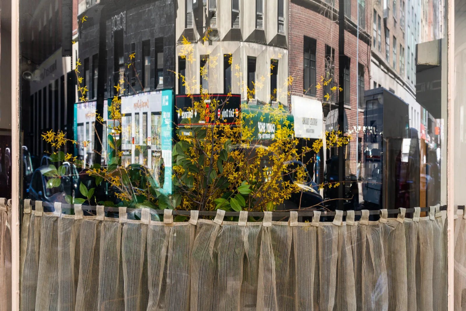
There are two kinds of low-reflection glazing, and they behave differently. Anti-reflective glass has optical coatings that cut the reflection to a small fraction of what plain glass gives while staying perfectly clear, so the print looks almost as if nothing were in front of it. Non-glare glass has a finely etched surface that scatters the reflection, exactly as matte paper does. It removes the mirror image but lays a slight haze over the picture, and the haze softens detail more the farther the glass sits from the print.
Never let a glossy or luster print press directly against glass. In humid conditions the surface can stick to the glass or develop shiny, wet-looking patches where the two touch. A mat or a spacer keeps a small air gap between them.
Choosing the frame as well as the paper? Matting and framing photos for display covers mat selection, frame selection, glass options and archival framing practices.
Albums and handled prints
Prints that will be handled need a surface that forgives fingers. Skin oil leaves a patch of different gloss, which is obvious on a smooth glossy surface and nearly invisible on the texture of luster. Matte hides oil but can scuff or pick up shiny rub marks in dark areas, especially on cotton papers, so hold those by the edges; the handling advice in how to store and care for old prints applies to fresh ones too. For printed books the paper choice is made with the book, and photo book design covers the paper and printing options.
Bright rooms
Stand where people will stand and look at the wall: any window or lamp you could see in a mirror hung there will appear in a glossy print or in the glass. If you cannot move the picture or the light, go matte without glass, or pay for anti-reflective glass. How to hang photos has a section on light, glare and fading.
Ordering a small test print
A screen cannot show you a paper surface. The cheap, reliable way to choose is to order the same file small on two or three finishes before committing to a large print.
- Pick a demanding file. Use the picture you intend to print, or one that contains deep shadow detail, a saturated color, a smooth gradient such as sky, and fine texture. If people are in it, include skin.
- Order the same file on each finish at a small size such as 4 by 6 or 5 by 7 inches, from the lab that will make the final print. Many labs also sell a sample pack with one small print or swatch on every paper they stock.
- For a big print, test a piece at full scale. Crop a section of the picture and print the crop small, so the detail is the size it will be on the wall. For a 20 by 30 inch print, a crop one fifth of the width and one fifth of the height, printed at 4 by 6 inches, shows exactly the final scale. Crop without resampling; DPI vs PPI explains how pixel dimensions become print size.
- Judge the prints where the final will be seen. Look in daylight and under the evening lamps of that room. Tilt each print and note at what angles reflections appear.
- Check the darkest areas. Can you still tell one deep shadow tone from the next? If the shadows have merged on the matte print, lift them in the file or choose another finish.
- If it will be framed, lay a sheet of glass over each test. The clean glass from any frame will do. The differences between finishes shrink behind glass, and it is better to learn that from a small print.
- Write down the lab, paper name and finish for the one you choose, so a reorder matches.
Common mistakes
- Choosing glossy for a dark picture that hangs opposite a window. The dark areas become a mirror. Fix: move the print, change to luster or matte, or use anti-reflective glass.
- Expecting matte paper to cure glare under ordinary glass. The glass reflects whatever is behind it. Fix: change the glass or the position, not the paper.
- Sending a dark, contrasty file to matte paper unchanged. The shadows merge and the print looks flat. Fix: soft proof with the paper’s profile, lift the deepest shadows slightly and add a little contrast.
- Trusting the finish name. One lab’s satin is another’s luster. Fix: compare sample prints, and reorder from the same lab on the same paper.
- Glossy prints for a stack that will be passed around. They come back covered in fingerprints. Fix: use luster on a resin-coated base for anything handled.
- Pressing a glossy print against the glass. It can stick or show wet-looking patches. Fix: use a mat or spacers.
- Ordering large without a test. The surface cannot be judged on a screen. Fix: order small prints or a full-scale crop first.
Try this
This takes fifteen minutes with paper you already own. Find one shiny print or page (a glossy photo or a magazine cover) and one flat one (a matte print, or a book page with photographs on uncoated paper). Stand with your back to a window and tilt the shiny one until the window appears in it. Notice how narrow that angle is, and how completely the reflection hides the picture. Tilt the flat one through the same angles: nothing changes. Next, hold the darkest black of each side by side in even light: one is black, the other charcoal. Press a clean fingertip on a dark corner of each and tilt toward the light. Last, take the glass out of a small frame, lay it over both and repeat the tilt. Both now reflect the window, and the blacks still differ.
Frequently asked questions
Is luster the same as satin or semi-gloss?
They belong to the same family: finishes between glossy and matte with deep blacks and reduced reflections. The names are not standardized, so one maker’s satin can match another’s luster. Luster usually has a more visible fine texture, and satin and semi-gloss are usually smoother.
Which paper finish is best for framing behind glass?
Luster, baryta or matte all work well, because the glass supplies its own reflection and hides much of the difference in sheen. Glossy is fine too if a mat keeps it from touching the glass. If glare is the worry, the glass matters more than the paper.
Does glossy paper make photos sharper?
It makes them look sharper. The smooth surface holds fine detail and keeps more contrast at edges, and the eye reads edge contrast as sharpness. The file is the same, and a soft picture stays soft on any paper.
Do matte prints last longer than glossy prints?
Sheen alone does not decide how long a print lasts. That depends on the ink or dye, the paper base and how the print is displayed and stored. Check the lab’s or paper maker’s own information for the specific paper, and keep any print out of direct sunlight.
Related guides
- Canvas prints vs photo paper: choosing between paper, canvas, metal, acrylic and wood.
- Black and white printing: neutral tones, paper white and proofing for monochrome.
- Matting and framing photos for display: mats, frames and the glass that goes in front of the paper.
- How to print photos at home: printers, paper types and color management.
- Soft proofing: previewing a paper’s blacks and color on screen.
- How to hang photos and plan a gallery wall: height, spacing, and light and glare on the wall.