Pastel colours are pale, light, soft versions of colours, like baby pink, mint and sky blue. Muted colours are toned-down, greyish or earthy colours, like dusty rose, olive and slate. Both feel calm, gentle and quiet compared with bright, saturated colours. You find them in soft light: fog, overcast days, shade, early morning and the pale sky after sunset. To capture them, avoid harsh sun, expose a little brighter for pastels, keep contrast low, and edit gently by lowering saturation or lifting shadows rather than pushing colour.
Bright, punchy colour gets a lot of attention, but some of the most beautiful photos use colour quietly. A pale pink sky over a desert, a misty field in soft greens, a faded painted wall, or a bunch of pale flowers can feel peaceful, dreamy and elegant. Learning to see and capture soft colours gives you a whole new mood to work with.
This guide explains what pastel and muted colours are, why they feel the way they do, where to find them, how to expose and shoot for them, how to edit them, and the common mistakes. There is a 10-minute exercise and an FAQ at the end.
Three words for colour
To understand soft colours, it helps to know three simple words. The guide to colour in photography covers them in more depth.
- Hue is the colour itself: red, blue, green and so on.
- Saturation is how strong or pure the colour is. High saturation is vivid. Low saturation is greyish. See saturation.
- Brightness, sometimes called lightness or value, is how light or dark the colour is.
With those three words, the difference is easy:
- Pastel colours are high in brightness and low to medium in saturation. Think of a colour mixed with lots of white: pale, airy, light.
- Muted colours are low to medium in saturation, at any brightness. Think of a colour mixed with grey or brown: dusty, earthy, soft.
Pastels are always light. Muted colours can be light or dark. Many soft photos mix both.
A simple way to picture this is with paint. Take a bright red. Add white and you get pink, a pastel. Add a little grey or brown instead and you get a dusty rose or brick colour, a muted tone. Add a lot of black and you get a deep, dark maroon, which is dark but can still be muted. Photographers work the same way, except the “paint” is light, exposure and editing.
You do not need to name every colour exactly. What matters is noticing whether colours in a scene are loud or quiet, and deciding which one you want. Once you start paying attention, you will see that most of the world is actually made of soft, muted colours, and the bright, pure colours are the exception.
How soft colours feel
- Calm. Low saturation does not shout for attention, so the eye relaxes.
- Gentle and tender. Pastels often suggest softness, innocence, spring, sweetness and quiet mornings.
- Nostalgic. Muted, faded colours can remind people of old prints and memories.
- Elegant and refined. Restrained colour can feel stylish and grown up.
- Moody. Dark muted colours, like deep olive, charcoal blue and brown, can feel serious, thoughtful or melancholy.
Bright saturated colour, by contrast, feels energetic, loud and exciting. Neither is better. Choose the one that matches your subject and story.
Where to find pastel and muted colours
Soft light
The biggest secret to soft colour is soft light. Harsh direct sun creates strong contrast and intense colour. Soft, diffused light lowers contrast and gently reduces saturation.
- Overcast days. Cloud cover acts like a giant diffuser. Colours look softer and more even. See overcast day photography.
- Fog and mist. Fog washes colours out toward pale greys and soft tones, creating natural pastels. See fog photography.
- Open shade. The shade of a building or tree on a sunny day gives soft, even light.
- Early morning. Before or just after sunrise, light is soft, and skies are often pale pink, peach and blue.
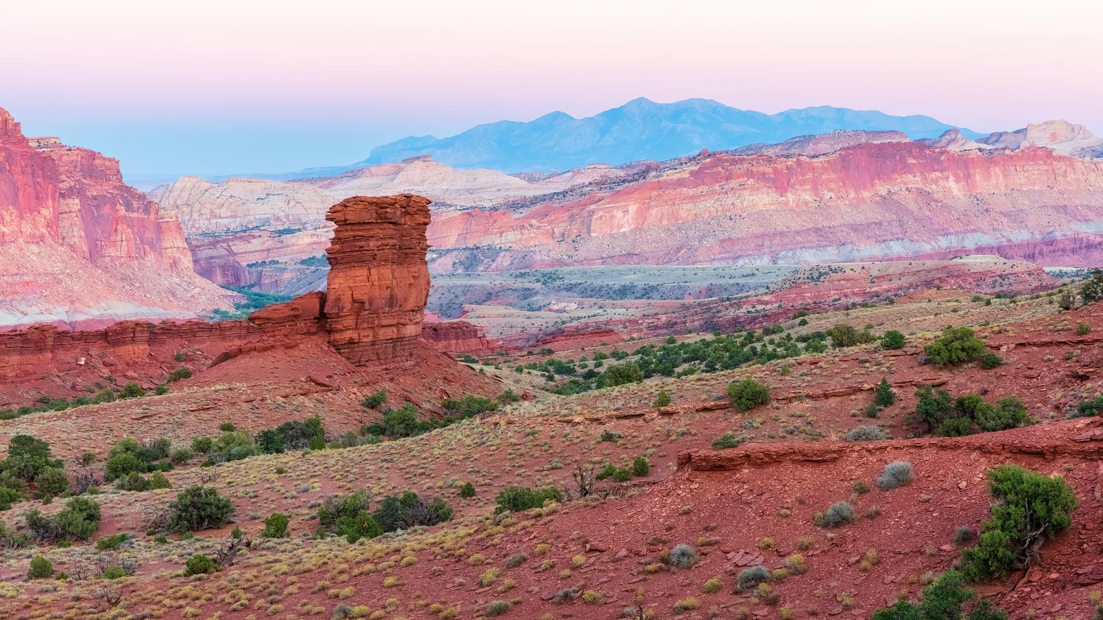
- After sunset. The sky often turns pastel pink and lilac above the horizon, like the photo at the top of this page. The blue hour brings soft blues.
- Snow and haze. Snow reflects soft light everywhere, and haze softens distant colours.
Pastel and muted subjects
- Flowers in pale pinks, lilacs, creams and peaches.
- Painted buildings in seaside towns and old streets.
- Weathered and faded surfaces: peeling paint, old doors, sun-bleached signs.
- Sand, stone, driftwood, dry grass and desert landscapes.
- Baked goods, sweets and soft fabrics.
- Sea and sky on hazy days.
- Autumn and winter landscapes in earthy, muted tones.
Shooting soft colours
Expose a little brighter for pastels
Pastels are light colours, so photos of them usually look best slightly bright. Cameras often try to make scenes average grey, which can turn pastels muddy. Use exposure compensation to brighten by a small amount, while checking that the brightest areas do not turn pure white.
Keep contrast low
Contrast is the difference between the brightest and darkest parts of a photo. Soft colours look best with low contrast: few deep shadows and few harsh highlights. Choose soft light and avoid deep black areas in the frame.
Simplify the palette
Soft colours are easily overpowered. A single bright red object in a pastel scene grabs all the attention. Either remove strong colours from the frame or use one deliberately as a small accent.
Use light backgrounds
A pale sky, white wall, light sand or soft blur behind your subject helps keep the whole image light and airy.
Consider backlight
Shooting with the light behind or to the side of a subject, especially through flower petals or leaves, can produce a glowing, pale, soft look.
Set white balance thoughtfully
White balance controls whether colours look warm (yellow and orange) or cool (blue). Slightly warm white balance gives peachy pastels; slightly cool gives soft blues and lilacs. Auto usually works, but adjust if the mood feels wrong.
Watch the background colour
Colour from a nearby surface can bounce onto your subject. A green lawn can tint a face green, and a red wall can add a pink cast. For clean pastels, look for neutral or pale surroundings, or use the colour cast on purpose if it suits the mood.
Shoot RAW if you can
RAW files give you more freedom to adjust brightness, colour and saturation gently later.
Editing for pastel and muted colours
Soft colours often come from editing as much as from shooting. The key is gentle adjustments.
For pastels
- Raise exposure slightly to make the image light.
- Lower contrast a little.
- Lift the shadows so dark areas become lighter.
- Lower saturation slightly, or use the vibrance control, which affects stronger colours less than gentle ones. See vibrance vs saturation.
- Check the whites so bright areas keep a little detail.
For muted colours
- Lower saturation overall, or for specific colours using colour sliders.
- Lift the black point slightly so the darkest tones become soft dark grey instead of pure black. This gives a faded, matte look. The tone curve guide explains how.
- Shift colours toward earthy tones, for example making greens more olive or blues more slate.
- Keep skin natural. Muting colour too far can make skin look grey or ill.
Colour grading
Colour grading means adding a gentle tint to the shadows, midtones or highlights to create a mood, for example warm highlights and cool shadows. Small amounts can enhance pastel or muted looks. See colour grading.
Building a soft colour palette
A palette is the group of colours in a photo. Soft palettes often work best when the colours are related.
- Monochromatic. Shades and tints of one colour, like several pale blues. See monochromatic colour.
- Analogous. Neighbouring colours, like pink, peach and pale orange.
- Soft complementary. Opposite colours, like pale blue and peach, softened so they do not clash. The guide to colour theory explains these combinations.
Soft colour in different kinds of photography
Portraits
Pastel clothing, a pale background and soft window light create gentle, airy portraits. Keep skin tones natural and warm.
Landscapes
Look for fog, mist, early morning light and pastel skies after sunset. Desert, coastal and winter scenes often have naturally muted palettes.
Flowers and nature close-ups
Pale flowers in soft shade, with a light blurred background, are ideal pastel subjects.
Street and travel
Painted houses, faded signs and weathered doors offer muted, nostalgic colour.
Food and still life
Light backgrounds, soft window light and pale props create fresh, clean pastel images.
Learning to see soft colour
Beginners often walk past soft colour because it does not shout. Train your eye with a few habits:
- Look up after sunset. Many people leave as soon as the sun goes down, but the pastel sky often arrives ten to twenty minutes later.
- Go out on grey days. Instead of waiting for sunshine, look for soft, gentle colours in flowers, walls and landscapes.
- Collect palettes. When you see a pleasing soft combination, like pale green and dusty pink, photograph it and save it as a reference.
- Compare with bright versions. Edit one photo two ways, vivid and soft, and notice how the mood changes.
Looking closely at the photos on this page
The desert photo at the top of this page shows how the same place can hold both kinds of soft colour. The sky after sunset has turned pale pink and soft blue, true pastels, because the sun has dropped below the horizon and the light is gentle and scattered. The red rock below is still warm, but it is muted rather than glowing, because no direct sunlight is hitting it. The lone rock tower gives the eye a clear subject, so the soft colours can stay calm without the photo feeling empty.
Imagine the same scene at midday. The sky would be a strong blue, the rock a hot orange, and the shadows deep and dark. It would be a bold, high-energy photo, but the peaceful mood would be gone. Choosing the time of day was really choosing the colour palette.
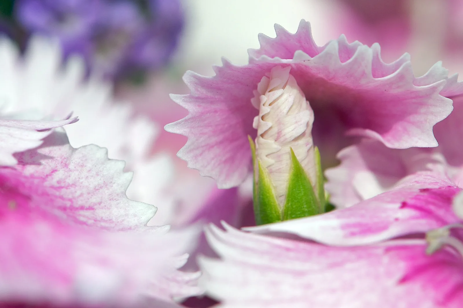
The flower close-up shows pastels at a much smaller scale. The petals are pale pink and lilac, the light is soft, and there are no deep shadows. Because the whole frame is filled with gentle tones, the image feels light and delicate. A single bright yellow or deep red petal in the corner would pull the eye away and break that mood.
Soft colour on a phone
Phones are very good at bright, punchy colour, and many phones boost saturation and contrast automatically. That can work against a soft look, but it is easy to adjust. Tap on your subject, then slide the brightness control up a little for pastels. Avoid filters labelled vivid or dramatic. If your phone has photographic styles or colour profiles, try a softer or more natural option.
After taking the photo, use the phone’s editor to lower contrast slightly, lift the shadows, and reduce saturation or vibrance by a small amount. Make small moves and compare with the original. It is easy to go too far on a small screen, so check the photo again later on a larger screen if you can.
When to choose soft colour
Soft colour is a choice, not a rule. It suits quiet subjects, peaceful places, gentle portraits, early mornings, foggy landscapes, delicate flowers and nostalgic street scenes. It usually does not suit fast action, bold graphic street scenes, festivals or anything where energy and excitement are the point.
A good question to ask is: how do I want someone to feel when they look at this photo? If the answer is calm, gentle, dreamy or reflective, soft colour will probably help. If the answer is excited, surprised or energised, stronger colour may serve the photo better. Many photographers also keep a consistent soft palette across a whole series or portfolio, which makes the work feel connected and recognisable.
If you are unsure, take the photo both ways. Shoot in soft light when you can, then edit one version gently and one with more punch. Over time you will learn which subjects come alive with soft colour and which need something stronger.
Common mistakes
- Shooting soft subjects in harsh sun. Strong light adds contrast and saturation. Wait for soft light or find shade.
- Underexposing pastels. Pale colours turn muddy when the photo is too dark. Brighten a little.
- Overexposing too far. Pastels can vanish into white. Keep some detail in the brightest areas.
- Removing all colour. Too little saturation looks grey and dull rather than soft. Reduce gently.
- A clashing bright object. One strong colour can ruin the calm. Remove it or use it deliberately.
- Grey skin. Muting colour too far makes people look unwell. Protect skin tones.
- Heavy faded looks on every photo. A matte look suits some photos, not all.
Try this: a 10-minute soft colour hunt
- Minute 1 to 2: Find a pale subject in soft light: a flower, a light wall, a pale fabric, a soft sky.
- Minute 3 to 4: Take a photo at normal exposure, then one a little brighter using exposure compensation. Compare.
- Minute 5 to 6: Photograph the same subject in direct sun if possible, then in shade. Notice how colour and contrast change.
- Minute 7 to 8: Find something weathered or faded and photograph its muted colours.
- Minute 9: Edit one photo gently: brighten slightly, lower contrast, lift shadows, reduce saturation a little.
- Minute 10: Compare before and after. Which mood do you prefer?
Frequently asked questions
What are pastel colours in photography?
Pale, light, soft colours with high brightness and low to medium saturation, like baby pink and mint.
What are muted colours?
Colours with lowered saturation, often greyish or earthy, like dusty rose, olive and slate.
What light is best for pastel colours?
Soft, diffused light: overcast days, fog, open shade, early morning and the sky after sunset.
Should I overexpose for pastels?
Slightly brighter exposure often helps, but keep detail in the brightest areas.
How do I get a muted look when editing?
Lower saturation gently, lift the darkest tones a little, and shift colours toward earthy tones.
Is a muted look the same as black and white?
No. Muted colour keeps colour, just softened. Black and white removes colour entirely.
Wondering what saturation really controls? Read the guide to saturation.
Want to know which colours look good together? Try colour theory for photographers.