A single strong photograph stands on its own. A body of work does not. Once you have more than a handful of images meant to be seen together, in a portfolio, a photo book, or on a gallery wall, the order you put them in becomes part of the work itself. Two photographers with the same twenty images can produce a tight, memorable set and a forgettable scroll, purely through editing and sequencing. This guide covers how to cut a large shoot down to the images that belong together, how to pair and order them, and how the right sequence changes depending on where the work will be seen.
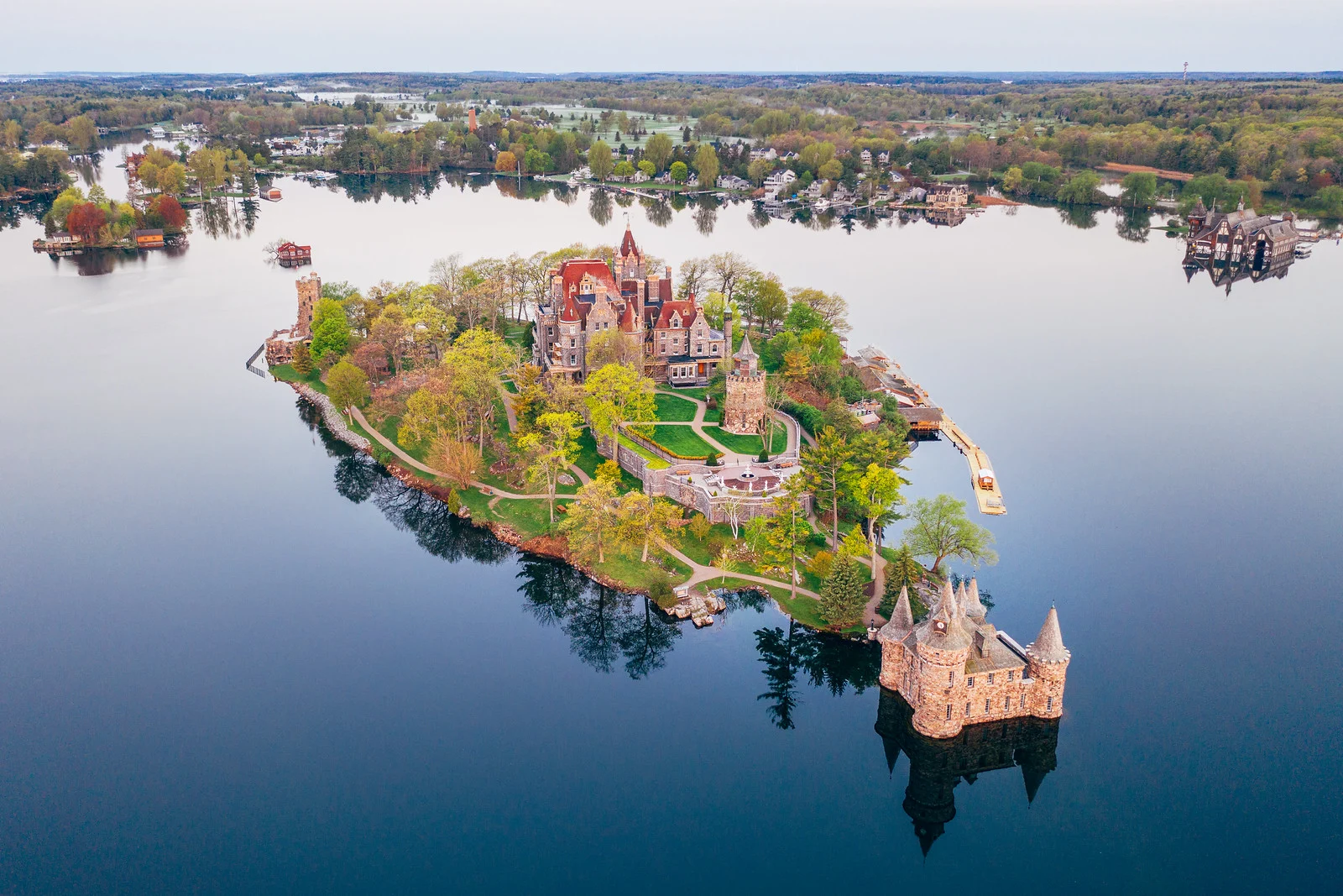
The First Edit: Cutting Before You Sequence
Sequencing only works once you have a shortlist worth ordering. If you start arranging two hundred images, you are not sequencing, you are stalling. The first job is a brutal cut, and it happens before you think about order at all.
Go through everything once and remove anything that only works with an explanation. If you have to tell someone “you had to be there” for an image to land, it is not carrying its own weight and it does not belong in the final set. Then remove near-duplicates: if you have four frames of the same subject in the same light from the same angle, keep the single best one and cut the rest, even if two or three of them are technically fine. A set with five near-identical frames feels padded no matter how good each individual frame is.
Be suspicious of your own favorites. The image you love because you remember the effort it took to get it, the risk you took, or the way the light felt in the moment, is not always the image a stranger will respond to the same way. Put your shortlist aside for a day or two and come back to it cold, or ask someone who was not there to react to it. Distance from the shoot is the single easiest way to see your own work more honestly.
A useful target for a first cut: get down to roughly two to three times as many images as you think you will actually use. If your final set is fifteen images, aim for a shortlist of thirty to forty-five before you start sequencing. That gives you real choices during pairing and pacing instead of forcing every image to stay in because you have nothing to replace it with.
Pairing Images
Once you have a shortlist, look at how images behave next to each other, not just on their own. Two techniques do most of the work: visual rhymes and deliberate contrast.
A visual rhyme is a pair (or small group) of images that share something formal: the same color palette, a matching shape or gesture, a repeated composition. Rhymes reward a viewer who is paying attention and give a sequence a sense of internal logic, even across images shot months or years apart. You do not need the same subject for a rhyme to work, though the strongest rhymes often use the same subject shot in different conditions, since the repetition itself becomes the point.

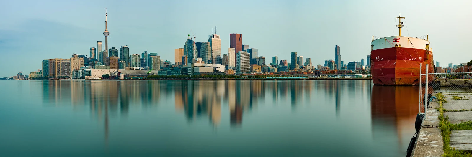
These two images are the same skyline, shot from a similar vantage point by the same photographer, months apart: one is a violent lightning strike at night, the other is dead calm at dawn. Placed side by side they rhyme, because it is recognizably the same subject and framing, and they contrast, because the mood could not be more different. That combination, familiar enough to read as a pair, different enough to create tension, is what makes a pairing work. A pairing that is only similar feels redundant. A pairing that shares nothing feels random. The best pairs do both at once.
Deliberate contrast pairs do not need a visual rhyme to work. A quiet, empty frame placed next to a busy, crowded one resets the viewer’s attention and makes both images read more strongly than they would surrounded by similar work. Use contrast pairing to break up a run of images that are starting to feel the same, or to make a specific point: stillness against motion, isolation against crowd, wide open space against tight detail.
Pacing a Sequence
Pacing is about what happens over the course of the whole set, not just between any two neighbors. A few practical rules hold up across most bodies of work.
- The opening image has to work alone. It has no context yet, nothing has come before it, so it needs to be strong enough to stand by itself while also setting a tone for what follows. Many photographers spend more time choosing the first image than any other single decision in the edit.
- The closing image should resolve something or leave a question. A flat, arbitrary ending undercuts everything that came before it. Decide whether you want the set to feel finished or to leave the viewer wanting more, and choose your last image on purpose rather than by default.
- Avoid three similar images in a row. Similar distance, similar subject type, similar color palette, similar mood: any of these repeated three times in sequence starts to feel monotonous even if each individual image is strong. Break up runs by alternating wide, medium, and close shots, and by varying color and mood so the viewer’s attention keeps resetting.
- Build in rhythm, not just variety. A few quiet images can build tension before a loud one lands harder. A sequence that is uniformly intense, or uniformly calm, wears the viewer down. Think in terms of rise and fall across the whole set, not image-to-image novelty for its own sake.

A medium-distance, human-scale image like this works well mid-sequence, after a wide establishing shot and before a closer detail or a quieter frame. It gives the viewer a person to orient around after an aerial or landscape opener, and its energy (motion, weather, a specific moment) contrasts naturally with stiller images nearby.
Sequencing Strategies
There is more than one valid way to order a body of work. Pick the strategy that matches what the work is actually about, rather than defaulting to the easiest option.
Chronological. Images appear in the order they were shot or the order events happened. This is the simplest strategy and it works well when time itself is the subject: a single day, a season changing, a project’s visible progress. It works poorly when the shooting order has nothing to do with the meaning of the work, which is most of the time for a general portfolio.
Thematic. Images are grouped by subject, color, or idea rather than by when they were taken. This suits a portfolio meant to demonstrate range or a specific specialty, since it lets you cluster your strongest examples of a given theme together instead of scattering them through a timeline.
Formal, visual-rhyme-driven. The sequence is built almost entirely around how images look next to each other: color, shape, light, gesture. This produces the most purely visual, book-like reading experience and is common in fine art photo books, but it demands a large enough shortlist that you have real rhyming options to choose from.
Hybrid, loose-narrative. Most working sequences borrow from all three: a rough chronological or thematic backbone, with formal rhymes used locally to smooth specific transitions. This is usually the most practical approach unless you have a specific reason to commit fully to one method.
Sequencing for a Portfolio, a Book, or an Exhibition
The same set of images can need a different order depending on where it will be seen, because viewers encounter each format differently.
A portfolio website is skimmed, not read. Most visitors will look at the first few images and decide within seconds whether to keep scrolling. Front-load your single strongest image, and put your second-strongest early as well, since you cannot rely on someone reaching the middle or end of the set. Save experimentation and quieter work for further down, where only the more engaged viewers will see it.
A photo book is read in a fixed order, page by page, usually by someone who has already chosen to spend time with it. You can build slowly, let quiet images breathe, and rely on the reader to stay with you across a longer arc, since the physical act of turning pages carries a kind of forward momentum that a scrolling webpage does not have. The opening spread still matters enormously, but you have more room after it than you do online.
An exhibition wall is viewed non-linearly. People walk in from either direction, backtrack, and skip around, so the sequence needs to work reasonably well from any entry point, not just left to right. Physical spacing, print size, and where a viewer’s eye naturally lands in the room all affect the reading as much as which image comes “next” on a list. Group by wall or section rather than relying on a single strict order, and make sure each section can stand on its own for a viewer who enters partway through.
Common Mistakes
- Sequencing purely by capture date. Chronology is easy but it is rarely the most meaningful order unless time itself is the subject. Default to a chronological edit and you are letting your calendar make a decision that belongs to you.
- Burying your best image in the middle. Your strongest single image needs to do real work, either opening the set or closing it. Leaving it stranded in the middle wastes it.
- Ending on a weak or redundant note. A set that trails off on an average image, or repeats an idea already covered earlier, leaves a worse final impression than the average quality of the work deserves. Viewers remember endings disproportionately.
- Not editing out near-duplicates. Keeping multiple similar frames “because they’re all good” dilutes the set. Every image should be doing something the others are not.
- Treating the edit as separate from the sequence. Which images you keep and what order you put them in are not two separate steps done one after the other. An image that does not fit anywhere in the sequence usually should not have made the cut in the first place.
Try This
Pull twenty to thirty of your own images, either as small prints on a table or as thumbnails on a large screen. Arrange them three separate times: once strictly chronological, once grouped thematically, and once built around visual rhymes (color, shape, or repeated subjects). Photograph or screenshot each arrangement. Compare how differently the same images read in each version: which one feels strongest as an opener, which order creates the most tension, and which pairing surprised you. The exercise makes the effect of sequencing visible in a way that reading about it cannot.
Continue Learning
Sequencing is one part of presenting a finished body of work. These related guides cover the rest:
- Photo Essay Guide: Build a narrative sequence around a single story
- Documentary Photography: Shoot a body of work with enough visual variety to sequence well
- Design Principles in Photography: The visual theory behind why certain pairings and rhythms work
- Photography Portfolio: Build the website your sequenced work will live on
- Black and White Photography: Tonal consistency across a sequence when color is removed