Composition rules like the rule of thirds or leading lines are useful shortcuts, but they are downstream of something deeper: a small set of visual elements and principles that explain why certain arrangements of shapes, lines and tones read as pleasing, clear or dynamic, and others read as confusing or dull. This guide covers that underlying theory, the building blocks (the elements) and how you combine them (the principles), plus the perceptual rules, called Gestalt principles, that describe how the human eye groups and simplifies a busy scene into a readable image.
The elements: what you are actually arranging
Every photograph is built from the same seven raw ingredients, regardless of subject. Learning to see them separately from the subject itself is the real skill.
- Line. An edge, a horizon, a road, a shadow, anything the eye can trace from one point to another. Lines lead the eye and can imply direction, speed or stability depending on their angle. See leading lines for the full technique.
- Shape. A flat, two-dimensional silhouette or outline, the simplest thing the eye recognizes before it processes any detail inside it.
- Form. Shape with the illusion of three-dimensional volume added, built almost entirely by shading and shadow. This is why direction of light matters so much: it is what turns a flat shape into a form with weight and depth.
- Texture. The surface quality of a subject, rough, smooth, woven, cracked, communicated visually rather than by touch. Raking light is the fastest way to bring texture forward; see texture in photography.
- Pattern. A shape, line or texture that repeats with enough regularity that the eye starts predicting the next repetition. See pattern and repetition.
- Color. Hue, saturation and value used to separate, unify or emphasize parts of a frame. Covered in full in the site’s color theory guide.
- Space. The area around and between subjects, including negative space, which is not “empty” so much as an active shape in its own right that gives the positive subject room to read clearly.
The principles: how you combine the elements
If elements are the ingredients, principles are the technique for combining them into something coherent.
Balance
Balance is about visual weight, not physical symmetry. A small, bright, high-contrast object can visually “outweigh” a much larger, duller area, the same way a small red accent can balance a large blue field in color composition. Symmetrical balance mirrors weight on either side of a center line; asymmetrical balance distributes different-sized elements so the overall frame still feels settled rather than lopsided.

Contrast
Contrast separates elements from each other, in tone (light against dark), color (warm against cool, complementary hues), scale (large against small) or sharpness (crisp subject against soft background). Contrast is what makes a subject visible against its surroundings in the first place; without some contrast, subject and background merge and the image reads as flat regardless of what is technically “in” the frame.
Emphasis
Emphasis is the principle of making sure the eye knows where to look first. Every strong photograph has a clear answer to “what is this photo of,” and every technique in this guide, contrast, isolation, leading lines, framing, is ultimately in service of emphasis. A photograph with three or four equally competing points of emphasis usually reads as confusing, not rich.
Rhythm
Rhythm is repetition with variation, the visual equivalent of a beat. Pure, unbroken pattern can feel static; introducing one break, one different-sized or differently-lit repeat, gives the eye a place to land and turns flat repetition into rhythm.

Unity
Unity is the sense that every element in the frame belongs together, achieved through a consistent color palette, a repeated shape, or a single dominant light source tying the whole scene together. A photograph can have strong individual elements and still feel disjointed if nothing unifies them.
Figure-ground: the first split your eye makes
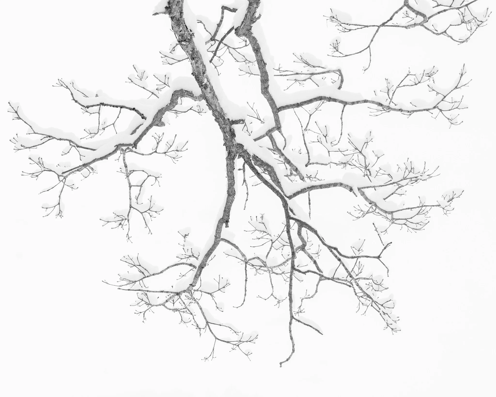
Before a viewer identifies what something is, their visual system first separates a scene into figure (the subject) and ground (everything else). This is not a learned skill, it is close to instantaneous and automatic, and photographers who understand it work to make that split as unambiguous as possible: a clean background, a difference in tone or focus between subject and surroundings, a simple silhouette. When figure and ground compete, for instance a subject whose tone and edges blend into a busy background, the eye has to work to resolve the scene, and most viewers give up and move on rather than working at it.
Gestalt principles: how the eye groups a scene
Gestalt psychology describes a handful of rules the human visual system uses to organize separate marks into a single, simplified whole. You do not need the psychology background to use them, only to recognize what they predict.
- Proximity. Elements placed close together are perceived as a group, even if they are otherwise unrelated. Cluster your subjects if you want them read as a unit, separate them if you want each read individually.
- Similarity. Elements that share color, shape or size are grouped together mentally, even across distance. A single differently colored or shaped element in a field of similar ones becomes an instant focal point, the same effect discussed in the site’s color and emotion section.
- Closure. The eye completes a shape from incomplete information. A partially obscured circle still reads as a circle. Photographers use closure constantly in silhouettes and cropped compositions, letting the frame edge or an obstruction imply the rest of a form rather than showing it fully.
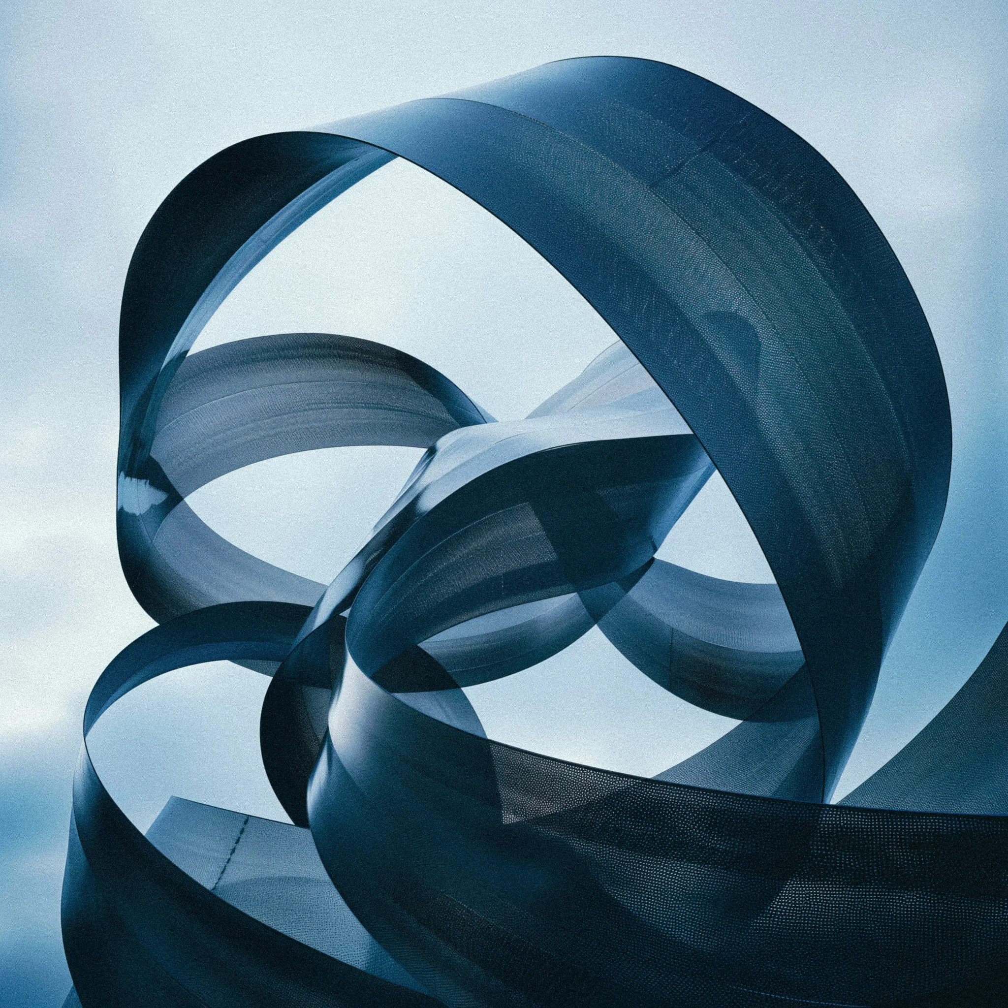
- Continuity. The eye prefers to follow a smooth, continuous line or curve over a series of abrupt direction changes. A winding river, a flowing ribbon of fabric or metal, or a road that bends rather than switches back all keep the eye moving through a frame rather than stopping it.
Putting it together in the field
None of this requires slowing down your shooting into an art-school exercise. In practice it means asking two fast questions before you press the shutter: what is the figure and what is the ground, and is there one clear place I want the eye to land first. If you can answer both, the elements and principles above are usually already working in your favor even if you never name them consciously. Naming them becomes most useful after the fact, when a photograph is not working and you need a vocabulary for diagnosing why: is it a balance problem, a figure-ground problem, or is there simply no emphasis at all.
A useful habit is to look at a photograph you admire and try to name which single principle is carrying the most weight in it. Sometimes it is obvious, a portrait built entirely on contrast between a lit face and a dark background. Sometimes two principles are stacked, rhythm in a row of columns interrupted by one figure standing in the gap, which is rhythm plus emphasis working together. The goal is not to produce a checklist you tick off before every shot. It is to build a vocabulary specific enough that when a photograph is not working, you can say why in one sentence instead of a vague sense that “something feels off.” That specific diagnosis is what actually improves the next photograph.
Common mistakes
- Treating “the rule of thirds” as the whole subject. It is one narrow application of balance and emphasis, not a substitute for understanding either.
- Competing focal points. Two equally bright, equally sharp, equally sized subjects in one frame usually split attention rather than doubling interest.
- Weak figure-ground separation. A subject that shares tone, color and sharpness with its background will read as merged, no matter how interesting the subject is on its own.
- Pattern with no break. Perfectly unbroken repetition can feel inert. A single variation, in size, light or spacing, is often what turns pattern into rhythm.
- Ignoring negative space. Empty areas of a frame are doing compositional work (balance, breathing room, implied scale), not wasting it.
Try this
Choose a single element, texture, pattern, or line, and shoot five photographs where that element is the entire point of the picture, not a supporting detail. No obvious “subject” allowed. Then look for one scene that demonstrates closure (something partially hidden that your eye still completes) and one that demonstrates continuity (a curve or line your eye follows smoothly through the frame). Naming which principle is doing the work in each image is the actual exercise, not the shooting.
Related guides
- Composition: The practical rules (thirds, framing, leading lines) built on top of this theory
- Direction of Light: How light direction builds the form element specifically
- Color Theory for Photographers: Color as an element and a compositional tool
- Depth in Photography: Space and form working together to imply three dimensions
- Glossary: More photography terms defined in one place