A diptych is two photographs presented together as one piece, and a triptych is three. They work when the panels share something obvious (a shape, a colour, a horizon height) and differ in one clear way, so the viewer compares them. To make one, crop the pictures to the same proportions, resize them to the same pixel height, and place them on a single canvas with an even gap of about 1 to 3 percent of the total width.
This guide covers both halves of the job: choosing pictures that belong together, and building the file. Photo sequencing explains how to order a whole body of work, and juxtaposition covers contrast inside a single frame. This page deals with the small, fixed format of two or three panels: how pairs relate, how to shoot for them, the canvas arithmetic, step-by-step layout on a computer and on a phone, simple grid collages, and printing and hanging the result.
What diptychs and triptychs are, and what they do that one frame cannot
Both words come from Greek and mean “two-fold” and “three-fold”. They first described hinged panels such as folding writing tablets and painted altarpieces. In photography they mean separate images, fixed in a set position and read as one work. A piece with more than three panels is a polyptych.
A single photograph shows one place at one instant from one position. Two panels remove that limit: you can show two times at once (summer and winter), two distances at once (the whole street and the door handle), or two things that never shared a frame (a person and the room they work in). The viewer works out the link, and that small effort is what makes a good pair memorable.
Five ways two pictures can relate
Every pair that works has two ingredients: something held constant and something that changes. If nothing is constant the pair looks random. If nothing changes it looks like you could not choose between two similar frames.
| Relationship | Held constant | What changes | Example |
|---|---|---|---|
| Echo | A shape, line or colour | The subject | A spiral staircase beside a snail shell |
| Opposite | Framing and subject type | One quality: season, time of day, age, weather | The same bench in sun and in snow |
| Wide and detail | The place and the light | Distance | A harbour, then one knot on one rope |
| Before and after | Camera position | Time | An empty table, then the same table after the meal |
| Cause and effect | The event | The moment | A wave rising, then spray over the sea wall |
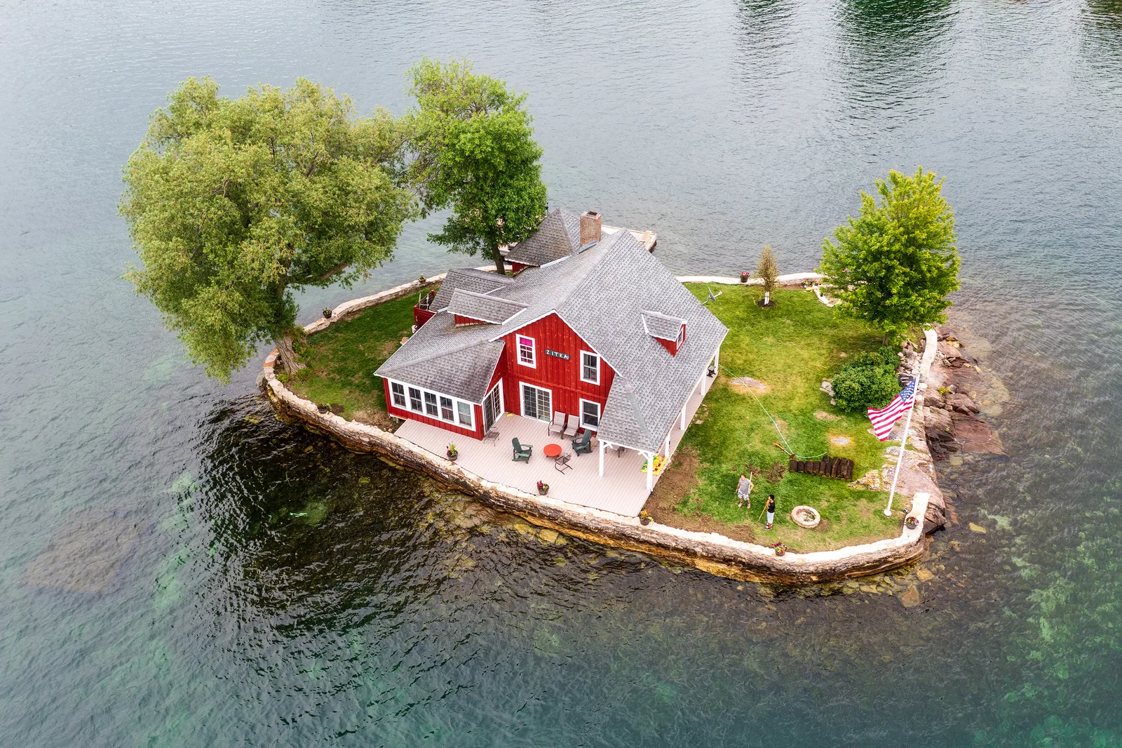
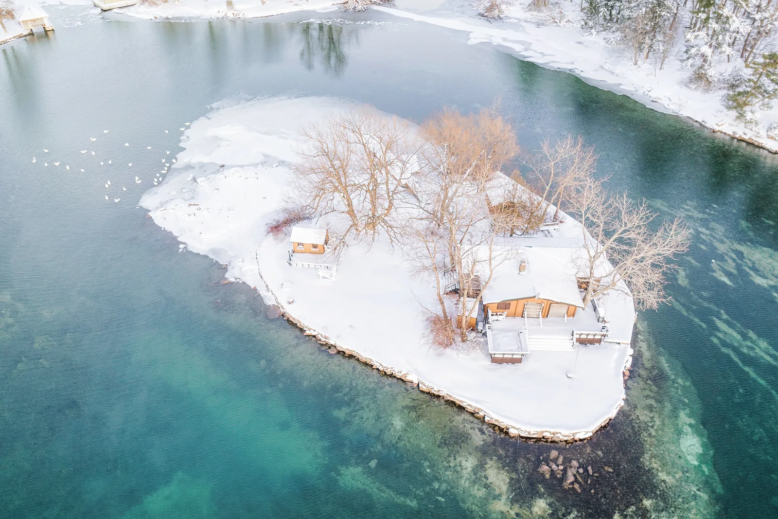
These two frames are an “opposite” pair. The constants are strong: one small island, centred, seen from above at a similar angle, in the same 3:2 shape, with water filling the rest of the frame. The change is the season. They are two different islands: a pair needs shared structure, not the identical subject.
Which picture goes on the left
Readers of left-to-right languages tend to start at the left panel, so put the picture that sets up the idea there and the one that answers it on the right: before on the left, after on the right; the wide view first, the detail second. In a vertical stack, the top panel is read first.
Direction inside the frames matters as much. People, animals and vehicles that face or move toward the gap hold the pair together. Subjects that face outward pull the eye off both edges and the pair falls apart.
Triptychs: three structures, or one scene split in three
Three panels give you a centre. Most triptychs fall into one of three structures:
- Centre and wings. The middle panel carries the main subject and the outer two support it, often mirroring each other in tone or shape.
- Beginning, middle, end. Three moments read in order: a diver on the board, in the air, entering the water.
- Three of a kind. Three variations at equal weight: three doors, three hands, three trees in the same fog. See patterns and repetition.
Balance is easier with three than with two: put the heaviest picture in the middle, or two similar weights on the outside. The ideas in visual weight apply to the whole canvas.
Splitting one scene into three panels
The other kind of triptych is a single photograph cut into three. It suits wide scenes with interest spread across the whole width and no single subject sitting on a cut line. The shape of the original decides the shape of the panels:
| Original shape (width to height) | Each of three equal panels | Looks like |
|---|---|---|
| 3:2 (a standard frame) | 1:2 | Three tall, narrow strips |
| 2:1 | 2:3 | Three standard vertical prints |
| 3:1 | 1:1 | Three squares |
| 4:1 | 4:3 | Three landscape prints |

Before you cut, draw vertical guides at one third and two thirds of the width. Each panel should hold something worth looking at, no important object should sit on a cut, and the horizon must be level, because a tilt of even one degree shows as a step between panels.
Allowing for the gap on the wall
When the prints hang with space between them, you have two choices. Cut the image into three touching pieces and hang them apart, which keeps every pixel but makes diagonal lines jump sideways at each gap. Or discard a strip of the picture equal to each gap, so the scene continues as if seen through a three-part window.
The arithmetic for the second method: add the three panel widths and the two gaps to get the total width, then divide the image’s pixel width by that total. For three panels each 40 cm wide with 5 cm gaps, the total is 130 cm. An image 13,000 pixels wide gives 100 pixels per centimetre, so each panel is 4,000 pixels wide and each discarded strip is 500 pixels. Cut at 0 to 4,000, 4,500 to 8,500 and 9,000 to 13,000.
Shooting with the pair in mind
- Shoot the partner frame straight away. After a wide view, walk in and make the detail in the same light. After a horizontal frame, make a vertical of the same subject. Pairs shot minutes apart share colour and contrast without any editing.
- Keep the camera orientation consistent. Two verticals side by side make a compact, nearly rectangular piece. Two horizontals side by side make a very long strip, and stack better one above the other.
- Lock what should stay constant. For before and after pairs, use a tripod or mark your standing position, keep the same focal length, and fix the white balance to a preset so that the colour does not shift between frames.
- Put the horizon at the same height. If both panels include a horizon or a tabletop edge, place it on the same line in each frame. The eye follows that line straight across the gap.
Matching tone, colour and edges across panels
Small mismatches that nobody would notice in separate pictures become obvious when the frames sit 2 cm apart. Edit the panels together, on screen at the same time, and work through this order.
- Crop to one shape. Give every panel the same proportions unless you have planned a wide centre panel.
- Match the white point and black point. If one frame has true black shadows and the other stops at dark grey, the second looks faded. Set both to the same depth, and do the same for the brightest whites.
- Match the colour temperature of neutrals. Find something that should be grey or white in each frame (cloud, concrete, a shirt) and bring them to the same neutral, unless warm against cool is the point.
- Match overall brightness. Zoom out until the panels are thumbnail size, or squint. If one panel jumps forward, lower its exposure a little or raise the other.
- Match saturation and contrast. Copy the settings from one panel to the other as a starting point, then adjust by eye.
- Match the texture. A clean low ISO frame beside a grainy one looks mismatched. Add a little grain to the clean one.
Converting both frames to black and white removes the hardest part of matching and puts all the attention on shape. If you keep colour, a shared accent helps: one red object in each panel links them firmly. Colour theory for photographers explains which combinations sit together.
Canvas size, gutters and borders: the arithmetic
The gap between panels is called the gutter. The margin around the outside is the border. Three rules keep a layout tidy: make every gutter the same width, make the border equal to or wider than the gutter, and make the panels the same height in a horizontal layout (or the same width in a vertical stack).
For two panels side by side:
- Canvas width = (2 x panel width) + gutter + (2 x border)
- Canvas height = panel height + (2 x border)
Worked example for a screen: two vertical panels of 1,200 by 1,800 pixels, a 40 pixel gutter and a 40 pixel border give a canvas of 2,520 by 1,880 pixels. For a triptych, use three panel widths and two gutters.
The shape of the finished piece follows from the panels. Ignoring gutters and borders:
| Panels | Arrangement | Finished shape |
|---|---|---|
| Two 2:3 verticals | Side by side | 4:3 |
| Two squares | Side by side | 2:1 |
| Two 3:2 horizontals | Side by side | 3:1 |
| Two 3:2 horizontals | Stacked | 3:4 |
| Three 2:3 verticals | Side by side | 2:1 |
This is why two vertical frames are the classic diptych: the result is close to an ordinary 4:3 picture and fits screens, pages and standard frames. Two horizontal frames side by side make a 3:1 strip that shows very small on a phone held upright, so stack them instead.
A gutter of 1 to 3 percent of the canvas width reads as a clean division. Thinner looks like a seam, and much wider separates the panels into two unrelated pictures. Use plain white or black.
How to put two photos side by side in any layer-based editor
The steps below work in any editor that has layers, guides and a move tool, including the free ones compared in free photo editors. Menu names and panel positions shift between programs and versions, but the tools are the same. If layers are unfamiliar, read layers and masks first.
- Finish both pictures first. Do the tone and colour matching described above, crop both to the same proportions, and export or resize them to the same pixel height (for example 1,800 pixels).
- Create a blank document. Enter the canvas width and height from the formula. Choose a white background, and sRGB as the colour profile for screen use.
- Add guides. Drag vertical guides to the border, to the right edge of the first panel, and to the left edge of the second. With a 40 pixel border and gutter and 1,200 pixel panels, the guides sit at 40, 1,240, 1,280 and 2,480 pixels. Add horizontal guides at 40 and 1,840.
- Bring each picture in as its own layer. Use the place or open-as-layers command, or copy and paste. Turn on snapping, then drag each layer until it clicks into its guides.
- Judge the pair. Zoom out to fit the screen, try swapping left and right, and check the horizon heights.
- Save two files. Keep the layered document so you can change the gutter or swap a panel later, and export a flattened copy for sharing.
The quick method: extend the canvas
If both pictures are already the same size, open the first, find the canvas size command, anchor the existing picture to the left, and set the new width to twice the picture width plus the gutter. Paste the second picture in and slide it to the right edge. For an outer border, increase the canvas size once more with the anchor in the centre.
Building a diptych or grid collage on a phone
Most phones can do this without extra software. Many built-in gallery apps have a collage or layout option that appears after you select two or more pictures, and most of the layout tools described in mobile photo editing apps work the same way.
- Select the pictures in the gallery and choose the collage or layout option, or open a layout app and pick a template with two cells side by side.
- Set the overall shape first (4:3, square or 4:5), because changing it later reshuffles the cells.
- Drag a picture onto another to swap positions. Pinch inside a cell to scale the picture and drag to reposition it within the cell.
- Set the border and spacing sliders to the same small value. Turn off rounded corners, shadows and background patterns.
- Export at the highest quality offered. Some apps shrink collages heavily, so check the pixel dimensions of the saved file before you print it.
Grid collages with a hero image
A collage of four or more pictures needs a hierarchy, or it becomes a contact sheet. Pick one hero image and give it at least twice the area of any other cell. A dependable layout is one large square on the left with two small squares stacked on the right: on a 1,800 by 1,200 pixel canvas with no gutters, the hero is 1,200 pixels square and the other two are 600 pixels square.
Choose supporting pictures that are simpler than the hero (details, textures, plain backgrounds) and stop at five or six. Beyond that, each cell is too small to read on a phone and the project is better handled as a photo essay.
Sizing, printing and hanging multi-panel work
For screens, the flattened file follows the same rules as any other picture: sRGB, a sensible long edge and moderate compression, as set out in the guide to exporting photos. Remember that each panel only gets half or a third of the pixels, so a diptych exported at 2,000 pixels wide shows each picture at under 1,000.
For print you have three options.
- One sheet. Print the whole canvas as a single picture. Alignment is perfect and it needs one frame. Check resolution for the full sheet with the print size calculator.
- Separate prints, one frame. Order individual prints and a mat cut with two or three windows. The mat becomes the gutter. See matting and framing photos.
- Separate frames. Each panel gets its own identical frame, and the wall is the gutter.
When hanging separate frames, treat the set as one object. Work out the total width (frames plus gaps), find its centre, and place that centre where a single picture would go. Gaps of roughly 5 to 10 cm suit most medium-sized frames. How to hang photos covers heights, hardware and planning with paper templates.
Six diptych and triptych projects
- Same place, two seasons. Record your position and focal length, and return months later.
- Portrait and object. A person on one side, the thing they would save from a fire on the other.
- Hands and work. A close view of hands, then the finished thing they made.
- Colour echo. Walk until you find the same strong colour on two unrelated subjects.
- Morning, noon, dusk. One window view, three times in one day, as a triptych.
- Whole and parts. A building in the centre panel, two of its details on the wings.
Common mistakes
- Two pictures that are nearly the same. The pair looks like indecision. Fix: change one thing boldly (distance, time, subject) or cut one frame and show a single picture.
- No visible link. The viewer cannot tell why the two are together. Fix: name the constant in one word (shape, colour, place). If you cannot, find a different partner.
- Mismatched panel sizes. One frame is a few pixels taller, so the edges do not line up. Fix: crop both to the same proportions and resize to the same height before placing them.
- Horizons at different heights. The line steps up or down at the gutter. Fix: recrop one frame so the lines meet, or choose frames with no horizon.
- Subjects facing outward. The eye leaves by both edges. Fix: swap the panels so that subjects look or move toward the gap.
- A gutter that is too wide or decorated. Thick coloured bars, shadows and rounded corners draw attention away from the photographs. Fix: a thin, even, plain white or black gap.
Try this
Give yourself fifteen minutes and one small subject near you: a houseplant, a parked bicycle, a kettle. Make a vertical photograph of the whole thing with some space around it. Then move in and make a vertical close-up of one part, in the same light, with the camera pointing the same way. Crop both to 2:3, resize both to the same height, and build a diptych with a thin white gutter using the canvas extension method or your phone’s layout option. Make a second version with the panels swapped, compare the two at thumbnail size, and name what is constant and what changes.
Frequently asked questions
What is the difference between a diptych and a collage?
A diptych is exactly two panels, usually the same size, with a deliberate relationship between them. A collage is any arrangement of several pictures on one canvas, often in mixed sizes.
Do the two photos in a diptych have to be the same size?
No, but equal panels are the easiest to balance. If the sizes differ, make the difference obvious, such as one panel twice the width of the other, and keep the heights equal so that the top and bottom edges line up.
Should a diptych be horizontal or vertical?
Two vertical frames side by side give a compact shape close to 4:3 that suits most screens and frames. Two horizontal frames usually work better stacked one above the other.
How do I split one photo into three panels?
Crop the picture to a shape that divides well, such as 3:1 for three squares, then crop three times at fixed pixel positions (one third and two thirds of the width) and export each piece. If the prints will hang with gaps, decide first whether to discard a strip at each cut.
Related guides
- Photo sequencing: choosing and ordering a larger set once you have more than three pictures.
- Juxtaposition in photography: building the contrast inside one frame instead of across two.
- Aspect ratio: what each frame shape does, which decides your panel shapes.
- Photo book design: facing pages are diptychs, and the same pairing rules apply to spreads.
- Matting and framing photos: multi-window mats and consistent frames for sets.
- How to hang photos: spacing, height and hardware for panels on a wall.