Every photo you open in an editor carries a hidden graph of its own tones: the histogram. Before you touch a single slider, that graph tells you whether the image has room to work with or whether detail is already gone. Levels and Curves are the two tools that act on what the histogram shows you, and understanding what each one actually does, and in what order to reach for them, turns tonal editing from guesswork into a repeatable process.
Reading the Histogram First
The histogram is a bar graph of every pixel in your image, sorted from pure black on the left to pure white on the right, with the height of each bar showing how many pixels sit at that brightness. It has nothing to do with color and everything to do with tone. Read it before you read the image on screen, because a bright room, a dim room, or a phone screen at the wrong brightness will all lie to your eyes about how light or dark a photo really is. The histogram does not lie.
Three things to check every time. First, where does the data sit. A histogram bunched toward the left is a dark image, bunched toward the right is a bright one, and neither is automatically wrong: a snow scene should sit right, a low-key portrait should sit left. Second, does the graph touch either wall. A spike jammed against the left edge means pixels are being recorded as pure black with no detail left to recover: this is clipping, and once it happens in a single-exposure file, that detail is gone for good, not just hidden. A spike against the right wall is the same problem in the highlights, most commonly a blown sky or a blown-out window. Third, how wide the spread is. A histogram squeezed into a narrow band in the middle, with empty space on both sides, describes a flat, low-contrast image: hazy air, an overcast sky, or a scene lit by soft, even light with nothing casting a strong shadow.

Levels: The Fast Global Fix
Levels gives you three controls sitting directly under the histogram: a black point slider, a white point slider, and a gamma (midtone) slider between them. Dragging the black point slider inward tells the editor “treat this value as pure black,” which remaps everything to its left to black and stretches the remaining tones to fill the gap. Dragging the white point slider does the same at the bright end. Move both sliders in from the edges of a flat, washed-out histogram and the image immediately gains contrast, because you are stretching a narrow band of recorded tone back out to fill the full black-to-white range the file can hold. The gamma slider then shifts the midtones brighter or darker without moving your new black and white points, which is the fastest way to fix an image that is contrasty enough but simply too dark or too light overall.
Levels is a blunt instrument in the best sense: three sliders, one look at the histogram, a few seconds of work. It is the right tool for a flat or hazy file that needs a quick, honest contrast correction, and it is usually the first move in an edit, not the last.
Curves: More Control, More Care
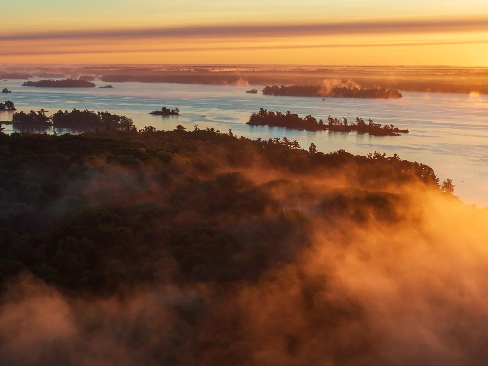
Curves does the same underlying job as Levels, mapping an input tone to an output tone, but instead of three sliders you get a full line you can bend at as many points as you like. That extra freedom is the whole reason to reach for it: Curves can brighten the midtones while leaving the black point and white point untouched, add contrast without an S-curve crushing the shadows, or adjust one tonal region (just the shadows, just the highlights) independently of the rest. Working per color channel, Curves can also shift color casts in specific tonal ranges only, cooling the shadows while warming the highlights, which Levels cannot do in a single move.
This page will not re-walk the specific curve shapes: the Tone Curve glossary entry already covers the classic S-curve for contrast, the reversed S for a flatter film-emulation look, lifted blacks, and per-channel color curves in detail. What matters here is when to pick Curves over Levels: reach for Levels first for a quick, global fix on a flat or off-exposure file, and reach for Curves when you need to protect one tonal region while adjusting another, when you want finer control than three sliders allow, or when the color cast itself needs to change by tonal region rather than globally.
A Practical Workflow Order
Most tonal edits go faster and look more controlled when they follow the same order. Start with global exposure and Levels: set an honest black point and white point from the histogram, then correct overall brightness with gamma or an exposure slider. Move to Curves next for finesse: shape contrast in a specific tonal region, protect a highlight or shadow you don’t want to touch, or nudge a color cast by tonal range. Finish with local, selective adjustments, masks, dodging and burning, or targeted color work, once the overall tone is already right. Doing local work before the global tone is settled means redoing it once Levels or Curves shifts everything underneath it.
Check the histogram again after each stage, not just at the start. It is easy to nudge a curve a little further than intended and clip a highlight you were trying to protect; the histogram will show a new spike jammed against the right wall the moment that happens, well before it’s obvious on screen.
Why File Format Changes What Levels and Curves Can Recover
A spike against the wall of the histogram does not always mean the same thing. A RAW file records far more tonal steps between black and white than the eight-bit JPEG your camera shows on the back screen, so a highlight that looks blown on that screen often still has a stop or more of real, recoverable detail sitting in the RAW data. Pull the white point down or shape a highlight rolloff with Curves and it comes back. A JPEG has already thrown that extra data away in the camera’s own processing, so what looks clipped on a JPEG usually is clipped, permanently. This is one of the practical reasons to shoot RAW whenever you plan to do any real tonal work: Levels and Curves are only as powerful as the data you hand them.
The same logic applies per color channel. A red channel can clip in a sunset while the green and blue channels still hold detail, which is why a per-channel curve can sometimes rescue a highlight that a single combined Curves or Levels adjustment cannot: it only has to pull down the one channel that is actually clipped.
Common Mistakes
- Crushing the blacks or blowing the whites for punch. Dragging Levels sliders in past the point where the histogram actually has data clips real detail, not just empty space. Watch the histogram, not just the preview.
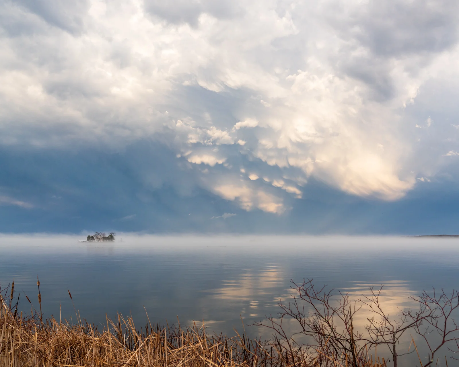
- Overcorrecting contrast on a flat scene. Fog, haze, and overcast light are often the reason the photo works. Restore some contrast with Levels, but don’t force a hazy scene to look like a clear, contrasty one.
- Trusting an uncalibrated screen over the histogram. A screen that is too bright or too dim, or viewed in a bright room, makes a correctly exposed file look wrong on screen. The histogram is the same regardless of screen or room.
- Reaching for Curves before Levels. Fine per-region shaping on a file that still has a basic exposure problem means redoing the fine work once the global tone changes.
- Ignoring per-channel curves when a color cast is the actual problem. A cast that only lives in the shadows or only in the highlights needs a per-channel curve targeted at that tonal range, not a global white balance shift.
Try This
Open the histogram panel on three of your own recent photos before you touch any slider, and for each one, write down (even mentally) what you expect Levels and Curves to need: does the graph touch a wall, is it bunched to one side, is it squeezed into the middle. Then make the edit and compare it to your prediction. Do this for a week and reading a histogram at a glance stops being a skill you have to think about.
Continue Learning
- Tone Curve: The specific curve shapes, S-curves, lifted blacks, and per-channel color curves
- Histogram: A closer look at reading the graph itself
- Clipping: What happens when tonal data is lost at either end
- Dodging and Burning: Local tonal control once your global tone is set
- Color Grading: Using tone and color together for mood
- Post-Processing Hub: The full editing workflow, stage by stage