Subject separation is whatever makes your subject stand apart from the things behind and around it, so the viewer sees it instantly as one clean shape. You get it from a difference: in tone (light against dark), in color, in sharpness, in light, or simply in what happens to be behind the subject from where you stand. The strongest photographs usually stack two or three of these differences at once, and the fastest fix for a weak one is often to move your feet rather than change a setting.
Why separation is the first job, not a finishing touch
Before anyone decides whether your photograph is beautiful, their visual system splits the frame into figure and ground, the thing and everything else. That split is covered as theory in design principles in photography. This page is the practical side: the specific tools you can reach for when the split is not happening on its own.
Separation fails in a predictable way. A dark jacket against a dark doorway, a brown bird in brown branches, a green shirt against green leaves, a head that overlaps a busy signboard. The subject is there, it is in focus, it is properly exposed, and it still disappears, because nothing distinguishes its edges from what lies behind them. The camera records edges only where something changes: brightness, hue, sharpness or texture. No change, no edge, no subject.
So the question to ask at every scene is simple: what is different about my subject compared with the patch of background directly touching its outline? It does not matter that the sky at the top of the frame is bright if the part of the scene behind your subject’s head is a dark hedge the same tone as their hair. Separation is decided at the boundary.
There are six levers. One strong difference can carry a photograph; two that agree make it unmistakable.
- Tone: a light subject on a dark ground, or the reverse.
- Color: a hue or saturation the background does not share.
- Focus: a sharp subject against a soft background.
- Light: the subject lit and the background not, or an edge of light around the subject.
- Vantage point: a cleaner background chosen by where the camera stands.
- Edges: a clear gap of background around the outline.
Tonal separation: light on dark, dark on light
Tone is the most powerful separator because it survives everything: small screens, prints, color blindness, black and white conversion. A light subject against a dark background, or a dark subject against a light one, reads instantly even in a thumbnail.
Light on dark is the classic portrait and still life arrangement. A face lit by a window, with the room behind falling into shadow, glows off the page. A white flower in front of shaded foliage does the same. Dark on light is the silhouette family: a figure against a bright sky, a tree against fog, a bird on sunlit water. Here the outline does all the work, so the shape needs to be clear and recognizable (a silhouette of an overlapping crowd is just a dark blob).
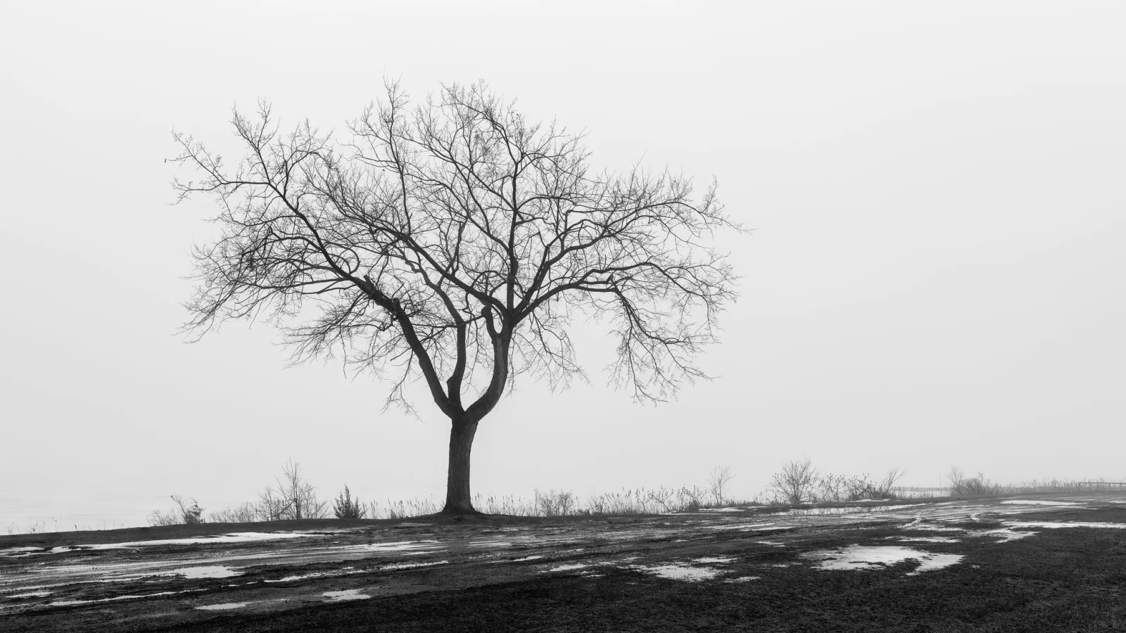
The awkward case is the middle: a mid-grey subject against a mid-grey background. That is where most failed separation lives, because nothing is obviously wrong when you look at the scene in color. Two quick checks catch it:
- The squint test. Squint until the scene goes soft. Detail disappears and only large tonal areas remain. If your subject melts into the background when you squint, it will melt in the photograph too.
- The monochrome preview. Set your camera’s picture style to monochrome while shooting raw. The raw file keeps its color, but the screen shows you pure tone, which is exactly what you need to judge.
A useful rule of thumb: if subject and background are within about one stop of each other, you need another lever (color, focus or light) to carry the separation. If they are two stops or more apart, tone alone will usually do it.
Color separation, and when it lies to you
A red coat in a green park, a yellow umbrella on a grey street, a blue boat on an orange sunset reflection. Hue contrast separates beautifully, and complementary pairs (opposites on the color wheel) separate most strongly. Warm, saturated colors also tend to advance and pull the eye, a topic covered under visual weight and in color theory for photographers.

The trap is that two colors can look completely different to you and still have almost the same brightness. Saturated red and mid green are the textbook pair. In color the subject pops; converted to black and white, or seen by someone with red-green color vision deficiency, it vanishes into the background. If a photograph depends on color separation alone, check it in monochrome before you trust it.
Color also works by absence. A single saturated subject in an otherwise muted scene (a bright jacket in fog, a painted door in a grey stone wall) separates more strongly than the same subject in a scene full of competing color. When the background is busy with color, look for a position that puts something neutral behind your subject: sky, a plain wall, shade, water.
Focus and distance: the four things that blur a background
Blurring the background turns everything behind your subject into soft tone and color, which removes the edges and detail that compete with your subject. Most people reach straight for a wider aperture, but aperture is only one of four factors, and often not the biggest.
- Aperture. A wider aperture (smaller f-number) gives shallower depth of field and a larger blur. Going from f/8 to f/2.8 makes out-of-focus areas roughly three times softer.
- Distance from subject to background. This is the one people ignore. Move your subject away from the wall. A person standing against a hedge stays sharp-edged against a readable hedge at almost any aperture. Walk them ten paces forward and the same hedge becomes a smooth wash. Background blur grows as the background gets farther away relative to your focus distance.
- Focal length, at the same framing. If you keep the subject the same size in the frame by stepping back with a longer lens, the background blurs more and you also see a narrower slice of it. That narrower slice is its own separation tool: at 135mm you can often find two meters of clean background where at 35mm you would include the whole cluttered street.
- Distance from camera to subject. Getting closer to the subject makes depth of field shallower, which is why close-ups of flowers blur their backgrounds even at moderate apertures.

Put numbers on it and the priorities become obvious. A portrait at f/4 with the background one meter behind the subject can look busier than the same portrait at f/8 with the background thirty meters away. Distance to background is free, needs no new lens, and never costs you sharpness on the subject. Use it first.
Two cautions. First, blur is not the same as separation: a soft background that is the same tone and color as your subject still merges with it, just more gently. Second, the quality of the blur matters. Small bright points in the background (sunlight through leaves, street lights) become discs of bokeh that can pull attention back if they are large and bright. The technique of choosing a single plane of sharpness to guide the eye is covered further in selective focus.
Separating with light: falloff, pools of light and rim light
Light gives you three separate tools, and they work whether or not you own a flash.
Put the subject in the light and the background in shade
The simplest version is found light: a person stepping into a shaft of sun in a shaded street, a doorway lit by afternoon light with a dark interior behind, a performer in a spotlight. Because the camera exposes for the bright subject, the unlit background falls several stops darker and nearly disappears. You are not creating the difference, you are noticing it and placing your subject in it.
Use falloff from a close source
With a window, lamp or flash, the inverse square law hands you separation almost for free. Light from a small source weakens with the square of distance. If your subject sits one meter from a lamp and the wall behind is three meters farther back (four meters from the lamp), the wall receives one sixteenth of the light, four stops less. Exposed for the face, the wall goes nearly black. Move the lamp back to three meters from the subject, with the wall now six meters from the lamp, and the difference shrinks to a quarter, only two stops. The rule: light close to the subject and far from the background for a dark background; move the light back to lift the background.
Outline the subject with backlight
Light coming from behind the subject and grazing its edges draws a bright line around hair, shoulders, fur or leaves. That line is rim light, and it separates even a dark-haired subject from a dark background, the one situation where tone and color both fail. Low sun behind your subject does this outdoors; a lamp or window behind them does it indoors. The rim shows best against a darker background, so look for backlight with shade or dark foliage behind the subject, not open sky. More on working with light from behind is in backlighting.
Vantage point: change the background by moving your feet
Every background problem is a position problem first. The background you see is whatever lies on the line from your lens, through your subject, to infinity. Move the camera and that line swings across the scene, landing on something else. Small moves make big changes because the background is far away and the subject is close.
- Step sideways. Half a meter left or right slides a pole, a bright window or a stranger’s head out from behind your subject. Try both directions before you shoot.
- Crouch. A low camera looks upward, putting sky, canopy or ceiling behind the subject instead of cluttered ground and street. This is the quickest way to get a clean background for a standing person, a flower, or a statue.
- Climb or hold the camera high. Looking down puts plain ground, grass, water or pavement behind the subject. It works for people seated on steps, objects on a table, and anyone in a crowd.
- Move the subject, not just the camera. Ask a person to turn a quarter or take three steps toward open space. Turn a potted plant so the dark doorway is behind it instead of the bright window.

Notice what this photograph does with a wide lens at f/11, where background blur is not available. The canyon is sharp and full of detail, so the green canopy is placed where it only touches sky. The camera position does the separating that a long lens and wide aperture would otherwise do. In landscapes and architecture, where you usually want everything sharp, vantage point and tone are your main separation tools.
Edges: overlaps, gaps and the outline test
Separation is ultimately about the outline, so look at the outline itself. Trace your subject’s edge with your eye all the way round. Everywhere the background behind that edge shares its tone, color and sharpness is a place where the shape will leak.
The most common edge failures are overlaps: a person’s arm merging into another person, a tree growing out of a head, a building roofline running exactly along the top of a hat. These are covered in detail in tangents and mergers. For separation, the practical rule is: give important parts of the outline a clear gap of background around them, especially the head, the hands and anything that carries gesture. A figure whose silhouette is complete, with daylight visible between the arms and body, reads more clearly than the same figure with arms pressed to the sides.
When you cannot get a gap, get an obvious overlap instead. A foreground element that clearly sits in front of the subject (sharper, darker or larger) reads as depth. It is the ambiguous half-touch, where you cannot tell which object is in front, that confuses the eye.
Separation in black and white
Remove color and one of your six levers is gone. Everything color was doing must now be done by tone, focus, light and position. This is why a color photograph that works can fall apart when converted: the red subject and the green background were separated only by hue and had nearly the same brightness.
In the edit you can put that separation back, because a black and white conversion lets you set how bright each original color becomes. Darken the greens and lighten the reds and a red subject lifts off foliage; darken blues to deepen a sky behind a pale figure. The rule is to push the subject’s color and the background’s color in opposite directions. Push too far and you get halos and blotchy skin, so stop as soon as the edge reads clearly.
Local tone does the rest. A gentle darkening of the background around the subject, or lightening of the subject itself, with a brush or dodging and burning, strengthens separation in color and monochrome alike. Keep it subtle enough that the light still looks like it came from the scene.
Common mistakes
- Relying on aperture alone. A wide aperture with the subject backed against a wall still gives a busy background. Fix: move the subject away from the background first, then open up.
- Trusting color that has no tonal difference. Red on green looks separated until it is printed small or viewed in monochrome. Fix: squint or check a monochrome preview, and add a tonal or focus difference.
- Checking the scene, not the boundary. A bright background overall does not help if the patch behind the head is dark. Fix: look only at what touches the outline.
- Dark hair against dark shade with front light. The edge disappears. Fix: backlight the subject for a rim, or move them so a lighter area sits behind their head.
- Blurred but same-toned backgrounds. Soft is not the same as separate. Fix: combine blur with a tone or color difference.
- Overdoing it in the edit. Heavy vignettes and glowing halos look like cutouts. Fix: make local adjustments you only notice when you toggle them off.
Try this
Pick one small subject you can move: a mug, a toy figure, a houseplant, or a patient friend. In twenty minutes, make six photographs, one per lever, each changing only one thing:
- Tone: place it against a background of the opposite brightness.
- Color: place it against a contrasting color, then against a similar color, and compare.
- Focus: keep your aperture fixed and shoot with the background at arm’s length, then at the far end of the room or yard.
- Light: put a lamp or window close to the subject with the background far away.
- Vantage point: shoot from standing, then from floor level, without moving the subject.
- Edges: arrange it so nothing overlaps its outline.
Convert all six to black and white and view them as small thumbnails. Rank them by how fast the subject reads. The winners show you which levers are strongest for your kind of subject.
Frequently asked questions
Do I need a fast lens to separate a subject from the background?
No. A fast lens helps with focus separation, but tone, color, light and vantage point cost nothing, and increasing the distance between subject and background blurs it more than most aperture changes. Many strong landscape and street photographs are separated entirely by tone and position at f/8 or f/11.
How far should my subject be from the background?
For portraits, try for at least three to four times the camera-to-subject distance if you want the background soft. If you stand two meters from your subject, a background eight meters behind them will blur far more than one that is half a meter behind.
Why does my subject look separated on the camera screen but not on a computer?
The small, bright camera screen exaggerates contrast and hides fine overlap. On a larger screen, weak tonal differences and edge merges become visible. Zoom into the edges while shooting, or use a monochrome preview to judge tone rather than color.
Related guides
- Design Principles in Photography: the figure and ground theory behind separation.
- Depth of Field: the full explanation of aperture, distance and focal length.
- Rim Light: placing a light to draw an edge around your subject.
- Inverse Square Law: why a close light darkens the background.
- Visual Hierarchy: once the subject is separated, controlling where the eye goes next.
- Tangents and Mergers: catching the edge problems that break separation.
- Bokeh: the character of the blur you create behind your subject.