Visual hierarchy is the order in which a viewer’s eye moves through a photograph: what it lands on first, where it goes second, and where it finally rests. Faces, readable text, the brightest area, the sharpest area, the highest contrast, warm saturated color and anything isolated or different all pull attention early. A strong photograph lines these up so the most important thing wins first, the next most important comes second, and nothing irrelevant jumps the queue.
Hierarchy is about order, not balance
It is easy to confuse visual hierarchy with visual weight, because both use the same ingredients: brightness, color, size, faces. The difference is the question each one answers.
- Visual weight asks: does the frame feel settled? It is about balance, how heavy elements feel on each side of the frame, like weights on a seesaw.
- Visual hierarchy asks: in what order is the frame read? It is about sequence, first, second, third, like the headings on a page.
A photograph can be perfectly balanced and still have no hierarchy, for example two identical, equally lit figures on either side of the frame. The eye bounces between them and never settles. And a photograph can be deliberately unbalanced with a very clear hierarchy, like one small bright figure at the edge of a dark frame. This page is about the second question: controlling the reading order.
Why it matters: viewers give a photograph a very short time before deciding whether to keep looking. If the first thing they see is the subject, and the second thing adds to it, they stay. If the first thing they see is a bright sign in the corner, the photograph has lost them before it started.
What wins attention first
Human vision is not a camera scanning evenly from corner to corner. The eye jumps between points of interest, and some things reliably pull it before others. Eye-movement research going back to the work of Alfred Yarbus in the 1960s shows viewers returning again and again to faces and especially eyes. The attention magnets, roughly in order of how hard they are to resist:
- Faces and eyes. A face, even a tiny one in a big landscape, is almost always found first. Eyes looking at the camera are the strongest pull of all.
- Readable text. Words are read compulsively. A sign, a headline or a logo that can be read will be read, often before anything else, which is why stray text is one of the most common hierarchy problems in street and travel photographs.
- The brightest area, and more precisely the area of highest local contrast. A light patch in a dark frame, or a dark shape in a light one.
- The sharpest area. When part of a frame is sharp and the rest is soft, the eye goes to the sharp part and treats the rest as context.
- Warm, saturated color. Red, orange and yellow advance and pull attention ahead of cool and muted tones.
- Isolation and difference. The one thing that is unlike its neighbors: one person facing the other way, one red umbrella among black ones, one tree in an empty field.
- Size and position. Large and central elements are found early, but size is the weakest of these on its own. Almost any of the factors above will beat it.
Two more factors do not win first place but steer the eye once it has landed: gaze (people look where other people in the photograph are looking) and lines (edges, roads and shapes the eye can follow).
The order is not a law. A huge, bright, red object will beat a tiny face in shadow. What matters is the principle: when several of these factors point at the same element, that element is unmistakably first. When they point at different elements, you get a fight.
Primary, secondary and supporting elements
Think of a photograph in three layers, the way a well-designed page has a headline, a subheading and body text.
- Primary. The one thing the photograph is about. It should collect the most attention factors: sharpest, brightest or most contrasty, warmest, and if there is a person, it is usually their face.
- Secondary. One, sometimes two, elements that add meaning: the person the subject is looking at, the mountain behind the hiker, the doorway the cat is about to enter. The secondary element should be clearly noticeable but lose to the primary on at least two factors.
- Supporting. Everything else: texture, setting, color field, sky. It gives context and mood but should never be the first thing seen. Supporting areas usually work best when they are darker, softer or less saturated than the elements above them.

In that photograph the three layers are easy to name. The ship wins on color, size and contrast. The island is found second, and it adds the sense of place. The water is a single, calm field that supports both without competing. Nothing else in the frame asks for attention.
A quick test: look at a photograph for three seconds, look away, and list what you saw in order. If your list matches what you intended as primary, secondary and supporting, the hierarchy works. If the second item on your list is a trash can, it does not.
Entry, route, rest and exit
Once you know the order, think of the viewer’s path through the frame as a short journey with four parts.
Entry
Where does the eye land first? Usually on the primary element, because it has the strongest pull. Sometimes it lands on a strong foreground shape or a line starting at the bottom edge, then travels to the subject. Either works, as long as the entry point leads somewhere.
Route
From the entry point, the eye follows whatever connects elements: leading lines, a person’s gaze, a sequence of bright areas stepping across the frame, a repeated color. A red door, then a red roof in the distance, makes a route. So does a face looking toward a second face. Without a route, the eye jumps randomly between competing points.
Rest
Every photograph needs places where nothing happens: sky, shadow, a plain wall, calm water. These are where the eye pauses between elements, and they are what make the elements feel distinct. A frame with no rest areas feels busy even if everything in it is interesting. This is the job of negative space in hierarchy.
Exit
Eventually the eye leaves. The question is whether it leaves after seeing everything you wanted, or halfway through because something pulled it out early. The common early exits are lines running straight off the edge, a bright area at the border, and a person at the edge looking out of the frame.

Follow your own eye through this one. The entry is the boathouse, the only solid, contrasty shape in the frame. The red door holds you there; it is the warmest, most saturated spot in a nearly monochrome scene. Then the small red roof across the water repeats the color and carries you back into the distance. The snow and mist are the rest areas, and there is no strong line or bright edge offering an early exit. That repeated red is doing the job a leading line would do in a busier scene.
Keeping the eye inside the frame
The longer a viewer stays in a photograph, the more of it they see. Several simple choices keep the eye circulating inside the frame instead of drifting out:
- Keep the edges quieter than the center. Darker, softer or less saturated edges act like walls. This is why photographers often darken the corners slightly.
- Turn lines back in. A road that curves back into the frame, or a line that ends at the subject, holds the eye. A line that runs straight into a corner is a slide out.
- Give gazes room. A person looking toward the center of the frame sends the viewer inward. A person looking out of a tight frame sends them out. The idea is covered in the rule of space.
- Use a frame inside the frame. Doorways, arches and branches around the subject enclose the route. See frame within a frame.
- Check the borders for bright spots and stray fragments. These are the most common unplanned exits; the full routine is in tangents, mergers and checking the edges.
When two things fight for first place
The most common hierarchy failure is not a missing subject. It is two subjects of equal strength. A person and a bright sign. A sunset sky and a sharp, colorful foreground. Two people, equally lit, looking in different directions. The eye goes back and forth and the photograph feels undecided.
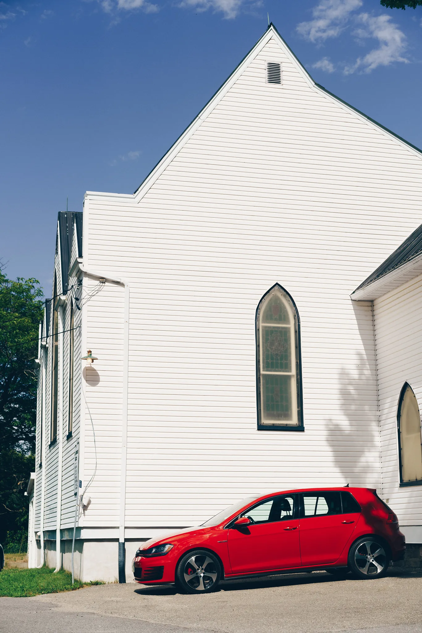
Here the contest is the point of the picture: a big, calm, white church and a small, loud, red car, and the photograph is about the contrast between them. Notice how hard it is to decide which you saw first. That tension is a deliberate choice. When it is not deliberate, you have three ways to resolve it:
- Remove one. Reframe, step, or wait so the competitor is outside the frame.
- Demote one. Make the competitor lose on two or more factors: move it out of focus, put it in shadow, make it smaller by changing distance, or reduce its saturation afterward.
- Relate them. If both must stay, give the viewer a route between them, such as a gaze, a line or a shared color, so the second is read as an answer to the first rather than a rival.
Building hierarchy in the edit
Editing cannot invent a hierarchy that is not in the photograph, but it can make a good one much clearer. Work from large to small:
- Crop. Remove edge competitors first. There is no point toning a distraction you are about to cut.
- Set global tone. Get the overall brightness and contrast right so the primary sits in a good tonal range.
- Dodge the primary, burn the rest. Gently brighten the subject and the route toward it; gently darken bright secondary areas and the edges. Dodging and burning is the single most effective hierarchy tool in editing, because brightness is the attention factor you can change most freely without it looking processed.
- Adjust color locally. Reduce saturation on competing colors in the background, especially reds and yellows. Leave the primary’s color alone or lift it slightly.
- Add a subtle vignette. A slight darkening toward the corners keeps the eye in. If you notice the vignette before you notice the subject, it is too strong.
- Place detail last. Local sharpening or texture on the primary, and none on the background, reinforces the sharpness cue.
The test after each step is the same as before: glance away, glance back, and ask where your eye lands. If it lands on the subject faster than before, the edit helped.
Diagnosing hierarchy in any photograph
Your own photographs are hard to judge because you already know what they are about. These tricks strip that knowledge away and show you what a stranger sees:
- The thumbnail test. Look at the photograph at postage-stamp size. Detail disappears and only the strongest tonal and color masses remain. Whatever you see first here is what the viewer will see first.
- The squint or blur test. Squint, or blur the image heavily, and the same thing happens at any size.
- The monochrome test. Convert to black and white. If the primary disappears, it was winning on color alone and needs a tonal difference too. This connects to the tools in subject separation.
- The upside-down test. Flip the image. Without recognizable content, the pure pattern of light, dark and color shows where attention really goes.
- Ask someone. Show the photograph for a few seconds and ask what they noticed first. One honest answer is worth ten minutes of your own staring.
Common mistakes
- A bright background behind a darker subject. The eye goes to the brightest area, which is not your subject. Fix: move so the subject is the lightest element, or darken the background.
- Readable text in the frame. A sign steals first place from any person. Fix: reframe, blur it with shallow depth of field, or make it part of the story on purpose.
- Everything equally sharp, bright and colorful. Nothing is first because everything is first. Fix: demote the supporting layer with shade, blur or muted color.
- A warm color in the wrong place. A red bin at the edge beats a person in grey. Fix: exclude it, or reduce its saturation in the edit.
- No rest areas. A frame packed edge to edge exhausts the eye. Fix: include some plain space.
- Confusing balance with hierarchy. A balanced frame can still be unreadable. Fix: check order separately, with the thumbnail test.
Try this
Choose ten of your own photographs, including a few you like and a few you do not. For each one:
- View it as a small thumbnail for three seconds, then look away.
- Write down the first, second and third things you noticed.
- Next to each, write which attention factor won it: face, text, brightness, sharpness, color, isolation or size.
- Mark any photograph where the first item was not the intended subject.
Take the worst offender and fix it in twenty minutes using only cropping and dodging and burning. Compare the before and after as thumbnails. You will likely find that most of your weaker photographs fail for the same one or two reasons, which tells you exactly what to watch for next time you shoot.
Frequently asked questions
What is the difference between visual hierarchy and a focal point?
A focal point is the single element that wins first place. Hierarchy is the whole ranking: first, second, third and what stays in the background. A photograph can have a clear focal point and still have a poor hierarchy if the second thing seen is a distraction.
Does visual hierarchy apply to landscapes without people?
Yes. Without faces, the order is set by brightness, contrast, sharpness, color and isolation. A sunlit peak against a shaded valley, a lone tree, or the one warm-lit rock in a cool scene becomes primary for the same reasons a face would.
Do people in all cultures read photographs from left to right?
Reading direction may nudge how people scan an image, but the pull of faces, brightness, contrast and color is far stronger than any left-to-right habit. Build your hierarchy on those factors and it will work for almost everyone.
Can a photograph have two primary subjects?
It can if the relationship between them is the subject, like two people in conversation. Even then, one usually wins slightly, and the photograph reads more clearly if you let it, for example by placing the other in softer light or showing them from behind.
Related guides
- Visual Weight: how the same factors create balance rather than order.
- Leading Lines: building the route from one element to the next.
- Dodging and Burning: the main editing tool for strengthening hierarchy.
- Design Principles in Photography: emphasis, contrast and the Gestalt rules behind all of this.
- Subject Separation: making sure the primary element stands apart.
- Negative Space: designing the rest areas.
- Tangents and Mergers: catching the edge problems that pull the eye away.