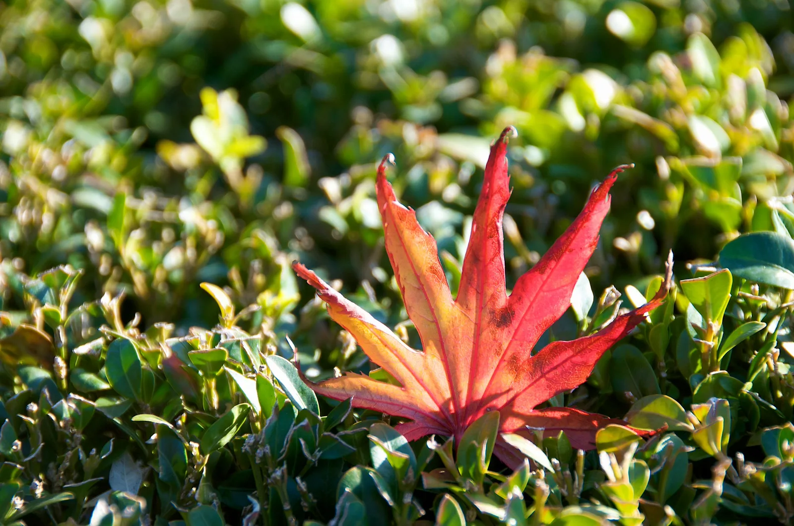
Selective colour is a look where most of a photo is black and white, or very muted, while one colour or object stays in full colour, like a red umbrella in a grey street. It pulls the eye straight to the coloured part. You can create it when editing, by removing colour from everything except your subject, or find it naturally by photographing one bold colour against a neutral or contrasting scene. Use it sparingly, choose a subject that deserves the attention, and keep the edges of the coloured area clean.
Selective colour, sometimes called colour splash or colour accent, is one of the first editing effects many beginners try. It can be striking: a single red rose in a black and white wedding photo, a yellow taxi in a grey city, a child’s blue boots in a monochrome puddle. It can also look dated or gimmicky when overused or done carelessly.
This guide explains what selective colour is, why it works, when to use it, how to create it in editing, how to find natural colour accents in camera, and the common mistakes beginners make. There is a 10-minute exercise and an FAQ at the end.
What selective colour is
In a selective colour photo, most of the image has its colour removed or greatly reduced, leaving one colour, or one object, in colour. The contrast between grey and colour makes the coloured part pop out.
There are two main ways to get the effect:
- The edited version. You take a normal colour photo, then remove colour from everything except the part you want to keep. This is what most people mean by selective colour.
- The natural version. You find a scene where one bold colour already stands out against neutral or opposite colours, like the red leaf among green foliage at the top of this page. Nothing is removed; the colour accent is real. Photographers often call this a colour accent or spot of colour.
Both work on the same idea: the eye goes to colour first, especially when it is surrounded by grey or by very different colours.
Why selective colour works
Your eye is drawn to the parts of a photo that are different from everything around them. This is called contrast, and it comes in many forms: light against dark, sharp against blurry, big against small, and colour against no colour. The guide to visual hierarchy explains how photographers decide what the viewer sees first.
When almost everything is grey, any colour becomes the strongest point of contrast in the frame. It acts like a spotlight. That is why selective colour can be so effective at separating a subject from a busy background, something the guide to subject separation covers in other ways too.
Warm, saturated colours like red, orange and yellow stand out the most, because they feel like they move toward the viewer. Cool colours like blue and green stand out less, but still work when the rest is grey.
When to use selective colour
Selective colour works best when there is a clear reason for one thing to stand out. Good uses include:
- Telling a story. A coloured object can carry meaning, like a bright toy left in a grey, empty playground, or a single flower on a stone memorial.
- Isolating a subject in a busy scene. A red coat in a crowded street becomes the main character.
- Emphasising a detail. A wedding ring, a bouquet, or a bright pair of shoes.
- Creative and graphic work. Posters, album covers and playful projects where a bold look suits the purpose.
It usually works less well when every photo in a set uses it, when the coloured object is not important, or when the scene is already simple and the subject already stands out. In those cases, a natural colour photo or a full black and white version is often stronger.
Creating selective colour in editing
Most photo editors, including many phone apps, can create selective colour. The tools have different names, but the ideas are the same. The guide to photo editing for beginners covers the basic controls if you are new to editing.
Method 1: colour sliders
Many editors have a panel with separate sliders for each colour, often called HSL, which stands for hue, saturation and luminance. To make a selective colour image:
- Find the saturation sliders for each colour.
- Pull saturation all the way down for every colour except the one you want to keep. For a red umbrella, keep red and perhaps orange, and remove the rest.
- Check the result. If other red things appear around the image, you may need method 2 to remove them.
This method is quick and gives clean edges because it works on colour, not on a drawn shape. Its weakness is that every object of that colour stays coloured, not just your subject.
Method 2: masks and brushes
A mask is a way to choose which part of a photo an edit affects. The guide to masking explains it in more depth. For selective colour:
- Make the whole photo black and white, or lower its saturation to zero.
- Use a brush or a subject selection tool to paint colour back onto only the part you want.
- Zoom in and clean up the edges so colour does not spill onto the background, and no grey gaps remain on the subject.
Many editors can automatically select a subject, sky or object, which makes this much faster. This method gives total control but takes more care around edges, especially with hair, leaves and fine details.
Method 3: combining both
Use colour sliders for most of the work, then a mask or brush to remove colour from any stray objects that share the same colour. This often gives the cleanest result.
Make the black and white part good
The grey part of a selective colour photo is usually most of the image, so it deserves attention. Adjust brightness and contrast so the black and white areas have rich tones rather than flat grey. The guide to black and white photography explains how to make strong monochrome images.

Finding natural colour accents
You do not have to edit to get the spotlight effect of selective colour. Natural colour accents are often more subtle and believable, and they are great practice for seeing colour.
Look for one bold colour in a quiet scene
Grey city streets, foggy mornings, snowy fields, concrete buildings, sandy beaches and overcast days all make neutral backgrounds. Into those scenes, look for one bold colour: a red coat, a yellow door, a blue car, a pink building, or a bright umbrella. The pink lifeguard tower above stands out because the sand is pale and the sky is a simple blue.
Use opposite colours
A colour stands out strongly against its opposite on the colour wheel. Red pops against green, orange against blue, and yellow against purple. These pairs are called complementary colours. A red leaf among green leaves is a natural selective colour photo without any editing.
Wait for the accent
In street photography, find a neutral background and wait for someone wearing a bright colour to walk into the right spot. It takes patience, but the result feels natural and alive.
Simplify the frame
Move closer, change angle, or zoom in to remove other bright colours that compete with your accent. One strong colour is usually more powerful than several.
Choosing the colour to keep
Not every colour works equally well. Strong, saturated colours, especially red, orange and yellow, stand out most and are the classic choices. Blues and greens can work if they are bright and the rest is clearly grey. Skin tones are tricky: keeping colour only on a person’s skin while the rest is grey can look strange, so it is usually better to keep colour on clothing, an object, or the whole person.
Think about meaning too. Red can suggest love, danger or energy. Yellow suggests happiness and warmth. Blue suggests calm or sadness. The guide to colour in photography explores how colours affect mood.
Selective colour on a phone
Many phone editing apps include selective colour or colour splash tools. Some let you tap on a colour to keep it, while others let you paint colour back with your finger. Zoom in while painting so you can follow edges more accurately, and use a smaller brush near fine details. Some phones also have portrait or filter modes that create a similar effect automatically, but these often make rough edges, so check the result closely before sharing.
Even on a phone, the natural approach often works best: find a bold colour in a quiet scene and frame it simply. The photo will look clean and real without any editing tricks.
Selective colour in different kinds of photography
Street
Bright clothing, umbrellas, taxis, buses and painted doors against grey city backgrounds are classic subjects.
Portraits and events
Flowers, dresses, ties and rings are common accents. Use them gently and only on a few photos in a set.
Nature
A red leaf in green, a yellow flower in a grey rock field, or a bright bird on a bare branch all make natural colour accents.
Travel
Painted buildings, market stalls, and traditional clothing against neutral stone streets provide strong accents.
Making selective colour look good
The difference between selective colour that looks stylish and selective colour that looks dated usually comes down to restraint and care. A few guidelines help:
- Pick a subject that matters. The coloured part should be the heart of the story, not a random object.
- Keep edges clean. Colour spilling onto the background, or grey patches on the subject, look sloppy.
- Consider partial desaturation. Instead of making the background completely grey, reduce its colour by most of the way. This softer version can look more natural and modern.
- Use it rarely. In a set of fifty photos, one or two selective colour images can be memorable. Twenty becomes repetitive.
- Compare with the full colour and full black and white versions. Sometimes one of them is simply better.
Selective colour and your wider colour skills
Selective colour is really a lesson in how colour controls attention, and that lesson is useful in every photo you take, not just in special edits. Once you understand why a single red object pulls the eye, you can use the same idea more gently in ordinary colour photos.
For example, you might lower the saturation of a busy background just a little, so the subject’s colours feel stronger by comparison. You might choose a location with quiet, muted tones so a person in a bright jacket stands out, an approach covered in the guide to pastel and muted colours. Or you might use colour harmony, choosing colours that work together, as explained in colour theory for photographers.
Colour is also only one kind of contrast. Brightness, sharpness and size all compete for attention too. A coloured subject that is also the brightest and sharpest part of the frame will stand out far more than one that is dim and soft. The guide to contrast explains how light and dark tones work alongside colour.
Street photographers use these ideas constantly, often without any editing at all. They learn which neighbourhoods have grey walls and colourful passers-by, and they wait in the right spot. The guide to street photography has more on finding and waiting for good moments. Training your eye this way makes selective colour a choice you make while shooting, not just a trick you add later.
Common mistakes
- Using it on everything. Overuse makes the effect feel like a gimmick. Save it for photos where it adds meaning.
- Messy edges. Colour bleeding onto the background or missing from parts of the subject. Zoom in and clean up.
- Choosing an unimportant object. The colour pulls the eye, so make sure it pulls it to the right place.
- Keeping too many colours. One colour is the point. Several colours lose the effect.
- Flat grey backgrounds. Give the black and white part good contrast and rich tones.
- Grey skin with coloured clothes. This often looks odd. Keep colour on whole people or on objects.
- Forgetting the natural approach. Sometimes simply finding a bold colour in a neutral scene works better than editing.
Try this: a 10-minute colour accent challenge
- Minute 1 to 3: Look around you for one bright object against a neutral or opposite-coloured background: a red mug on a grey table, a yellow flower on dark soil. Photograph it simply.
- Minute 4 to 5: Move closer or change angle to remove any other bright colours from the frame. Take another photo.
- Minute 6 to 8: Open the photo in an editor. Lower saturation for every colour except your accent colour.
- Minute 9: Zoom in and check the edges. Clean up any stray colour.
- Minute 10: Compare three versions: the original colour, the selective colour, and a full black and white. Which tells the story best?
Frequently asked questions
What is selective colour photography?
A photo where most of the image is black and white or muted while one colour or object stays in colour, drawing the eye to it.
Is selective colour outdated?
It can look dated when overused or done roughly. Used rarely, with clean edges and a meaningful subject, it can still be striking.
How do I make a selective colour photo?
Lower saturation for every colour except the one you want, or make the photo black and white and paint colour back onto the subject with a mask or brush.
Can I get the effect without editing?
Yes. Photograph one bold colour against a neutral or opposite-coloured background, like a red coat in a grey street.
Which colour works best?
Strong warm colours like red, orange and yellow stand out most, but any bright colour works against grey.
What is the difference between selective colour and colour grading?
Selective colour removes colour from most of the image. Colour grading adjusts the overall colour mood without removing it.
Wondering how to make the grey part of the photo look rich and strong? Read the black and white photography guide.
Want to learn how masks let you edit just one part of a photo? Try the guide to masking.