Color is one of the most powerful tools in photography, yet it often goes unexamined. Photographers spend hours learning about aperture, shutter speed, and composition rules, but give surprisingly little attention to the colors in their frame. The truth is that color shapes the mood, directs attention, creates harmony or tension, and tells the viewer how to feel before they even process the subject. Understanding color will make your photography stronger whether you shoot landscapes, portraits, street scenes, or still life.
This guide goes beyond basic color theory. We will cover how to see color, how to use it for storytelling, and how to control it in the field and in post-processing. By the end, you will have a practical framework for making deliberate color choices in every image you create.
How Color Affects Mood and Emotion
Colors trigger emotional responses. This is not just artistic opinion. It is grounded in psychology and cultural association. While personal and cultural factors play a role, some color-mood connections are remarkably consistent across contexts.
Warm colors (reds, oranges, yellows) feel energetic, passionate, and inviting. They advance visually, meaning they seem to come toward the viewer. A splash of red in an otherwise neutral scene grabs attention immediately. Golden hour light bathes everything in warm tones, which is one reason those images feel so emotionally compelling.
Cool colors (blues, greens, purples) feel calm, serene, or melancholy. They recede visually, creating a sense of distance and space. Blue hour light, overcast skies, and underwater scenes all share this cool palette. Cool tones can convey peace, isolation, or sadness depending on context.
Neutral colors (black, white, gray, brown) provide visual rest. They serve as a backdrop against which more saturated colors pop. A single red umbrella against a gray cityscape works precisely because the neutrals allow the red to command all the attention.
Understanding these associations gives you a storytelling advantage. If you want an image to feel warm and inviting, shoot during golden hour or seek out warm-toned subjects and environments. If you want something that feels stark and contemplative, embrace blue tones, overcast light, and muted palettes.
Color Harmony: Making Colors Work Together
Color harmony is about choosing color combinations that feel pleasing, intentional, and unified. Just as musical notes can sound harmonious or discordant depending on their combination, colors interact in ways that either enhance or undermine your image.
Complementary colors sit opposite each other on the color wheel: red and green, blue and orange, yellow and purple. These pairings create maximum contrast and visual energy. They vibrate against each other in a way that feels dynamic and alive. A sunset (orange) over the ocean (blue) is a classic complementary combination, which explains why those images feel so visually satisfying.
Analogous colors sit next to each other on the color wheel: red, orange, and yellow, or blue, teal, and green. These combinations feel harmonious and cohesive because the colors share underlying tones. Autumn forests (red, orange, yellow, brown) and tropical oceans (blue, teal, green) are natural examples. Analogous palettes create images that feel unified and easy on the eyes.
Monochromatic color schemes use variations of a single hue. Think of a foggy forest where everything is a different shade of green, or a desert scene in varying tones of gold and tan. Monochromatic images feel calm, focused, and sophisticated. They eliminate the visual noise of competing colors and let the viewer concentrate on shape, texture, and light.
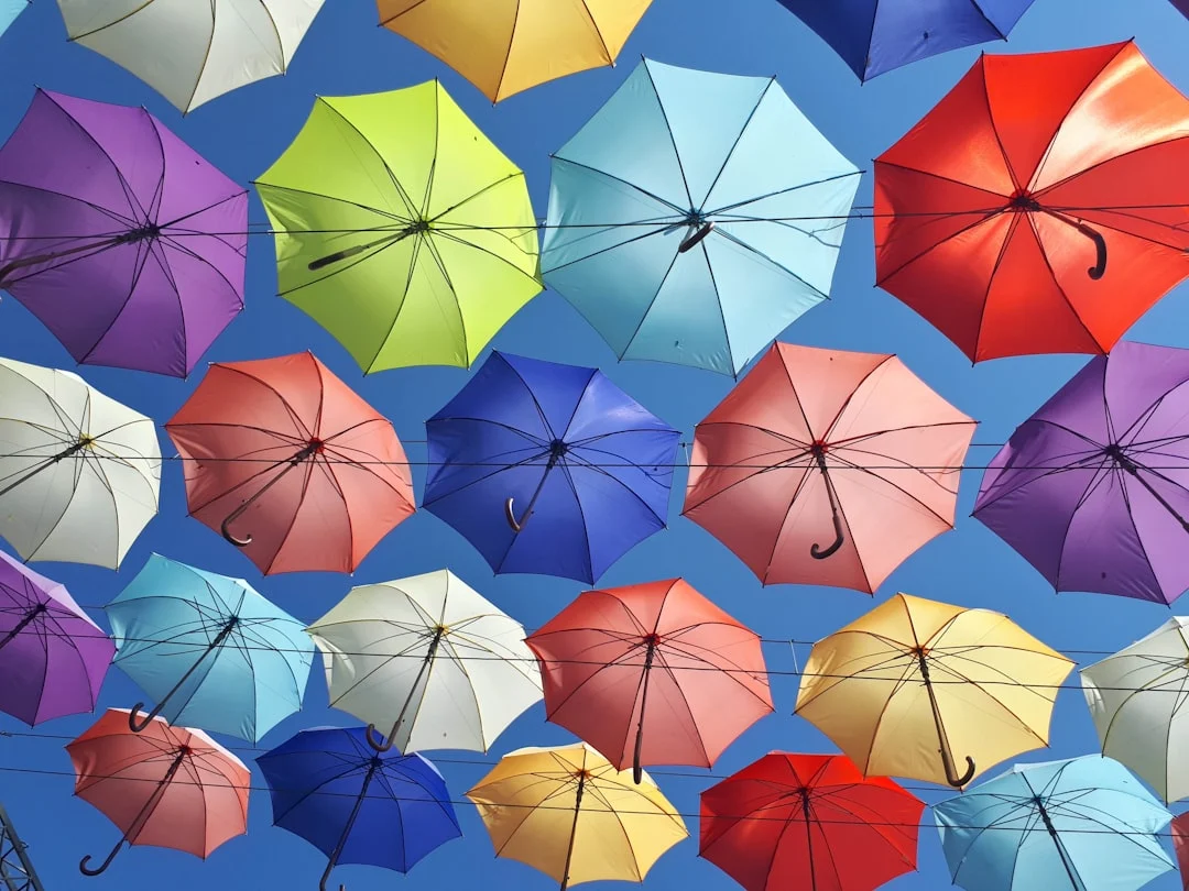
Triadic colors are evenly spaced around the color wheel: red, yellow, and blue, or orange, green, and purple. These combinations feel vibrant and balanced. They are less common in nature but can be found in urban environments, street markets, and deliberately styled scenes.
You do not need to memorize color wheel diagrams. Instead, train your eye to notice when colors in a scene work together and when they clash. Over time, you will develop an instinct for arranging your frame to emphasize harmonious color relationships.
Using Color to Direct Attention
Your eye is drawn to the most saturated, brightest, or most contrasting color in an image. This is a fundamental principle of visual perception, and you can use it to control where viewers look.
A person wearing a red jacket in a landscape of muted greens will always be the focal point, regardless of where they are positioned in the frame. A yellow taxi on a gray street draws the eye like a magnet. A single orange flower in a field of blue instantly becomes the subject.
This means you need to be intentional about color in every part of your frame, not just the subject. If there is a bright, distracting color in the background or at the edge of the frame, the viewer’s eye will wander there whether you want it to or not. Scan your entire viewfinder for competing colors before pressing the shutter.
In portrait photography, this principle guides wardrobe and background choices. Neutral clothing against a colorful backdrop puts focus on the environment. A colorful outfit against a neutral background puts all attention on the subject. The same principle applies to food photography, product shots, and any genre where you control the color palette.
Controlling Color in the Field
You have more control over color than you might think, even when shooting uncontrolled scenes.
Time of day. The color of natural light changes dramatically throughout the day. Midday light is neutral white. Golden hour light is warm orange. Blue hour light is cool blue. Overcast conditions produce soft, slightly cool, desaturated light. Choosing when you shoot is the single biggest way to control the color palette of your images.
White balance. Your camera’s white balance setting determines how it interprets color temperature. Auto white balance works well in many situations, but deliberately setting your white balance (or adjusting it in post) gives you creative control. Warming the white balance slightly makes sunset images glow. Cooling it enhances the mood of a somber, overcast scene.
Position and framing. You control what colors appear in your frame by where you stand and what you include. Sometimes taking two steps to the left removes a distracting red sign from the background. Sometimes zooming in tighter eliminates a chaotic mix of colors and leaves you with a cleaner, more harmonious palette.
Filters. Polarizing filters deepen blue skies and increase color saturation in foliage. They also reduce reflections on water and glass, which can reveal colors hidden beneath surface glare. This is one of the most useful physical tools for color control in landscape and outdoor photography.
Shooting in RAW. RAW files preserve the full color data captured by your sensor, giving you far more flexibility in post-processing. If you care about color (and you should), always shoot in RAW format. The difference in your ability to fine-tune colors after the fact is enormous.
Color in Post-Processing
Even with careful field technique, post-processing is where you refine and polish the color in your images. A few key adjustments make a significant difference.
HSL (Hue, Saturation, Luminance) sliders let you adjust individual color ranges independently. You can make blues deeper without affecting skin tones, shift greens toward yellow for a warmer autumn feel, or desaturate distracting colors in the background while keeping your subject vibrant. This is one of the most powerful color tools available in editing software.
Color grading (previously called split toning in some applications) lets you add color casts to the highlights, midtones, and shadows independently. Adding warm tones to highlights and cool tones to shadows is a classic technique that creates visual depth and a cinematic feel. Subtle application is key. The effect should feel natural rather than filtered.
Consistency matters. If you are presenting a series of images (a portfolio, a wedding gallery, a social media feed), color consistency ties the work together. Using the same white balance, similar color grading, and a consistent level of saturation across a set creates visual cohesion that makes your work look polished and professional.
Common Mistakes
Even photographers who understand color theory can fall into these traps.
- Over-saturating in post-processing. The saturation slider is the most abused tool in photo editing. Pushing colors to unnatural levels makes images look garish and artificial. If someone’s skin turns orange or the sky looks radioactive, you have gone too far. Use the vibrance slider instead of saturation for a more nuanced boost that protects skin tones.
- Ignoring color in the background. Your subject might look great, but a bright, distracting color behind them will pull the viewer’s eye away. Always check the edges and background of your frame for competing colors before shooting.
- Not considering color when choosing shooting time. The quality of light determines the color palette of your image more than anything else. Shooting a warm, romantic scene at noon under harsh white light will never produce the result you want. Plan your shooting times around the color of light you need.
- Clashing colors without intention. Sometimes color clashes work as a deliberate creative choice. More often, they are an oversight that makes the image feel chaotic. If your image has a jumble of competing saturated colors with no clear hierarchy, simplify. Remove elements, change your angle, or move closer to eliminate the visual noise.
- Forgetting about color in black and white. This might seem counterintuitive, but understanding color is essential even for black and white photography. Different colors convert to different gray tones. A red rose against green leaves might look dramatic in color but flat in black and white because both colors can map to similar gray values. Thinking about color before converting helps you predict and control the monochrome result.
Try This: Practical Exercises
These exercises will sharpen your ability to see, use, and control color in your photography.
Exercise 1: The Single-Color Walk. Take a walk with your camera and photograph only subjects or scenes that feature one specific color. Spend an entire session shooting “red” or “blue” or “yellow.” This trains your brain to scan for color patterns in the environment. You will be amazed at how much of your chosen color exists in the world once you start actively looking for it.
Exercise 2: Complementary Color Hunt. Seek out scenes that feature complementary color pairs: blue and orange, red and green, yellow and purple. These can be found in nature, urban environments, markets, and everyday life. Photograph these scenes with the complementary relationship as the primary compositional element. Pay attention to how the color contrast creates visual energy.
Exercise 3: Same Subject, Different Light. Choose a subject you can access at different times of day and photograph it during golden hour, blue hour, midday, and overcast conditions. Do not change anything about your composition or camera settings except exposure. Compare the four images and notice how the changing color of light completely transforms the mood, despite the subject remaining identical. This is one of the most valuable color lessons you can learn.
Color is not just something that happens to be in your photographs. It is an active compositional tool that shapes how people experience your images. When you start making deliberate color choices, picking your shooting time for the light, scanning your frame for distracting hues, seeking out color harmonies, and controlling saturation in post-processing, your photography takes on a level of visual coherence that separates intentional work from snapshots. See color, think about color, and use it with purpose.