This is one of the most useful lessons in the course. Composition is how you arrange what’s inside the frame, and it’s the difference between a photo that holds attention and one a viewer scrolls past. You need the camera fundamentals from the earlier lessons to act on what follows here: composition is where exposure, focus and framing come together into a single decision about what to include, what to leave out, and where to put it.
Without a working knowledge of composition, photographs tend to look accidental: the subject dead center with no context, or important elements cut off, or so much in the frame that the eye doesn’t know where to rest. None of the ideas below are rules in the sense of physics. They’re patterns that reliably make images easier to read. Learn them so you can use them on purpose, and break them on purpose too.
Primary and secondary elements
Every strong photograph uses a small number of these compositional tools, not all of them at once. Pick a landscape: you might use the rule of thirds to place the horizon, a complementary color pair for the light, and a line of trees as a secondary element that supports the shot without competing with it. Trying to cram every tool from this lesson into one frame produces clutter, not craft. Decide what is primary (the thing the photo is about) and what is secondary (the thing that supports it), and treat everything else as a candidate for removal.
Lines
Lines are one of the most direct ways to control how a viewer’s eye moves through a photograph. A line doesn’t have to be a literal object like a fence or a road; it can be implied by a row of objects, a gaze, or a shadow. Different line directions carry different associations, built up from a lifetime of seeing them in the world: verticals read as strength and height, horizontals read as calm and stability, diagonals read as energy and motion, and curves read as softness. None of this is a law of physics, but it is a consistent enough pattern in how people respond to images that it’s worth using deliberately.
Vertical lines run up and down: skyscrapers, tree trunks, a person standing straight. They tend to make a scene feel taller, stronger and more formal than it otherwise would.
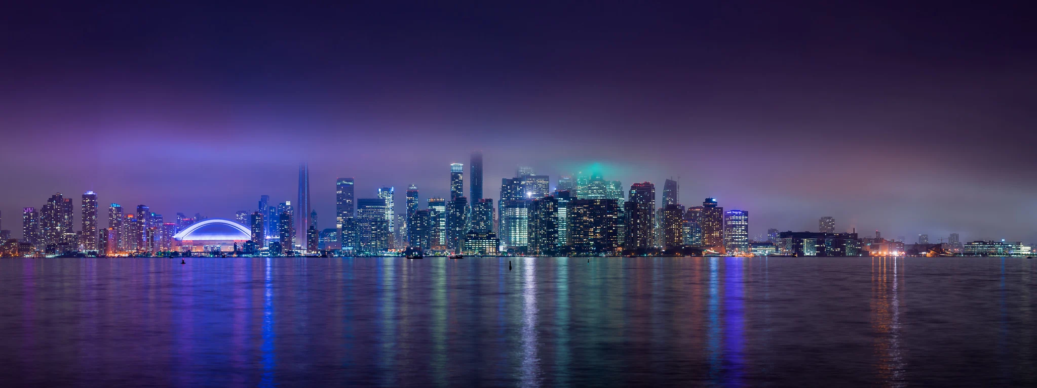
The repeated verticals of the towers do most of the work here. The long exposure also lets the reflection double each building’s visual weight, which is a technique covered later in this lesson.
Horizontal lines run side to side: a flat horizon, a sleeping figure, still water. They read as calm and restful, the opposite of a diagonal.
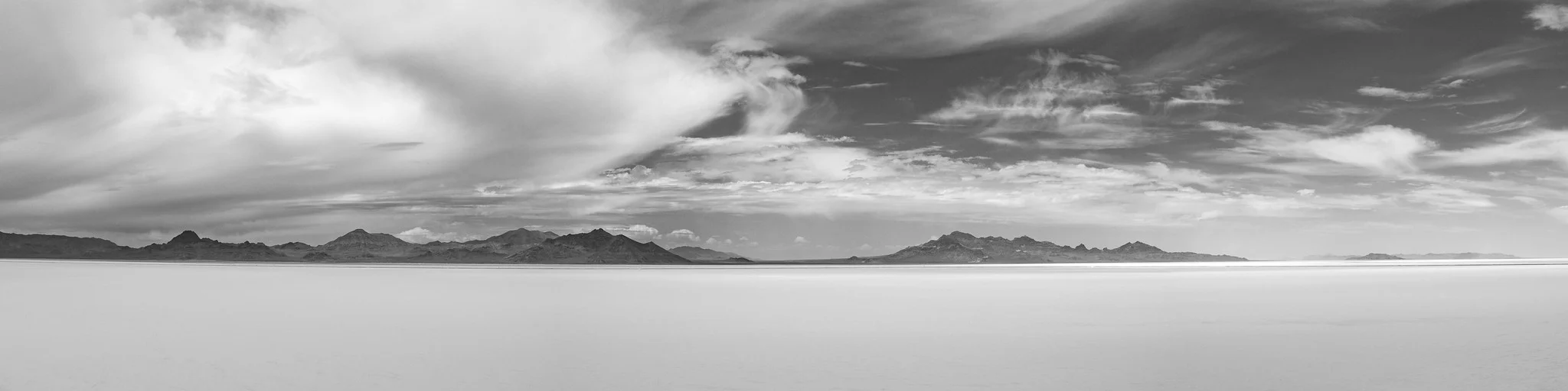
A flat salt desert is an extreme example, but the same effect works with any calm water, a quiet field, or a long empty wall. A wide panorama crop reinforces the horizontal feeling further.
Diagonal lines carry energy, force and motion: a runner leaning into a start, a mountain slope, wind-carved sand. You can also create a diagonal that isn’t there by tilting the camera, though used carelessly this just looks like a crooked horizon rather than an intentional choice.

Curved lines read as graceful rather than forceful: a river bend, a coastline, a path through a garden. A curve that reverses direction, an S-shape, is sometimes singled out as especially pleasing because it leads the eye into the frame, changes direction once, and leads it back out again, giving the composition both movement and balance.
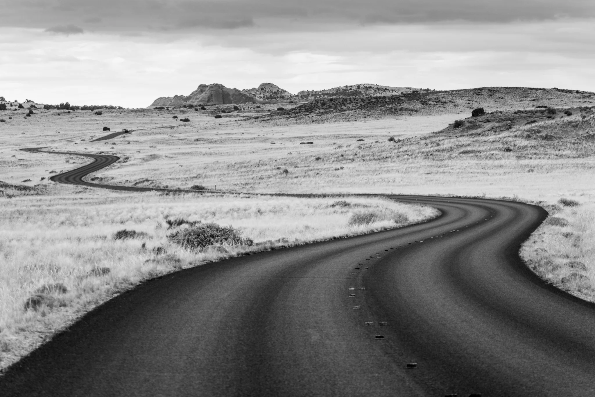
This road is also a textbook leading line: a line that starts near a bottom corner of the frame and draws the eye in toward the main subject, here the hills in the distance. A leading line works best when something in the frame, a bend, a building, the horizon, stops the eye once it arrives, rather than letting it run straight out of the picture with nothing to land on.
Shape
The way subjects relate to each other in a frame forms shapes that guide the eye between them. Squares and circles tend to feel static and symmetrical; triangles and irregular polygons tend to feel more dynamic, because the eye has to travel between unequal points. A triangle can come from the subject itself (a pyramid-shaped rock, a tent), from posing a group of people so their heads fall at uneven heights instead of a single flat line, or from three separate elements at different depths, a person in the foreground, a boat further out, an island at the far edge, that the eye can trace in sequence. A diagonal line splitting the frame into two contrasting triangles, a fence separating a busy road from an open field, can also emphasize the difference between the two halves.
Light and dark: high key and low key
When a photograph’s tones are pushed toward the bright end of the range, with few or no dark shadows, it’s called high key. When tones are pushed toward the dark end, with the frame mostly shadow, it’s called low key. Both are choices about how much of the tonal range you use, not just how bright or dark the overall exposure is: a high key image can still have a small, deliberate dark subject in it, and a low key image can still have one bright highlight.
High key photography tends to read as light, open and quiet, because most of the frame offers the eye nowhere to stop except the one dark shape you’ve left in it.
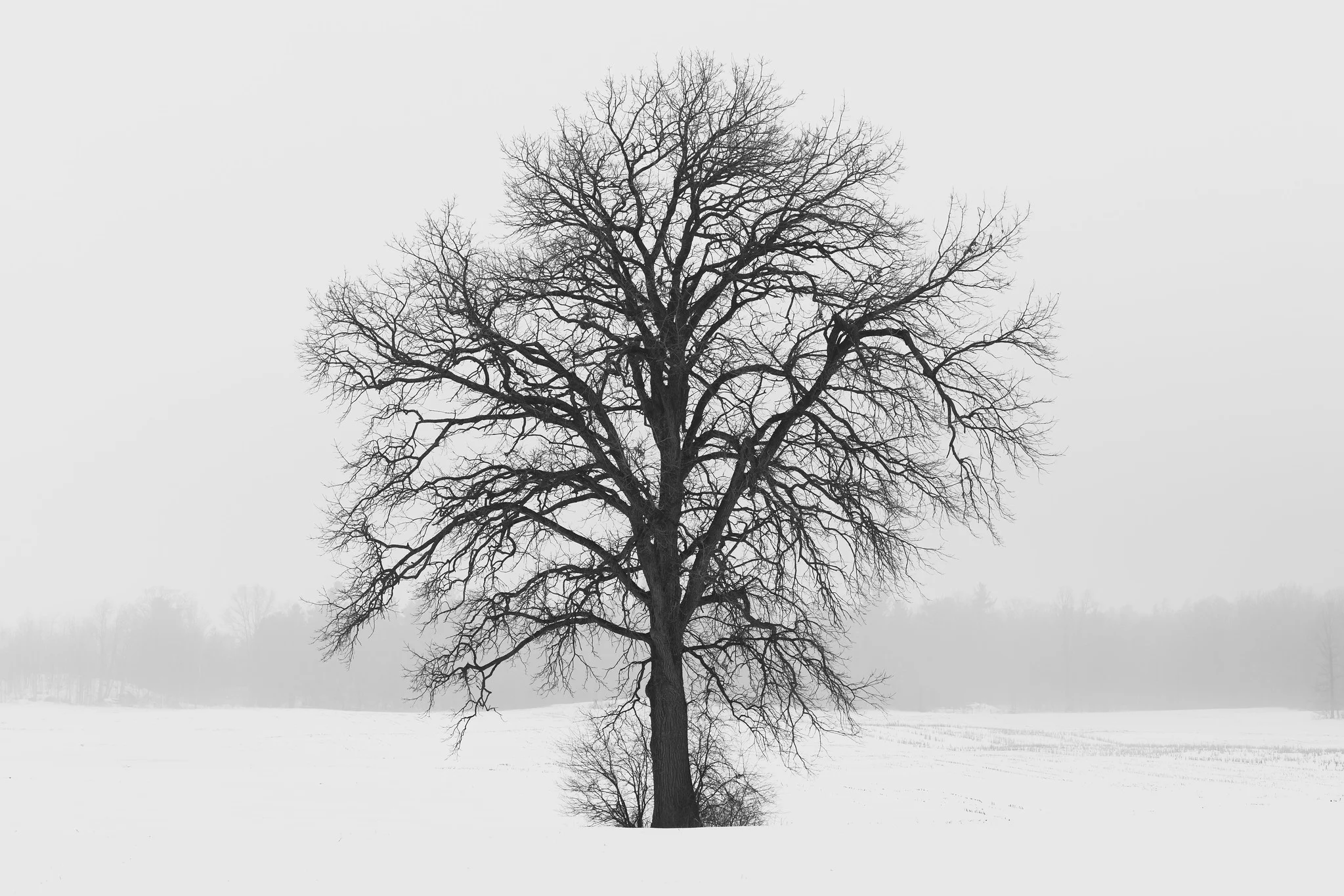
Snow and fog make high key easy because they hand you a bright, low-contrast background for free. Metering for the highlights (or dialing in positive exposure compensation over what the camera’s meter suggests for an all-white scene) keeps the snow bright without blowing out the one dark subject you want to keep.
Low key photography pushes the opposite direction: most of the frame in shadow, with light falling on only the part of the subject you want noticed. It tends to read as mysterious or dramatic, because shape and silhouette carry the image instead of color and even lighting.
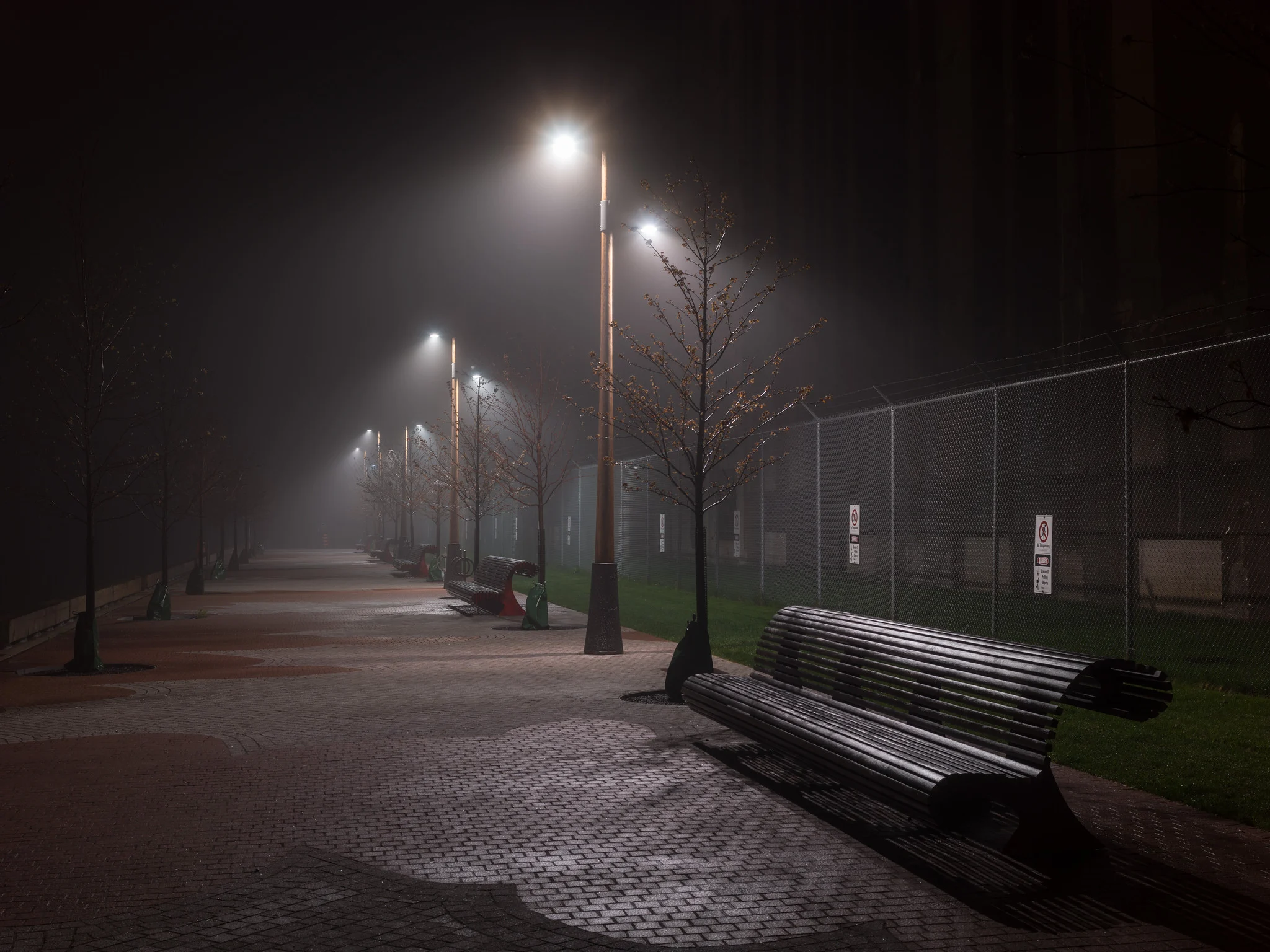
Night and fog do for low key what snow does for high key: the darkness removes everything you don’t want in the frame for free, leaving only what the light actually reaches. A tripod and a longer shutter speed, as in this exposure, let you keep ISO low even in very little light; see the shutter speed and ISO lessons for why that trade is usually worth making when nothing in the frame is moving.
Dominance and subordination
Dominance is the part of composition that establishes your main subject; subordination is making sure everything else supports it instead of competing with it. Not every secondary element needs to be removed, some need to stay but be visually quieted. If you’re photographing someone in a small room, the objects around them, a bed, a window, a chair, can stay in frame because they provide context for the story. You might use a wider aperture to blur the background just enough that it reads as context rather than competing detail. The test for any element in the frame is the same: does it support the main subject, or fight it for attention? If it does neither, it’s a candidate to crop out or reframe around.
Pattern
Pattern comes from shapes or lines that repeat: a row of windows, ripples on water, a stand of identical trees. It’s usually a secondary element that adds texture and rhythm to a photo built around something else, but it can become the primary subject in its own right, which is a large part of what abstract photography does: removing the “something else” and letting the repetition itself be the point.
Balance
Balance is how the visual weight of a photograph is distributed, through color, size, brightness and position. Formal balance is close to symmetry: a portrait shot straight-on, a building photographed dead center. It reads as calm, orderly, sometimes a little static, and works well for subjects that are themselves roughly symmetrical. Informal balance is asymmetrical: a large, dark shape on one side offset by two smaller, brighter shapes on the other. Most real scenes aren’t symmetrical, so informal balance is the more common tool, and it’s usually more visually interesting because the eye has to actively weigh the different elements against each other instead of registering a mirror image at a glance.
Reflection
A reflection, in still water, glass, metal or a puddle, adds a second copy of your subject to the frame, which effectively doubles its visual weight and can turn a plain composition into a more graphic, symmetrical one. It’s also one of the simplest ways to add a strong vertical line to a scene that otherwise lacks one, since the reflection extends the subject downward. You don’t need a lake for this: a rain puddle after a storm does the same job at street level.
Negative space
Negative space is the part of the frame left empty around your subject: a plain sky, a stretch of water, a blank wall. It doesn’t have to be a single flat color; a softly textured surface with little detail still reads as negative space as long as it isn’t competing with the subject for attention. The main use of negative space is emphasis: an isolated subject surrounded by nothing reads as more important, and often more solitary, than the same subject buried in a busy frame.

Almost the entire frame here is water. That’s what makes the small island read as remote rather than merely small: negative space changes how a subject feels, not just how much room it takes up. Note too that the island sits off-center rather than in the middle of the frame, which brings us to the next section.
The rule of thirds and the golden ratio
The rule of thirds is the most commonly taught composition guideline, and for good reason: it’s simple to apply in the field. Divide the frame into three equal columns and three equal rows, giving four intersection points, and place your main subject near one of those points instead of dead center. Do the same with the horizon in a landscape: put it roughly a third of the way up the frame if the foreground is the more interesting element, or a third of the way down if the sky is.
Why does this work better than centering, most of the time? Centering a subject leaves equal, often uninteresting space on all four sides and gives the eye nothing to explore. Placing the subject off-center creates a relationship between the subject and the remaining space, and that relationship is what holds attention. That said, this is a tendency in how most people respond to most photographs, not a hard perceptual law, and plenty of strong images center the subject deliberately, particularly portraits and anything symmetrical.
The rule of thirds is often described as a simplified version of a much older idea: the golden ratio, a proportion of roughly 1.618 to 1 that shows up repeatedly in mathematics, going back at least to the Greek mathematician Euclid, and that later designers and architects have deliberately built into buildings, page layouts and artwork because they found the proportion pleasing. The Fibonacci sequence (0, 1, 1, 2, 3, 5, 8, 13, 21…), where each number is the sum of the two before it, approaches the golden ratio more and more closely as it grows, and it’s this connection that’s usually invoked to explain why the ratio “shows up in nature.”
Be skeptical of the stronger versions of this claim. The golden ratio does describe some real patterns of plant growth reasonably well, phyllotaxis (the spiral arrangement of leaves and seeds) is a genuine, well-studied example. But the popular claim that a nautilus shell’s spiral is an exact match for the golden spiral doesn’t hold up: measured nautilus shells cluster around a variety of growth ratios, most of them close to but distinctly different from phi, and the same is true of the claims made about the Great Pyramids and human DNA. The golden ratio is a real mathematical constant with some real applications; it is not a hidden signature stamped on all of nature, and you don’t need to believe the mysticism to find it a useful compositional tool.
As a practical matter, a golden ratio grid divides the frame slightly differently than a rule-of-thirds grid, with the dividing lines a little closer to one edge. In photographic practice the two produce nearly identical results, and most photographers use “rule of thirds” as the everyday shorthand for both. The Greek Parthenon and Notre-Dame Cathedral are both commonly cited as buildings whose facades approximate the golden ratio, and it’s genuinely useful to search out photographs of them and see the proportion for yourself rather than take any single source’s word for it. In photography, the Magnum photographer Henri Cartier-Bresson is frequently cited as a photographer who composed with an eye for these proportions as part of what he called “the decisive moment,” and it’s worth looking through his published work with a thirds or golden-ratio grid in mind. Whether the Mona Lisa was deliberately composed on golden ratio lines is genuinely disputed among art historians; treat it as an interesting claim rather than a settled fact.
Complexity versus simplicity
In practice, the single most common mistake beginner photographers make is not a lack of technical skill: it’s leaving too much in the frame. It’s easy to fixate on the main subject and stop paying attention to everything else inside the four edges of the picture. Every element that makes it into the frame should be there on purpose, either as part of the main subject or as a deliberate piece of supporting context. If you can’t say why something is in the frame, that’s a sign to reposition, zoom in, change your angle, or wait for it to move, rather than leave it in and hope it doesn’t matter.
Amputation
“Amputation” describes a specific version of the clutter problem above: an object partially cut off by the edge of the frame in a way that reads as accidental rather than intentional, a person’s hand sliced off at the wrist, a second subject with their head cropped out at the top. It happens when you’re focused entirely on the main subject and stop checking the edges of the viewfinder. A deliberate crop, cutting off a subject’s legs below the knee in a tight portrait, for example, reads as a choice. An accidental one reads as a mistake. Before you press the shutter, do one more pass around the four edges of the frame and ask what’s crossing them and whether that’s what you want.
Viewpoint and perspective
The easiest change with the biggest effect on a photograph’s mood is often the simplest one: move your feet and change the height you’re shooting from. Most beginners shoot everything standing at their own eye level, because that’s the natural, unconsidered default. Raising or lowering the camera changes both what’s visible in the frame and the emotional register of the shot.
A high viewpoint, shooting down onto a scene, tends to orient the viewer by showing how elements relate to each other spatially, and it makes the subject feel smaller and less imposing. This is part of why aerial and drone photography reads as documentary or map-like rather than dramatic.

A low viewpoint, shooting up at a subject, does close to the opposite: it exaggerates height and scale, giving the subject a “larger than life” feeling, and it often clears background clutter automatically, because pointing the camera upward frequently means all you have behind the subject is open sky.
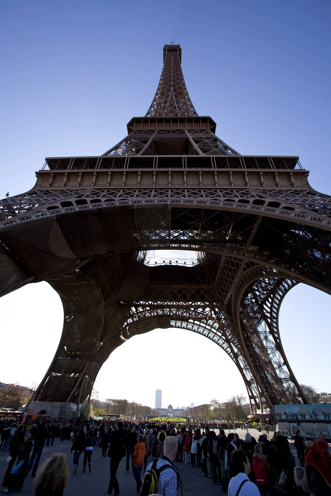
Neither viewpoint is correct. They’re two more tools alongside lines, balance and negative space, chosen for the feeling you want the photograph to carry, not applied automatically. The habit worth building from this lesson isn’t memorizing every term above: it’s the habit of pausing before you shoot and asking what’s in the frame, why it’s there, and where you’re standing when you take the picture.