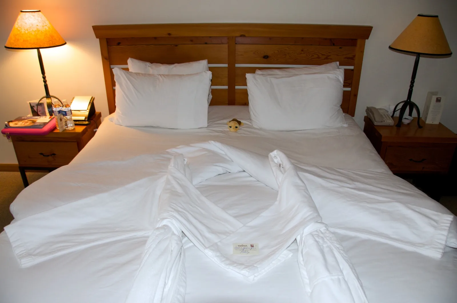
Interior photography comes down to five things: a level camera, a moderate wide-angle lens, a tripod, even light and a tidy room. Set the camera at about chest height (1.1 to 1.3 metres), keep it level so the walls stay vertical, use a focal length of 16 to 24mm on a full-frame camera, shoot at f/8 and base ISO, and bracket exposures when the windows are much brighter than the room.
This guide is written for hosts, homeowners and designers who photograph their own rooms. Real estate photography covers the agent’s job (flash blending, exteriors, twilight and virtual staging) and architectural photography treats buildings as design. This page goes further on where to stand, whether lamps should be on, how to style each room, how to handle small rooms, and how to choose the set of pictures for a rental listing.
What makes a room photo look professional
Put a quick snapshot of a room beside a photograph from a design magazine and the differences are easy to list. None of them depends on an expensive camera.
- Vertical lines are vertical. Door frames and wall corners run parallel to the sides of the picture. In the snapshot they lean, because the camera was tilted.
- The light is even. You can see into the corners and out of the window in the same frame.
- The colour is clean. White walls look white, not orange near the lamp and blue near the window.
- The room has been edited. Surfaces are mostly clear and nothing is in the frame by accident.
- The space is believable. The room looks the size it is.
The one piece of equipment worth having is a tripod, because good interior light is dim. At f/8 and ISO 100, a room lit by a window on a grey day can need a shutter speed of a second or more. A tripod also holds the composition while you walk in to move a chair and then check the result from the same viewpoint. How to use a tripod properly covers setting one up level and steady.
Camera height, verticals and where to stand
Three decisions set the geometry of every room photo: how high the camera is, whether it is level, and where it stands.
Height
A workable height for most rooms is about chest height, 1.1 to 1.3 metres from the floor. From standing eye level the camera looks down on the furniture and shows a lot of floor, which is the snapshot look. Too low and the ceiling dominates, and sofa backs hide what is behind them. Adjust by room: about a metre in bedrooms and lounges where the furniture is low, and around 1.4 metres in kitchens so the worktop surface is visible instead of only its front edge. You should see a little of the top of tables and worktops without looking down on them.
Level
Vertical lines converge whenever the camera points up or down. Keep the back of the camera upright, like a spirit level held against a wall, and every vertical in the room stays parallel to the frame edges. Use the camera’s electronic level or its grid lines, and compare a grid line with a door frame near the edge of the picture, where a tilt shows most. If keeping level cuts off something you need, change the camera height instead of tilting. A small lean can be straightened afterward at the cost of cropping, so leave spare room around the composition.
Position
- Straight on. The camera faces one wall squarely, so that wall’s horizontal lines run level across the frame and the side walls recede toward a single point. It looks calm and formal and suits a bed centred on a wall, a fireplace or a run of kitchen units. The camera must be truly square to the wall. A degree or two off looks like a mistake.
- From a corner or doorway. The camera looks diagonally across the room and shows two walls. This view shows the most floor and forgives small errors. If a third wall creeps in at the edge, the lens is usually too wide.
Stand back as far as the room allows, in a doorway or with the tripod against the wall, so that you can use a longer focal length for the same view. Then look at what sits nearest the lens. A chair back or the corner of a bed at the bottom of the frame becomes huge and blocks the room. Move sideways until the foreground is open floor or one low, tidy object.
Wide angle without stretching the room
A room needs a wide lens because you cannot back up through the wall. The range that works is roughly 16 to 24mm on a full-frame camera, about 10 to 16mm on APS-C. Toward 24mm, furniture keeps its shape. Toward 16mm you fit more in, but everything near the edges is stretched: a round table becomes an oval, a bedside lamp leans outward, and the far wall shrinks so the room looks deeper than it is. How to use a wide-angle lens explains edge stretch and how to control it.
- Use the longest focal length that still shows what the picture is about. A bed, a window and one chair say “bedroom” more clearly than four walls and a ceiling.
- Keep round and familiar objects out of the corners. Plates, clocks, lamps and stools show stretching first.
- Do not try to show a whole room in one frame. Two photographs from opposite corners describe it more honestly than one extreme wide view.
There is an honesty limit as well. A listing photo is a promise about what a guest will walk into, and a lens that makes a small double room look like a suite earns a complaint on arrival. Listing platforms publish photo rules, and advertising rules differ from place to place, so check the ones that apply to you.
| Setting | Where to begin | Reason |
|---|---|---|
| Aperture | f/8 (f/5.6 to f/11) | Sharp across the frame, with depth for a whole room |
| ISO | Base value, usually 100 | Cleanest shadows |
| Shutter speed | Whatever the exposure needs, often 1/4 second to several seconds | Nothing in the room is moving |
| Focus | An object about two metres away | At 20mm and f/8 on full frame, everything from under a metre to the far wall is acceptably sharp |
| White balance | A fixed preset or Kelvin value, raw files | Every frame gets the same colour |
| Release | Two-second self-timer or remote | No vibration from your finger |
Window light, lamps on or off, and mixed colour
Daylight through windows is the best light for most rooms. It is soft, it comes from the side and it gives furniture shape. The easiest conditions are a bright overcast day, or a time when the sun is not shining straight in. Direct sun throws hard patches on the floor that are several stops brighter than their surroundings and burn out to white. Open curtains fully and evenly, and raise all blinds to the same height.
Whether lamps should be on is the question everyone asks, and working photographers use both answers.
- Lamps off. All the light is daylight, so it is one colour and white walls stay white. The risk is that parts of the room far from a window go dim.
- Lamps on. Lamps add warm points of interest and lift dark corners. The risk is mixed colour. Warm white household bulbs are around 2,700 to 3,000 K and daylight is around 5,500 K or higher. With white balance set for daylight, every lamp throws an orange pool on the wall. Set for the lamps, the windows turn blue.
A practical rule for daytime: keep lamps off unless part of the room is too dark, and then switch on only lamps that appear in the frame. A lit lamp you can see reads as intentional. An orange glow from a ceiling light you cannot see reads as a colour fault. If you want every lamp on for an evening look, check that all the bulbs in the frame are the same type and colour, because one cool bulb among warm ones is obvious.
Dusk gives a third option. For a short time after sunset the daylight outside falls to about the brightness of the lamps inside. The windows show a deep blue view instead of a white blank, the lamps glow warm, and one exposure holds both. Have the room styled and the camera in place beforehand, because the balance lasts only a few minutes.
Orange and blue still in the same frame after the shoot? How to fix mixed light using raw smart objects covers masking each light source and adjusting each zone separately.
Bright windows: bracketing and blending
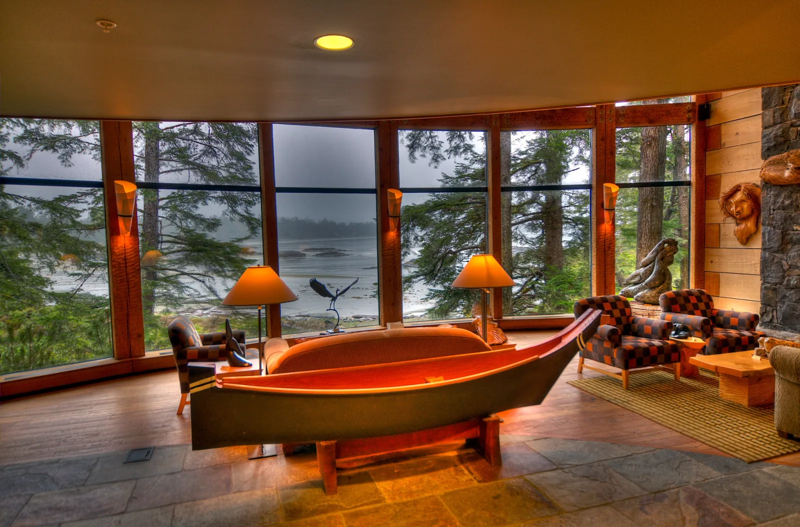
In daytime the view through a window is often many stops brighter than the wall beside it, more than a single exposure can hold. Expose for the room and the window is a white hole. Expose for the view and the room is black. There are four answers, simplest first.
- Choose the time. On an overcast day, at dusk, or when the sun is on the other side of the building, the gap between inside and outside shrinks.
- Expose for the room and let the window run bright. This is the airy look of many design magazines, and the right choice when there is no view worth showing. It works when the window frames and curtains keep their detail.
- Bracket. On the tripod, fix the aperture, ISO, focus and white balance and change only the shutter speed. Three frames two stops apart (minus 2, 0 and plus 2) cover most rooms. Use five when direct sun is on the scene outside. Bracketing explains the camera function that shoots the series for you.
- Add light inside. A flash bounced off the ceiling or the wall behind the camera raises the room toward the brightness of the window.
Merge the bracketed frames with the HDR function of a raw editor, then lower the highlights and lift the shadows. Keep the result natural: the window should still be the brightest thing in the picture, and there should still be shadow under the furniture. Anything that moves between frames leaves a ghost in the merge, so turn off ceiling fans and screens and close windows that are stirring the curtains.
Not sure how to merge the frames without a grey, overcooked look? HDR photography covers the bracketing technique, the merging workflow and natural versus dramatic tone mapping.
Styling and decluttering, room by room
Styling is removal first and addition second. The camera records everything with equal weight, and a wide lens shows a great deal of everything.
- Clear the surfaces. Leave no more than three objects on any worktop, bedside table or coffee table.
- Remove the personal and the temporary. Family photos, post showing a name or address, medicines, toiletries, fridge magnets, bins, laundry and trailing cables.
- Straighten. Push chairs in evenly, plump cushions, pull bed linen tight, fold towels the same way and level pictures on the wall.
- Check everything that reflects. Mirrors, television screens, oven doors and glazed pictures can all show you or the tripod. Move the camera sideways until they do not.
- Judge it on the camera screen. Zoom in and scan the edges. A fix is right when it looks right from the camera, even if a chair sits at an odd angle in the room.
Then add a little: a plant, a folded throw, a bowl of fruit. One or two things per room is enough. For a rental, style only with what a guest will find.
| Room | Camera position and height | Prepare | Watch for |
|---|---|---|---|
| Living room | Corner or doorway, about 1.1 metres | Cushions, clear coffee table, remotes and cables hidden | Reflections in the television; a sofa back filling the foreground |
| Bedroom | Corner at the foot of the bed, about 1 metre, or straight on | Smooth linen, matching pillows, clear bedside tables | Creases; storage showing under the bed |
| Kitchen | Straight on to the main run of units or from a corner, about 1.4 metres | Two or three objects on the worktop, empty sink, steel and glass wiped | Yourself in the oven door or a glossy splashback |
| Bathroom | Doorway, 1.2 to 1.4 metres, often a vertical frame | Toilet lid down, fresh towels, bottles removed, glass wiped | The camera in the mirror; water spots on glass and chrome |
Small rooms and bathrooms
A small room cannot be shown whole, and trying makes it look like a tunnel. Stand in the doorway, or just outside it with the door wide open, and show one end of the room well. Turn the camera vertical when the room is taller than it is wide: a vertical frame of basin, mirror and shower says more than a horizontal one with a door frame down each side.
Mirrors need a plan. Stand to one side so that the camera’s reflection falls outside the mirror, which means photographing it at an angle and not square on. Then look at what the mirror does show, because it is part of the picture. Bathrooms often have a small window or none, so this is the room where the ceiling lights usually stay on. Set the white balance for those lights.
The set for a listing: hero image, order and detail shots
A listing is a sequence, not a single picture. Most people see one small thumbnail in a page of search results, decide in a moment whether to open it, and then swipe through the rest to answer practical questions about beds, kitchen and bathroom.
The hero image is the cover photo. It has to read at thumbnail size, so it needs one clear subject, simple shapes and plenty of brightness. Choose whatever makes this place different: the view, the main living space, a fireplace, a terrace. A horizontal frame is the safe default, but platforms change the shape they display, so check the current guidance for yours.
- Main living space: two or three views from different corners.
- Each bedroom: one wide view and one of the bed.
- Kitchen: one overall view and one of the working end.
- Each bathroom: one or two frames.
- Dining table and desk: one each.
- Outside: the entrance, any garden, balcony or parking, and the view.
- Details: about one for every three or four wide views.
Arrange the pictures in the order of a walk through the door: cover, living space, kitchen, bedrooms, bathrooms, outside. A viewer who can build a floor plan in their head trusts the listing. How to write a photography shot list includes an example list for a property.
Detail shots are tighter, at a normal or short telephoto focal length, and a wider aperture such as f/2.8 to f/4 is fine because the background can be soft. They show what a wide view cannot: the coffee corner, a reading lamp and its books, the texture of the bed linen. Designers use the same shots to record materials and joinery.
Finish the set as a set: the same white balance and similar brightness on every frame, every vertical straight, saturation left alone. Removing a stray cable is tidying. Removing a permanent feature, such as a pylon in the view or a stain on the ceiling, misrepresents the place.
Walls still leaning in the finished file? How to use the Transform tool in Lightroom covers the automatic corrections, Guided Upright, the manual sliders and cropped corners.
Photographing a home for sale instead of a rental? DIY real estate photography covers preparing the property, exterior curb appeal, floor plan photos and virtual tours.
Common mistakes
- Leaning walls. The camera was tilted. Fix: level it, and change the height if you need more floor or ceiling.
- Going too wide. The room looks like a tunnel and objects at the edges are stretched. Fix: step back into the doorway, use 20 to 24mm and take two photographs.
- Camera at eye level. The picture looks down on the furniture. Fix: lower the camera to chest height.
- White windows and black corners. One exposure could not hold the range. Fix: shoot on an overcast day or at dusk, or bracket and blend.
- Orange and blue in one room. Fix: turn lamps off, or match the bulbs and use a fixed white balance.
- Clutter you stopped seeing. Fix: review each frame zoomed in before moving the tripod.
- Overcooked HDR. Grey, flat rooms with glowing edges around the windows. Fix: keep the window the brightest thing in the frame and leave real shadows under furniture.
Try this
Give one room fifteen minutes. Without tidying, stand in the doorway, hold the camera or phone at eye level and take one frame. Spend five minutes clearing every surface down to three objects. Set the camera at chest height on a tripod, or brace it on a chair back, and level it against a door frame. Take one frame from the doorway and one from the opposite corner at about 24mm. From the better position, take three versions: lamps off, lamps on, and a bracket at minus 2, 0 and plus 2 stops. Compare them on a large screen, looking at the verticals, the view through the window and the colour of the walls near each lamp.
Frequently asked questions
What is the best lens for interior photography?
A wide-angle zoom covering roughly 16 to 35mm on a full-frame camera, or about 10 to 24mm on APS-C, handles almost every room. Most pictures look best around 20 to 24mm, where furniture keeps its natural shape.
What camera settings should I use for interior photos?
Use a tripod, f/8, base ISO and whatever shutter speed gives a correct exposure, often a second or longer. Shoot raw with a fixed white balance and use the two-second self-timer.
Should the lights be on or off for interior photos?
In daytime, off gives the cleanest colour, because all the light is daylight. Turn on lamps that are visible in the frame when a room needs warmth or a dark corner needs lifting, and make sure the bulbs match.
How do I take rental listing photos with a phone?
Clean the lens, use the main camera and hold the phone level at chest height with the grid turned on. The ultra-wide camera stretches the edges, so use it only when a room will not fit. Leave HDR on, brace the phone on something solid and shoot in daylight with the curtains open.
Related guides
- Real estate photography: ambient and flash blending, twilight exteriors and virtual staging for sales listings.
- Architectural photography: perspective and geometry control for buildings inside and out.
- How to use a wide-angle lens: edge stretch, converging verticals and when not to go wide.
- Bounce flash: soft light from a ceiling or wall, and mixing it with the room light.
- Natural light photography: how window light behaves indoors.
- Photographing museums, churches and interiors: dim interiors and bright windows without flash or a tripod.
- How to photograph through glass: cutting reflections when the view from a window is the picture.