Run your eyes across a photograph of cracked, sun-baked earth, and you can almost feel the dryness under your fingertips. Look at a close-up of weathered barn wood, and you sense the rough grain and the splinters. This is the power of texture in photography. Texture adds a tactile, almost physical dimension to a two-dimensional image, giving your photographs a richness and depth that flat, smooth surfaces simply cannot achieve. Learning to see, capture, and emphasize texture will transform the way you photograph everything from landscapes to portraits, and it will make your images feel more immersive and real. Texture is a fundamental element of photographic composition, and mastering it opens up a new layer of visual storytelling.
What Is Texture in Photography?
Texture refers to the surface quality of an object as perceived visually. In the real world, texture is tactile: rough, smooth, soft, hard, gritty, silky, bumpy, polished. In photography, you cannot actually touch the surface, but when an image captures texture well, the viewer’s brain fills in the tactile sensation. A photograph of rust-covered metal feels rough. A photograph of flowing silk feels smooth. This visual-to-tactile translation is what makes texture such a powerful tool. It engages an additional sense beyond vision, making the image more immersive.
Every surface has texture, from the most obviously rough (bark, stone, coral) to the subtlest (skin, fabric, water). The question is not whether texture exists in your scene but whether you choose to emphasize it, minimize it, or ignore it. Deliberate texture work involves recognizing the textural qualities of your subject and using lighting, angle, lens choice, and distance to make that texture a prominent element of the composition.
Why Texture Matters
Texture adds depth to photographs that might otherwise feel flat. A smooth, evenly lit wall is a blank surface. The same wall photographed with sidelight that reveals every crack, chip, and brush stroke becomes a richly detailed surface that the eye wants to explore. Texture provides visual micro-detail that rewards close inspection. In an age of quick scrolling, images with strong texture make viewers pause and look more closely.
Texture conveys information about the subject. The peeling paint on an old building tells a story of age and neglect. The smooth, polished surface of a new car speaks to precision manufacturing. The weathered skin of a farmer’s hands reveals a lifetime of outdoor labor. Texture communicates without words, adding narrative layers to your images that go beyond what shape and color alone can convey.
Texture creates contrast within an image. The juxtaposition of rough and smooth, hard and soft, coarse and fine creates visual tension that keeps the viewer engaged. A rough stone wall behind a person wearing a silk dress. A splintered wooden dock leading to mirror-smooth water. These textural contrasts work on the same principle as juxtaposition in composition, using opposing qualities to create interest and meaning.
The Role of Light in Revealing Texture
Light is the single most important factor in texture photography. The direction, quality, and angle of light determine whether a textured surface looks dramatic and three-dimensional or flat and featureless.
Sidelight: The Texture Revealer
Sidelight, where the light source is positioned to the side of the surface, is the most effective type of lighting for revealing texture. When light strikes a surface at a low, raking angle, every bump, ridge, crack, and imperfection casts a tiny shadow. These micro-shadows make the texture visible and dramatic. The lower the angle of the light, the longer the shadows and the more pronounced the texture appears.
This is why golden hour light, the low-angle sunlight shortly after sunrise or before sunset, is so prized for texture work. At golden hour, sunlight rakes across surfaces at an extreme angle, turning walls, ground surfaces, tree bark, and rocks into landscapes of light and shadow. The same surface photographed at midday, when the sun is directly overhead, appears flat by comparison because the light hits the surface from above, filling in the shadows that define the texture.
Backlight
Backlighting, where the light comes from behind the subject, reveals a different kind of texture. Translucent subjects like leaves, fabric, paper, and flower petals glow when backlit, revealing internal structures and surface details that are invisible with front or sidelight. A backlit leaf shows its vein network in exquisite detail. A backlit curtain reveals its weave. Backlighting works best for thin, translucent surfaces and creates a luminous, almost ethereal texture quality.
Front Light
Front light, where the light source is behind the camera and illuminates the surface evenly, minimizes texture. Because the light fills in all the micro-shadows, the surface appears smoother and flatter. This is not necessarily bad. Portrait photographers often use front light deliberately to minimize skin texture and create a smooth, flattering look. But for subjects where texture is the point, front light is usually the weakest choice.
Diffused vs. Hard Light
Hard, directional light (direct sunlight, a bare bulb, a focused spotlight) creates the sharpest, most dramatic texture because the shadows are well-defined. Soft, diffused light (overcast sky, a large softbox, reflected light) creates gentler shadows and a more subtle texture rendering. For maximum texture drama, use hard sidelight. For a softer, more even texture quality, use diffused natural light from the side.
How Distance and Angle Affect Texture
The distance between your camera and the subject determines the scale of the texture in your image. From far away, the rough surface of a mountain appears as a smooth, gradual slope. Move closer, and individual rocks and crevices emerge. Move closer still with a macro lens, and the surface of a single rock becomes a landscape of mineral crystals and micro-fractures. Every surface has multiple layers of texture that reveal themselves at different distances.
Your shooting angle also matters. Surfaces photographed straight-on reveal less texture than surfaces photographed at an oblique angle. When you shoot a textured surface at a steep angle, the perspective compression makes the texture elements overlap and stack, creating a denser, more visually complex pattern. A wooden deck photographed from directly above shows the grain pattern as flat lines. The same deck photographed from a low angle shows the dimensional depth of each plank, with grain, warping, and weathering all becoming more pronounced.
Getting your camera to the right height and angle often means getting lower than you might expect. Many of the best texture photographs are shot from positions close to the surface, where the raking angle of the camera itself helps emphasize the three-dimensional quality of the texture.
Lens Choice for Texture
Any lens can photograph texture, but certain focal lengths and lens types lend themselves to different scales of texture work.
Macro lenses are the ultimate texture tools. They allow you to fill the frame with fine detail that is invisible to the naked eye. The texture of a butterfly wing, a rusted bolt, a piece of bread, or a section of woven fabric, each becomes a world of detail when photographed with a macro lens. If texture is a major part of your photography, a macro lens (60mm to 105mm) is a worthwhile investment.
Standard focal lengths (35mm to 50mm) render texture at roughly the same scale the human eye perceives it, which creates a natural, relatable feel. These lenses are versatile for environmental texture work, where you want to show the texture in the context of its surroundings.
Telephoto lenses (70mm to 200mm and beyond) let you isolate texture from a distance. A telephoto can pick out the texture of a distant rock face, a weathered roof, or a patch of bark on a tree across a field. The compression effect of telephoto lenses also stacks texture elements together, creating a denser, more packed visual effect.
Wide-angle lenses can incorporate texture as part of a broader composition, particularly as foreground interest. A wide-angle shot of a landscape with a heavily textured rock in the near foreground uses the texture to anchor the bottom of the frame and draw the viewer into the scene.
Texture as Subject vs. Texture as Element
Texture can serve two different roles in your photographs, and understanding this distinction will help you use it more intentionally.
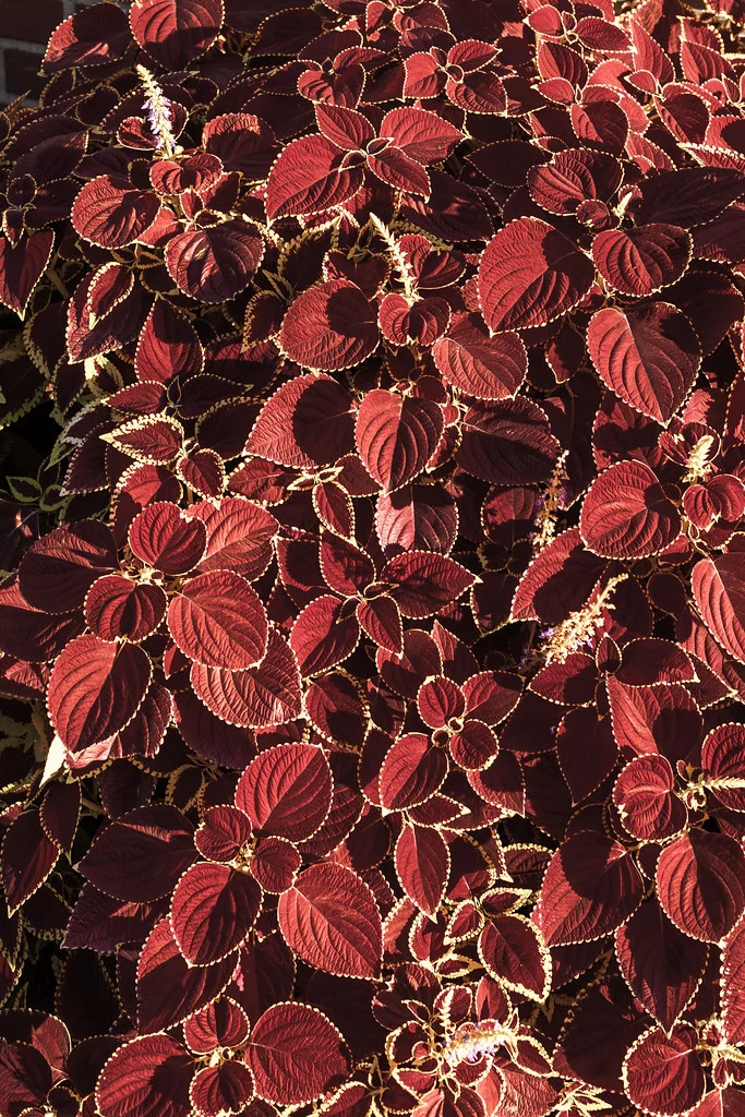
Texture as subject: The texture itself is the main focus of the image. There is no other subject competing for attention. The image is about the texture: its pattern, its tactile quality, its visual rhythm. This approach produces images that often border on abstract photography. A frame-filling shot of cracked earth, peeling paint, woven bamboo, or rusted metal is a texture-as-subject image. These photographs work because the texture is rich enough and detailed enough to sustain the viewer’s interest on its own.
Texture as element: The texture plays a supporting role in a broader composition. It adds depth, context, or mood to the image without being the primary subject. A portrait where the subject leans against a rough brick wall uses the wall’s texture as a compositional element that adds visual interest and says something about the environment. A landscape where foreground gravel adds texture that contrasts with a smooth sky uses texture as one of several compositional elements working together.
Both approaches are valid, and many strong photographs combine them: a close-up texture shot that also includes a small subject (an insect on bark, a flower growing from cracked concrete) bridges the two roles.
Textural Contrast
One of the most effective ways to use texture is to place contrasting textures next to each other within the same frame. Rough next to smooth. Hard next to soft. Coarse next to fine. Organic next to manufactured. These textural contrasts create visual tension and make each texture more noticeable by comparison.
A weathered, rough-hewn wooden table with a smooth, glossy apple sitting on it. A person in a soft wool sweater leaning against a cold, hard concrete wall. A delicate feather resting on coarse sandstone. In each case, the textures amplify each other. The smoothness of the apple is more apparent against the rough wood. The softness of the wool is more pronounced against the hard concrete. This principle of contrast applies to texture in the same way it applies to color, light, and all other visual elements.
When composing with textural contrast, position the contrasting textures so that the viewer can easily compare them. Place them adjacent to each other within the frame, or use one as a background for the other. The contrast should feel natural and meaningful, not forced. A smooth river stone on a sandy beach is a natural textural contrast. A random smooth object placed on a rough surface for the sake of a photograph feels contrived.
Texture in Different Photography Genres
Landscape Photography
In landscape photography, texture is often what separates a good image from a great one. Textured foregrounds (rocks, grass, sand, ice) anchor the bottom of the frame and give the viewer a tactile entry point into the scene. The texture of clouds across the sky adds visual weight to the upper portion of the frame. The texture of distant mountains, softened by atmospheric haze, creates a sense of depth. Work with golden hour light to maximize the texture in your landscape foregrounds, and use a narrow aperture to keep texture sharp from front to back.
Portrait Photography
In portrait photography, texture decisions involve both the subject and the environment. Skin texture is one of the most discussed aspects of portrait work. Some portraits emphasize skin texture, showing every pore, wrinkle, and imperfection for an honest, editorial look. Others minimize skin texture with soft light, wide apertures, and post-processing smoothing for a polished, commercial look. The choice depends on the purpose of the portrait and what you want to communicate about the subject.
Beyond skin, the textures of clothing, backgrounds, and props all contribute to the overall feel of a portrait. A subject wearing a coarse knit sweater against a smooth studio backdrop. A musician’s calloused hands gripping a leather guitar strap. An elderly person’s lined face framed by a soft, out-of-focus garden. Each texture tells part of the story.
Architecture Photography
In architecture photography, texture reveals the materials and craftsmanship of a building. The rough-cut stone of a medieval castle. The smooth glass and steel of a modern skyscraper. The warm, grainy wood of a traditional Japanese temple. Texture communicates the character and age of architecture in a way that shape alone cannot. Use sidelight to emphasize architectural textures, and get close enough to show the material quality rather than just the overall form.
Abstract Photography
Texture is one of the primary tools of abstract photography. When you isolate a texture from its context, removing any clue about what the object is, the image becomes purely about the visual and tactile quality of the surface. Peeling paint becomes an abstract color field. Rusty metal becomes a landscape of warm tones and rough terrain. Ice crystals become geometric art. Abstract texture photography trains you to see surfaces as compositions in their own right, separate from the objects they belong to.
Street Photography
In street photography, urban textures add atmosphere and grit. Crumbling plaster, graffiti-covered walls, wet pavement, rusted gates, and worn wooden doors all convey the character of a neighborhood. Incorporating these textures as backgrounds or environmental elements gives your street photographs a sense of place that clean, smooth surfaces lack. The textures tell the viewer about the history, age, and character of the location.
Texture and Patterns
Texture and patterns overlap significantly. Many textures contain repeating elements that form patterns: the grain lines in wood, the scales on a fish, the weave of a basket. When you photograph these textural patterns, you are working with both concepts simultaneously. The distinction is one of emphasis. If you are focused on the tactile, surface quality, you are working with texture. If you are focused on the rhythm and repetition, you are working with pattern. Many images do both at once, and that is perfectly fine. The concepts are complementary, not competing.
Color vs. Black and White for Texture
Texture often reads more powerfully in black and white than in color. When color is removed, the viewer’s attention shifts entirely to form, tone, and surface detail. The tonal range of light and shadow across a textured surface becomes the dominant visual element. Black and white texture photographs have a graphic, almost sculptural quality that color versions sometimes lack.
Color, on the other hand, adds another layer of information to texture. The warm orange-brown of rusted metal, the green-gray of lichen on stone, the rich red of a leather surface. Color texture photographs feel warmer and more contextual than their monochrome counterparts. Both approaches are valid. Try converting your texture images to black and white in post-processing to see if the texture reads more strongly without color. Often, the answer is yes.
Common Mistakes
Flat lighting that kills the texture. This is the most common texture photography mistake. Front light or soft overhead light minimizes the shadows that define texture. If your texture photograph looks flat, the problem is almost always the lighting direction. Revisit the scene when the sun is lower, or reposition your artificial light source to the side of the surface.
Not getting close enough. Texture becomes more impactful the closer you get. If you photograph a textured wall from ten meters away, the texture is barely visible. At one meter, it begins to emerge. At arm’s length with a macro lens, it fills the frame with rich detail. If your texture images feel weak, try moving closer.
Motion blur destroying detail. Texture photographs depend on sharpness to convey the fine surface detail. Camera shake or subject movement can blur the texture and destroy the tactile impression. Use a fast enough shutter speed to eliminate motion blur, or use a tripod. This is especially important in macro texture work, where even tiny movements are magnified.
Over-sharpening in post-processing. It is tempting to crank up the sharpening slider to make texture pop. But excessive sharpening creates halos and artifacts that make the image look processed and unnatural. Apply sharpening subtly. If you captured the texture well in the field with proper lighting and focus, minimal sharpening is needed.
Ignoring the aperture. For texture-as-subject images, you usually want maximum depth of field so the entire textured surface is sharp. Use a narrow aperture (f/8 to f/16) and focus carefully. For texture-as-element images, where the texture is a background or supporting detail, shallow depth of field may be appropriate. But even in those cases, the textured area should be rendered with enough sharpness for the viewer to perceive the tactile quality.
Choosing uninteresting textures. Not every texture makes a compelling photograph. Smooth, featureless surfaces are not interesting. Mildly rough surfaces with no distinctive character are forgettable. The most photographable textures have strong visual character: deep cracks, bold grain patterns, dramatic weathering, extreme roughness, or unusual material qualities. Be selective about which textures you photograph.
Try This
The golden hour texture walk. Go outside during golden hour with the specific goal of photographing textures. The low, raking light will reveal textures in walls, sidewalks, tree bark, fences, and every surface you encounter. Shoot at least twenty texture images. Review them afterward and note which surfaces responded most dramatically to the golden hour light.
Textural contrast pairs. Photograph five pairs of contrasting textures. Rough and smooth. Hard and soft. Organic and manufactured. Include both textures in a single frame for each pair. Pay attention to how the textures interact and how the contrast makes each texture more noticeable.
The lighting experiment. Choose a single textured object (a piece of bark, a rough stone, a woven basket) and photograph it with light coming from five different directions: front, left side, right side, back, and above. Compare all five images. You will see how dramatically the appearance of the same texture changes with lighting direction. This single exercise will teach you more about texture photography than any amount of theory.
Macro texture exploration. Use a macro lens, extension tubes, or your lens’s closest focusing distance to photograph textures at extreme close range. Fabric weave, paper fibers, skin pores, metal grain, food surfaces. The closer you get, the more you will discover textures that are invisible at normal viewing distance. Try to photograph at least ten different materials. This could make an excellent addition to your photography project ideas.
The black and white conversion. Take ten of your texture photographs and convert them to black and white. Compare the color and monochrome versions side by side. Note which textures are enhanced by the removal of color and which lose something important. This exercise builds your understanding of when black and white treatment strengthens texture work.
Texture in portraits. Photograph a portrait where texture plays a significant role. It could be the texture of the subject’s skin, their clothing, the background, or all three. Pay attention to how your lighting choice affects the visibility of each texture. Experiment with sidelight (emphasizes skin texture) and front light (minimizes skin texture) and decide which serves the portrait better.
FAQ
What is the best lighting for texture photography?
Sidelight is almost always the best choice for emphasizing texture. The low, raking angle creates the micro-shadows that define texture. Hard sidelight (direct sun at golden hour) creates the most dramatic texture. Soft sidelight (overcast but directional) creates a more subtle, even rendering. Front light flattens texture, and top light (midday sun) minimizes it on vertical surfaces while emphasizing it on horizontal ones.
Do I need a macro lens for texture photography?
No, but a macro lens opens up an entire scale of texture that other lenses cannot reach. Many compelling texture photographs are shot with standard or telephoto lenses at normal working distances. A macro lens is valuable if you want to explore fine detail (fabric weave, mineral crystals, insect surfaces), but it is not essential for texture work in general.
How does texture relate to depth in photography?
Texture and depth are closely connected. Texture in the foreground of an image (a rocky surface, a sandy beach) creates a sense of depth by giving the viewer a tactile anchor point close to the camera. As the eye moves from the textured foreground to the smoother background, the change in texture detail reinforces the perception of spatial distance. This is why textured foreground interest is so effective in landscape photography.
Should I always maximize texture in my photographs?
No. Sometimes minimizing texture serves the image better. Portrait photographers often soften skin texture for a flattering look. Landscape photographers sometimes use long exposures to smooth water texture into a silky blur. Minimalist photographers may deliberately seek out smooth, featureless surfaces. Texture is a tool, and like any tool, its value depends on context. Emphasize it when it serves your vision, and minimize it when smoothness or simplicity is more appropriate.
How do I capture texture on overcast days?
Overcast light is soft and diffused, which reduces the dramatic shadows that define texture. On overcast days, look for textures with inherently strong three-dimensional relief (deeply cracked surfaces, heavily weathered wood, rough stone with deep grooves). These textures still read well in soft light because the shadows are created by the depth of the surface features, not just the angle of the light. You can also get very close to textured surfaces and use a small flashlight or reflector to add directional light artificially.
Can texture be the main subject of a photograph?
Absolutely. Texture-as-subject images are a recognized genre, closely related to abstract photography. The most successful texture-as-subject images feature surfaces with strong visual character: interesting color, dramatic form, and enough detail to sustain the viewer’s interest. Fill the frame with the texture, light it well, and ensure the image is sharp. The texture itself becomes the composition, the subject, and the story.
What is the relationship between texture and patterns?
Texture and patterns often coexist but serve different functions. Texture appeals to the tactile sense, making the viewer feel the surface. Patterns appeal to the rhythmic sense, making the viewer follow the repetition. A woven basket has both texture (the rough, fibrous surface) and pattern (the repeating weave). You can emphasize one or the other through your lighting, angle, and distance choices, or you can celebrate both simultaneously.