To photograph a painting accurately, put the camera on a tripod with the sensor exactly parallel to the artwork and the lens aimed at its center, use a normal to short telephoto focal length, and light it with two identical lights at about 45 degrees on either side. Shoot a gray card or color target in the same light to set white balance, work in RAW at a middle aperture, and cross-polarize the lights and lens if the surface is glossy.
Copying artwork is one of the few kinds of photography with a right answer. The goal is a faithful record, not an interpretation: the rectangle stays a rectangle, every corner is equally bright, the colors match the original, and no glare hides the brushwork. Each goal has its own technique.
Squaring the camera to the artwork
If the sensor is not parallel to the artwork, the edge nearer the camera comes out larger than the far edge and the rectangle turns into a trapezoid. This is keystoning, and it is the most common flaw in photographs of paintings. It can be corrected in software, but correction stretches some pixels and discards others, and it cannot fix the focus: with a tilted camera, one side of the canvas sits closer than the other, and at wider apertures it goes soft.
Get it right in the camera with this sequence:
- Hang the work flat and level. A painting on a wall is easier than one on an easel, because easels usually tilt the canvas back. If the work must lean, tilt the camera to the same angle rather than leaving the camera level.
- Put the lens at the height of the artwork’s center and directly in front of it, so an imaginary line from the middle of the painting hits the middle of the lens at a right angle.
- Level the camera with the in-camera level or a bubble level on the hot shoe, for a work hanging vertically.
- Check with the mirror trick. Hold a small flat mirror against the center of the artwork. Look through the viewfinder or at the screen: you should see the reflection of your own lens. Adjust the tripod head until the lens appears dead center in the mirror. At that point the lens is looking straight at the surface, not at an angle.
- Confirm with the grid. Turn on the grid overlay and compare the edges of the artwork with the grid lines. Parallel edges mean parallel planes. A tape measure from the lens to each corner is an alternative: equal distances mean the camera is square on.
Choosing the focal length and distance
For a flat subject photographed square on, any rectilinear lens reproduces the shape correctly in theory. In practice, a normal to short telephoto focal length (roughly 50 to 100mm on a full-frame camera, or 35 to 70mm on a smaller sensor) is the best choice, for four reasons:
- Less lens distortion. Wide-angle lenses tend to bow straight edges outward (barrel distortion), which is obvious on the frame of a painting. Short telephotos and macro lenses are usually close to distortion-free. See lens distortion for the different types.
- More forgiveness. The further the camera is from the work, the smaller the difference in distance between the near and far edges for any small alignment error, so a slight tilt produces much less keystoning.
- Room for the lights. A wide lens puts the camera close to the painting, where the camera and tripod cast shadows and show up in reflections.
- Less vignetting. Corners darken less with a longer lens stopped down a little, which makes even lighting easier to judge.
Use the lens’s sharpest middle aperture, usually f/5.6 to f/8. A flat surface needs very little depth of field, and going beyond f/11 softens detail through diffraction. Keep the ISO at its base setting and use the self-timer or a remote release. Focus with magnified live view on a patch of fine detail near the center, then check the corners at the same magnification. Soft corners with a sharp center almost always mean the camera is not square.
Lighting evenly with two lights at 45 degrees
The standard copy setup uses two identical lights, one on each side of the camera, each aimed at the artwork from about 45 degrees to its surface. Identical matters: two different lights rarely match in color or brightness, and the mismatch shows as a color shift from one side of the painting to the other.
The 45-degree angle is a compromise between two problems. Move the lights closer to the camera axis and their reflections start bouncing off the surface straight into the lens as glare. Move them closer to the wall, so the light skims across the surface, and every brush ridge throws a shadow and the near side of the painting becomes much brighter than the far side. That grazing light is useful as a separate texture study, but it is not a faithful copy.
Distance matters as much as angle. Light falls off with distance according to the inverse square law, so with a light close to a large painting, the near edge can be a stop brighter than the far edge. Pulling both lights back makes the difference in distance across the work proportionally small, and the illumination evens out. A useful refinement is to aim each light slightly past the center, toward the far edge of the artwork, so the brighter core of each beam lands on the side that is further away.
Checking that the light is even
Your eye adapts too well to judge evenness. Measure it instead:
- The gray card check. Hold a gray card flat against the artwork at the center and at each corner and take a spot meter reading or a test photo at each position. Adjust the lights until all five readings match as closely as you can. Differences you would ignore in a landscape show clearly across a flat field of paint.
- The pencil check. Hold a pencil straight out from the middle of the artwork. It should cast two shadows, one from each light, of equal length and equal darkness. A darker shadow means the light casting it is stronger; a longer one means that light is at a more grazing angle.
- Kill the room light. Turn off ceiling lights and cover windows. Mixed light sources add color casts that change across the painting and cannot be fully removed with one white balance setting.
Use flash or continuous LED panels with a high color rendering rating, both of the same kind, with diffusers or umbrellas to soften shadows from texture in the paint. The setups in product photography use the same principles for three-dimensional objects.
Glare, varnish and cross-polarization
Glare is specular reflection: light bouncing off a glossy surface like a mirror. Varnished oils, glossy acrylics and heavily textured impasto are the worst offenders. On a flat surface, 45-degree lights usually keep the mirror-angle reflection out of the lens. On textured paint, every raised brushstroke has tiny faces tilted at all angles, and some of them always reflect a light straight into the camera, which shows as white specks across the darks.
The professional cure is cross-polarization. It works because reflected glare keeps the polarization of the light that caused it, while light that has entered the paint and scattered back out from the pigment loses it. The setup has three parts:
- Cover each light with a sheet of linear polarizing film, with both sheets turned to the same orientation.
- Put a polarizing filter on the lens. An ordinary circular polarizer works.
- Rotate the lens filter while watching a shiny spot (the glare on a varnished area, or a spoon held against the canvas). At one position, 90 degrees to the film on the lights, the glare vanishes. That is the crossed position.
The cost is light. The film and the lens filter each absorb more than half of the light passing through them, so expect to need roughly three stops more exposure than without polarizers. Keep film well away from hot lamps; flash and LED lights run cool enough to use with it. Be aware that removing every trace of surface sheen makes the colors look deeper and more saturated than viewers see them in a room, and some artists regard the gloss as part of the work. Decide deliberately, and if the result looks too dense, rotate the lens filter back slightly to let a little of the natural sheen return.
Framed work behind glass
Glass in front of a picture reflects everything on your side of it: the room, the lights, the camera, and you. The best solution by far is to photograph the work out of its frame, with the owner’s permission. When that is not possible:
- Black out the camera side. Work in a dark room and hang a black cloth or a large sheet of black card behind or around the camera, with a hole for the lens. Glass can only reflect what is lit, so dark, matte surroundings give it nothing to show.
- Keep the lights at 45 degrees, or angled slightly more toward the wall, so their reflections from the flat glass bounce away to the sides rather than into the lens.
- Cross-polarize. Reflections of the polarized lights in the glass are blocked just as glare on varnish is. It does not remove reflections of unpolarized things like the camera or a bright window, which is why the room must also be dark.
A polarizer on the lens alone does little here, because it only cuts reflections from glass viewed at an angle, and copy work is done square on. The same physics is explained for zoos and shop windows in photographing through glass and fences.
Getting the color right with a gray card or color target
Even with good lights, the camera’s automatic white balance guesses from the painting’s own colors, and a canvas dominated by warm reds will be pulled cooler. Take the guess out:
- Place a gray card or a color target in the same plane as the artwork, in the same light, and take a reference frame. Then remove it and shoot the artwork with identical settings.
- In your editor, click the white balance picker on the gray patch and apply that setting to the artwork frame.
- Set exposure so the lightest neutral patch is bright but not clipped in any channel on the histogram.
- For the highest accuracy, use profiling software with a color target to build a custom camera profile for that lighting. How to use a color chart walks through the reference frame and the profile.
Then judge the result on a calibrated screen, ideally side by side with the original under light of a similar color. The wider chain of calibrated devices and consistent color spaces is covered in color management. One limit is worth knowing: some pigments change appearance under different light sources, so a match under your copy lights may drift slightly under daylight. High color rendering lights reduce the problem; they do not eliminate it.
Large works: stitching sections together
A big painting photographed in one frame may not have enough resolution for a large print. As a guide, printing at 300 pixels per inch needs about 11,800 pixels across for every meter of artwork width at actual size. When one frame is not enough, shoot the work in overlapping sections and stitch them.
- Move the camera, do not pivot it. For a flat subject, slide the tripod along a line parallel to the wall between shots, so every section is photographed square on. Pivoting from one spot makes the outer frames look at the work at an angle, with keystoning and changing glare to fix.
- Overlap each frame by about a third with its neighbors, horizontally and vertically.
- Lock everything: manual exposure, fixed white balance, manual focus, same aperture. Any change between frames shows as a visible seam.
- Light the whole work at once and leave the lights fixed. Lights that move with the camera create a patchwork of brightness.
Merge the frames with a flat or planar projection option if your software offers one. The panorama photography guide covers the merging step in detail.
Murals and street art outdoors
Outdoors you cannot place lights, so choose the light instead. The ideal is open shade or a bright overcast day, when the whole wall is lit evenly with no hard shadows. The worst light is part sun and part shade: a shadow line from a tree, pole or neighboring building falling across a mural cuts it in two, and no exposure holds detail on both sides. Visit when the wall is entirely in shadow, or wait for cloud.
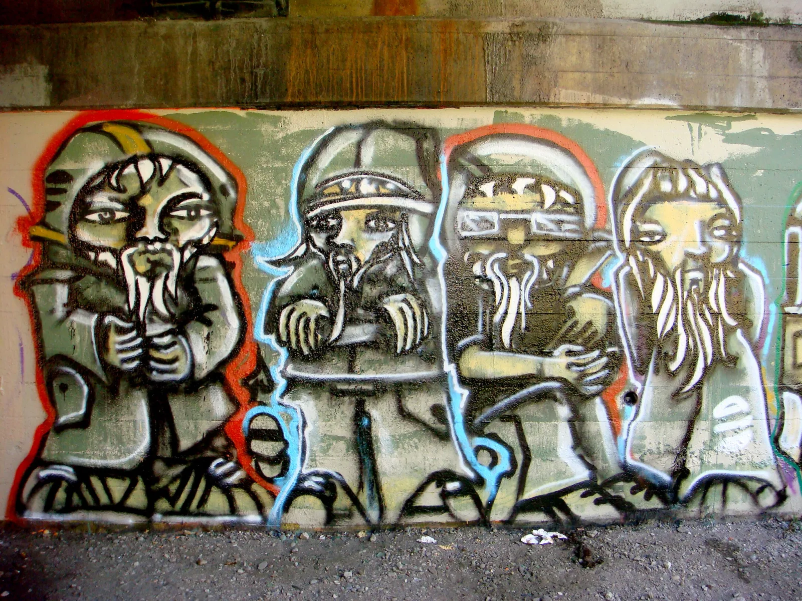
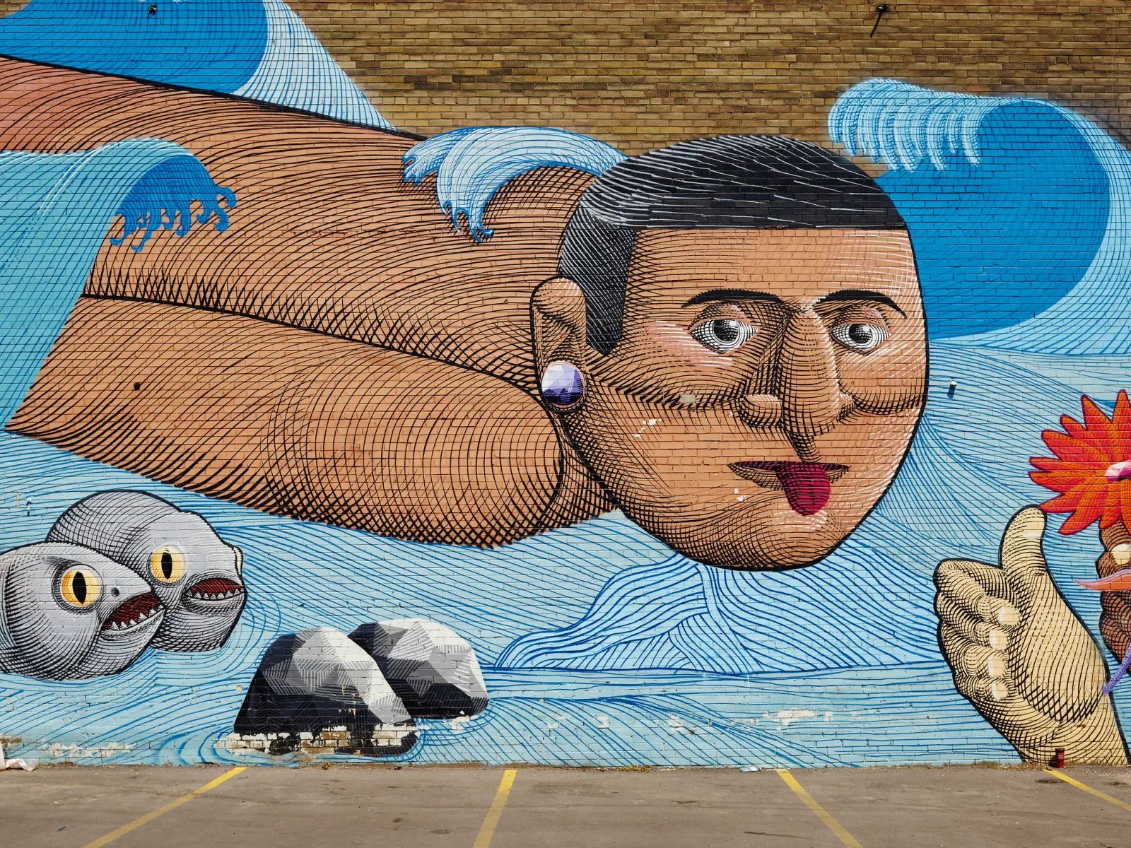
Tall murals cause keystoning because you are forced to look up at them. Stand back as far as the street allows and keep the camera level rather than tilting it up, using a wider focal length so the whole mural fits in the upper part of the frame, then crop away the empty foreground. If you must tilt, leave generous space around the work so a perspective correction tool does not cut off its edges. Arrive early in the morning to avoid parked cars and passers-by, and note the artist’s name and the location for your caption. Street artists are rarely credited, and naming them is part of recording the work properly.
Cropping, finishing and exporting the copy
A copy is a record, so the editing is restrained: white balance from the reference frame, exposure, lens profile correction for distortion and vignetting, any small perspective correction, and gentle sharpening. No added contrast, clarity or saturation for effect.
Crop either exactly to the edge of the painted surface, or with a small, even margin of the wall or frame if the edges of the canvas matter to the artist. Keep the reference frame with the target alongside the master, so anyone can check the color later. Export a large 16-bit TIFF in a wide color space as the archive master for printing, and a separate sRGB JPEG for web and email, since browsers and phones assume sRGB. Name each file with the artist, title, year and dimensions, and add the same details to the file’s metadata so the information travels with the image.
Common mistakes
- Handholding. Tiny tilts cause keystoning and focus falloff. Use a tripod and square the camera with the mirror trick.
- Relying on one light or the room light. One side ends up brighter and the color is mixed. Use two identical lights and turn everything else off.
- Lights too close to the painting. The near edges glow and the center goes dim. Pull both lights back and check with a gray card at every corner.
- Using a wide-angle lens close up. Edges bow and the camera shows in reflections. Step back with a 50 to 100mm lens.
- Trusting auto white balance. The painting’s own colors fool it. Set white balance from a gray card in the same light.
- Photographing glossy work without polarizers. Specks of glare hide the darks. Cross-polarize, or at least move the lights to a steeper angle.
- Editing the copy like a photograph. Added contrast and saturation make it a new interpretation. Correct, do not enhance.
Try this
Tape a flat poster, a child’s drawing or a printed page to a wall. Set up the camera on a tripod with a 50mm-ish focal length, and use two matching desk lamps, one on each side at about 45 degrees, with the room lights off. Square the camera using a small mirror on the center of the artwork. Do the pencil check and adjust one lamp until both shadows match. Shoot a frame with a gray card taped to the middle, then a frame without it. Now take one deliberately bad frame: camera tilted up slightly and one lamp moved close. Set white balance from the gray card in your editor, apply it to both good and bad frames, and compare them side by side. In twenty minutes you will see exactly how much squaring and balanced light contribute.
Frequently asked questions
Can I photograph artwork with a phone?
Yes, for sharing online. Use the phone’s standard lens rather than the ultra-wide, keep it parallel to the art (a phone tripod clamp helps), and shoot in even open shade or next to a large window with the light coming from the side. For prints and archives, a camera with interchangeable lenses gives more resolution, lower distortion and RAW files.
Do I need cross-polarization for every painting?
No. Matte work such as watercolor, pencil, pastel and most unvarnished acrylic photographs well with 45-degree lighting alone. Reserve cross-polarization for varnished, glossy or heavily textured surfaces, and for work under glass.
Am I allowed to publish photos of someone else’s artwork?
A photograph of a painting reproduces the artist’s work, and the artist or their estate usually holds copyright in it for many years. Photographing for personal reference is one thing; publishing or selling the images generally needs permission. Rules differ by country, including for public murals, so read copyright basics for photographers and consult a lawyer in your jurisdiction before any commercial use.
Related guides
- Product photography: the same controlled lighting applied to objects.
- Color management: keep color consistent from camera to screen to print.
- How to use a color chart: build a custom profile for accurate color.
- Polarizing filter: how the lens half of cross-polarization works.
- Gray card: the simplest tool for neutral white balance and even lighting checks.
- Lens distortion: why straight frame edges bow with some lenses.
- Image stitching: combine sections of a large work into one high-resolution file.
- Inverse square law: why moving lights back evens out illumination.