You stood in front of a stunning vista, composed carefully, and pressed the shutter. But when you look at the file on your computer, it falls flat. The sky is washed out, the foreground is dark, and the colors do not match what your eyes saw. This is completely normal, and it is exactly why landscape photos need editing.
The camera captures raw data. Your job in Lightroom is to interpret that data and bring the image to life. This is not about making photos look artificial or over-processed. It is about revealing the detail, color, and dynamic range that your camera recorded but cannot display on its own. When done well, landscape editing does not make a photo look edited. It makes it look like what you experienced standing in that place.
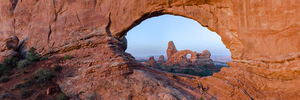
This guide walks through a complete landscape editing workflow in Lightroom, from the first global adjustments to targeted local edits and final polish. Every technique here works across Lightroom versions and applies to any landscape photography scenario, whether you shot a misty mountain sunrise, a dramatic coastal scene, or a quiet forest trail.
Start With a Strong File: Why RAW Matters for Landscapes
Before we touch a single slider, let us talk about file format. If you are editing landscape photos and shooting in JPEG, you are making your life significantly harder. JPEG files discard enormous amounts of data at the moment of capture. That blown-out sky? A RAW file might have two or three extra stops of highlight detail hidden in the data. Those muddy shadows? RAW retains far more shadow detail that you can pull out cleanly.
Landscape photography presents some of the most extreme dynamic range challenges in all of photography. Bright skies paired with dark foregrounds. Deep shadows under forest canopies. Reflective water next to dark rocks. Shooting in RAW gives you the flexibility to handle these challenges in post-processing without visible degradation. If you are serious about landscape editing, RAW is not optional.
Step 1: Evaluate the Image and Set a Direction
Resist the urge to start moving sliders immediately. Take a moment to look at the photo and ask yourself a few questions. What drew you to this scene? What mood do you want to convey? Is it a warm, golden sunset or a moody, stormy coastline? What are the problems you need to fix? A blown sky, flat contrast, color cast, or distracting elements?
Having a mental picture of your goal before you start editing prevents aimless slider pushing. Every adjustment should serve the vision you have for the final image.
Look at the histogram as well. It tells you objectively whether you have good data to work with. A histogram that is bunched to the left means the image is underexposed, and pushing the shadows will introduce noise. A histogram with a spike against the right edge means you have clipped highlights that may not be recoverable. Understanding the histogram gives you a realistic sense of what the edit can achieve.
Step 2: White Balance and Color Temperature
White balance is the foundation of your color palette. Getting it right early saves you from fighting color issues throughout the rest of the edit.
For landscapes, white balance is often more of a creative choice than a technical correction. A sunrise scene might look beautiful with a slightly warm white balance that enhances the golden tones. A foggy forest might benefit from a cooler, bluer tone that reinforces the mood. A midday scene with neutral light might look best with accurate, balanced color.
Start by trying the “As Shot” setting, which uses the white balance your camera recorded. Then experiment with the Temp slider. Sliding toward the warm (yellow) end intensifies golden hour warmth. Sliding toward the cool (blue) end adds a moody, atmospheric quality. The Tint slider is less commonly used in landscapes but can correct green or magenta color casts that occasionally appear, especially in shaded forest scenes.
There is no single correct white balance for a landscape photo. The right choice is the one that supports the mood you want to create.
Step 3: Exposure and Tonal Adjustments
This is where you build the tonal foundation of your image. The goal is to create a full, rich tonal range from deep shadows to bright highlights while retaining detail throughout.
Exposure
Start with the Exposure slider to get the overall brightness in the right ballpark. Do not worry about the sky and foreground separately yet. Just get the midtones to a natural-looking brightness. Watch the histogram as you adjust. For most landscapes, you want the data spread across the full range without hard spikes at either edge.
Highlights and Shadows
This is where landscape editing in Lightroom really shines. The Highlights slider recovers detail in bright areas, and the Shadows slider reveals detail in dark areas. For a typical landscape shot into the light, you might pull Highlights to -70 or even -100 to bring back sky detail, while pushing Shadows to +40 or +60 to open up a dark foreground.
Be thoughtful here. Pulling Highlights all the way to -100 and pushing Shadows all the way to +100 creates a flat, HDR-like look that many viewers find unnatural. The key is balance. You want to reveal detail without eliminating the natural contrast between light and dark that gives a scene its depth and dimension. A landscape with no tonal contrast looks like a video game screenshot, not a photograph.
Whites and Blacks
After recovering highlights and opening shadows, your image might look a bit flat. The Whites and Blacks sliders restore the endpoints of your tonal range. Push Whites slightly positive to set a bright white point, and pull Blacks slightly negative to anchor the shadows with a deep black point. Hold Alt/Option while dragging to see exactly where clipping occurs. A small amount of clipping at the extremes is fine and actually gives the image a sense of tonal completeness.
Contrast
After setting Highlights, Shadows, Whites, and Blacks, you may or may not need the Contrast slider. Those four sliders already affect contrast significantly. If the image still feels flat after your tonal adjustments, a small positive Contrast bump (try +10 to +20) can add punch. If it already looks contrasty enough, leave it at zero or even pull it slightly negative.
Step 4: Presence Sliders for Impact
The Texture, Clarity, Vibrance, and Saturation sliders live in the Presence section of the Basic panel. They have an outsized impact on how a landscape photo feels.
Texture enhances fine detail like rock surfaces, tree bark, and cloud structure. A value of +20 to +40 adds a pleasing crispness to landscapes without making the image look over-processed. It is a more subtle tool than Clarity and is often the better first choice for adding definition.
Clarity adds midtone contrast, which gives landscapes a sense of depth and three-dimensionality. It is tempting to push it to +50 or beyond, but restraint produces better results. Values of +10 to +25 add punch without the crunchy, halo-ridden look that excessive clarity produces. For soft, misty, or ethereal landscapes, try negative clarity for a dreamy, painterly effect.
Vibrance is your friend for landscapes. It boosts muted colors while protecting already-vivid tones from oversaturation. A sunrise sky that looks washed out in the RAW file often comes alive with +30 to +50 Vibrance. It also protects skin tones, which matters if there are people in your landscape.
Saturation boosts all colors equally and is a blunter tool. Use it sparingly for landscapes. If Vibrance is handling the muted colors well, Saturation may not be needed at all. Oversaturated landscapes are one of the most common signs of amateur editing.
Step 5: The Tone Curve for Refined Contrast
The Tone Curve offers more precise control over contrast than the basic sliders. For landscapes, two approaches work particularly well.
The classic S-curve. Place a point in the lower quarter of the curve and drag it down slightly. Place another point in the upper quarter and drag it up slightly. This darkens the shadows and brightens the highlights, creating rich, film-like contrast. The steeper the S, the more dramatic the contrast. Start subtle and increase gradually.
The lifted blacks look. Drag the bottom-left point of the curve upward. This prevents your darkest shadows from reaching pure black, creating a faded, matte look that is popular in contemporary landscape photography. It gives images an airy, film-inspired quality that works especially well with soft light and muted color palettes.
You can also adjust the tone curve separately for Red, Green, and Blue channels. This is a powerful color grading technique. For example, adding a slight blue lift to the shadows while adding warmth to the highlights creates a pleasing complementary color split that adds visual interest without being obvious.
Step 6: HSL Adjustments for Individual Color Control
The HSL (Hue, Saturation, Luminance) panel is where landscape editing becomes truly precise. Instead of adjusting all colors together, you control each color independently.
Common landscape HSL adjustments:
Blue Luminance down (-15 to -30). Darkening the blue channel deepens the sky dramatically. This is the single most impactful HSL adjustment for landscapes with visible sky. It adds richness and visual weight to the upper portion of the frame without affecting the rest of the image.
Orange and Yellow Hue shift. If you want autumn foliage to lean more toward red-orange rather than yellow, shift the Orange Hue toward red and the Yellow Hue toward orange. Small adjustments of 5 to 15 degrees make a noticeable difference.
Green Saturation and Hue. Forest and grassland scenes often benefit from slight desaturation of the Green channel. Overly vivid greens look unnatural. A small negative Green Saturation adjustment (-10 to -20) keeps vegetation looking realistic. Shifting the Green Hue slightly toward yellow can warm up vegetation for a more inviting feel.
Aqua for water. Ocean and lake scenes often have Aqua tones in the water. Adjusting the Aqua Hue, Saturation, and Luminance independently lets you control the color of water without affecting the sky. This is especially useful in tropical or coastal scenes.
A useful technique is the targeted adjustment tool (the small circle icon at the top left of the HSL panel). Click and drag directly on a color in your image to adjust it. This is more intuitive than guessing which color channel to modify.
Step 7: Graduated Filters for Sky and Foreground
Global adjustments get you most of the way there, but landscapes almost always benefit from treating the sky and foreground separately. The Graduated Filter is the landscape photographer’s most essential local adjustment tool.
Darkening the Sky
Even after pulling Highlights down in the Basic panel, the sky often needs additional work. Select the Graduated Filter tool (press M), click at the top of the image, and drag downward. Position the transition zone along the horizon. Then reduce Exposure by -0.5 to -1.0 stop, decrease Highlights further, and consider adding a slight boost to Clarity and Saturation within the filter. This mimics the effect of a physical graduated neutral density filter and brings dramatic depth to the sky.
If your horizon is not straight, or if elements like trees or mountains protrude above the horizon, use the brush tool within the graduated filter to erase the effect from those areas. This prevents darkening the tops of trees or mountains along with the sky.
Brightening and Warming the Foreground
Apply a second Graduated Filter from the bottom upward. This targets the foreground. A slight Exposure increase (+0.2 to +0.5), a touch of warmth (increase Temp), and a small Clarity boost can make the foreground feel more inviting and three-dimensional. This technique is especially effective during golden hour when warm light strikes the foreground.
Enhancing Specific Areas with Radial Filters
The Radial Filter creates an elliptical adjustment area. Use it to draw attention to a focal point in your landscape. Place an ellipse around a mountain peak, a patch of light, or a key foreground element. Then slightly brighten the area inside and darken the area outside. The effect should be subtle enough that it is felt rather than seen, guiding the viewer’s eye without being obvious.
Step 8: Sharpening and Noise Reduction
Landscape photos demand careful sharpening. You want fine details like rock textures, leaf patterns, and cloud edges to look crisp, but you do not want to sharpen smooth areas like sky gradients or calm water, which would introduce ugly noise.
In the Detail panel, start with an Amount of 40 to 60 for most landscapes. Leave the Radius at 1.0 and Detail at 25 as starting points. The key slider is Masking. Hold Alt/Option while dragging it to the right and watch the preview. White areas will be sharpened, black areas will not. Drag until the smooth areas (sky, water) turn black while edges and details stay white. A Masking value of 60 to 80 is typical for landscapes.
If you shot at a low ISO (which you should for landscapes whenever possible), noise reduction may not be needed at all. If you do see noise, especially in shadow areas that you pushed significantly, apply Luminance noise reduction conservatively. Start at 10 to 20 and increase only until the noise becomes non-distracting. Heavy noise reduction smears away the fine detail that makes landscape images compelling.
Step 9: Lens Corrections and Perspective
Enable lens profile corrections to remove the barrel distortion and vignetting inherent in your lens. Check “Remove Chromatic Aberration” to eliminate color fringing along high-contrast edges, which is common in wide-angle landscape lenses. These corrections are simple, fast, and almost always improve the image.
If you shot with a wide-angle lens and have converging verticals or noticeable distortion at the edges, the Transform panel can help straighten things out. The Auto setting works well for many scenes, but use the Guided mode for precise control when you need specific lines to be straight.
Step 10: Crop and Final Composition
Cropping is your last chance to improve the composition. Even a small crop can make a significant difference in how a landscape reads. Look for distracting elements at the edges that you can eliminate. Check if the horizon is perfectly level. Consider whether a different aspect ratio, like 16:9 for panoramic scenes or 4:5 for social media, might serve the image better than the native camera ratio.
Be careful not to crop too aggressively. Every pixel you crop away is resolution you lose. For landscapes that you might want to print large, preserve as much resolution as possible. A slight crop to clean up the edges is very different from cropping away half the image.
Advanced Technique: Working with HDR Merges
When the dynamic range of a scene exceeds what a single exposure can capture, even in RAW, HDR photography provides a solution. Lightroom has a built-in Photo Merge feature that combines multiple bracketed exposures into a single HDR file with expanded dynamic range.
Select your bracketed exposures in the Library module, right-click, and choose Photo Merge > HDR. Lightroom will align the images and create a merged DNG file that contains highlight detail from the underexposed frame and shadow detail from the overexposed frame. You then edit this merged file using the same workflow described above, but with dramatically more latitude in the Highlights and Shadows sliders.
The key to natural-looking HDR is restraint in the editing. The merged file gives you the data. Your job is to use it tastefully, creating a result that looks like what your eyes saw rather than a tone-mapped fantasy.
Advanced Technique: Panorama Merging
Lightroom can also stitch panoramic images. Select your overlapping frames, right-click, and choose Photo Merge > Panorama. Lightroom aligns and blends the images into a single high-resolution file. Choose from Spherical, Cylindrical, or Perspective projection depending on your focal length and scene geometry.
After merging, you will have a massive file with extreme resolution that is perfect for large prints. Edit the merged panorama using the same landscape workflow. The expanded resolution means you can crop more aggressively if needed without losing print quality.
Editing for Different Landscape Scenarios
Different landscape situations call for different editing approaches. Here are guidelines for common scenarios.
Golden Hour and Sunset Scenes
The warm light of golden hour is already beautiful, so your editing should enhance rather than overhaul. Push the white balance slightly warm to amplify the golden tones. Be careful with Vibrance and Saturation, as sunset colors can quickly become garish. A subtle S-curve on the tone curve adds richness. Use a graduated filter to slightly darken the sky and bring out cloud structure.
Moody and Overcast Scenes
Overcast and moody landscapes benefit from a cooler white balance and muted colors. Reduce Vibrance slightly instead of boosting it. Add a small amount of grain in the Effects panel for a film-like quality. Try the lifted blacks technique on the tone curve to soften the shadows. Clarity can add atmosphere to fog and mist, but use it gently to maintain the soft quality of the light.
Forest and Woodland Scenes
Forest photography often involves extreme contrast between patches of light and deep shadow. Open the shadows aggressively to reveal detail in the dark areas. Desaturate the greens slightly for a more natural look. Watch for mixed lighting conditions where sunlit areas have a warm color cast while shaded areas are blue. You may need to use local adjustments to correct the white balance in different parts of the frame independently.
Coastal and Seascape Scenes
Coastal scenes often have a wide dynamic range and benefit from graduated filters on both sky and water. If you used a long exposure to smooth the water, keep the editing clean and minimal. Boost the Aqua channel in HSL for richer water color. Add a slight vignette to draw attention to the center of the frame. Be mindful of chromatic aberration along high-contrast edges where water meets rock.
Mountain and Alpine Scenes
Mountain scenes often feature atmospheric haze that reduces contrast in the distance. A dehaze adjustment (in the Effects section or within graduated filters) can cut through this haze and restore depth. Apply it with a graduated filter targeted at the distant mountains rather than globally, since you usually want the foreground to remain unaffected. Boost Texture to bring out rock detail and snow texture.
Common Mistakes
Even experienced photographers fall into these landscape editing traps. Knowing them helps you avoid them.
The HDR look. Pulling Highlights to -100 and Shadows to +100 simultaneously creates an unnatural, flat image with halos around horizon lines. The goal is to balance highlights and shadows while preserving the natural relationship between light and dark. Landscapes need tonal contrast to convey depth. If your edited image has less apparent depth than the original, you have probably flattened the tones too much.
Oversaturated skies. Sunset and sunrise skies are already colorful. Pushing Vibrance and Saturation too high makes them look like they came from a screensaver. If the colors look more vivid than anything you have ever seen in real life, dial it back. A good test is to show the image to someone who was not there and ask if it looks believable.
Too much clarity. Excessive clarity creates dark halos along contrast edges and gives the image a gritty, crunchy texture. It is especially visible in the sky near the horizon. Keep clarity below +30 for most landscapes and check for halos at 100% zoom.
Ignoring the edges of the frame. Beginners focus on the center of the image and forget to check the edges. Look carefully at all four edges and corners for distracting bright spots, sensor dust, chromatic aberration, or elements that draw the eye out of the frame. A few seconds of attention to the edges can save an otherwise excellent image.
Not straightening the horizon. Even a half-degree tilt is visible to most viewers and makes an image feel unsettled. Use the straighten tool within the crop overlay to get it perfect. If the scene has no visible horizon (deep forest, for example), look for vertical elements like trees and make them truly vertical.
Applying the same edit to every landscape. A stormy seascape and a sun-drenched meadow demand completely different treatment. Develop the habit of evaluating each image independently and editing to match the mood of the specific scene rather than applying a one-size-fits-all approach.
Forgetting to check at different zoom levels. An image can look great at the overview level but reveal problems at 100%. And an image that looks perfect at 100% might have distracting global issues visible only when zoomed out. Check both levels before calling an edit finished.
Try This: Landscape Editing Exercises
Practice is the only way to build real editing skill. These exercises target specific landscape editing abilities.
Exercise 1: The Highlight Recovery Challenge. Find a landscape photo where the sky is significantly overexposed. Using only the Basic panel sliders (no local adjustments), see how much sky detail you can recover while keeping the foreground looking natural. This teaches you the limits and capabilities of global tonal adjustments and shows you why shooting RAW matters.
Exercise 2: Three Moods, One Photo. Take a single landscape image and create three virtual copies. Edit each one to convey a completely different mood: warm and inviting, cold and dramatic, and soft and dreamy. This exercise builds your ability to use white balance, tone curve, HSL, and presence sliders to control the emotional impact of an image.
Exercise 3: Sky and Foreground Separation. Choose a landscape with both a bright sky and a dark foreground. Edit it using only global adjustments first, then reset and edit it using graduated filters to treat the sky and foreground independently. Compare the results. This demonstrates why local adjustments are so valuable for landscape work.
Exercise 4: HSL Precision. Open a colorful landscape (autumn foliage, sunset, or a flower field) and use only the HSL panel to improve it. Do not touch the Basic panel at all. See how much you can transform the image through individual color control. This builds your understanding of how HSL works and when to reach for it.
Exercise 5: The Subtlety Test. Edit a landscape photo that you think looks good straight out of camera. The challenge is to improve it with adjustments so subtle that a viewer would struggle to identify what you changed, but the edited version clearly looks better when shown side by side with the original. This is the hardest exercise and the most valuable, because it trains the restraint that separates professional editing from amateur over-processing.
FAQ
How much editing do professional landscape photos actually get?
More than most people assume but less than many beginners apply. Professional landscape photographers typically spend 5 to 15 minutes per image on standard edits and longer on portfolio-grade images. The edits are targeted and purposeful. Every slider movement serves the final vision. The difference between professional editing and amateur editing is not the amount of adjustment but the precision and restraint with which adjustments are applied. A professional might push Shadows to +70 for a specific reason while keeping Clarity at +8. A beginner might push everything to +50 because “more is better.” The professional version looks natural. The beginner version does not.
Should I use Lightroom presets for landscape editing?
Presets can be a useful starting point, but they should never be the end point. A preset applies generic adjustments that were designed for a different image under different conditions. Use a preset as a foundation, then adjust every setting to match the specific needs of your current image. Many photographers create their own presets based on their personal style and common editing patterns. This speeds up their workflow while still allowing customization. See our complete guide to Lightroom presets for more on building a preset library.
Is it better to get the exposure right in camera or fix it in Lightroom?
Always aim for the best possible exposure in camera. Understanding the exposure triangle, specifically how aperture, shutter speed, and ISO work together, lets you capture the most data possible. Lightroom’s editing power is not a substitute for good exposure technique. It is a complement to it. A well-exposed RAW file gives you significantly more editing latitude than an underexposed or overexposed one. That said, slight exposure corrections of a stop or two are completely routine and produce excellent results with RAW files.
How do I know when an edit is finished?
This is one of the hardest skills to develop. A few guidelines help. First, step away from the screen for a few minutes, then come back with fresh eyes. Does it still look good? Second, toggle the before/after comparison. If the difference between the original and the edit is dramatic and obvious, you may have gone too far (unless the original was badly exposed). Third, zoom in to check for artifacts, halos, or noise. Finally, ask yourself: does this photo look like it could exist in the real world? If the answer is yes, you are probably in good shape.
When should I use Photoshop instead of Lightroom for landscape editing?
Lightroom handles the vast majority of landscape editing needs. Move to Photoshop when you need to remove large distracting elements (a person walking through your frame, a power line), blend multiple exposures with complex masking (where Lightroom’s HDR merge is not sufficient), apply complex perspective corrections, or add elements from separate frames. For 90% of landscape photos, Lightroom alone does everything you need.
What export settings should I use for landscape photos?
For web display and social media, export as JPEG with quality 85-90, long edge resized to 2048 pixels, with output sharpening set to “Screen, Standard.” For print, export at full resolution as JPEG (quality 100) or TIFF with no resizing, and apply the appropriate print sharpening for your paper type. For archiving your finished edits, export as full-resolution TIFF or original DNG. Consider your color management settings when exporting for print, as sRGB is standard for web while Adobe RGB or ProPhoto RGB may be preferred for high-quality print output.
Developing Your Landscape Editing Eye
The techniques in this guide are the foundation, but developing a real editing eye takes time and practice. Study the landscape work of photographers you admire. Pay attention to their tonal range, color palette, and contrast. Try to reverse-engineer their edits. How warm or cool is their white balance? How much shadow detail do they retain? How vivid are their colors?
Edit the same photo multiple times over the course of weeks or months. You will be surprised how your approach changes as your eye develops. An edit you loved three months ago might look overdone today. This is normal and is a sign of growth.
Most importantly, get out and shoot more landscapes. The best editing in the world cannot save a poorly composed or badly timed capture. Work on your composition, learn to read the light, and chase conditions that provide naturally dramatic raw material. A great landscape photo starts in the field, and Lightroom is where you finish the job.