Humour in photography comes from a small surprise the viewer works out for themselves: something out of place, a coincidence of shapes, a gesture that looks human on an animal, or words that say one thing while the scene says another. You catch it by learning the handful of patterns that make pictures funny, placing yourself where they are likely to happen, waiting for the punchline, and framing so the joke reads in a second. The best funny photographs are also kind: they laugh with the world, not at the people in it.
Why visual jokes work
Most humour, visual or spoken, follows the same shape: you expect one thing, you get another, and then you understand why. A joke that is only surprising is confusing. A joke that is only predictable is dull. The laugh comes in the moment the viewer resolves the mismatch.
That has three practical consequences for photographers:
- The setup must be instantly readable. If the viewer cannot tell what is normal in the scene, they cannot see what is odd about it. Clutter kills visual jokes faster than anything.
- The viewer must do the last step. A photograph that explains its own joke, with a caption spelling it out, is no longer funny. Leave the final connection to the viewer.
- Timing still matters in a still image. A picture is read in sequence: the eye usually lands on the most prominent thing first and then moves on. The setup should be seen first and the twist second, which you control with size, contrast and placement.
Nearly every funny photograph uses one or more of a small set of patterns. Learning to name them trains your eye to spot them.
| Pattern | What it looks like | Where to look |
|---|---|---|
| Incongruity | Something where it does not belong, or doing what it should not | Folk art, festivals, shop windows, roadside attractions |
| Scale | An ordinary object far too big or too small | Public sculpture, inflatables, toys, giant signs |
| Coincidental alignment | Two unrelated things that line up to form a new meaning | Posters, murals, statues, billboards with passers-by |
| Gesture and expression | A pose or face that reads as a human emotion | Animals, statues, people reacting to something |
| Signs and text | Words that contradict or comment on the scene | Shopfronts, warning signs, notice boards, graffiti |
| Repetition with a break | A row of identical things, with one that is different | Queues, parked cars, birds on a wire, crowds |
Incongruity and scale: things out of place
Incongruity is the broadest source of visual humour: a sofa on a mountaintop, a business suit at the beach, a fish fishing. Your job is less to invent it than to notice it and then to frame it so the mismatch is the first thing the viewer reads.
Two framing rules help. First, include enough context to establish what is normal. A giant rubber duck is only funny if the viewer can see the harbour and the ordinary boats around it. Crop too tight and it becomes just a duck. Second, strip out everything that does not contribute. If the scene has three odd things in it, the viewer’s attention splits and the joke goes soft. Move until the one strongest mismatch dominates.
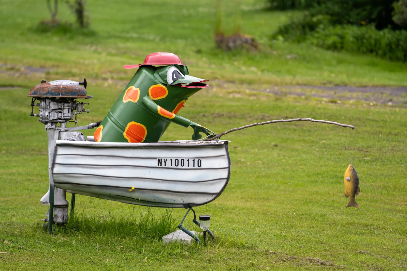
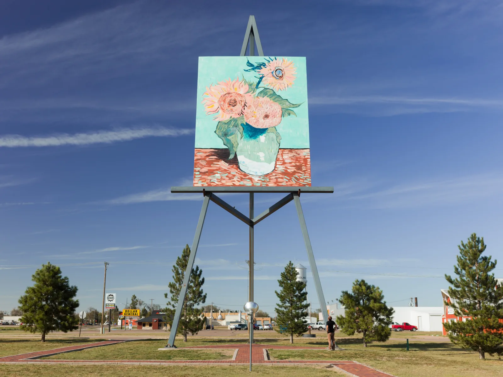
Scale is a special case of incongruity, and it always depends on a reference. A huge sculpture is only huge next to something whose size the viewer knows: a person, a car, a door, a tree. Wait for a figure to walk into the frame, or stand far enough back to include one. A single person looks better than a crowd here, because one small figure is easier to read against one big thing. The guide to scale in photography covers how references work.
Coincidental alignment: letting the camera make the joke
Some of the funniest photographs contain nothing funny at all in real life. The humour exists only from one exact position, where a pedestrian appears to be stepping on a billboard face, a statue seems to scowl at a tourist, or a painted figure on a mural appears to be handing something to a real person walking by. This is related to juxtaposition, but the meaning comes from alignment rather than from subject matter alone.
Because the effect lives in the geometry, your position is the main control. A step to the side slides the near object across the far one; crouching or rising moves it up or down. When you see a possible alignment, try several positions quickly and shoot each. A difference of a few centimetres in camera height often decides whether a hand appears to touch something or misses it.
Distance matters too. The farther apart the two elements are, the more their relative position shifts when you move, so a far background is easy to reposition behind a near subject, while two things side by side barely move relative to each other. Both elements usually need to be sharp enough to recognise, which means a moderate aperture such as f/8 rather than a very shallow depth of field.
Two related techniques are worth knowing. Forced perspective is the staged version, where you arrange people and objects at different distances on purpose so that someone appears to hold a building in their hand. And accidental alignments are the unwanted version: the lamp post growing out of a head, the horizon slicing through a neck. The guide to tangents and mergers covers how to avoid those. The difference between a merger and a visual joke is intent, and whether the result means something.
Signs, text and captions
Words are a gift to the humorous photographer because they bring a second layer of meaning that the picture can agree with or contradict. The strongest sign pictures fall into three groups:
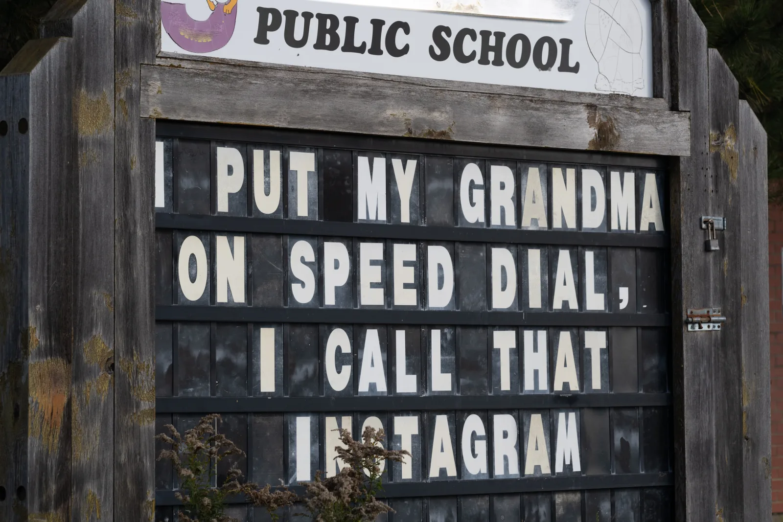
- The sign is the joke. A pun on a notice board, an oddly worded warning, a shop name that means something unexpected. Frame tightly and straight-on so every word is legible, and keep the sign level. The words are the subject; treat them like a portrait.
- The scene contradicts the sign. A “quiet zone” sign above a brass band, a “no dogs” notice with a dog sitting under it. Here you need both the sign and the contradiction in frame, and the words still have to be readable at the size the picture will be seen. That usually means getting closer than feels natural or using a longer lens.
- The sign comments on a person or animal. A “wet paint” sign beside someone leaning on a railing, an arrow pointing at a puzzled dog. These need timing as well as framing, because the person or animal has to be in the right place with the right expression.
Test legibility the way viewers will see it. Check the frame on your camera screen at the size of a phone picture: if you cannot read the key word, the joke will not land. A title can add a small extra twist, but it should never explain the joke. Advice on writing titles that add rather than repeat is in the guide to photo captions.
Animals, gesture and expression
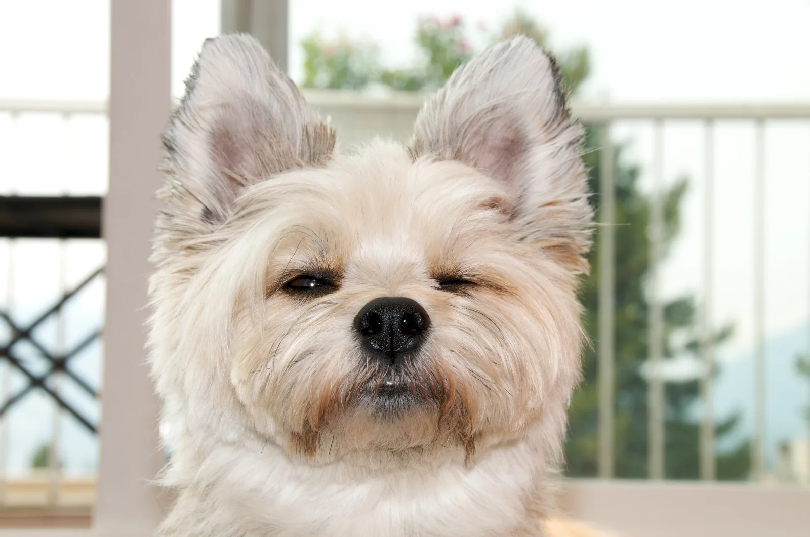
Animals are funny because people read human feelings into them. A narrowed eye looks suspicious, a head tilt looks puzzled, a yawn looks bored, a dog sitting upright in a car looks as if it is about to give directions. You are not photographing what the animal feels; you are photographing a posture that people recognise in themselves.
Elliott Erwitt, who built much of his reputation on gentle, absurd moments with dogs, often photographed them from their own height. Getting down to eye level does two things: it lets the animal’s face fill the frame, and it puts the viewer in the animal’s world rather than looking down at a pet. The page on Elliott Erwitt shows more of that approach.
Practical points for catching animal expressions:
- Watch for repeated behaviour. Dogs tilt their heads at certain sounds, cats freeze before a pounce, gulls lean forward before they shout. Once you have seen it twice, you can anticipate the third.
- Use a fast shutter speed. Expressions change quickly. Around 1/500 second or faster keeps a turning head or a flapping ear sharp in daylight.
- Focus on the eyes. An expression reads from the eyes first. If they are soft, the face loses its character.
- Look at the pairings. Owners and dogs with matching hair, a pigeon strutting in step with a pedestrian, a statue of an animal with a real one beside it.
Never frighten, bait, restrain or tease an animal to get a reaction. A dog made anxious for a picture does not look funny once you know what it went through, and wild animals should never be approached or fed for a photograph. The guide to photographing pets covers working with animals calmly.
Waiting for the punchline at a good stage
Much street humour is built in two halves: a setup that stays still, and a punchline that walks in. The setup might be a mural of a giant hand, a statue striking a pose, a poster of a surprised face, or a doorway painted to look like a mouth. None of these is funny alone. They become funny when the right person arrives at the right spot.
The approach is the same one described in the guide to the decisive moment: compose the setup first, then wait. What is specific to humour is knowing what the punchline would be before it arrives. Ask yourself what would complete the joke:
- A poster of a huge face looking sideways: someone walking in the direction it is looking, or standing in its line of sight.
- A sign reading “slow”: someone running past, or a very slow dog.
- A statue with an outstretched arm: a pedestrian whose gesture mirrors it, or someone walking directly into its reach.
- A doorway sized for giants: the smallest person on the street walking through it.
Once you know the punchline, you can ignore everyone who does not deliver it, and you will be ready when someone does. Stay long enough for several passes. The first person who almost fits teaches you where to stand for the second.
Working the scene and building sequences
Funny situations rarely peak on the first frame. Once you have found one, stay with it. Shoot the obvious version, then try a lower angle, a tighter crop, a wider view with more context, and a different moment.
Some jokes need more than one picture. A sequence of two to four frames lets you show a setup, a build and a punchline, the way a comic strip does: a pigeon eyeing a sandwich, the pigeon closer, the sandwich gone. Keep the camera position and framing identical across the frames so that the only thing that changes is the action; a fixed viewpoint makes the change itself the story. Present the frames in a row or a grid, in order. The guide to the photo essay covers sequencing more broadly.
Festivals, parades and costume events are some of the easiest places to practise, because people there are already playing. A costumed person hamming it up for your camera is collaborating on the joke, and asking for a picture usually makes it better rather than worse. The guide to festival photography covers working with crowds and costumes. People who chose to be absurd in public are very different subjects from an unguarded stranger caught at an awkward moment.
Laugh with, not at: the ethics of funny photographs
Humour aimed at a situation is generous. Humour aimed at a person can be cruel, and a photograph makes that cruelty permanent and shareable. A simple test separates the two: if the person in the picture saw it, would they laugh too? If the honest answer is no, do not publish it.
Some rules that follow from that test:
- Make the situation the target, not the person. A man dwarfed by a giant sculpture is funny because of the sculpture. A man photographed to make his body look ridiculous is not.
- Never make fun of the vulnerable. People who are homeless, ill, disabled, elderly and confused, grieving, drunk or in distress are not material for jokes. Neither are people’s bodies, clothing that reflects their culture or faith, or poverty.
- Be especially careful with children. A funny picture of a child can follow them for years. Photograph children only with a parent’s knowledge, and publish only what the family would be happy to see.
- Ask when you can. If you catch a funny moment involving an identifiable person, show them the picture. Most people enjoy a good one, and their reaction tells you whether to share it.
- Remember the law. Rules on photographing people in public and on publishing their pictures vary widely between countries. If you plan to publish or sell images of identifiable people, check the rules where you live and consult a lawyer in your jurisdiction if in doubt.
The guide to photography ethics covers consent and publication in more depth.
Common mistakes
- Too much in the frame. The joke is in there somewhere, but the viewer has to hunt for it. Fix: move closer or change angle until the setup and punchline dominate.
- Too little context. A tight crop removes the normal world that makes the odd thing odd. Fix: step back far enough to show what the scene should look like.
- Unreadable text. The sign is the joke, but the words are too small or blurred. Fix: get closer or zoom in, and check legibility at phone size before you leave.
- Explaining the joke. A caption that says what the viewer should find funny. Fix: let the picture stand, or give a title that adds a separate twist.
- Missing the alignment by a few centimetres. The hand nearly touches the poster. Fix: shoot several positions and heights, and review at full size on the spot.
- Punching down. A frame that gets a laugh at someone’s expense. Fix: apply the “would they laugh too?” test before publishing, and delete what fails it.
Try this
The six-pattern humour walk (about 30 minutes). Take a walk through a busy area, such as a market street, a town centre, a park on a weekend or an event, with the table of patterns above in mind.
- Try to photograph one example of each of the six patterns: incongruity, scale, coincidental alignment, gesture or expression, signs and text, and repetition with a break.
- For each one you find, shoot at least five frames from different positions or moments.
- For at least one, set up at a good stage and wait five minutes for a punchline to walk in.
At home, pick your best frame from each pattern. Show them without any caption to someone who was not there and watch their face. The ones that get a reaction within two seconds are working. For the ones that do not, ask them what they see first, and you will usually find the setup was not readable or the frame was too busy.
Frequently asked questions
Is it cheating to stage a funny photograph?
Not if you are honest about it. Staged humour, such as forced perspective, props and posed friends, is a long and respected tradition. The problem is only presenting a staged scene as a candid moment in contexts where viewers expect truth, such as documentary or news work.
What camera settings are best for catching funny moments?
Settings that let you react without thinking: a shutter speed of around 1/500 second for people and animals, an aperture around f/8 so that both halves of a joke are sharp, and auto ISO to keep exposure right as the light changes. A small, quiet camera helps because people behave naturally around it.
How do I get better at seeing humour?
Name the patterns as you walk, and look at a lot of funny photographs by others and ask which pattern each one uses. Slow down: humour hides in small details.
Do funny photos need a caption?
The best ones do not. A plain title such as the place and date is fine, and a title that adds a second small joke can work. Anything that explains the first joke weakens it.
Related guides
- Juxtaposition in photography: placing contrasting things together to create meaning, funny or serious.
- Street photography: the wider craft of photographing everyday life in public.
- The decisive moment: anticipation, timing and gesture in depth.
- Forced perspective photography: staging visual illusions on purpose.
- Tangents and mergers: the accidental alignments to avoid, and how to spot them.
- How to photograph pets: calm, patient ways to catch animal character.
- Photography ethics: consent, dignity and what to publish.