A photography movement is a group of photographers who shared a belief about what a photograph should be, and whose pictures look alike because of that belief. The major movements, from Pictorialism to the Düsseldorf School, are really a long argument about a few questions: should a photograph imitate painting or do what only a camera can do, should it be beautiful or plain, and should it show the dramatic or the ordinary. Each answer left behind a technique you can still pick up and use today.
How to use this page
This page skips biographies and dates and goes straight to ideas. For the technical story of how cameras and processes developed, read the history of photography; for the people themselves, the masters of photography pages go deeper. Here, each movement gets three things: what it believed, what its pictures looked like, and one experiment you can try with any camera.
Movements overlap, and many photographers passed through several. Treat the labels as lenses for looking, not boxes to sort people into. Most were reactions against the one before, so the order matters: once you see what a group rejected, its choices make sense.
Pictorialism: making photographs look made
What it believed. In the medium’s early decades, many critics said a photograph could not be art because a machine made it. Pictorialists answered by making the photographer’s hand visible. They argued that a print should express a feeling or an idea, the way a painting or an etching does, rather than simply record facts.
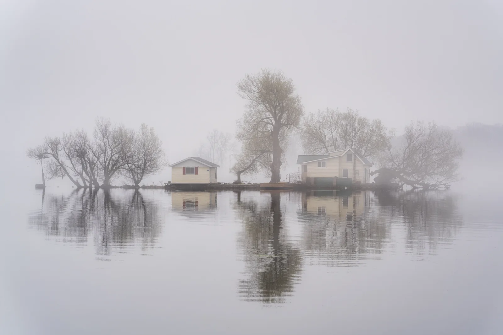
What it looked like. Soft focus, often from special lenses or deliberately diffused ones. Misty landscapes, twilight streets, figures in gardens, allegorical scenes. Prints were worked by hand in processes such as gum bichromate and platinum, which gave rich, matte tones and let the maker brush away or add detail. Julia Margaret Cameron’s soft, intimate portraits were an early influence, and Alfred Stieglitz and Edward Steichen made some of the best known Pictorialist work before both moved on. See Julia Margaret Cameron, Alfred Stieglitz and Edward Steichen.
Borrow this: mood before sharpness. Pictorialism is easy to mock as imitation painting, but its central lesson is sound: detail is not always the point. On a foggy or hazy morning, shoot toward the light so the scene falls into a few pale tones. Keep the composition simple, one or two shapes. In editing, lower contrast and clarity rather than raising them. The same impulse drives intentional camera movement, which trades literal detail for texture and feeling.
Straight photography and Group f/64: trusting the lens
What it believed. The reaction came from within. A new generation argued that photography would never be respected while it pretended to be painting. Its strength was different: precise, sharp, detailed description that no hand could match. Stieglitz himself turned toward this view and championed the direct, geometric work of Paul Strand. In California, a small group that included Edward Weston, Ansel Adams and Imogen Cunningham named themselves Group f/64 after one of the smallest apertures on a large-format lens, a setting that keeps the whole scene sharp. Their position was that a pure photograph should borrow nothing from other art forms.
What it looked like. Contact prints from big negatives on smooth paper, sharp from front to back, with a full range of tones. Subjects were often close studies of ordinary things (a pepper, a shell, a weathered wall), plus landscapes rendered with extreme clarity. The drama came from form, texture and light, not from blur or handwork.
Borrow this: slow, exact seeing. You do not need f/64. Depth of field depends on format as well as aperture, and on a large-format 8×10 inch camera f/64 gives roughly the depth of field that f/8 gives on a full-frame camera for the same framing. On a small sensor, stopping far down brings softness from diffraction instead of more sharpness. The real lesson is the attitude: put the camera on a tripod, pick one ordinary object, and spend twenty minutes moving it and the light until its shape and texture become the whole picture.
New Vision: the camera as a new kind of eye
What it believed. Artists connected with the Bauhaus school in Germany and the Constructivists in the Soviet Union saw the camera as a modern machine that could show things human vision normally skips. They were less interested in beauty than in a fresh way of seeing suited to cities, machines and speed. Alexander Rodchenko argued against photographing everything from chest height and pointed his camera steeply up at buildings and down at streets.
What it looked like. Bird’s-eye and worm’s-eye views, strong diagonals, tight crops of machinery and architecture, patterns of shadows, and photograms made by placing objects directly on light-sensitive paper without a camera. André Kertész brought a gentler version of this geometry to everyday scenes, finding shapes in chairs, shadows and rooftops.
Borrow this: refuse the default viewpoint. Almost every snapshot is taken standing up, from eye level, looking straight ahead. Choose one building or object and make ten frames of it, none of them from eye level: lie on the ground, hold the camera overhead, shoot through railings, tilt the frame until a line runs corner to corner. Wide lenses exaggerate the effect, so use them deliberately.
Surrealism and the found image: the strange inside the real
What it believed. Surrealist artists wanted to reach the dream logic beneath everyday life. Photography mattered to them because of its credibility: a strange photograph is more unsettling than a strange painting, because you assume it happened. Some made the strangeness in the darkroom. Man Ray made cameraless photograms and used solarization, a partial reversal of tones that draws glowing lines around shapes. Others simply found it.
What it looked like. Mannequins in shop windows, reflections that overlap two worlds, shadows detached from their owners, bodies distorted in mirrors, Paris at night full of fog and lamplight in the work of Brassaï. The Surrealists admired Eugène Atget‘s plain records of old Paris, where empty streets and shop displays look eerie, even though Atget made them as documents. That is the idea of the found image: meaning can come from how a picture is seen and presented, not only from how it was made.
Borrow this: hunt the uncanny. Walk a shopping street looking only for moments where something is not quite right: a reflection that places a face inside a display, a sign that comments on the person beneath it, a shadow that belongs to nothing visible. When the street will not supply them, double exposure lets you build them in camera.
Humanist and documentary photography: pictures with a purpose
What it believed. Two related ideas. Documentary photographers believed a photograph could show real conditions to people who would never see them and could push for change. Humanist photographers, strongest in postwar France, believed ordinary daily life was full of dignity, warmth and humour, and that photographs could remind viewers what they shared with strangers.
What it looked like. Documentary work tends toward direct, respectful framing, frequently in series with captions and text. Dorothea Lange and Gordon Parks both worked on government projects recording hardship in the United States. August Sander photographed people of every trade and class in Germany, posed plainly, as a catalogue of a society. Humanist work, such as that of Robert Doisneau, is lighter: children at play, couples, cafés, small comedies of the street, often in soft black and white. Henri Cartier-Bresson‘s idea of the decisive moment sits between the two.
Borrow this: stay longer. Both traditions depended on time spent with a place or a person. Choose one small subject you can return to, a market, a workshop, a neighbour’s garden, and photograph it on three separate visits. Write a short, accurate caption for each frame (the guide to writing photo captions covers how). The third visit almost always produces pictures the first could not, because people have stopped performing for the camera. Documentary photography covers the method in full.
The snapshot aesthetic and street photography: the beauty of accident
What it believed. By the middle of the twentieth century, some photographers felt that well-composed, sentimental pictures of human nature had become a formula. Robert Frank travelled the United States and came back with pictures that were grainy, tilted and lonely, and they were attacked for looking careless. The next generation, including Garry Winogrand and Lee Friedlander, embraced that energy. They borrowed the look of the amateur snapshot because it felt honest and alive, while using it with great control.
What it looked like. Tilted horizons, crowded frames with several things happening at once, people cut by the edge, reflections and shop signs layered over faces, wide lenses used very close. Helen Levitt‘s pictures of children playing in city streets show the same appetite for spontaneous life in a quieter key. The subject was often no single thing, but the tangle of the street itself.
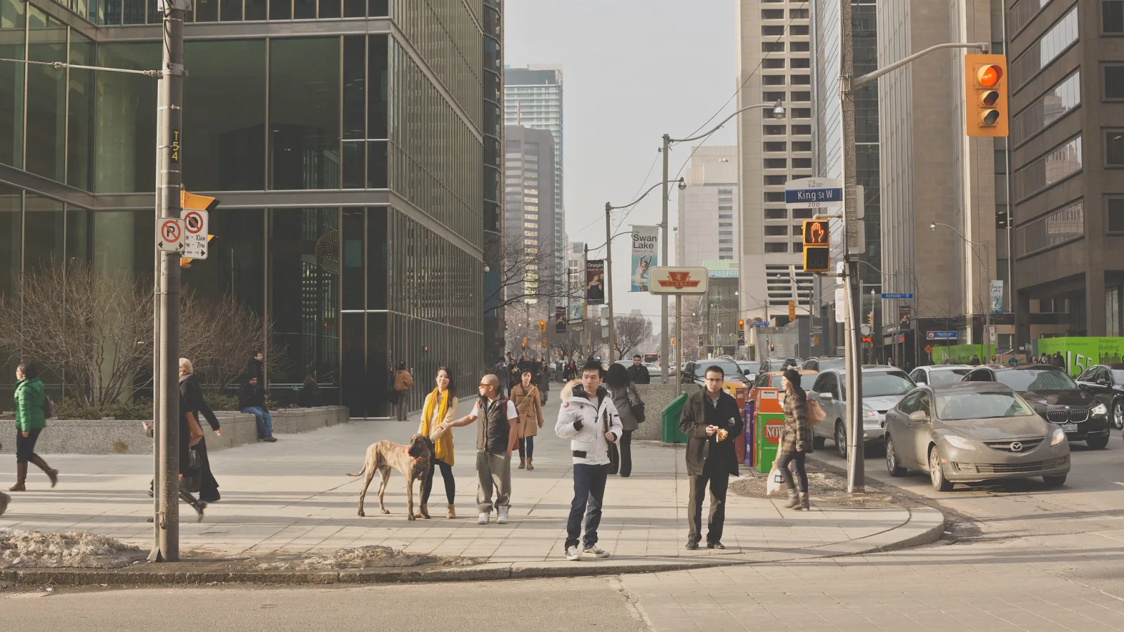
Borrow this: controlled chaos. The trap is thinking that any crooked, messy frame counts. It does not; the best of these pictures hold together because every element pulls its weight. Spend an hour on a busy corner with a wide lens, working close. Allow tilts and cut-offs, but for each frame ask whether the tilt adds energy or just looks like a mistake. Keep only frames where at least three separate things are happening and they relate to each other.
New Color: colour as the subject, not the decoration
What it believed. For decades, serious art photography was assumed to be black and white, and colour belonged to advertising and family snapshots. A group of photographers working in colour argued that it was not a coat of paint on a picture but part of its meaning, and that ordinary places (diners, parking lots, suburban kitchens, motel rooms) were worthy subjects. William Eggleston‘s colour pictures of everyday Southern life drew fierce criticism when a major museum exhibited them, which is part of why the moment is remembered. Stephen Shore photographed roadside America with a large view camera, giving motels and intersections the careful attention once reserved for mountains. Saul Leiter had already been making painterly colour street pictures for years, largely unnoticed.
What it looked like. Saturated but natural colour, often in plain daylight. Everyday subjects shown without irony. Frames where a red ceiling, a green wall or a blue car is the true subject and the scene is almost an excuse.

Borrow this: build a picture around one colour relationship. Walk your own neighbourhood looking for two colours that sit together in a way that surprises you: a faded pink door beside a green bin, an orange cone against blue siding. Make the colours the reason for the frame and let everything else be ordinary. Resist heavy saturation: these photographers relied on seeing, not sliders. The colour theory guide explains why some pairings feel calm and others vibrate.
New Topographics and the Düsseldorf School: the plain, altered landscape
What it believed. Classic landscape photography celebrated untouched wilderness in dramatic light. A group of photographers brought together in an influential exhibition subtitled “Photographs of a Man-Altered Landscape” pointed their cameras at what most people actually live in: tract housing, industrial parks, parking lots, roads. They aimed for a neutral, unemotional description, neither praising nor condemning, and trusted the viewer to reach a conclusion. Bernd and Hilla Becher, part of that show, spent decades photographing industrial structures (water towers, blast furnaces, pit heads) and presenting them in grids they called typologies. Bernd Becher later taught at the art academy in Düsseldorf, and students from that class, including Andreas Gursky, Thomas Struth, Thomas Ruff and Candida Höfer, carried the cool, precise approach into very large colour prints.
What it looked like. Even, often overcast light. Frontal or slightly elevated viewpoints. Horizons kept level and verticals straight. No sunsets, no hero rocks in the foreground. In the Bechers’ grids, every structure is shot the same way, so the eye compares small differences in form. In the later large prints, a vast amount of fine detail rewards close viewing.

Borrow this: make a typology. Pick one kind of structure you pass every day: garage doors, bus shelters, fire hydrants, corner stores. Photograph at least nine examples in exactly the same way: same height, same distance, straight on, soft light, subject centred. Lay them out in a three by three grid. Individually each frame is dull; together they become a study of variation and of the place that made them. It is also an excellent start to a long-term project.
Common mistakes
- Copying the surface, not the idea. A soft filter does not make a picture Pictorialist, and a tilted horizon does not make it street photography. Fix: before you imitate a look, write one sentence about what the movement believed, and check that your picture serves that belief.
- Treating movements as a ladder where later means better. Each one answered a problem of its time, and each is still a live option. Fix: judge a style by whether it fits your subject, not by where it sits on a timeline.
- Forcing people into categories. Many photographers moved between approaches, and few accepted the labels critics gave them. Fix: use movement names to describe qualities in pictures (“this has a New Topographics flatness”), not to pin photographers down.
- Confusing neutral with careless. The deadpan approach of New Topographics looks easy and is not. Level horizons, straight verticals, even light and exact placement all take work. Fix: use a tripod, check your verticals and be as precise as the look is plain.
- Studying only the famous images. One iconic picture tells you little about a movement. Fix: look at whole books or series, where the shared attitude becomes obvious.
Try this
One subject, three movements (30 minutes). Choose a single subject near home that you can walk around freely, such as a parked car, a tree beside a road or a small building. Photograph it three ways:
- Straight (10 minutes): tripod or braced camera, sharp throughout, one frame that describes its shape and surface as clearly as possible.
- New Vision (10 minutes): no eye-level frames allowed. Get low, get high, fill the frame with a diagonal.
- New Topographics (10 minutes): step back so the subject sits in its surroundings, shoot straight on with level verticals, and include the ordinary context you would normally crop out.
Put your best frame from each approach side by side. Notice how the same subject means something different in each, and which approach felt most natural to you. That preference is a clue to your own direction, which the guide to developing a personal style can help you follow.
Frequently asked questions
Do I need to know photography movements to take good photos?
No, but it helps. Knowing the movements gives you a menu of proven approaches and the reasons behind them, so you can choose a style on purpose instead of drifting into whatever is popular.
Which photography movement was the most influential?
There is no single answer. Straight photography set the terms for much of the century that followed, documentary work shaped journalism, and New Color made colour acceptable in galleries. Influence depends on which kind of photography you care about.
Is soft focus a legitimate choice, or just a Pictorialist leftover?
It is legitimate whenever it serves the picture. The straight photographers were right that sharpness is one of the camera’s great strengths, and the Pictorialists were right that detail is not always what a picture needs. Decide based on what you want the viewer to feel.
Can one photograph belong to more than one movement?
A picture can show qualities several movements valued: a street photograph can have a surreal reflection and a documentary purpose at once. Movements describe shared beliefs among groups of photographers, so it is clearer to talk about qualities in a single image than to assign it a single label.
How do I study a movement properly?
Look at complete photobooks and exhibitions rather than single famous images, read what the photographers or their critics wrote, then make a small series of your own in that spirit. The masters pages are a good starting point for names.
Related guides
- The History of Photography: the technical timeline of cameras and processes behind these movements.
- The Masters of Photography: profiles of the photographers named here and many more.
- Photography Theory: the ideas critics used to explain what these movements were doing.
- Visual Literacy in Photography: a method for reading any photograph closely.
- Fine Art Photography: turning an approach you admire into your own body of work.
- The History and Importance of Black and White Photography: why monochrome dominated art photography for so long.
- Street Photography: approach and etiquette for the snapshot tradition on city streets.